


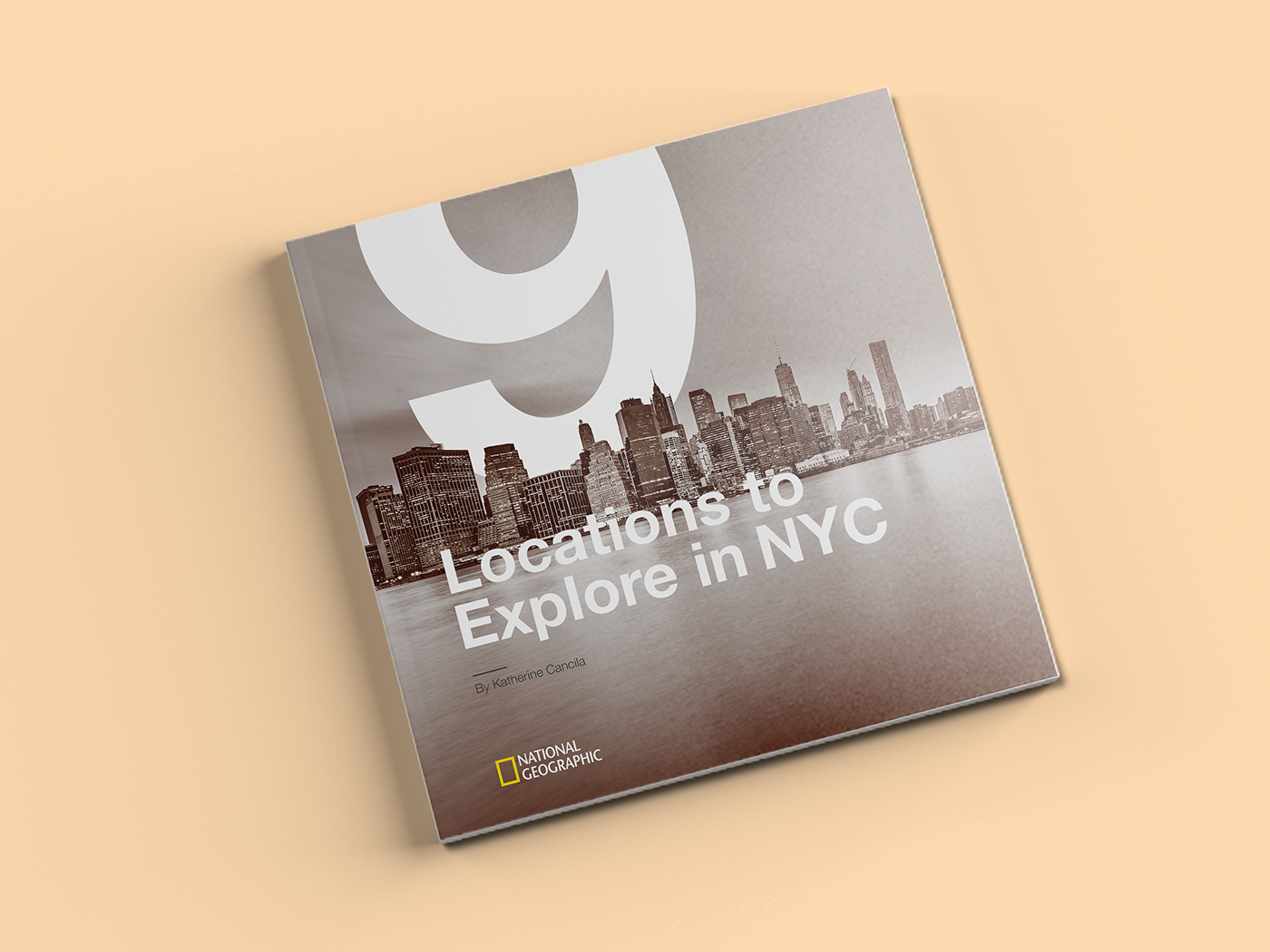
9 Locations to Explore in NYC: A City Guide
The goal of this project was to design a city guide that included a cover, table of contents, introduction, and main content pages.
––
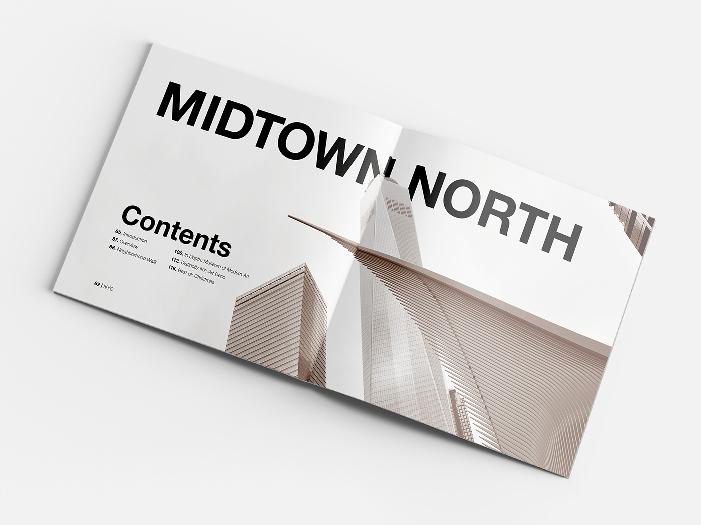
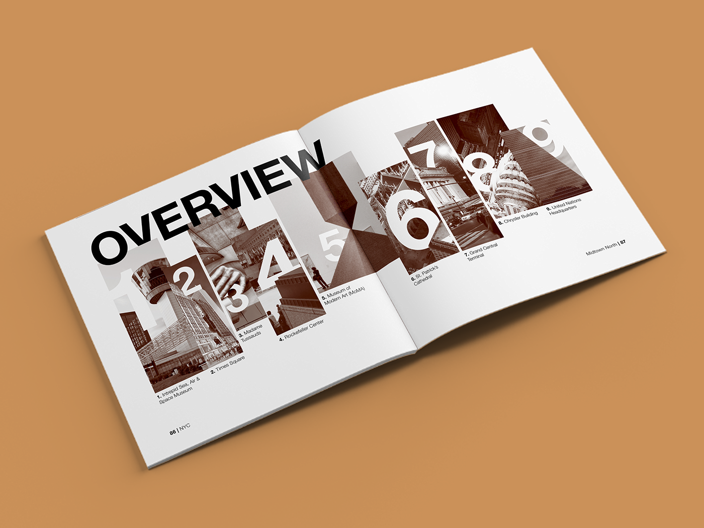
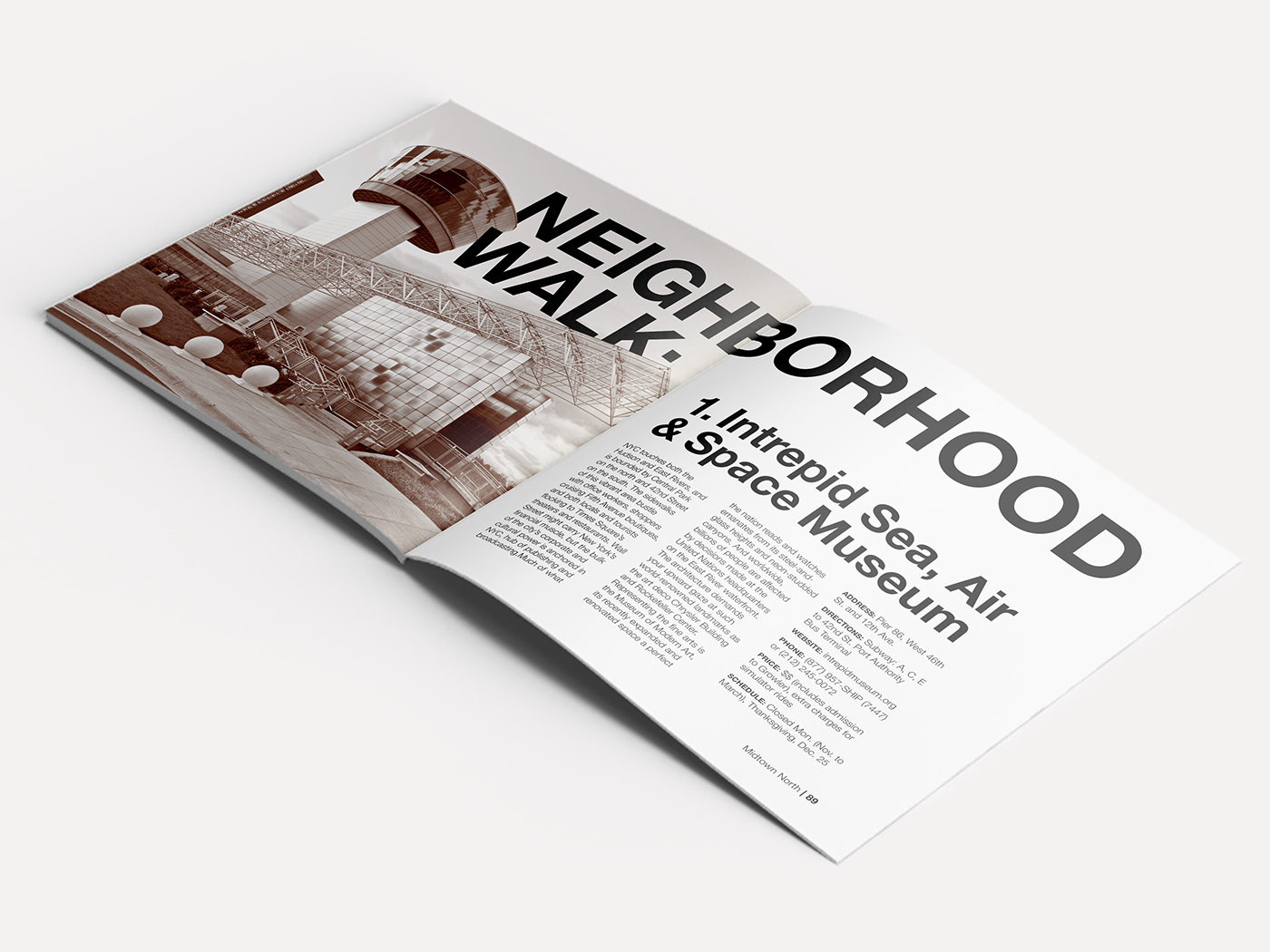
I utilized different type sizes to create visual hierarchy. I focused on finding a balanced ratio between the different point sizes.
As for the typeface, it's only fitting to use Helvetica. Used all throughout the subway system, every New Yorker is familiar with it. Helvetica screams New York City.
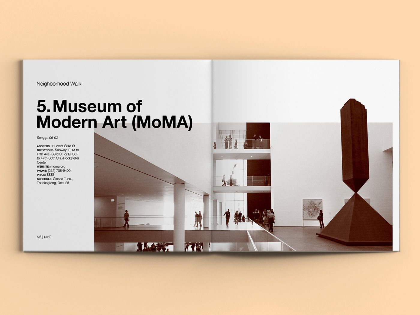
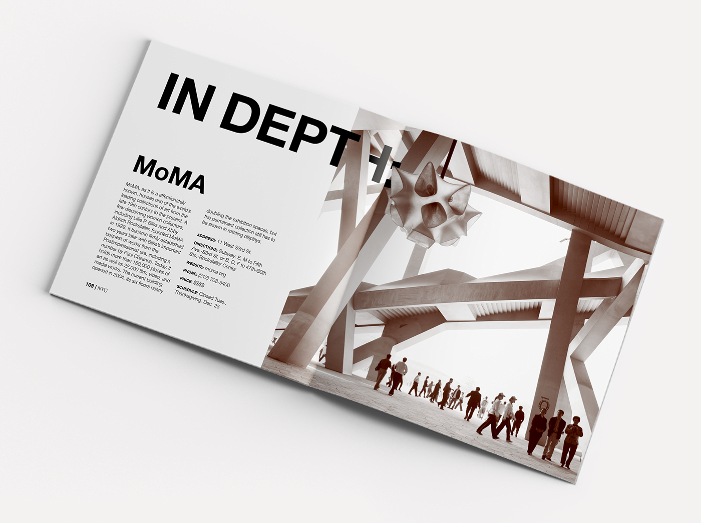
Large images convey the grand feeling of NYC, while the duotone color palette creates a consistent and modern aesthetic. Weaving type through iconic New York structures and having elements pop out of the image border, further emphasizes that feeling of grandness.


Note: This classroom project was created for the course “CD225 Introduction to Digital Layout”. This is purely for educational purposes and I do not own any textual information or photos.


