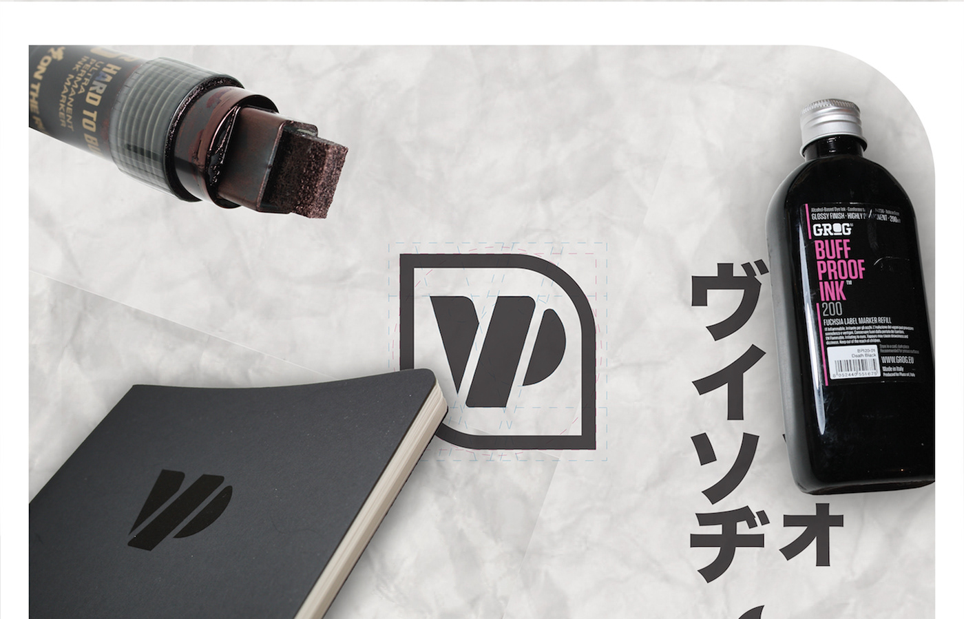

The logo created is formed by two letters, VP for Vincenzo Parretta plus the double O that represent me since few years.
The aim of the concept is to rebuilding a monogram from the foundations, to be inscribed (not necessarily) into a shape created by the overlap oh the two O seen as a circle and a square.
Not a single form but a "form" that changes depending on the need, I see myself in this definition.

The logo does not necessarily have to be accompanied by the logotype in din condensed, as we see on the business cards are used as single and separate elements.