
2019 LOGO
COLLECTION
_IN CHRONOLOGICAL ORDER
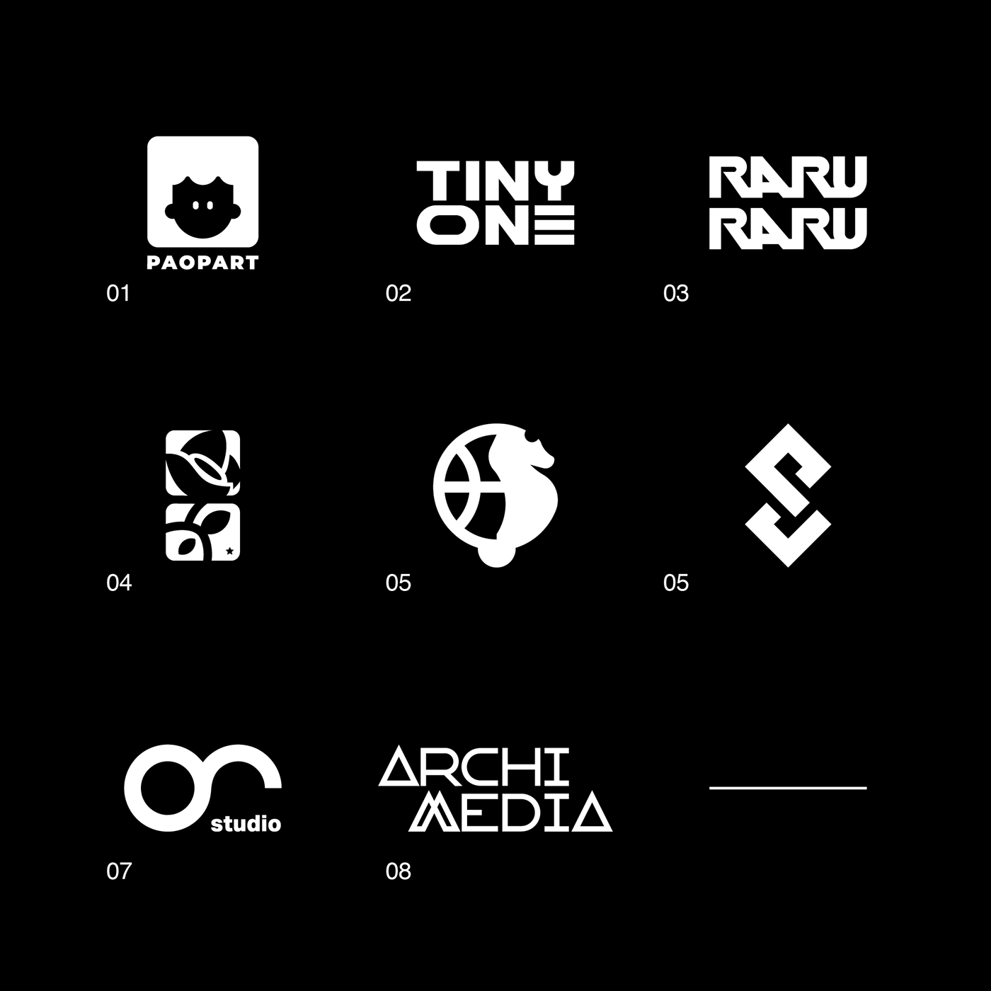

01 Paopart
_The shapes are inspired by the old luminous signs of the various photo brands, located outside the shops of photography, which is why we chose a very large character that enhances the aspects. To enhance the naming we chose a very lively color palette inspired by pop art, usable in various applications.

02 Tiny One
_The character arranged on two lines of text, was designed in such a way as to create an alignment between the two N, with which we chose to create a series of interactions, which would make the brand dynamic, giving life to a graphical representation sound waves in a minimal key.

03 Raru Raru
_The inspiration comes from unpacking the link between surrealism and the birth of psychoanalysis with the intention of having an outcome that is to be placed into a contemporary context.

04 Distretto Florovivaistico
_A logo designed to work even if broken down, the shapes are inspired by plants, the upper part of a bud and the lower one a stem.

05 Ippicampo
_Ippicampo is a sporty event that for the last six years has been animating the basketball court on the Soverato seafront and this year has decided to refresh its identity.

06 Pizza Collective
_The letters of the monogram have been inscribed within two squares, the shape is reminiscent of the square-shaped slices of pizza, the main product of the restaurant.

07 0039 Studio
_Everything starts with a basic shape. 0039 is a set of circles that intersect leaving an open space: the place where we meet you to develop your story.
08 Archimedia
_Archimedia is an audiovisual and film production company that operates for the major television networks since 1995.


