
In November 2015, I participated in my first Startup Weekend, in Copenhagen with the theme Health. A young lady named Charlotte Nielsen, pitched an interesting idea, so others and I joined the team.
So the idea was a tinder inspired application where elderly people and young students could arrange for outdoors activities.
The goal was to eradicate elderly loneliness.
We won the Nordea Life & Pension Award!
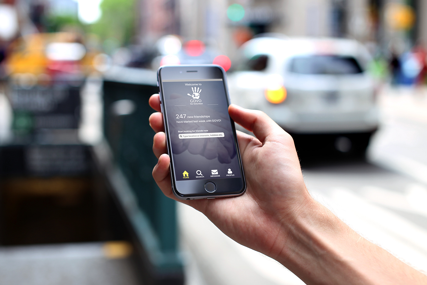
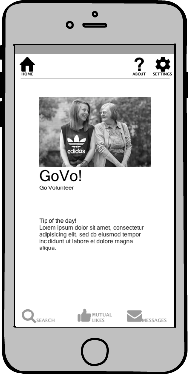
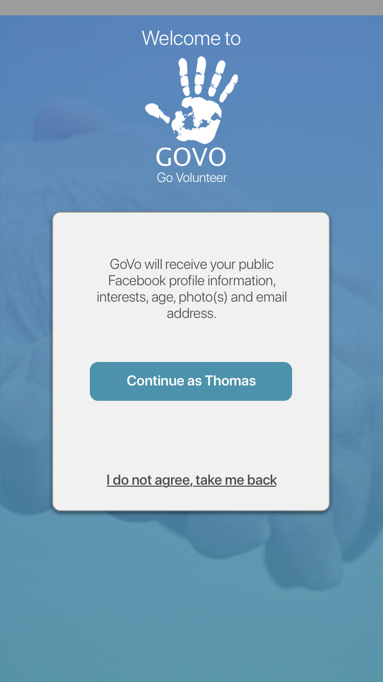
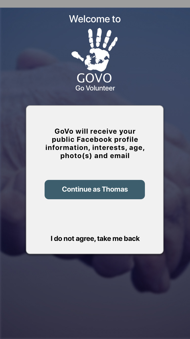
The name GoVo, derives from Go Volunteer, as the initial idea contained the notion that the young volunteer would go and volunteer to spend his time with an elderly person.
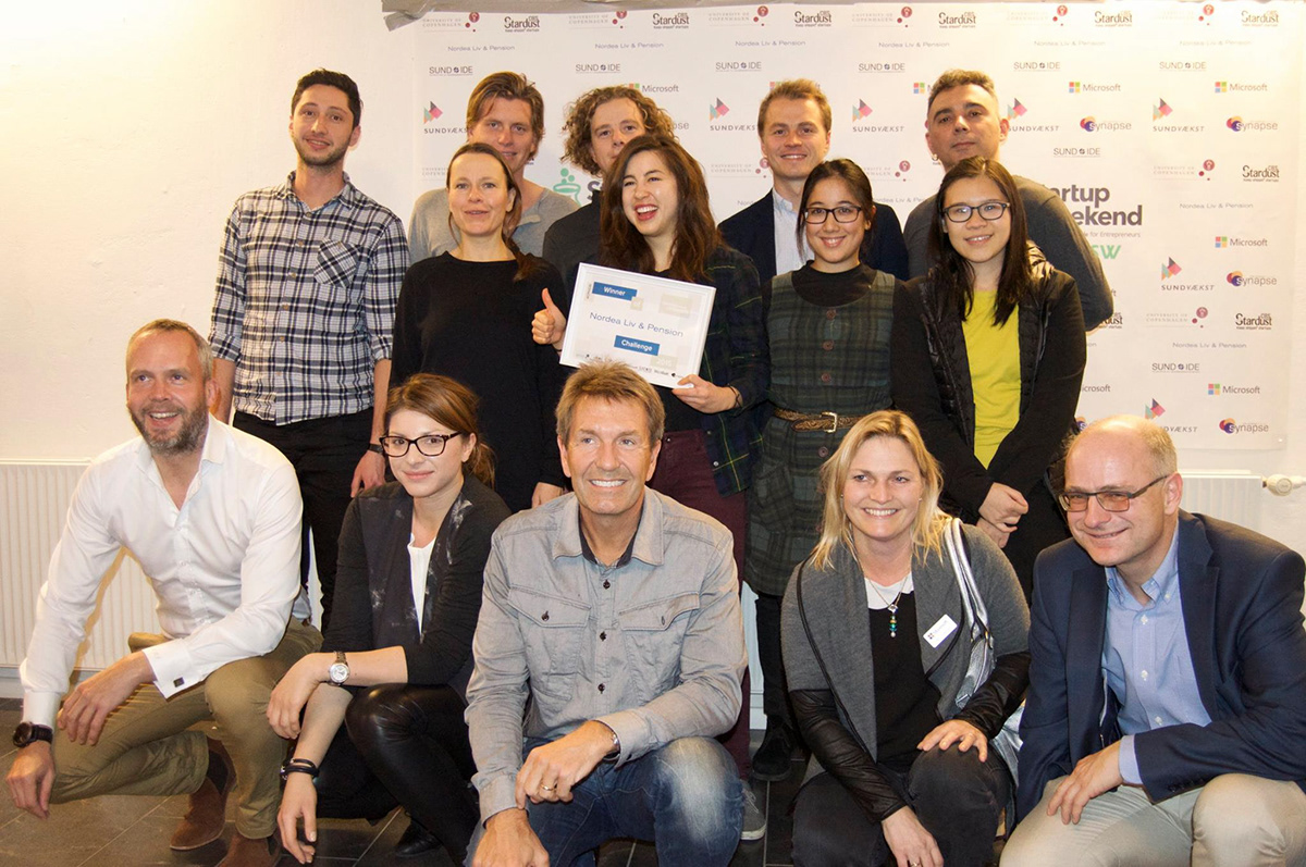
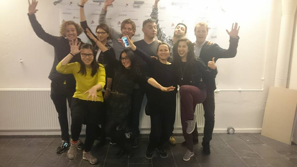


Images Above: During the Startup Weekend Health, on November 2015

In this project, my role as a designer was, to develop a clickable prototype from scratch for testing purposes through the main stages of a UX project. Making use of the best and most useful tools which currently UX design provides, one of my primary goals was to keep a robust user-centered design with accessibility in mind.

One challenge came when interviewing elderly people, during user research and usability tests.
- Elderly people absolutely HATE being labelled as or called lonely or elderly, they do not like to feel that others think they are needy or old.
- They like to keep their independence, and their well-being should not rely on others, so in many cases they denied being lonely, and frankly that is something that is not visible from an outsider.
- During the usability tests they identified themselves with the young volunteers user group rather than the elderly lonely user group.
So, the decision was made, although not immediately, to design an application that is simple to use, with a simple menu and navigation. I tried to keep the following things in mind:
- App needs to be very easy to use (usable)
- Users should be able to remember how they performed a certain actions in the past (memorable)
- The app needs to be able to perform the intended purpose (useful)
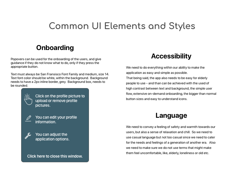
- The application needs to be WCAG 2.0 AAA graded, because of the target users. (AAA accessible)
Also, any mention of the following terms needed to be avoided at all:
Elderly, elders, old, older, old people, accessibility, loneliness, alone or their variations.
Elderly, elders, old, older, old people, accessibility, loneliness, alone or their variations.

Work has been divided in the following parts:
- Understand the problem
- Surveys and Interviews
- User Research
- User Personas
- User Journeys
- User Flows
- Site Map
- Wireframes
- Prototype and Clickable Prototype
- Usability Testing
- Design System Language
- Conclusion


Problem Statement
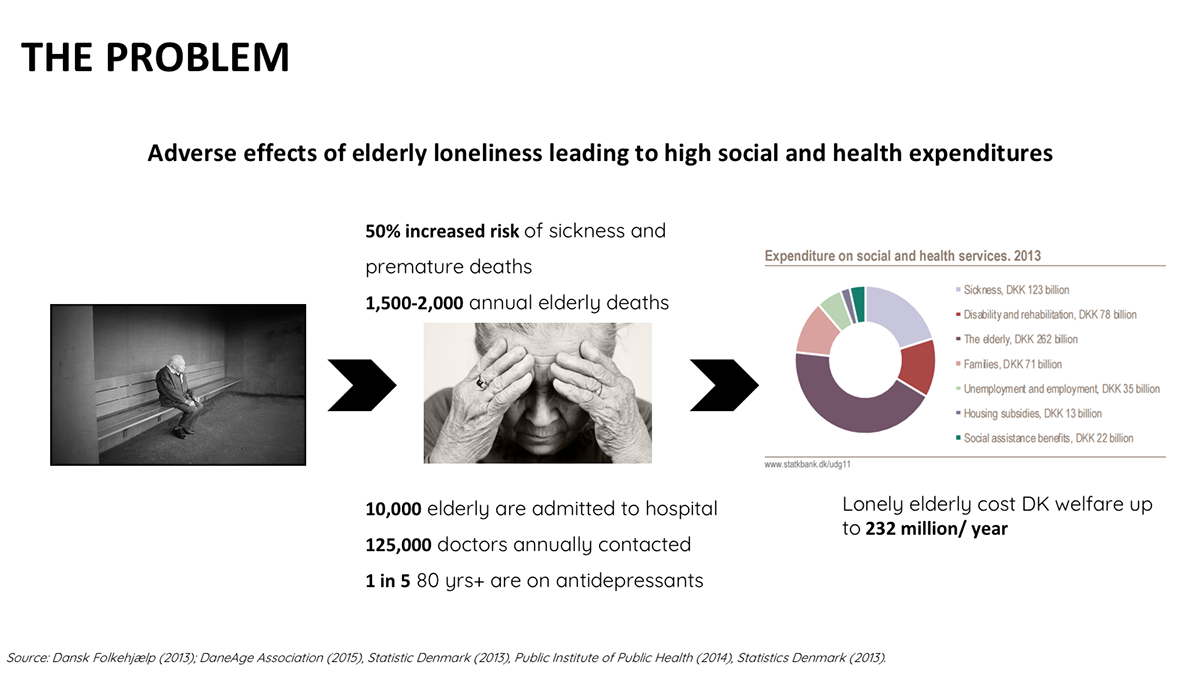
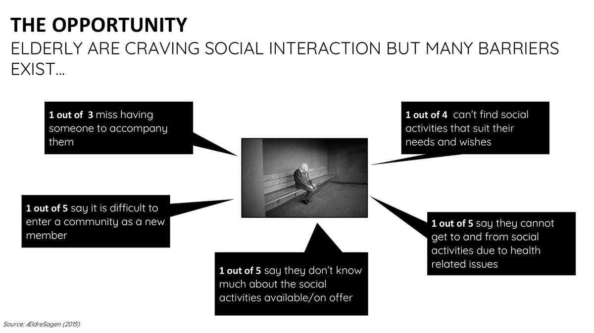
We have observed that there are many lonely yet tech savvy elderly persons who are not meeting their needs for social interaction and companionship which is causing depression, and increased health risks for them.
There are also many young and eager volunteers who aren’t meeting their needs to volunteer and offer their time and energy to help others in a meaningful way, which is causing frustration to them.
How can we improve a product/service that can successfully connect the above two groups together and fulfil their respective needs which we can evaluate using a user rating system?
Potential Solution
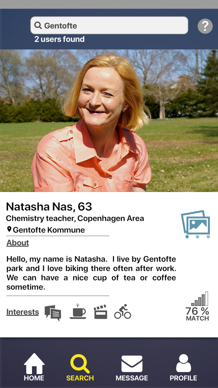
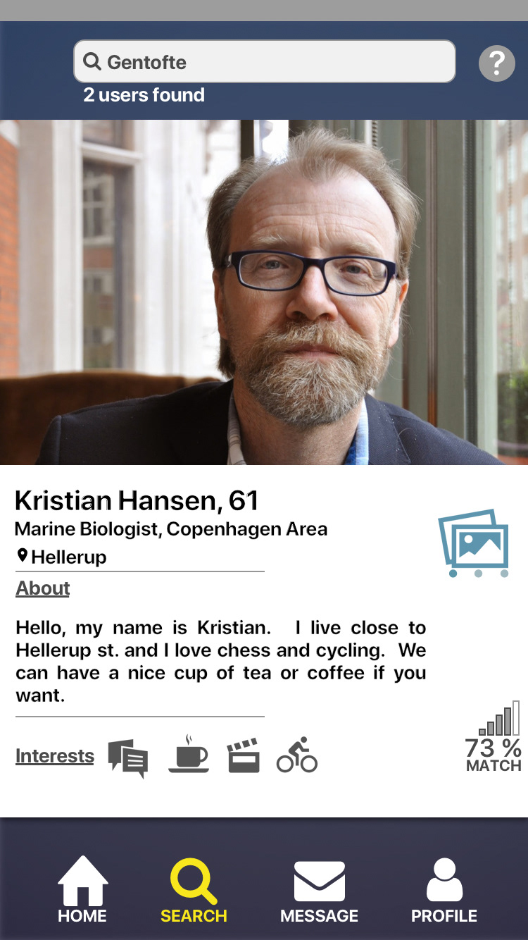
A Tinder-inspired mobile app that connects lonely elderly to energetic volunteers. The App's simple, user-friendly and well known interface will engage the tech savvy elderly and the volunteers, and it will reduce the time it takes to become a volunteer.
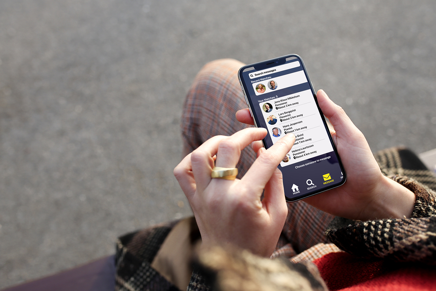
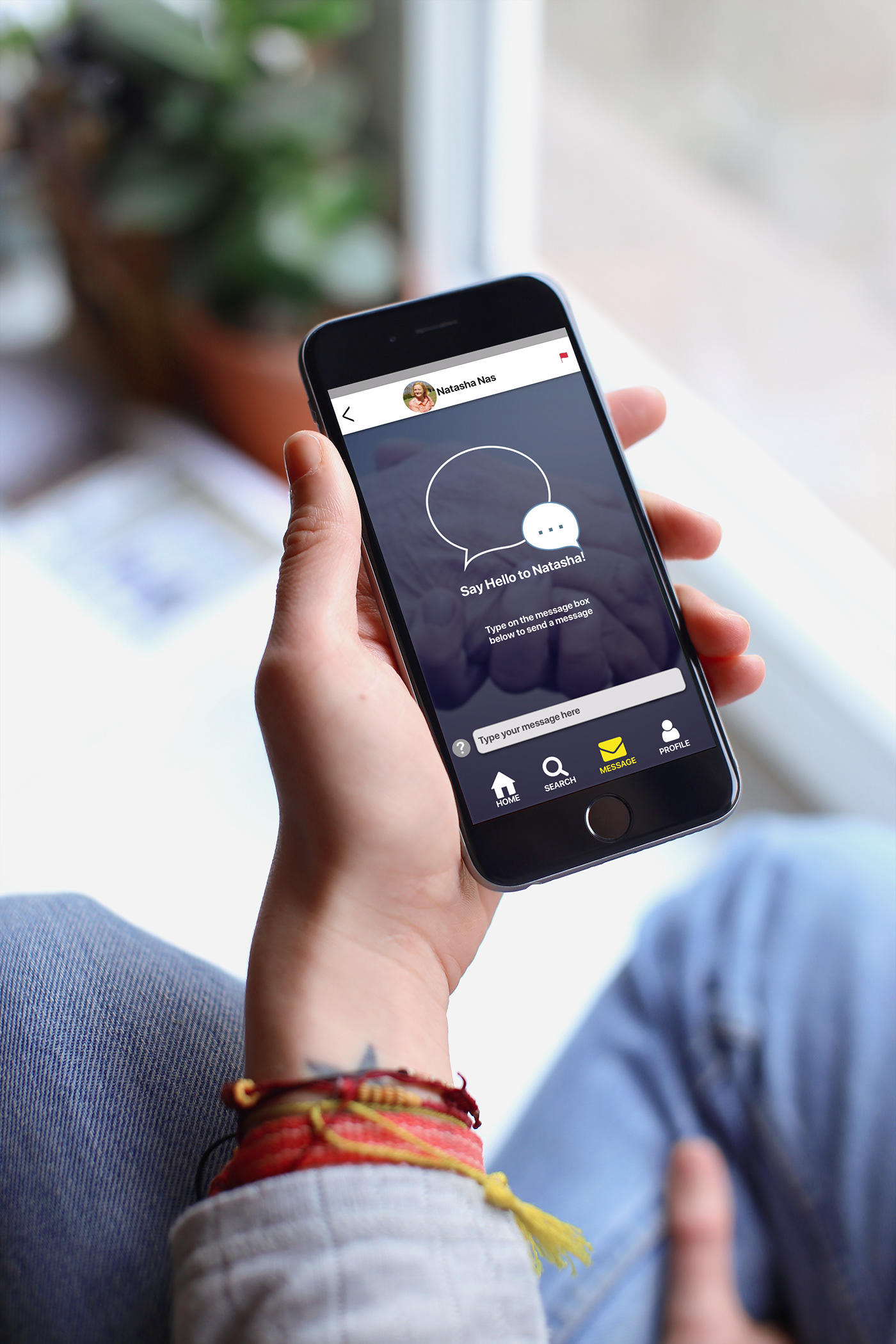
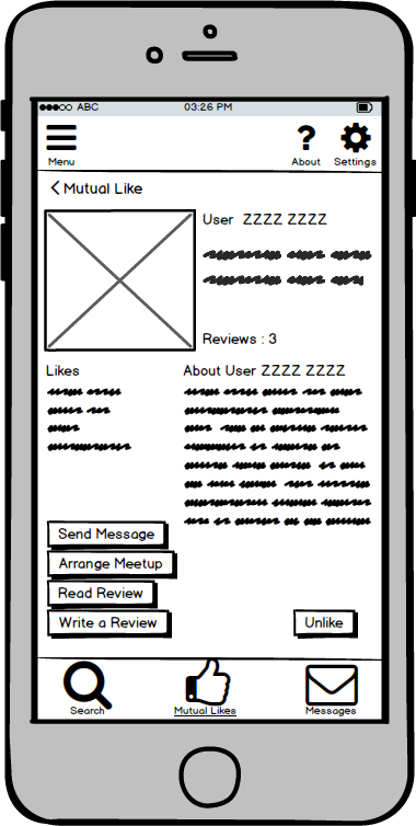
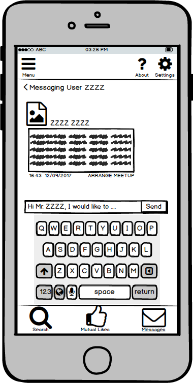
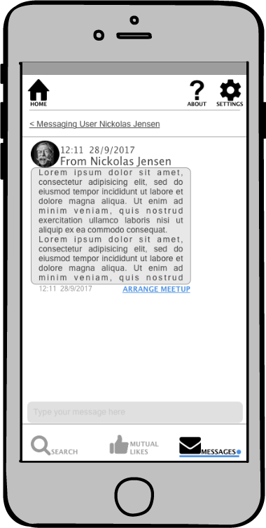
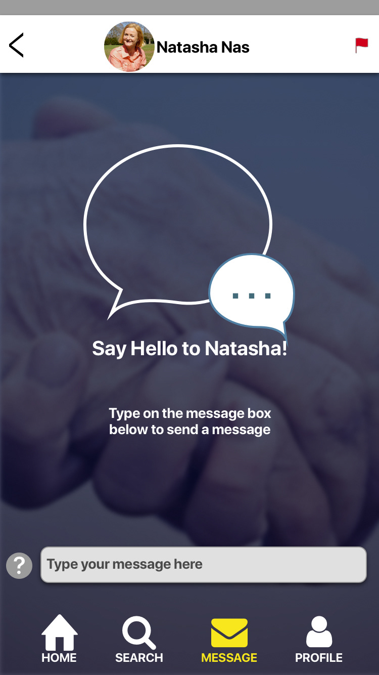
If there is a mutual like between the volunteer and the elderly, there is a match, and both parties can message and meet each other, for example, to take a walk, or play chess etc.

I prepared a questionnaire for both user groups, and I run a series of interviews.


Findings and Affinity map


Insights from the User Research Analysis
- All users would like to meet outside, in neutral ground for safety reasons etc, and they feel the need for some kind of governmental authority backing the project.
- All users seem to see the need for having a common interest with each other, because that is how they feel the meeting will be more meaningful for them.
- Users feel that trust issues are apparent and it is something that needs to be addressed.
- The elderly feel that they should be the ones making the first step in arranging the meeting.

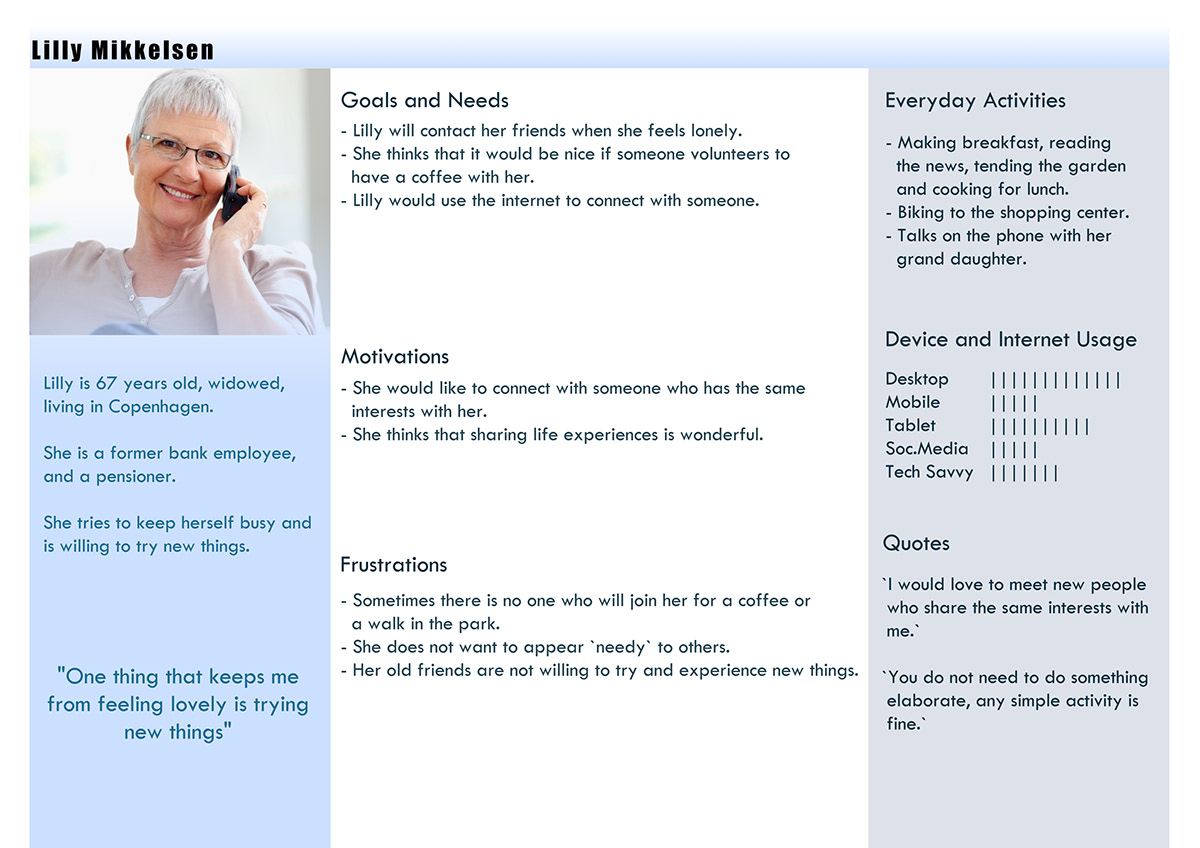
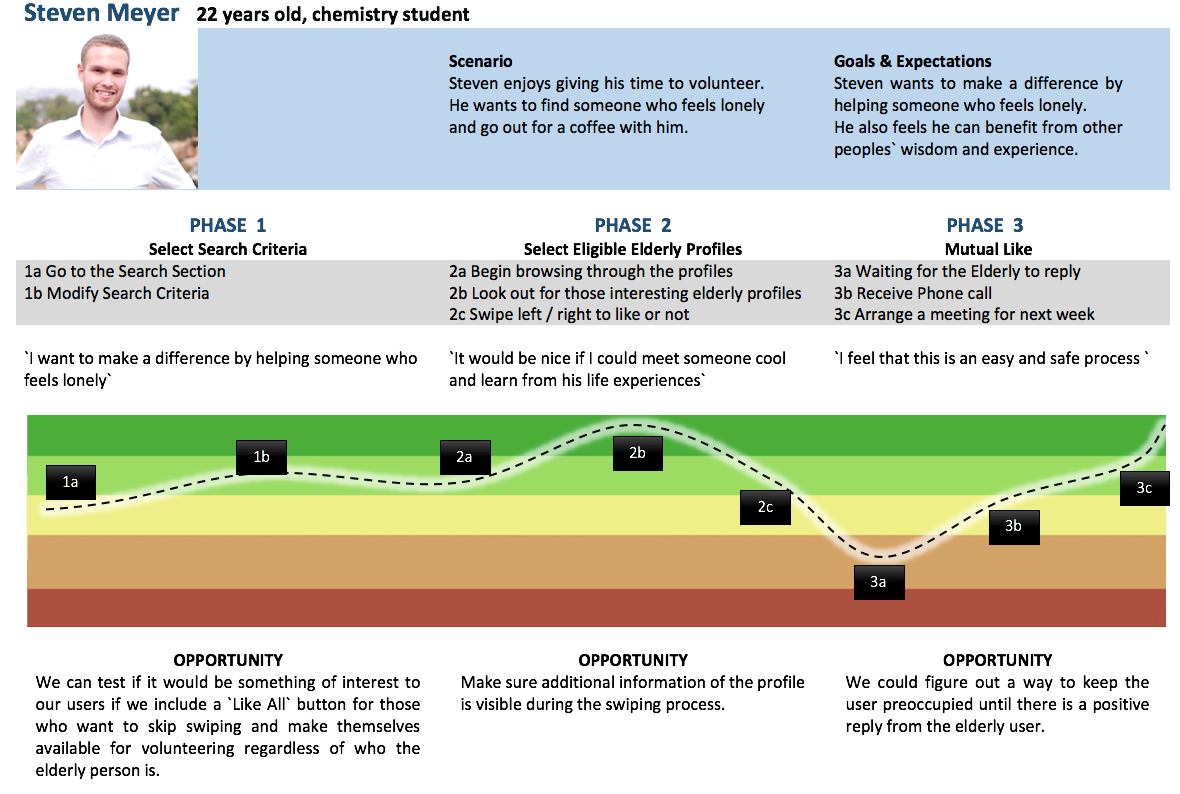
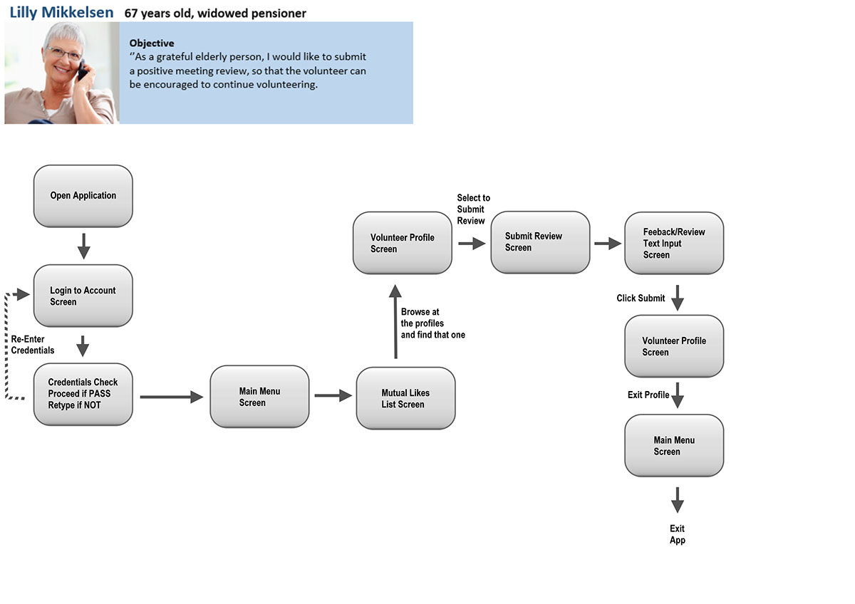
Below you can see 3 personas I have created for this task, Lars, Lilly and Steven, their journey and their flow through the application.


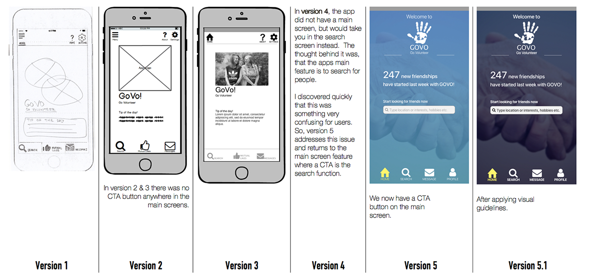
User flow, for versions 1 to 3. At version 5 and after usability testing, the flow is different and simpler as shown further down.
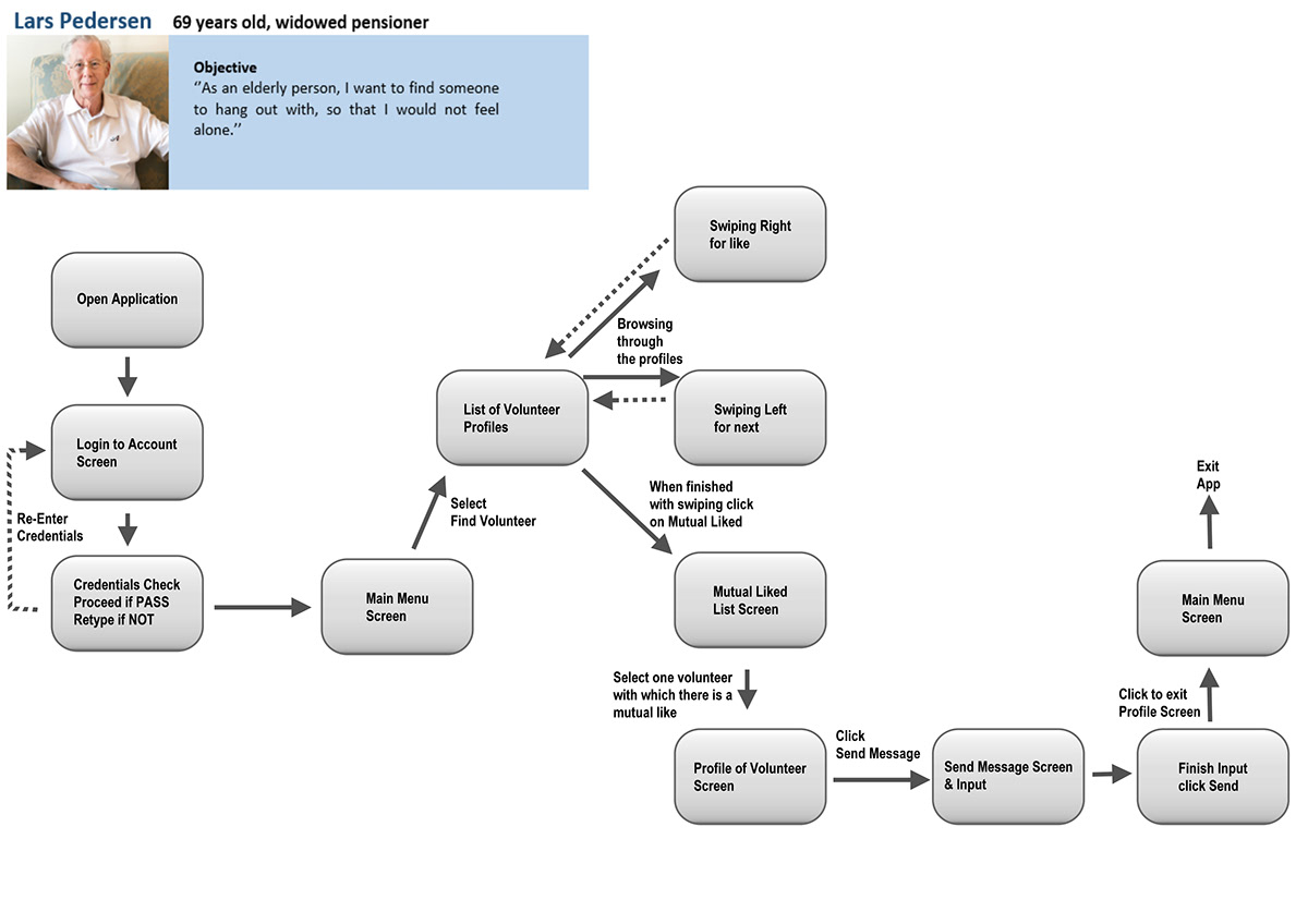
Below is Steven's current, and much simpler flow after a series of user tests. The other personas flows have been likewise been simplified.


Below is the site map, that was created for the desktop version of the app, using the findings from a card sorting exercise, conducted with 10 users.
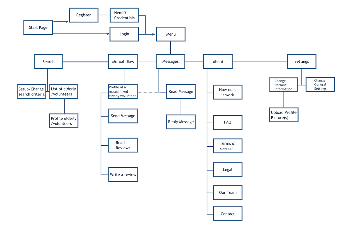
Card sorting exercise with 10 users and the results.


Mobile First Design.


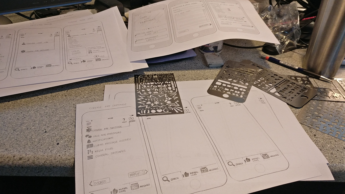
Initial wire framing:


Low fidelity prototype (ver 1):


Mid fidelity prototype (ver 2):


High Fidelity prototype (ver 3)


Then, the time came for a major usability test for version 3.

Introduction
Title: GoVo mobile (ver 3) test
By Aristeidis Kampas
Stakeholders: management team, designer and technical team
Last updated: 26th January 2018
Background
GoVo is a mobile app that connects lonely elderly people with energetic young volunteers. The app allows for users who like each other to contact and arrange a meet-up at a place and time of their own convenience. The purpose is the reducing of elderly loneliness.
Goals
The Objective of this test was to examine the use of the app`s core functions, ease of use and its overall usefulness. Our goal was to find any possible issues in the design and to optimize the strength, effectiveness and overall experience of our users.
Test Objectives
• To record how they interact with the mobile device.
• Users will be asked to find a user and like that user.
• They will also be asked to find a mutual liked user and message that user.
• Also they will be asked to arrange for a meetup with said user.
Methodology
The usability test was done in person, using an android device. There were 6 interviewed in total and on average the test took about 30 minutes for both platforms. The session has been recorded on audio and video, upon their signing of the consent form.
Participants and Schedule
The test took place during the 16th and the 17th of January 2018. There were 6 persons interviewed and their full detailed information is considered confidential and will not be disclosed. Their demographic details fit more or less our target audience.
The list and their information is available here: https://drive.google.com/open?id=1FscRHCZ0-sZQTCleucHLWrGytkiB2bfO
The revised Test Script used can be found here: https://drive.google.com/open?id=1MW9YG4F4Nbsq87fwdlCoGGonQX0uibgs
Usability testing conclusion
The Usability Test revealed quite a number of flaws in the initial design (ver 3).
To elaborate:
- Use of misleading (Search) or prone to misunderstand (Mutual Likes) terminology
- Functionality that was not easy to understand (Mutual likes)
- A home page or main page without call to action.
- Misplaced menu buttons (top menu)
- Lacking of on-boarding
- Old design patterns and other
The new design was rapidly wire-framed, prototyped and deployed (version 4), as you can see from the images below:
Rapid Wire-framing & Prototyping of version 4 below:


Revised version, after usability testing (ver 4)
You can see the included on-boarding screens.


Peer review feedback: Revised version 5
Some on-boarding after login, the rest of onboarding/help is available only if the user requests it.


Below you can find version 5.1 after a round of iterations and improvements especially on the visual side and after applying Accessibility Guidelines WCAG 2.0.
Clickable prototype is available: https://invis.io/9SGE30UWGJ8


As you can see, the application has gone through a few rounds of refining, as new information and feedback from users and testing became available.
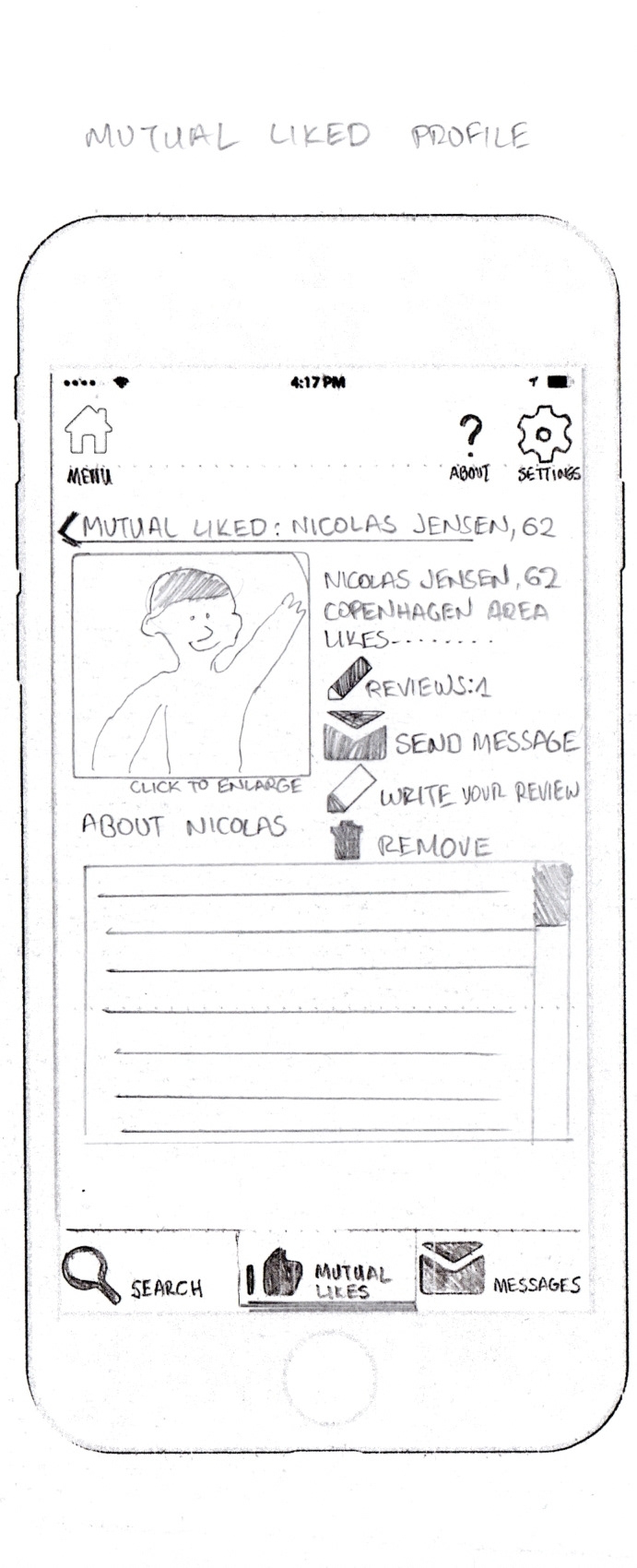
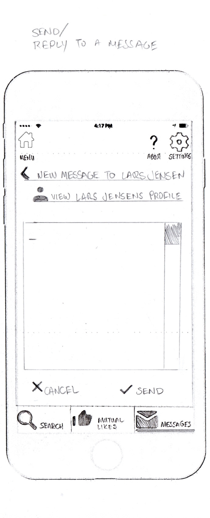
Below, I picked 3 random app screens, that show the progression from wireframe, to low-mid and high fidelity prototypes and finally to clickable mockups.
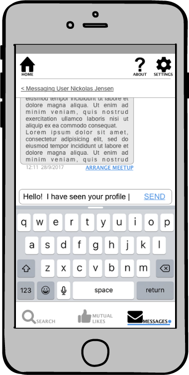
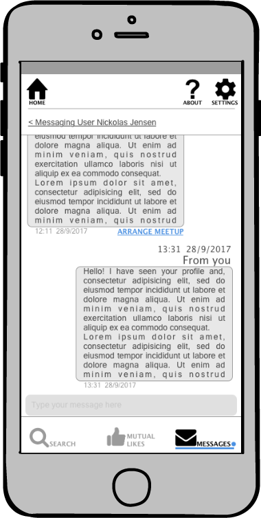
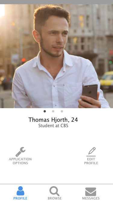
Below is the main application screen.
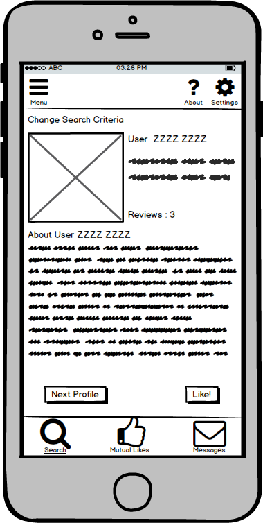
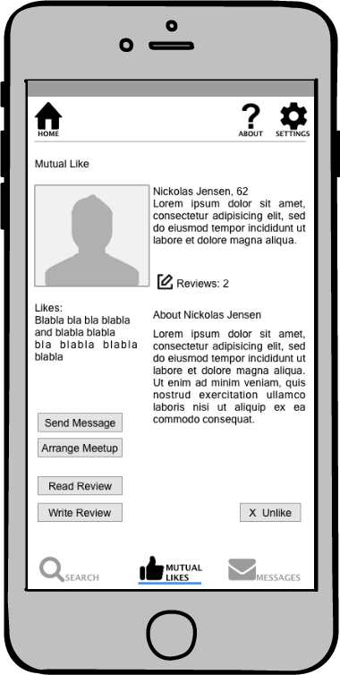
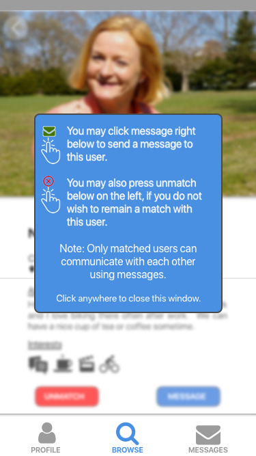
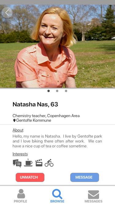
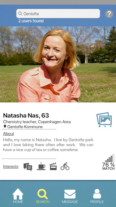
The screen below, is the user's profile while swiping left or right.
Swiping as functionality was not part of the design until version 4.

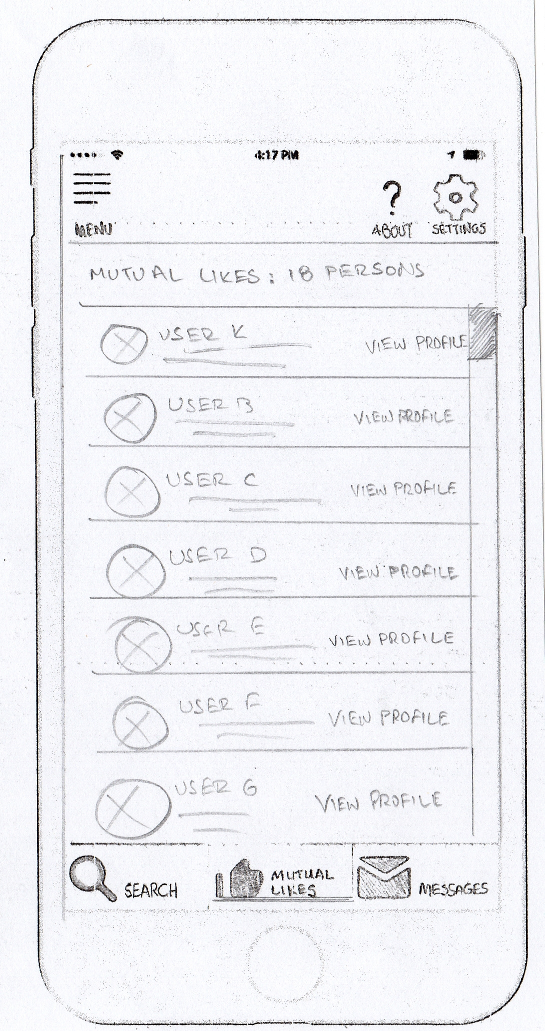
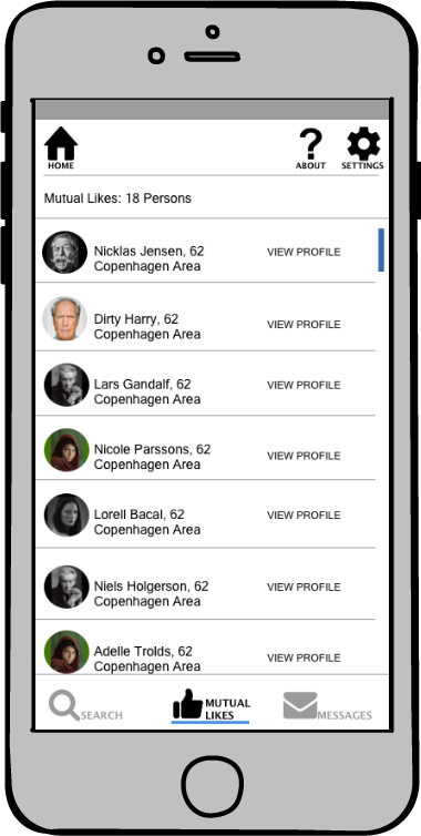
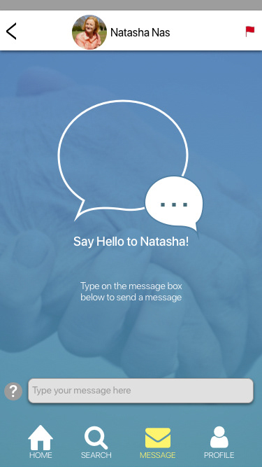
Above is the mutual likes as merged with messages screen. It was found that it made no sense to keep a separate screen for the mutual likes and the messages. Since those who you can message are only the mutual likes anyway.

After developing the prototype, the time came for the:


With all the knowledge, the pain and gain I got from each step during the design of GoVo, I’d like to say the following:
1. It is very important to keep the user in the centre of the design. Solid user research conducted before implementation ensures the project is going in the right direction.
2. It’s vital to begin wire-framing and deploy the design early on. Thus I can weed out anything that needs not be in the design, and include features that must be included. Also low-fidelity prototyping is a quick and cheap way, to start with usability testings. It allows to modify or improve designs fast and quick.
3. I need to be ready at any point to pivot and redesign from scratch, if the input and feedback from the users points toward some other direction. Scrap the design if it does not conform with the research data/user feedback, and not the other way around.
4. Feedback from other designers is also exceedingly valuable, especially when they are more experienced than me.
I am exceedingly obliged to:
My mentor Pia Klancar
My tutor Allison Yaeger
All the original GoVo team members from CPHSW
Fellow UX Designers: Helena Levison, Erik Fiala
All the other friends who contributed with their feedback and ideas.
Thank you
Lets make the world a better place to live in: help a person feel less lonely.