«Lactica» – innovation in milk.
Russian north-west is a region well-known for good tradition in milk production. And that’s the region where big processing and animal farms are located. «Lactis» is a full cycle group of facilities with a 45 year history of milk production specializing in production, processing and supplying of dairy products. «Getbrand» agency was commissioned to create a brand and package appearance.
Objective
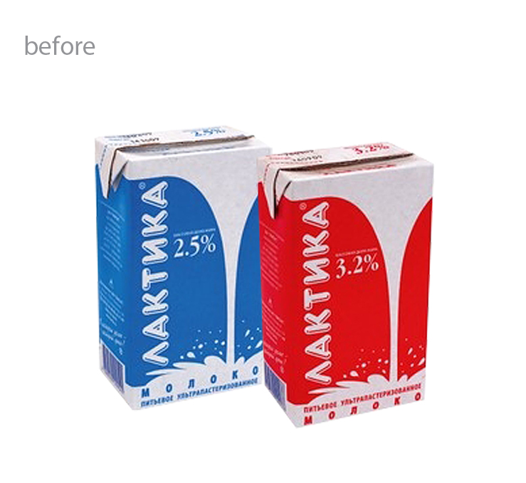
«Lactica» trade mark had already existed in the region, but the previous design wasn’t reflecting any consumer benefits and was too outdated for the new age. It was time for changes! New brand image was due to reflect main principles of the company – that is hi-tech production, highly trained personnel, and ever high grade natural stock. On the grounds of aforementioned principles «Lactica» is to become an expert brand in dairy category, oriented onto increased healthy nutrition trend common for modern society and self-regard standards.
«Lactica» trade mark had already existed in the region, but the previous design wasn’t reflecting any consumer benefits and was too outdated for the new age. It was time for changes! New brand image was due to reflect main principles of the company – that is hi-tech production, highly trained personnel, and ever high grade natural stock. On the grounds of aforementioned principles «Lactica» is to become an expert brand in dairy category, oriented onto increased healthy nutrition trend common for modern society and self-regard standards.
Solution
The new logo composed of «Lactica» caption and two styled check marks of different colors advantageously distinguishes the products on the market, stating them as goods of high quality and technology. White package color is a neat solution for the concept and suits the whole dairy category best. Pictures of people on the package makes the product relevant and modern, which reflects the main emotion of good health and benefit. The front of the package bears main consumer advantages of the product.
The new logo composed of «Lactica» caption and two styled check marks of different colors advantageously distinguishes the products on the market, stating them as goods of high quality and technology. White package color is a neat solution for the concept and suits the whole dairy category best. Pictures of people on the package makes the product relevant and modern, which reflects the main emotion of good health and benefit. The front of the package bears main consumer advantages of the product.
Expertise in milk is a new and growing trend that contrasts in front of the usual one that comprises pictures of cows, nature and cattlemen. The share of such new offers on Russian market is going to be growing in the nearest future.


