Corporate
By the end of 2009 I've been asked to redesign the corporate identity of Accademia Italiana, a design school based in Florence, and with branches in Rome, Bangkok, Skopje.
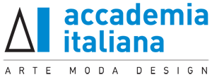
After a research on the past visual language I first defined the problems of the brand (i.e. the acronym AI was composed by a square ruler and a ruler embedded in a black square, or a discrepancy of typefeces for their corporate).
Secondly I decided to use a minimalistic style. The message had to be: what matters is the education!
I wanted to play with the weights of the fonts, with the geometries and the spaces of the support, in order to create an elegant and ordinate feeling of rationalism.
This work was intially commissioned for the Italian Headquarters.
Eventually I also redesigned the corporate of the Thai branch (where I lectured for 6 months), creating a sense of whole between the two offices.
Eventually I also redesigned the corporate of the Thai branch (where I lectured for 6 months), creating a sense of whole between the two offices.


On Top: A detail of the typeface used and the contrast between the three colours I used.
In the middle: the letterhead.
The two different business cards: one for the Italian quarters and the second for the Thai one.
The Booklet
A booklet created for the short courses of the Florence's Headquarters.


Editorials
Below some of the Editorial designs I worked on during my experience in Thailand.


An Advertising created for the School.


