This work is my major project for the MA in Graphic Branding & Identity at the London College of Communication, University of the Arts London.
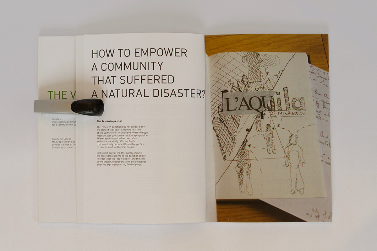
The Case Study is about L'Aquila, a medieval city in the centre of Italy struck by an earthquake the 6th of April 2009 at 3:32am. 309 persons died in the event.
After four years the city is still facing a series of problems related to its reconstruction and to the reassembling of its social tissue and identity.
As the subheading of this page suggests, the project had been focused on developing a communicative system for a city hit by a natural disaster.
The production of this task consisted in the conception, the design and the production of a smartphone application, the related website and (obviously) the brand definition and application of the project.
Specifically, the smartphone application had been designed to foster the reconstruction of the city centre and to renew the cohesion of its shattered community.

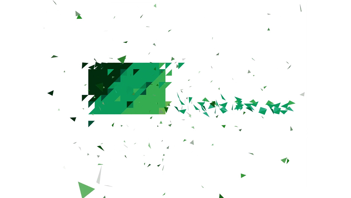
The construction of the logo, from a shattered whole of tringles to a unity of parts

The teaser of the project. 30 seconds to express the tone of voice of the application
This video explains the main features of the App and how is intended to empower the community of the case study

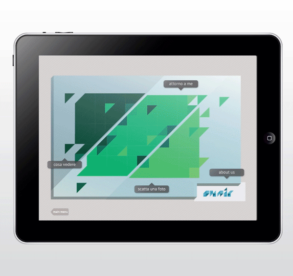

Some sketches from the Visual summary... preparatory drawings, UI layouts and a lot of strategy!

The target audience of this project has been mainly focused on the young and young adults.
Also, the project analysed the interventions that the brand could generate on the target audience and the possible commercial role that this brand could play in the selected environment.
The leitmotiv of the aesthetic is composed by merged triangles.
These shapes are intended to create a square, as a symbol of a recovering shattered community. It is starting from this keypoint that I created the logos, the typeface and the whole visual language.

The Major Project Report: 64 pages - The Visual Summary: 84 Pages
Size: B5 - One version Hardcover, one version Perfect bound with 300gs Cover Matte
Size: B5 - One version Hardcover, one version Perfect bound with 300gs Cover Matte


A page between a spread. On the left I reported three examples of previous logos using the same colours


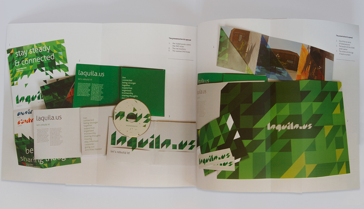
A double spread - At the end of the book I showed the "starters kit" of the project, a series of gadgets for the launch of the app among the city.
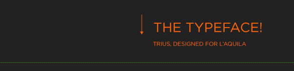
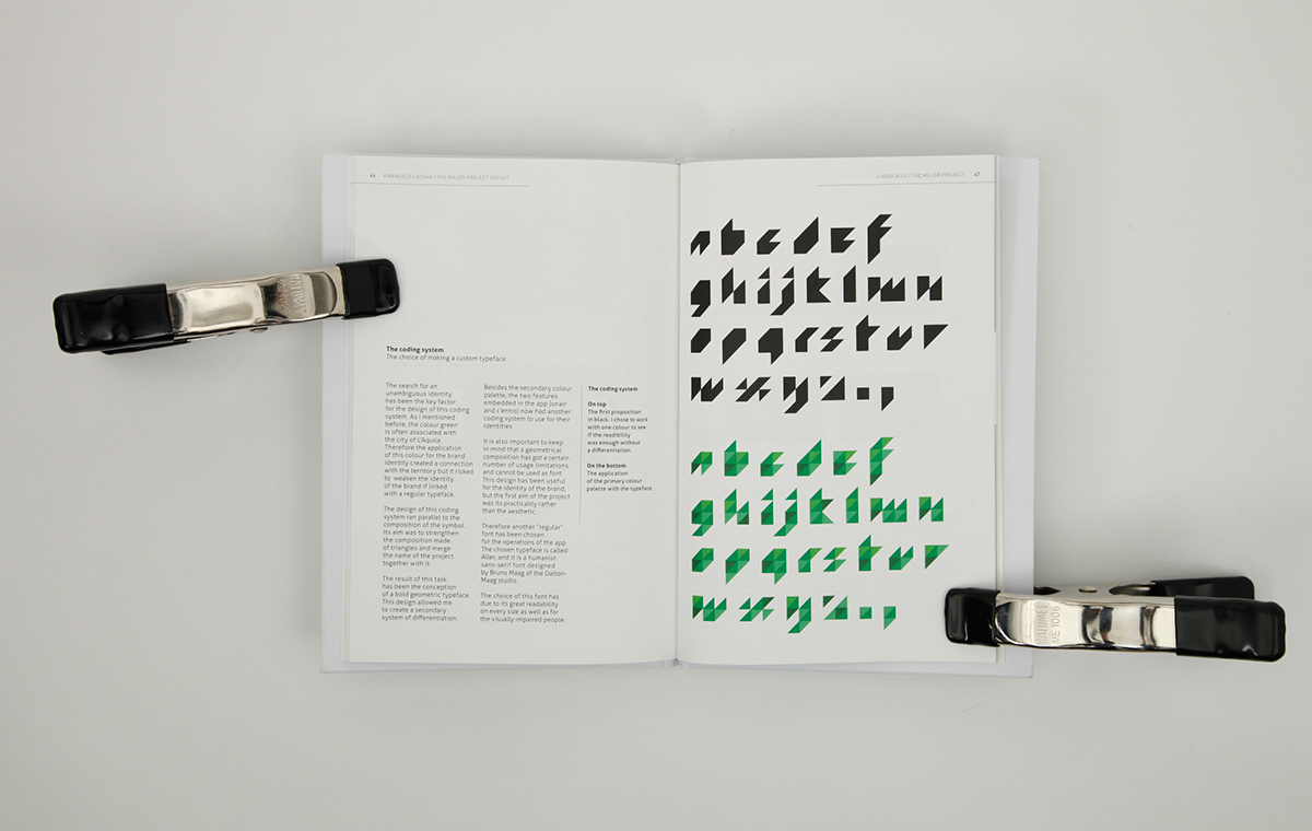
This is the typeface I created following the visual language and the colour palette of the project.
Click here for the explanation of this subproject!
Click here for the explanation of this subproject!

Other supports for the project.
As the laquila.us is intended to be enjoyed through a tablet/smartphone or pc, I created a series of "goodies" for the Launch of the community.
- A presentation DVD
- Two booklets with two pull-out poster
- Two folded postcards relating two landmarks of the city.

The opened supports

Very often the designer’s work is underestimated.
It is reduced to the mere visual transposition of a concept. Sometimes it could be trivialised.
Not many people understand that the designer's work is a method mainly composed by research.
The designer’s job is not (only) the visual synthesis or its aesthetic. With the proper method it becomes an added value, a work made of experience and study of the project.
The composition of this project has been a contribution to my roots. It has been my little “first things first”.
Through this project I analysed the issues of a shattered community.
A community that has to regain those dynamics usually given for granted. It is undeniable that in order to win back a normal lifestyle there is the need of several competences (political, psychological…).
The simple idea of creating a new identity for a city is not sufficient if there is not a hard work on the people’s mind. With my project I tried to use the new media in order to give a support on the reconstruction (either physical or abstract) of a city. I found interesting to understand how the laquila.us example could be enlarged for a global model of branding. Also, through the use of the models I investigated, the same project could be exported in other realities, such as after-war scenarios or other dramatic events.
The brand we create is a promise. No matter how small or big.

I strongly suggest you to give it a try.
Some pages are really cool!