Rome
Creating visual identity for the legendary city


Why ROME?
How is it so that one of the most breathtaking cities in the world happens to have a rather sad visual identity? We’ve heard that Rome crushes designers’ ambitions – it has so much bellezza around that it’s almost useless to try creating something new – a total modern depression. We dare to disagree and believe that respective identity could help one enjoy the old Rome with a new point of view. In addition, Rome is simply one of our most beloved places for a city-break. We’ve experienced Rome with tourist’s admiration many times. Even if locals would shrug at our ideas, our work is aimed at people coming to the city: curious visitors, wanderers and explorers.
What's the idea
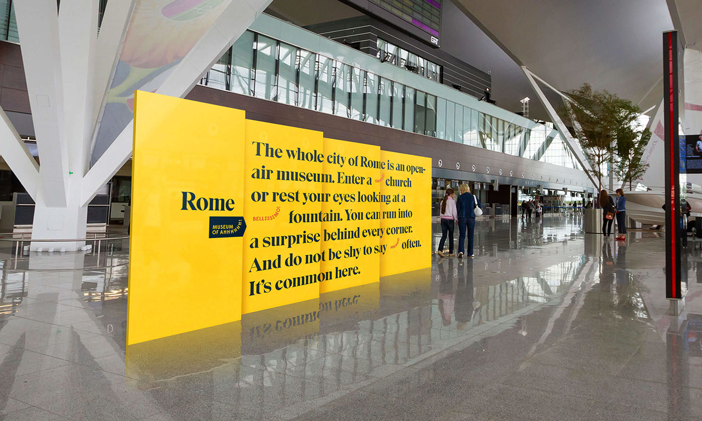
Rome is an open-air museum. The air is thick with history an even the most shabby churches or desolated monuments would be proudly welcomed by other cities as the most beautiful objects on their land. Everywhere you turn – you can see something worth exclaiming 'ahhh!'. Enter a church grande or rest your eyes looking at a fountain bellissimo. There are so many 'ahhhs!' there, that we decided to name Rome as 'Museum Of Ahhh!'. It’s a slogan and also a metaphor for a game you play when in Rome – behind every corner there’s something waiting to be rediscovered.

How we did it
We’ve chosen a contemporary serif font Eksell Display Large for the wordmark. Its character is a blend of modernity with hints of traditional letterforms found in ancient times. This typeface is like Rome, rich in history and in the meantime moving fast forward with what contemporary lifestyle has to offer.
A wordmark is often locked up with the arrow symbol. It holds the slogan of the city 'Museum of Ahhh!'. The arrow symbol highlights the directional purpose of this identity. We aim to make Rome more accessible to tourists, enabling them to discover hidden secrets in this legend of a city. The arrow symbol is used coherently across different touchpoints.
A wordmark is often locked up with the arrow symbol. It holds the slogan of the city 'Museum of Ahhh!'. The arrow symbol highlights the directional purpose of this identity. We aim to make Rome more accessible to tourists, enabling them to discover hidden secrets in this legend of a city. The arrow symbol is used coherently across different touchpoints.


A letter
First flight from Vilnius to Rome, rushing up the Cordonata stairs, (oh, that masterpiece of Michelangelo’s!) right up to the Capitol Square, in the hot season at noon! It was so worth it and the stamp on the letter is the proof we’re so proud to present!
Door to door till the right ones – Protocollo Gabinetto Sindaco di Roma. And so it began: “We’re here for the mayor. Yes, this is mega important – we have a gift for Rome. Yes, we would love to set up a meeting. Whatever timing is suitable to Virginia Raggi. Sure, we’ll wait.”
Surely we haven’t met the mayor, but the stamp on our letter means it has been approved by the authorities and will be handed to Virginia Raggi. Ahhh!! The ultimate challenge left to overcome – the Italian sense of time. When we’ll get the feedback: we’re taking this, it’s ok or…?

This project was created while Godspeed Branding was a part of New! Creative Agency.


