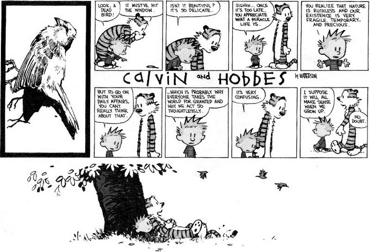
The goal for this project was to explore the use of expressive typography while maintaining the hierarchy of the image. For this photo, I analyzed the innate structure of the hanging birds and placed the type along the lines they created. The initial issue I ran into was the complexity of the image. The multiple birds in the photo paired with the different type elements resulted in a busy, yet boring exploration. I decided to crop out a portion of the photo, isolating just one bird. This allowed for more flexbility and space.
The type is a dialogue between two characters. I chose to differentiate the two voices using opposite orientations, different typefaces, and colors (bluish grey tones for Calvin and brown tones for Hobbes). After a few more explorations, the final result shows the focal point (the hanging bird) surrounded by type in a variety of treatments.


Alone by Edgar Allan Poe
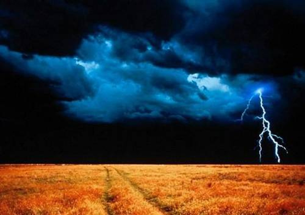
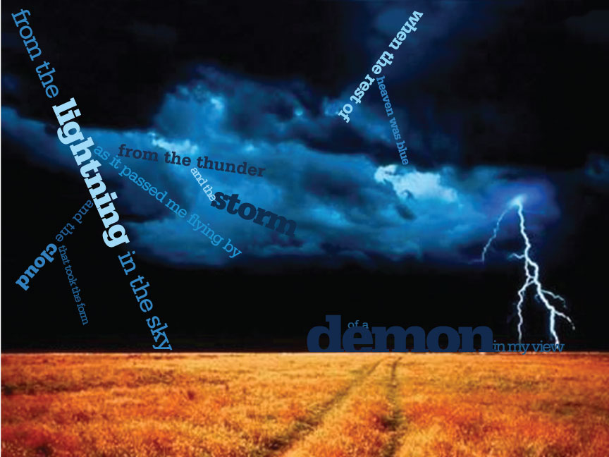
Since this photo lacked a prominent grid, I chose to mimick the shape of the lightning using the typography. I also wanted the type to lead the viewer through the image so I manipulated the lower half of the image and made the path veer to the right instead of the left. This helps lead the eye through the text, starting in the left corner and ending on the opposite side. In the initial explorations, I tried to utilize the shape of the path for the text but it was more distracting instead. For the last section of type, I tucked the words behind the lower half of the image to help it receed into the horizon. I also chose a very deep, muted color from the sky for the larger text to enhance this.