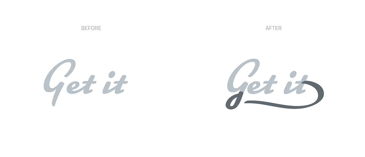
Some exercises on branding for a delivery service. The identity wants to be accessible and human, the funky colours will compete with the usual dark palettes used by competitors. The main typeface recalls a street-urban style, mitigated by the secondary typeface, cleaner and simpler to rebalance the whole look&feel. Imagery is all around the couriers moving around the city, young and stylish professionals that perfectly convey the identity general attitude.


gggggg