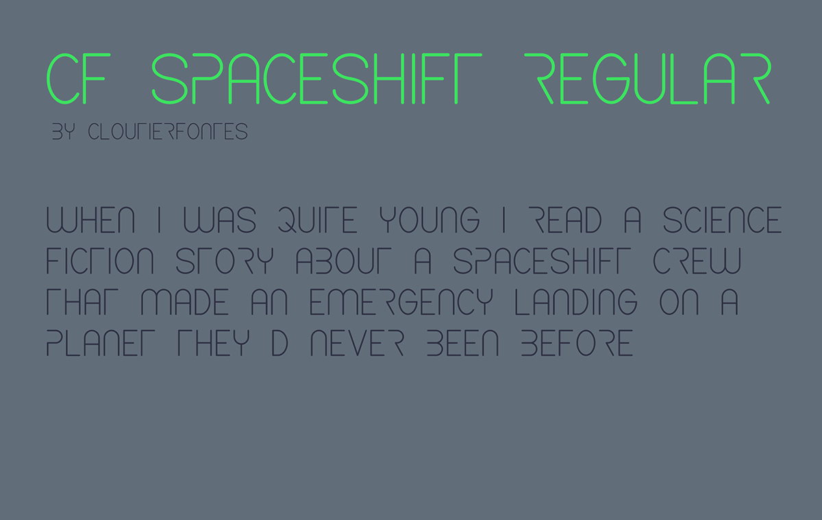
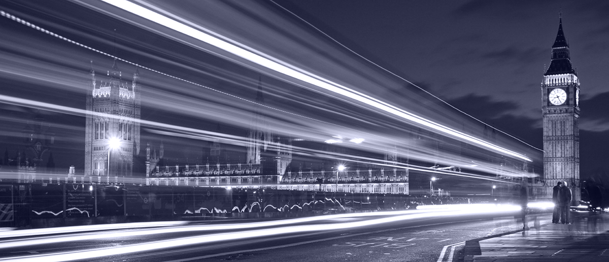
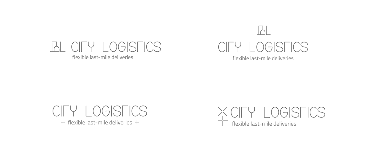
Some exercises on branding for a logistics service. The identity wants to be elegant and serious but with a hint of fun, theme supported by the use of a neon green on a dark grey. The main typeface, pretty complex, is yes peculiar but also interesting in order to give the brand a lighter and younger look&feel if compared to possible competitors. Imagery is mainly developed around city lights and modern architecture.


gggggg