
contexte / context
—
Dans le cadre d’une médiation de projet de la ZAC Route de Toulouse (Bègles + Villenave-d’Ornon en Gironde), j’ai travaillé avec l’agence deux degrés et Gabriel Bord sur l’identité de ce quartier girondin en pleine reconversion.
Ce quartier avait la particularité de comprendre une grande artère automobile commercial et industrielle surchargée de signes fait et conçus pour la voiture.
Ma mission a été de réfléchir à cette identité éphémère tout en prenant en compte le contexte de travaux et de changement de ce quartier.
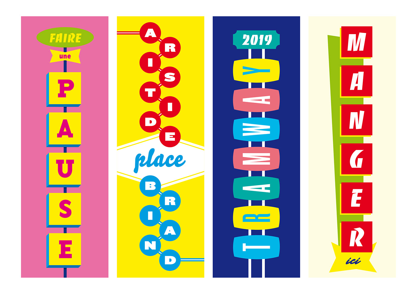
En reprenant l’idée du strip américain, des signes graphiques propres à Las Vegas et des commerces de bouche telles que les boucheries. Nous avons travaillé sur un mélange franco-américain des signes, des couleurs et des typographies. Afin d’éviter de créer une nouvelle charte déconnectée du site, nous avons opté pour une continuité graphique des signes déjà présents dans cet artère. Les signes graphiques, les typographies et les couleurs vont dans ce sens.
—
Within the scope of a project mediation regarding the urban development zone of Route de Toulouse (Bègles + Villenave-d’Ornon in Gironde, France), I worked with the agency deux degrés. The topic was the identity of this district which is in the process of conversion.
This district is peculiar in that it contains a large main road, commercial and industrial, overloaded with signs designed for cars.
My mission was to think about this ephemeral identity, taking into account the current context for this district: building work and change.
Picking up various ideas: American strip, typical signs from Las Vegas and from butcher’s shops; we worked on a French-American mix of signs, colors and typos. In order to avoid creating a new graphic standard out of touch with the site, we opted for a graphical continuity with the signs already there.


totems / totem
—
Avec l’aide des architectes de l’agence bordelaise Cancan, nous avons pu concevoir les choses en grand notamment via des totems qui rappelaient les “colonnes Morris” françaises ou encore les “colonnes Derrick” plus proche d’un monde industriel. Ces colonnes sont conçues à la fois pour les automobilistes (à l’arrêt ou en mouvement) puis pour les piétons qui trouvent information et mobilier urbain.
—
—
Avec l’aide des architectes de l’agence bordelaise Cancan, nous avons pu concevoir les choses en grand notamment via des totems qui rappelaient les “colonnes Morris” françaises ou encore les “colonnes Derrick” plus proche d’un monde industriel. Ces colonnes sont conçues à la fois pour les automobilistes (à l’arrêt ou en mouvement) puis pour les piétons qui trouvent information et mobilier urbain.
—
With the help of architects from the agency Cancan, we have been able to conceive things in a big way: Totems reminiscent of French “Morris columns” or even the “Derrick columns”, closer from the industrial world. These columns are designed both for car drivers (idled or moving) and pedestrians who find information and street furniture.


typographies / typefaces
—
Dans la continuité de notre réflexion sur les signes graphiques franco-américains et de l’existant foisonnant, une multitude de typographies ont été utilisées. Le « Banco » (du grand Roger Excoffon) était là pour représenter notamment les boucheries françaises ; le « Trade Gothic » pour sa représentation classique américaine ; l’utilisation d’une manuscrite plus spontanée et chaleureuse par le « Bello » pour représenter les parcs de la ville ; le « Knockout » pour impressionner avec toutes ses tailles ; un certain imaginaire américain via le « Base » de la grande fonderie Emigre ; « Mr Stalwart » pour le côté sign painting des vieilles devantures peintes.
—
In the continuity of our thoughts about French-American graphic signs and the teeming reality, a multitude of typos have been used. The “Banco” (from great Roger Excoffon) was here to represent notably the French traditional butcher’s shops; the “Trade Gothic” for its classical American representativeness; the use or a handwritten with the “Bello”, more spontaneous and warm to represent the city parks; the “Knockout” to impress with all its’ various sizes; a kind of American collective image via the “Base” of the great Emigre foundry; “Mr Stalwart” for the sign painting aspect of old painted shop fronts.

signalétique / signage
—
Durant la durée des travaux (qui s’étalent sur plusieurs années) nous avons aussi réfléchi à la conception d’une signalétique simple et rapide des principaux lieux du quartier. Afin de ne pas surcharger la rue déjà saturée de signes commerciaux, et typographiques nous avons opté pour une signalétique qui évoque plutôt les usages.
—
For the duration of the building work (several years) we have also thought about the conception of a quick and simple signage of the main district places. In order to avoid overloading the street already saturated with commercial signs and several typos, we have opted for a signage that evokes the practices.


typefaces / typographies :
“Antique Olive”, “Banco”, “Trade Gothic”, “Bello”, “Base”, “Knockout” and “Mr Stalwart” font
https://fontsinuse.com/uses/24012/bienvenue-sur-la-route-de-toulouse
merci Slip : )
“Antique Olive”, “Banco”, “Trade Gothic”, “Bello”, “Base”, “Knockout” and “Mr Stalwart” font
https://fontsinuse.com/uses/24012/bienvenue-sur-la-route-de-toulouse
merci Slip : )


