Client | Geli 民雄金桔
Year | 2013-2014
Art Director | Kuan
Design | 賴怡伶(主設計),汪平,白偉奇
Photography | 邱筱元
Year | 2013-2014
Art Director | Kuan
Design | 賴怡伶(主設計),汪平,白偉奇
Photography | 邱筱元
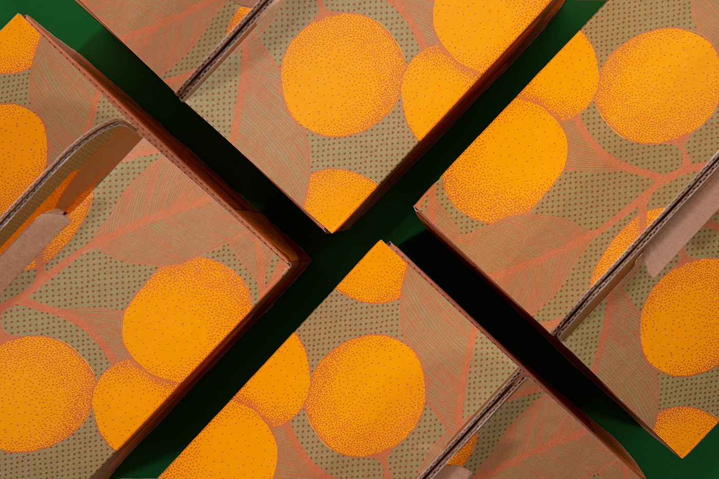
民雄金桔從阿公創立於民國四十九年,至今已傳到第四代,仍致力於推廣純金桔產品,創造民雄的地方特產。以古樸的牛皮紙搭配手感插畫,直觀對應金桔農產加工品的商品特點。因應國際化的需求,logo融合歐式氛圍與臺灣古早字體,可復古可創新 ; 在古樸細膩與濃郁色彩裡,呈現傳統滋味與金桔的酸甘甜。
Since being founded in 1960 by the family's grandfather, Geli is now in the hands of the third generation in the family, and is still dedicated to the promotion of kumquat products and creation of local specialty products in Minxiong.
The use of simple kraft paper with hand drawn illustration directly corresponds to the product characteristics of traditional kumquat agricultural processed products. In response to the needs of internationalization, the logo blends European ambiance with archaic Taiwanese font to offer a fusion of retroness and novelty; in the simple, delicate and rich colors, it presents the traditional taste and the sour and sweet taste of kumquats.