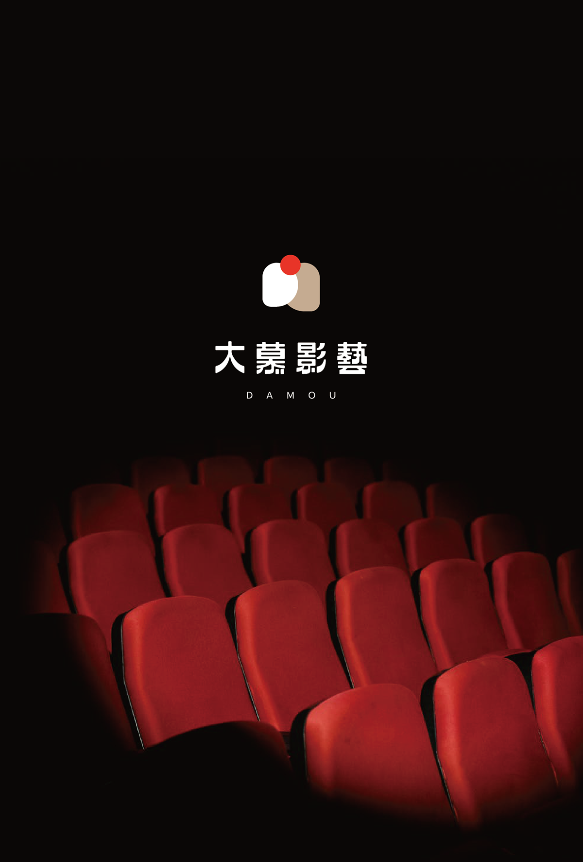
Client | 大慕影藝
Year | 2021
Art Director | 余岱官 Kuan
Design | 余岱官 Kuan(CIS)、汪平(標準字、延伸製作物)
Photography | 汪平
-
大慕希望說出好故事,做出能觸動人心的戲劇。
成立於2013年,歷年投資製作作品有《紅衣小女孩系列》、《麻醉風暴2》等作品,直到《我們與惡的距離》、
《做工的人》,大慕開始說自己的故事 。
《做工的人》,大慕開始說自己的故事 。
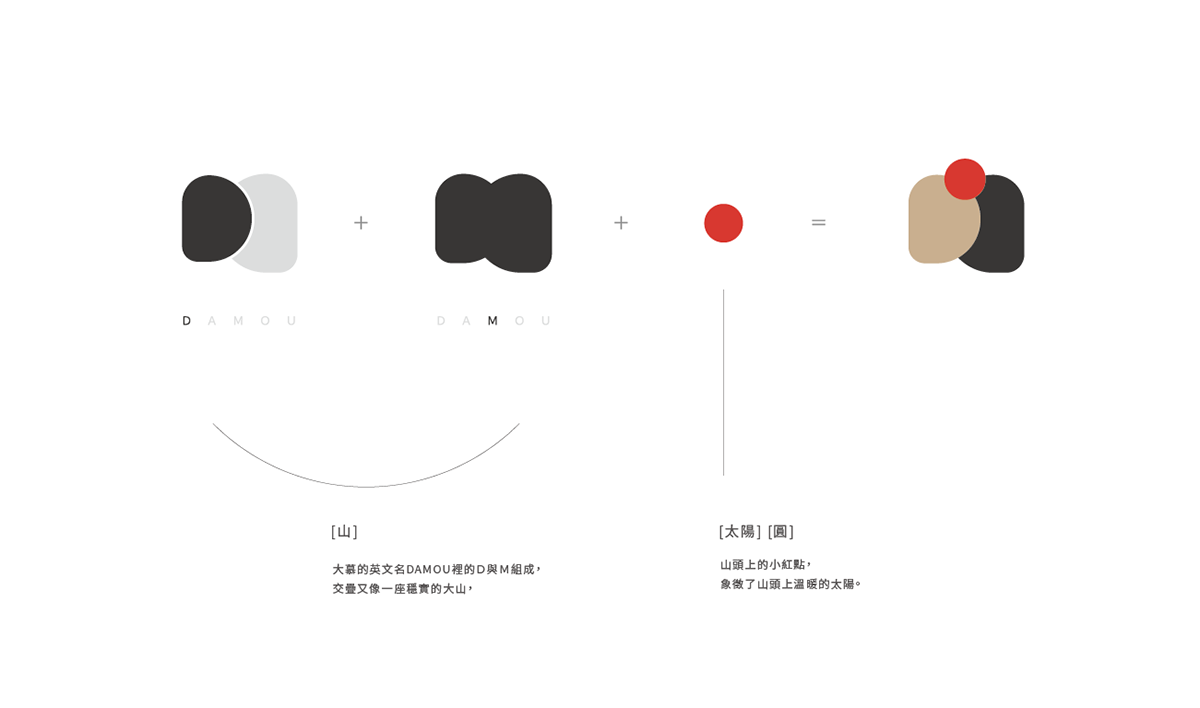
logo用DAMOU的D與M組成,交疊又像一座穩實的大山,山頭上的小紅點,象徵了山頭上溫暖的太陽,如大慕的作品帶著觀眾體會不同人的立場,
去思考並理解,讓社會找回一些溫度與同理,就像是那小點的太陽,照亮了你我的心。
去思考並理解,讓社會找回一些溫度與同理,就像是那小點的太陽,照亮了你我的心。
-
Damou aspires to tell good stories, to produce shows that can tug on people’s heartstrings. Established in 2013, past works have included The
Tag-along, Wake-up 2, and so on. It was not until The World Between US and Workers that Damou began telling their own stories.
Tag-along, Wake-up 2, and so on. It was not until The World Between US and Workers that Damou began telling their own stories.
The logo incorporated the D and M, layered on top of each other to look like a solid mountain. The little red spot on the tip of the mountain signifies the sunlight shedding on top of the mountain. Much in the way that Damou aims to assist the audience to put themselves in others’ shoes, to think critically, and to understand. The goal is to restore the warmth and empathy in society just like the Sun on top of the mountain lighting up our hearts.