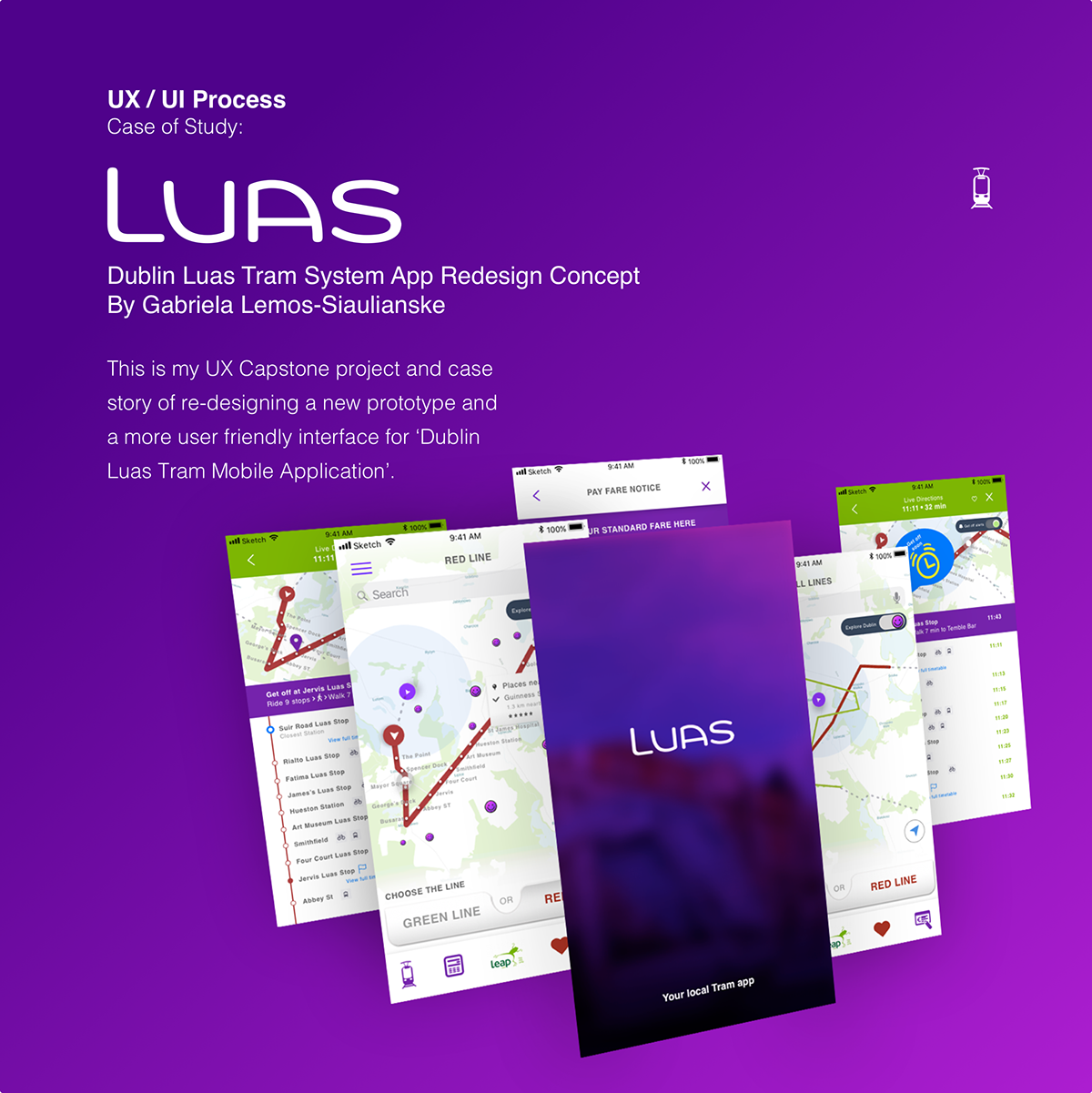
The Project Overview
Dublin Luas Tram system combines the best features of street cars with rail. The Tram makes direct connections between the city centre and surrounding regions, providing journeys faster, shorter and more accessible.
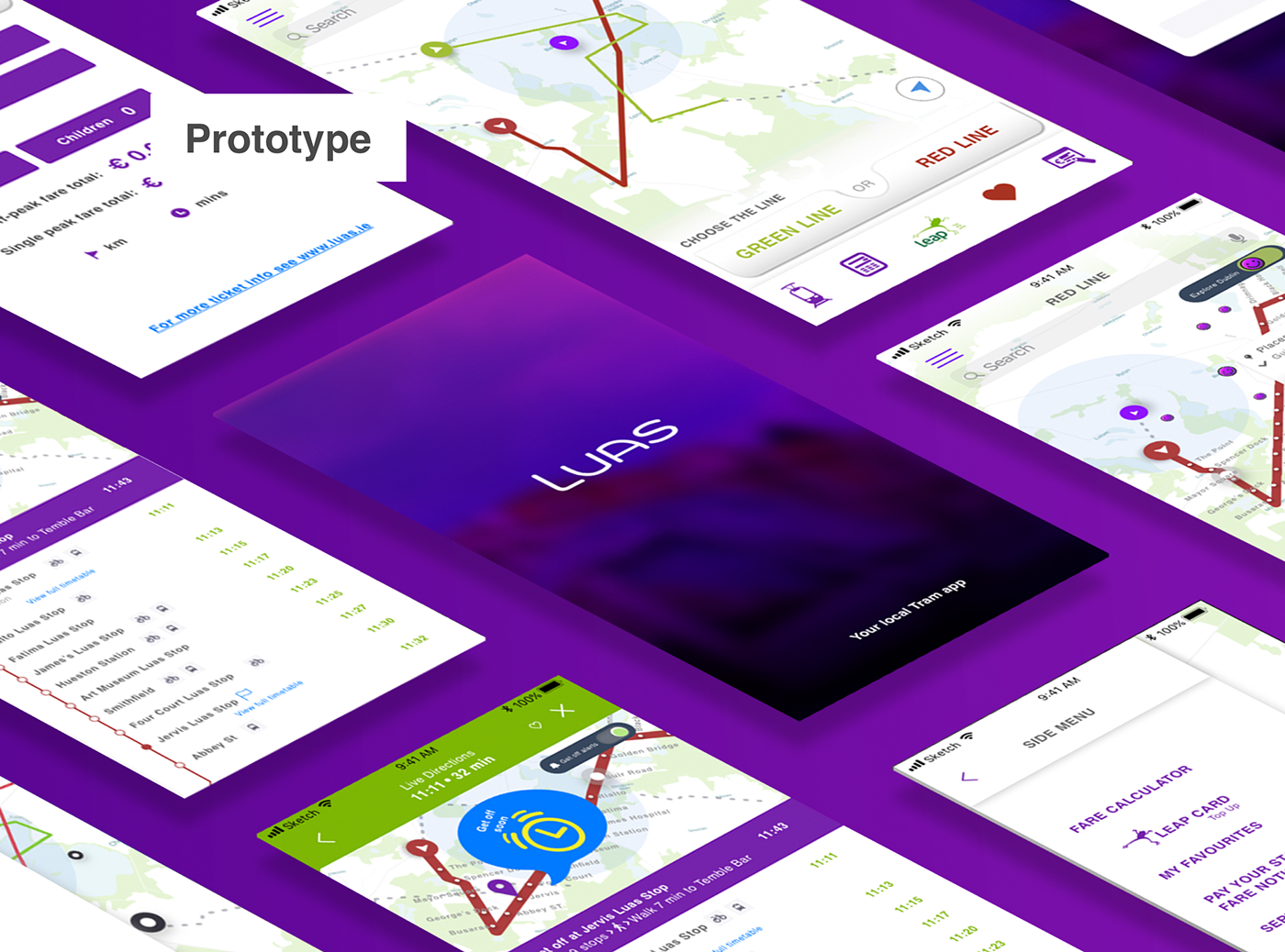
The proposal of my capstone project was to create a better interaction solution and re-design a new interface for the current Luas application through the UX design process. This project was developed from September 2017 - February 2018, where it was presented at Springboard Centre.
My Goals
1. Create a better, a more user friendly interface through the UX Design process.
2. Re-design the existing mobile app in other to enhance the application beyond the public transportation competitors.
3. Make the Luas passengers use the application more often.
My Role
As a sole designer of this project, I led the
UX Design process and the UX Research
with the support of my capstone mentor.
Main Tasks:
- User Centred Design.
- User Research Plan.
Survey in-person interviews and Demographic
infographic findings.
- UX Strategy.
Personas, Usability Heuristics Analysis.
Empathy Mapping, Personas and Scenarios Analysis.
- Lean UX.
User stories.
Content Strategy.
- Content Strategy.
- Sketching, Wireframing & Prototyping projects.
- Usability testing.
- Visual Design.


Summary of findings
Most respondents are employed people and students who use the LUAS tram every day or few times a week. Of the total survey participants, 17.86% of respondents have downloaded the LUAS app and 14.27% of them use it daily. Following 7.14% of them prefer the DublinBus app, 7.14% use the IrishRail app, and 67.86% never used any application for this purpose.
While 17.86% of respondents think that LUAS app is very useful for them, 35.71% said that they are somewhat satisfied with the look and feel of the software. The respondents suggested that the software could be integrated to other software as the Leap Card app (Leap Card is one of the ways to pay for public transports in Dublin area, it offers a benefit of 20% cheaper fare for the users). They also suggested that the LUAS app could help them to find out which fare is the best considering cost benefit, and also get notification of the service status would help them to resort to a different transport , for exemple, in case of breakdown, traffic jam and etcetera.
Interview Feedback
Public transportation is one of the largest segments of the world. Therefore, the search for applications that facilitate the journey of these users is necessary and is currently highly sought by users. The interviewees expressed a desire for a tool that could keep them up to date with real-time traffic data and other features that integrate the smart payment platform and travel planners, such as allowing passengers to plan their travels using local buses and trains .
All respondents said that a mobile public transit application that allows passengers to travel on the same ticket or subscription (a pay-as-you-go system), whether they travel by bus, tram or rail can be more integrated.
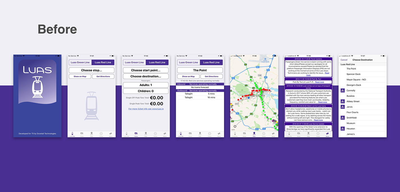
Respondents were frustrated when using the current Luas feature 'Live Info', most of them could not find any button or icon to refresh the page. Some, came up with the idea of receiving notifications about delays, peak times, and a feature that could help them to pay the fare notice by the application would be truly convenient for them.
Usability Heuristics Analysis
Map & Personas
According to Smashing Magazine, user-centered analysis helps get more profitable products to market at a quicker pace.
Knowing what our users really want:
For this project I took a look into the mind of Luas users by deconstructing UX personas, user stories, job stories and user experience maps.
After heuristic analysis, survey, interviews and all the observations and analysis of many Luas passengers I created four Personas who represent more the type of users and which would help me to focus into product decisions by adding a layer of real-world.


Each user story basically ends up with the user capturing the value of the product, so I prioritised the users' goals according to the value and difficulty of running it. Based on these features, I made the most of users needs, detailing what features my mobile application should develop.
Card Sorting & Site Map
When performing user research, I attempted to corroborate results using the Hybrid card classification methodology which allows them to predetermine some categories, but also o create and name their own.
Results
The Hybrid study had 36 cards to sort. I recruited 4 users who most represent the personas I've identified previously researching. Each participant completed the assignment in about 30 minutes.
It was evident in how participants sorted that hybrid sort cards after standardising the list of classifications generated, that there were different kinds of organisational models used by the responders to complete the sort.
I saw that the majority of participants chose to use the categories I already provided for them. All the participants found difficulties in identifying the lines and stops of the Tram, especially the persona who represented the tourist.
Most of them suggested me to insert a dynamic map that would allow them to find the location on the map and facilitate the decision by which tram line to choose.
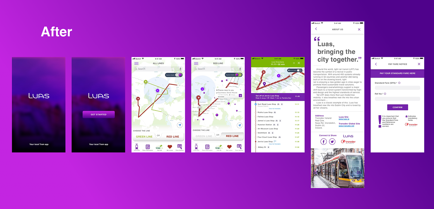
The participants questioned me about a way to pay the ticket directly through the app. Which made me consider the idea of adding online payment methods and a special feature for Leap Card. This feature would have a payment QR Code and Bar Code generator.
Some of the categories were very easily grouped, such as the Leap Card Top Up, Contact Luas and the one I've named ''Plus'' was suggested to be name Extra. The categories already being used on the Luas Tram mobile application didn’t seem to resonate well with the participants, especially with the persona Tourist who could not identify the differences in between the two mainTram Routes.

Site Map


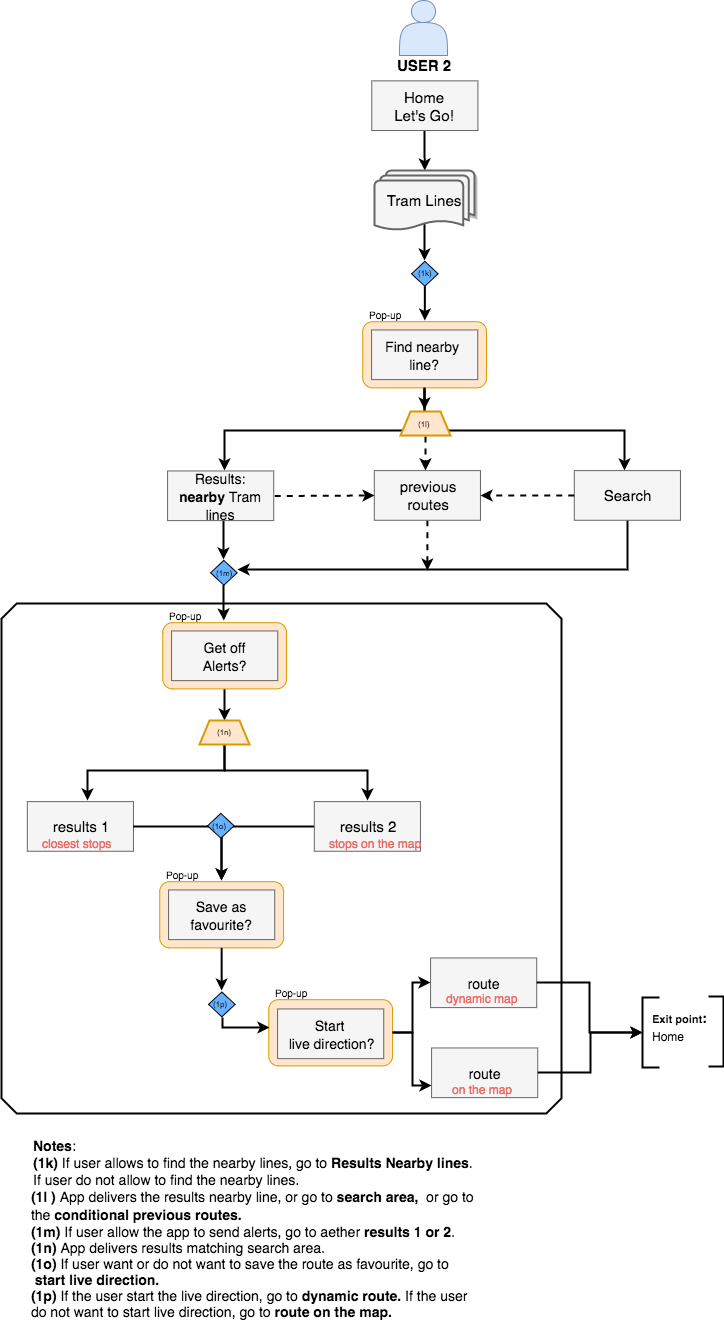
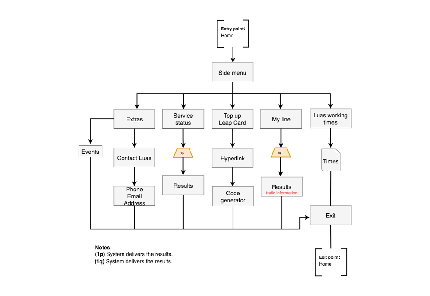
User Flow
User Flow based on two types of users.

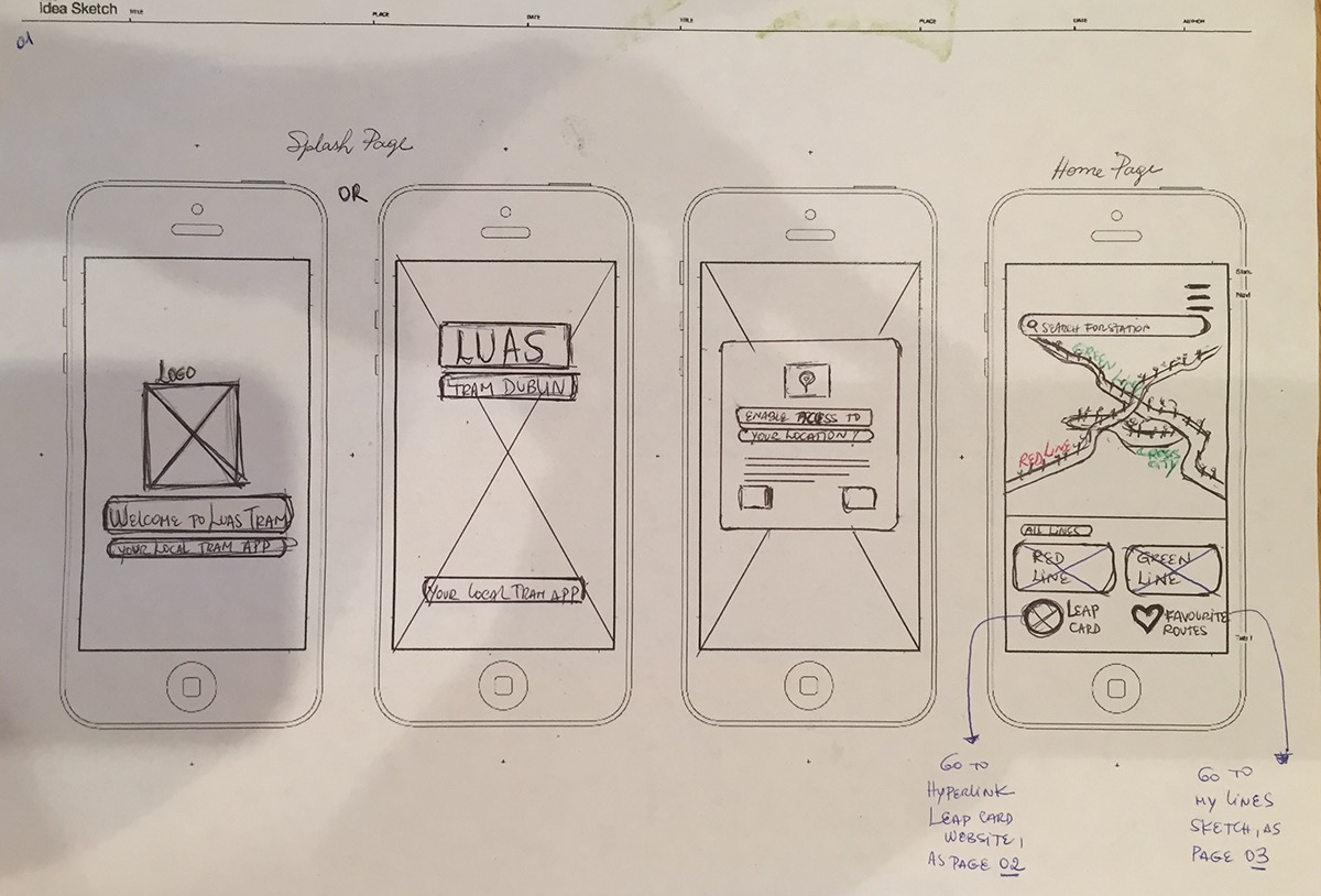
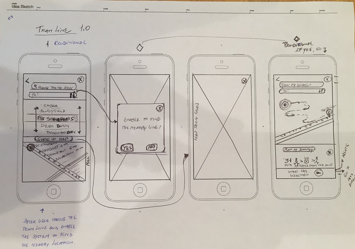
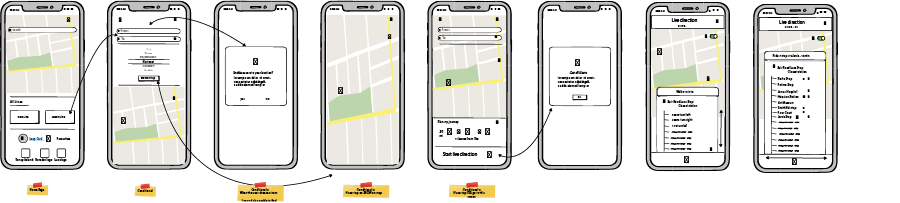
Sketches & Wireframes
Following my research, I developed ideas for action features and added better user interactivity to some gaps in the current Luas mobile app. Thus, I produced sketches that incorporated new features into the interface.
Sketching

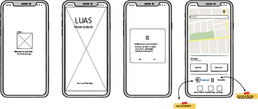
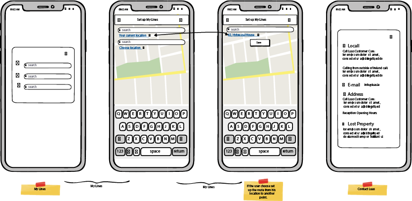
Wireframes
The following wireframes give a more detailed version of how the action features and interaction I brainstormed can be incorporated into the new user interface of the mobile app.
Style Guides
The colour palette of the Luas app was created based in the brand colour. Purple being the main. Taking into consideration that the two tram lines are named green and red lines, I must had to add these two colours to my palette.
The new palette I created from the three standards purple, red and green. I added white and grey to a give it and better balance not becoming too bright.
Colour palette

Typography
I chose to use the most likely (or unlikely) font nowadays: Helvetica.

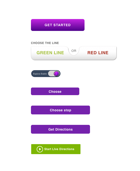
Call to Action Buttons