

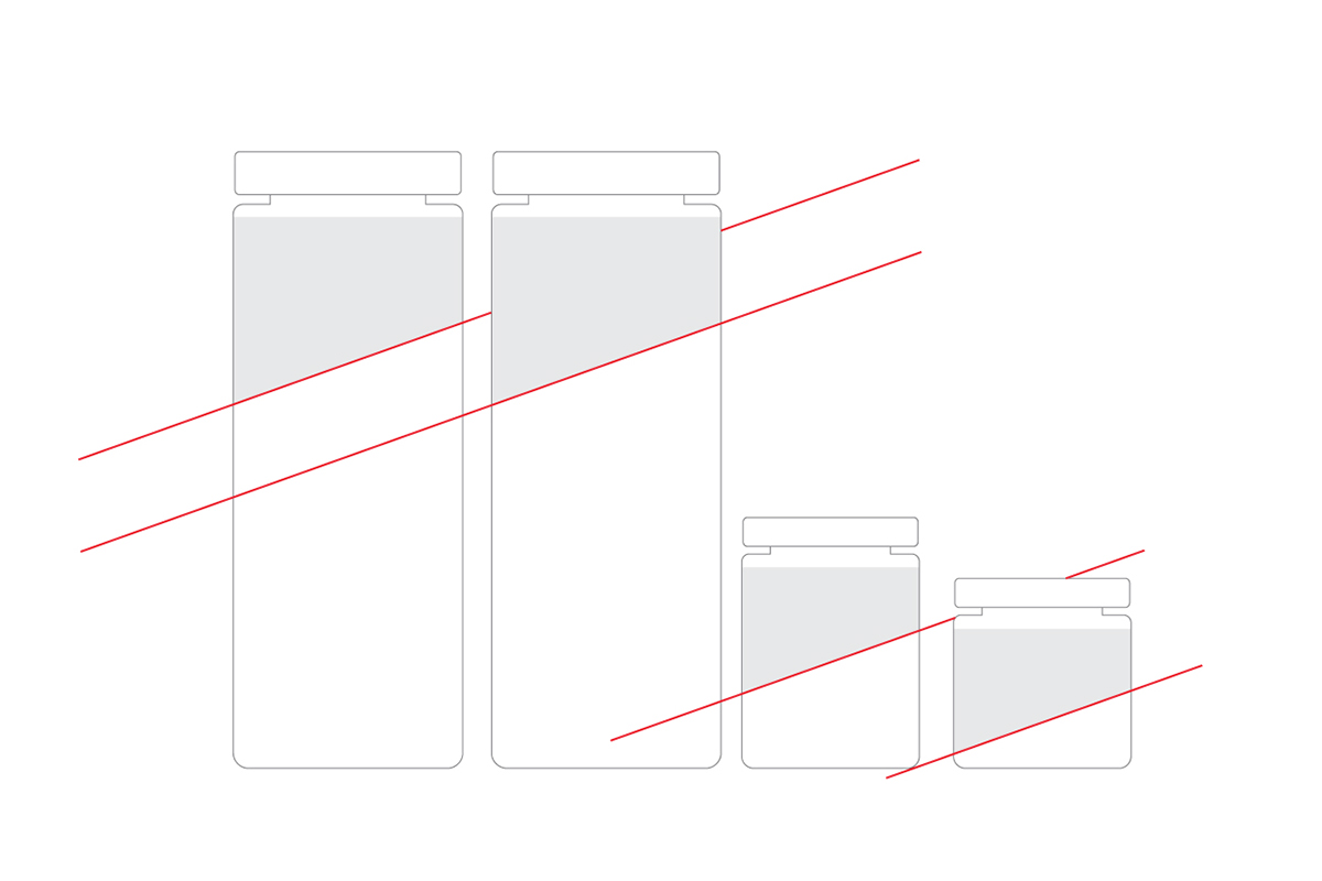
monache rosse is the rediscovery of an ancient taste promoted by Villa Raiano, to re-give substance to the forgotten flavours. And they do it thank to the passion of the chef-architect Raffaele Vitale, who loves essential tastes, which brought the name of our roots, that exalted the identity of a land through a dish. For the packaging we designed labels with an oblique side. For the logo we designed an elegant and essential lettering, even if it appears like a "serif font", only used in black or white. They suggest the shape of the "maccaturo", the cap worn by the ladies that used to cultivate and collect the tomatoes here in Italy.


Grazie! Visit our site: www.njucomunicazione.com


