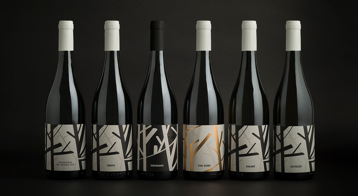
Wine of the forsests
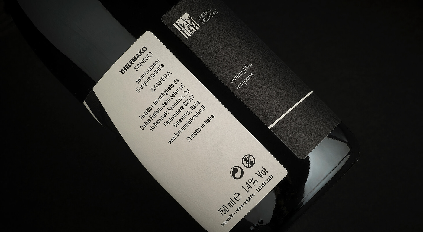
The project of Fontana delle Selve started as a restyling but immediately became a re-branding. In this project, the sylvan elements such as branches and stems in every inclination, synthesized, become the lines that cross each other, forming strong textures that rip the background and open to imaginary visions.

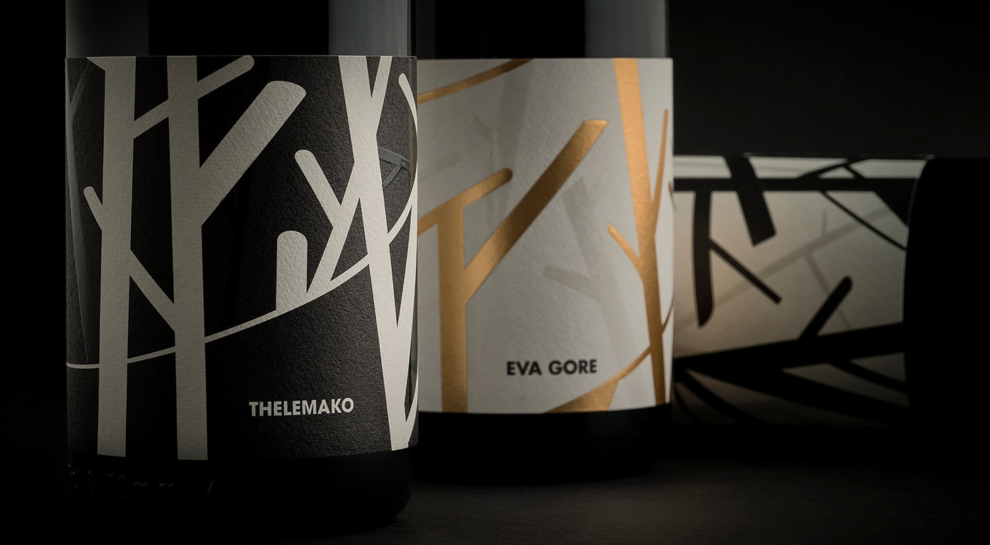
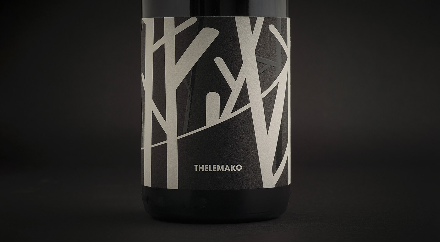
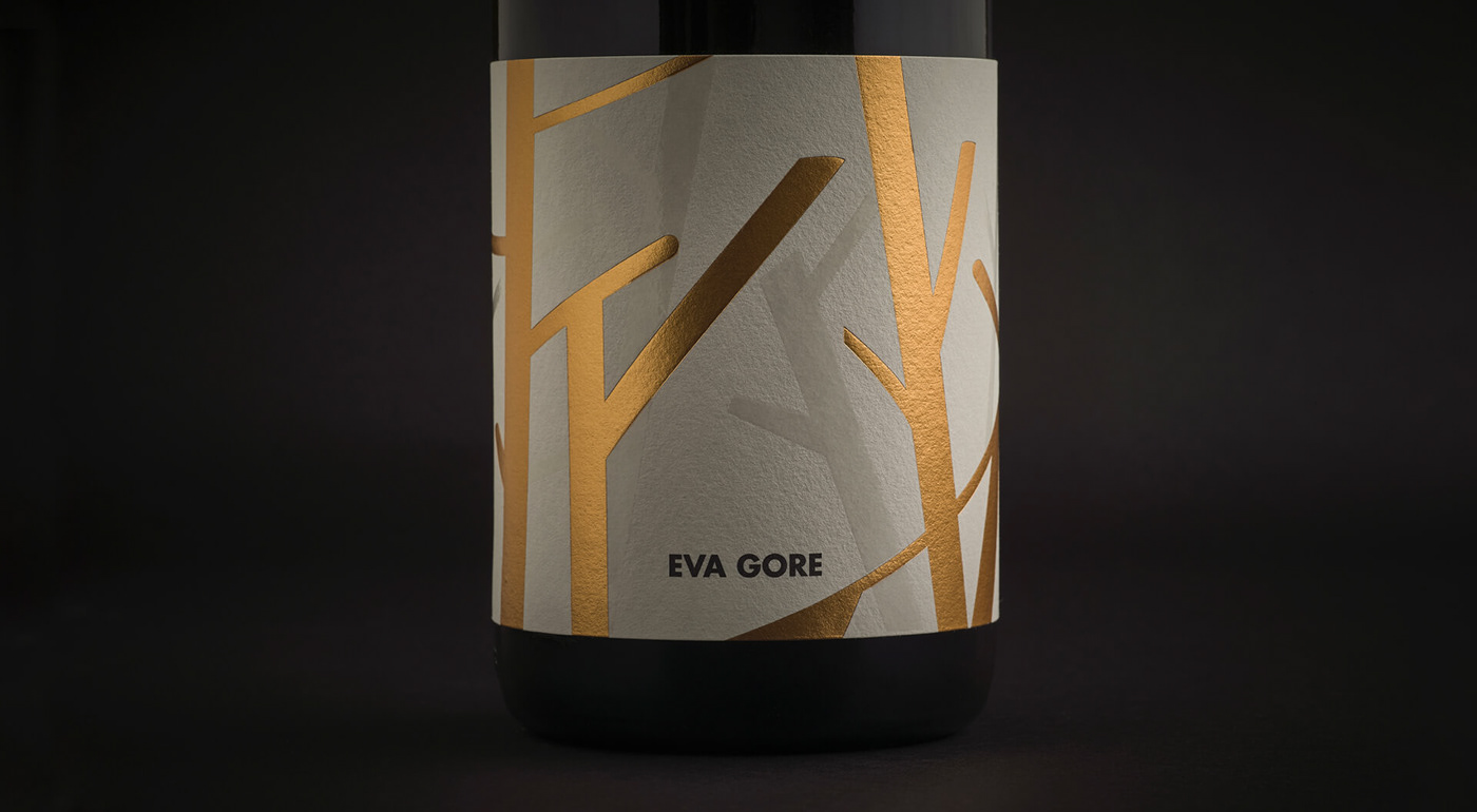
The contrasts are also accentuated by the use of black and white and gold: for the white wines in fact, the background of the labels is white and the branches are black, for the red wines it is the opposite, for the reserves, black it’s replaced by gold in foil.
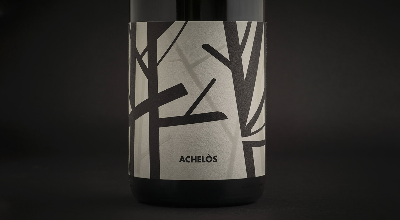
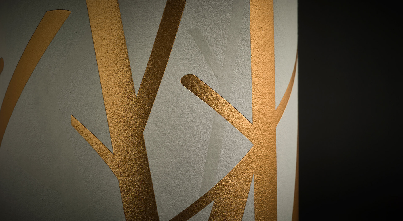


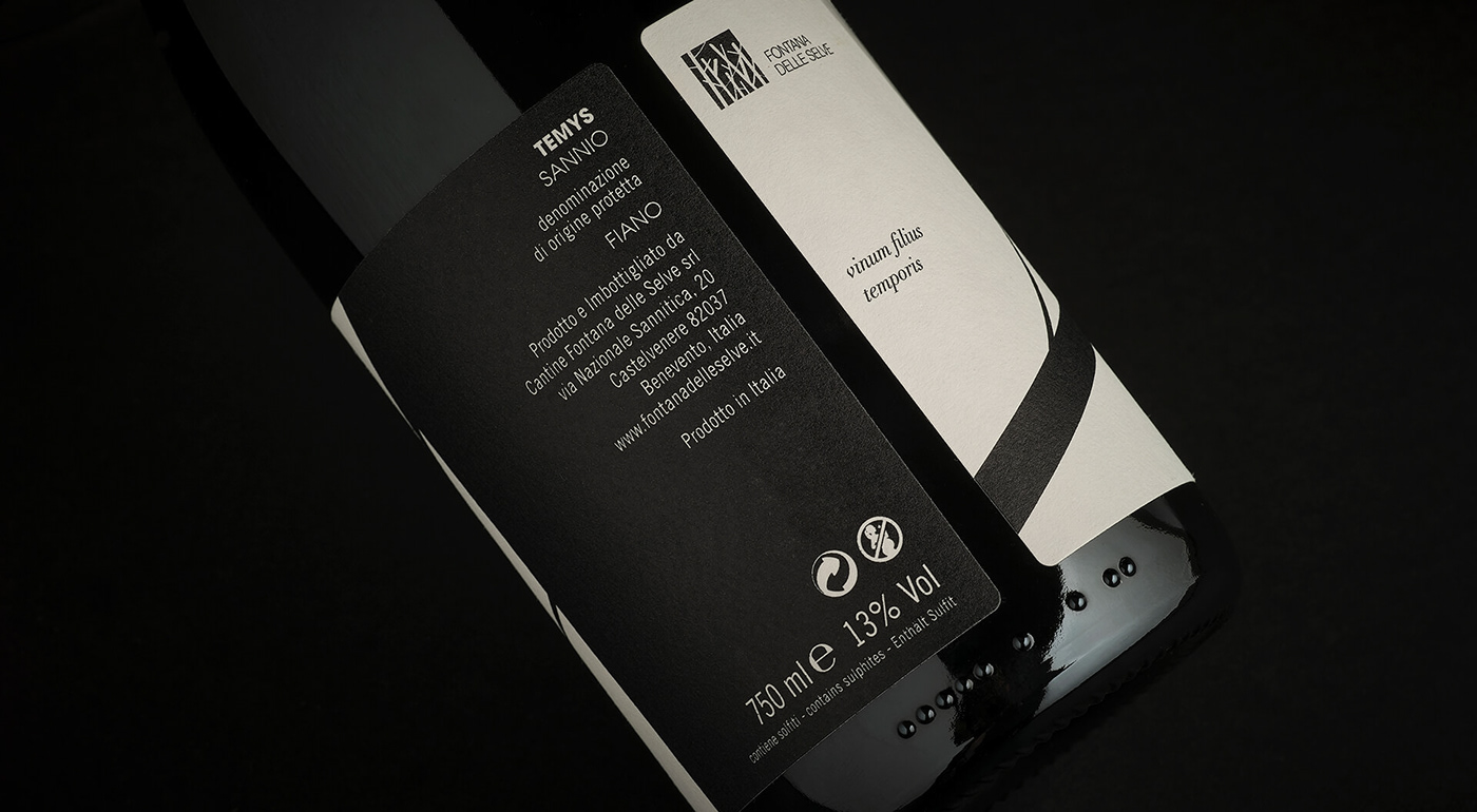
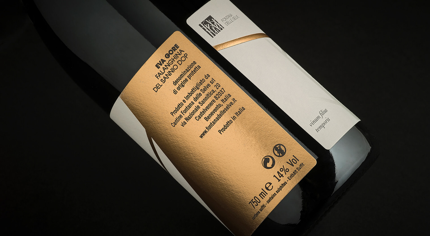
Each label, realized on Arconvert Cotone Bianco paper, bands the bottle and it’s printed in offset and glossy UV, except for the reserves, printed in gold foil and glossy UV.
See more works on


