Hara Chulha is a sustainable food brand in India. Literally, the word 'hara' is Hindi for the color green and 'chulha' translates to stove. In rural India, food is often cooked on a stone stove (or chulha) powered by biogas or gobar , and though it is eco-friendly, this mode of cooking produces a lot of soot and smoke. Hence, the idea of a green chulha is a paradox in itself.
For the brand, I have chosen to recreate the earthen pot, or 'matka' which is placed on top of the chulha to slow cook food. The texture of the pot is grainy and rough to reflect the feel of the pot as well as the soot.
In the logo, the matka is protecting the green leaf, which signifies the protection of the environment, even while cooking.

Initial explorations of form were done on paper, using ink and various brush techniques. The forms were then carried on to Illustrator and simplified & enhanced.

Sample text was added onto the form to complete the roundness and integrate the lettering into the form itself.
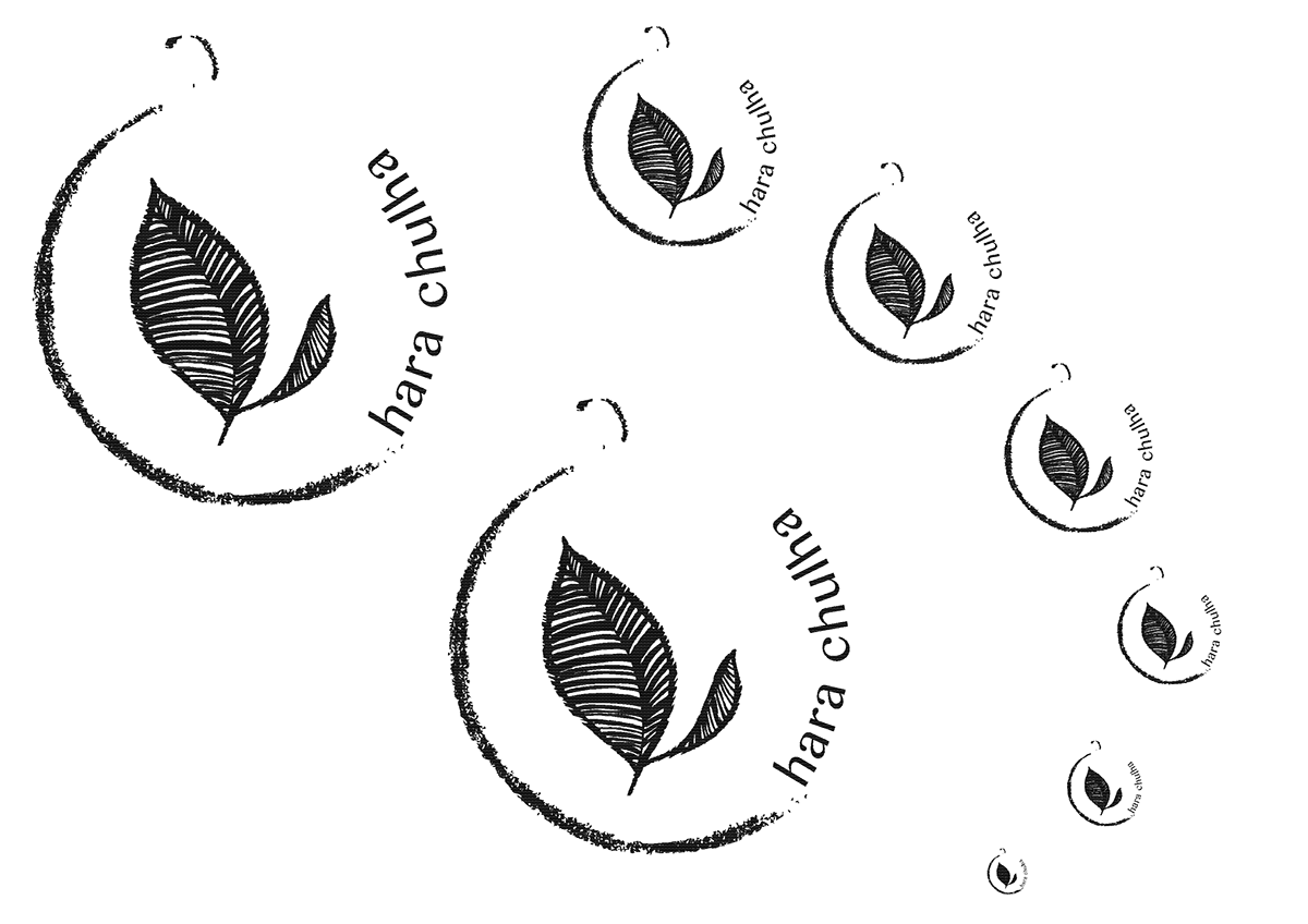
Once the form was finalized, I needed to see how it would work in smaller ratios and if the form was still distinguishable.

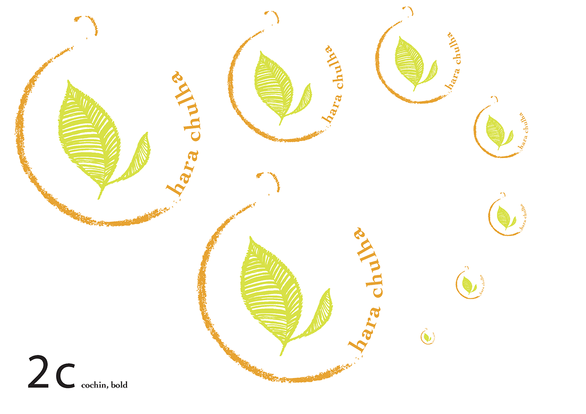
After checking that the form would be effective, color explorations were made

After finalizing the form and color, I decided to play with the typography and see how different fonts can change the feel of my logo.
Here I used Bangla MN.
Here I used Bangla MN.


Finally out of 6 options, I finalized on Centaur for its slight serifs. I changed the shade of the font slightly to distinguish it from the pot and make it stand out more.

The font was then applied to stationary- letterheads, envelopes and visiting cards. I also placed it onto tshirts and paper bags.


