Awareness Campaign
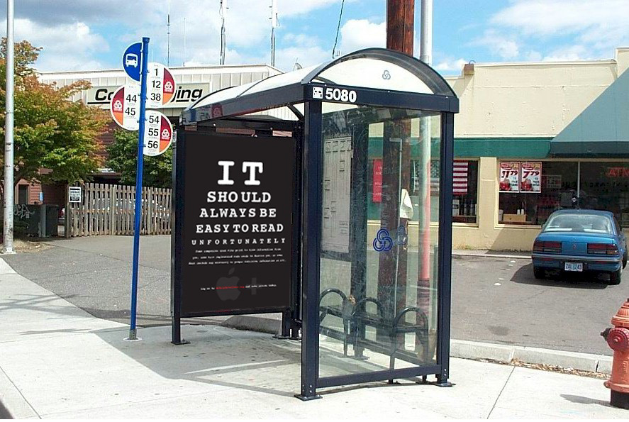
This project called for raising awareness to a design flaw. I chose readability on everyday food labels. My slogan was that things should always be easy to read. You should never have to fumble around a label to see what you are purchasing and eventually consuming into your body. This campaign kept a sleek black with white font to reinforce the message of easy readability. The medias used were (in order): magazine ad, poster, web landing page, and a bus bench ad in front of a grocery store.
- The magazine used a label format to place information where it should be viewed and pokes fun at the inability to read some labels at the market.
- The poster is stylized in the way of an eye chart to further enhance the concept.
- The landing page forces the viewer to use the key strokes apple+ in order to zoom in and read the fine print. This ties back to the concept of this campaign.
- Finally, the bus bench ad is placed strategically in front of a grocery store to really drive the point of this campaign home.