


C A U D A L

Caudal is a young and creative company based in Mexico City. Focused on events, community and cultural activations, the eleven-member group wanted a bold, eye–catching and unique design that was as playful as dependable. They have to work both with serious businessmen as with laid-off artists.


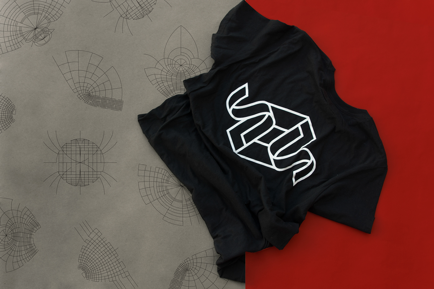

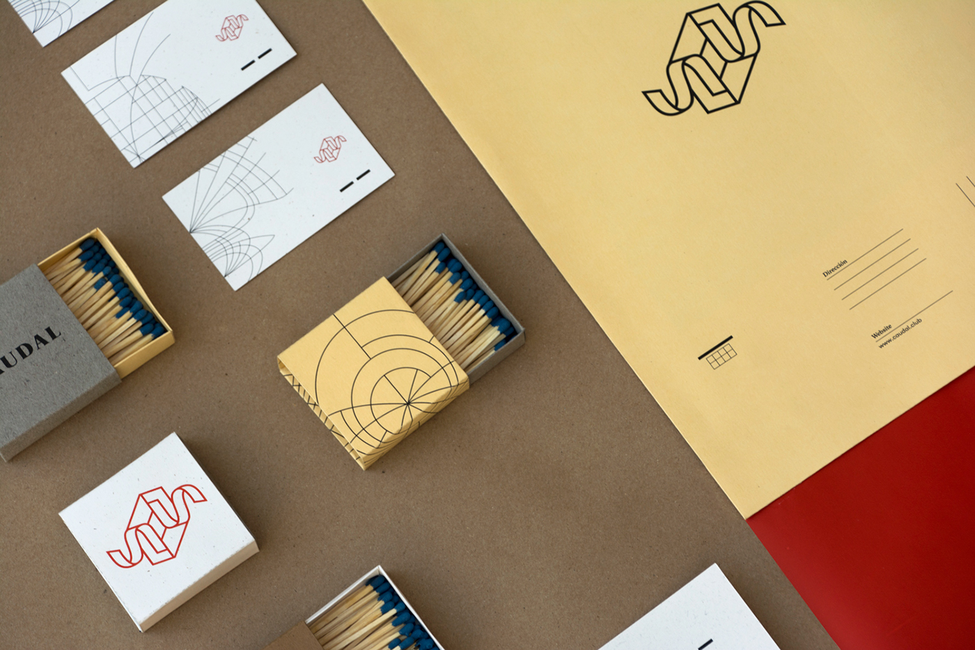
The logotype was inspired by the idea of the company being experience architects. Not experiences themselves but the trail that connects the people with the time and place. Caudal is a morphing force that brings together, a game-changing group with revolutionary spirit devoted to the Mexican entertainment community.
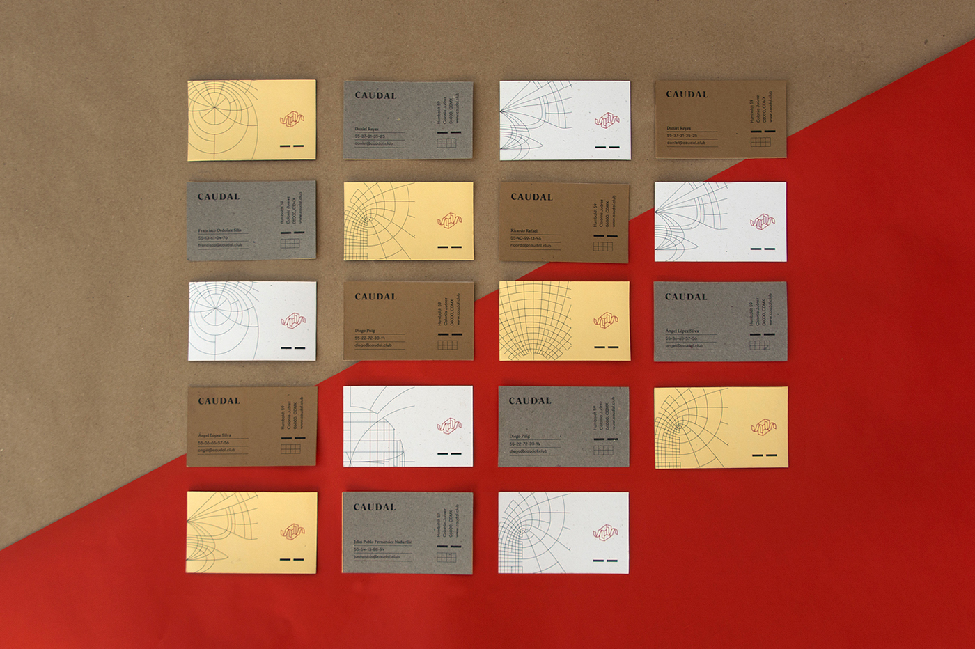
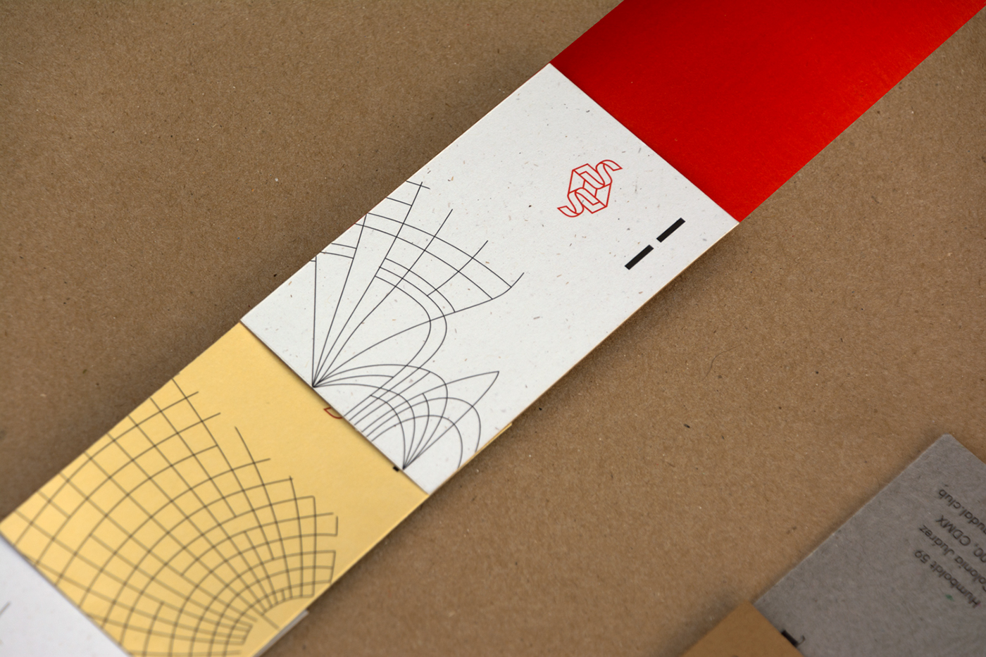
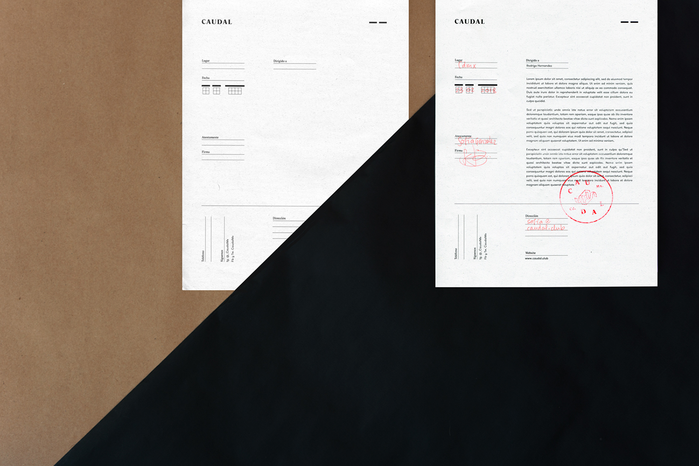
The whole branding is focused on flexibility and adaptability, including various types of papers and dozens of possible combinations that work together with 5 custom made illustrations. These were inspired by diagrams of forces in the magnetic fields, following the premise Caudal has an alluring power in their happenings no matter your age, religion or skin color.
Branding, art direction & photography: Mariela Mezquita
Thanks for watching!


