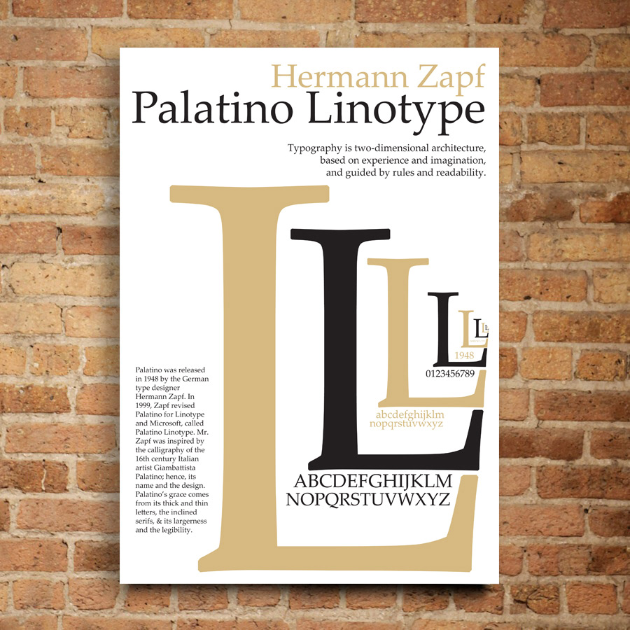
"Typography is two-dimensional architecture, based on experience and imagination, and guided by rules and readability. And this is the purpose of typography: The arrangement of design elements within a given structure should allow the reader to easily focus on the message, without slowing down the speed of his reading." – Hermann Zapf
Palatino Linotype is one of the beautiful typefaces I have seen so far, one of the characteristic to attract attention. Palatino was released in 1948 by the German type designer Hermann Zapf. In 1999, Zapf revised Palatino for Linotype and Microsoft, called Palatino Linotype. Mr. Zapf was inspired by the calligraphy of the 16th century Italian artist Giambasttista Palatino; hence, its name and the design. Palatino's grace comes from its thick and thin letters, the inclined serifs, & its largeness and the legibility.
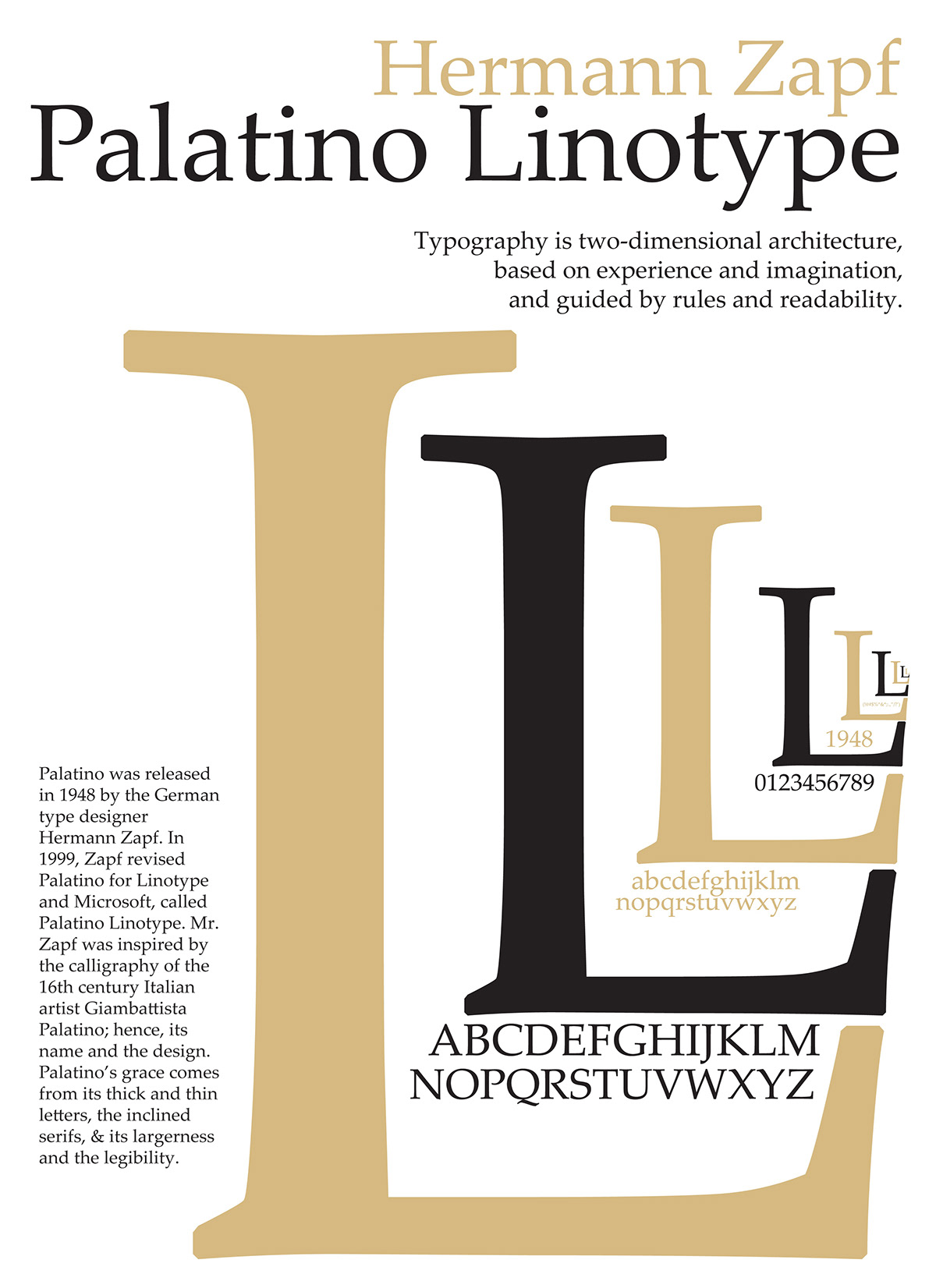
For the alphabets of ‘L’, I wanna to go make the whole image looks more interesting. Therefore, pale orange colour is required to let the design to be noticeably different from the last. In actual printing the colour of the final outcome of pale orange colour will be looks like almost gold colour. The gold colour gives the feeling of classic and elegant. This gave me a really good excuse to go a little overboard on the final part. I think the gold colour (or pale orange colour) gives the final ‘L’ perspective view a great focal point.
Poster features the elegant and classic typeface - Palatino Linotype.
The beauty of the design is its simplicity.
The beauty of the design is its simplicity.
