Task
We were approached by TypeType Foundry, which specializes in fonts production and is one of the market leaders, with a task to develop their new brand identity.
Solution
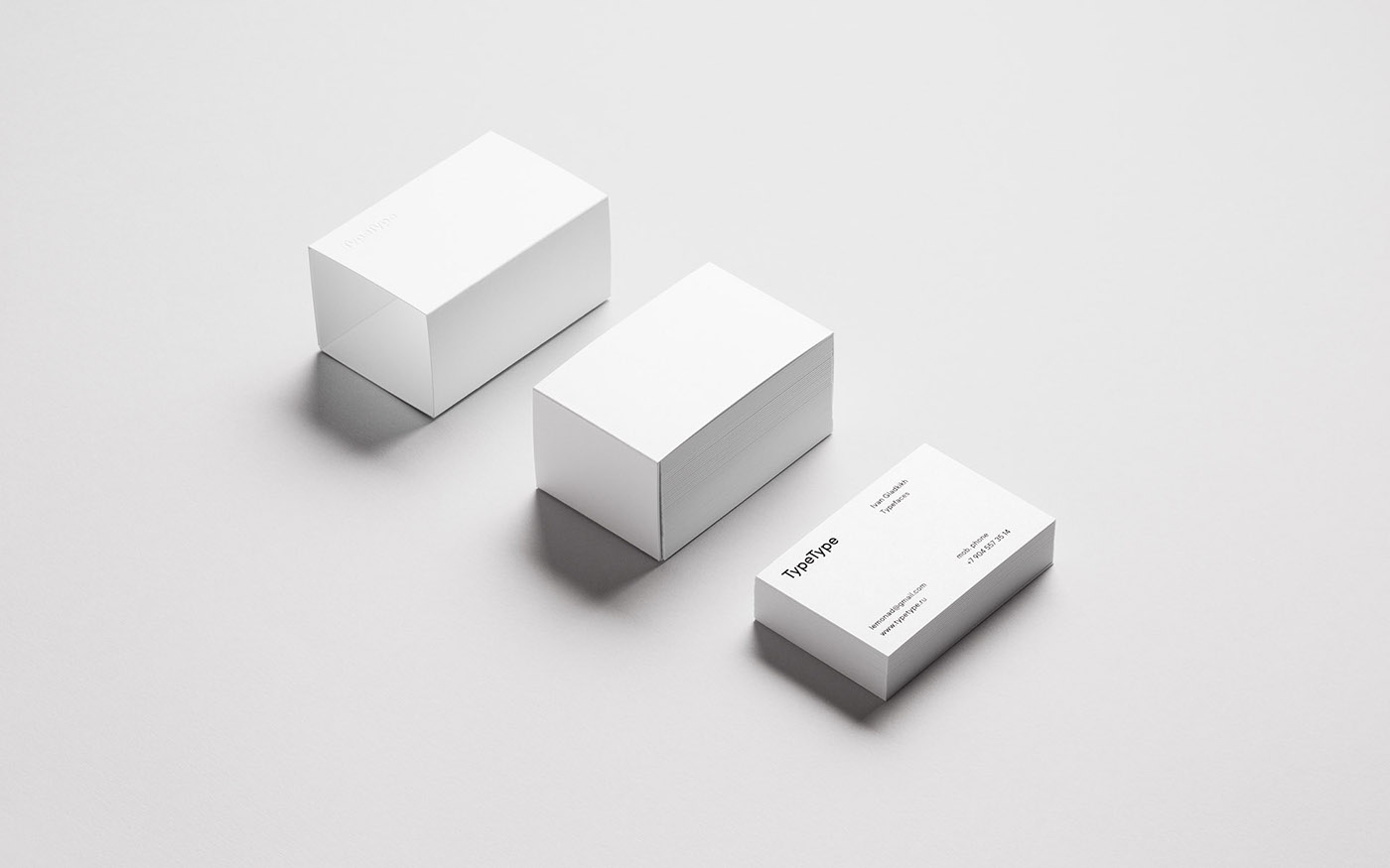
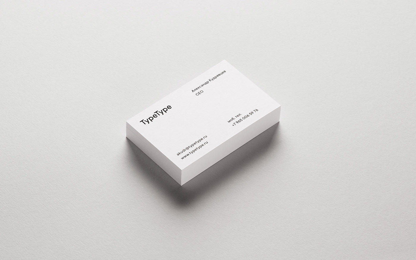
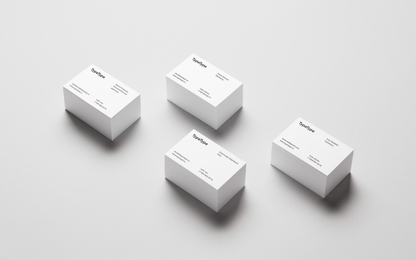
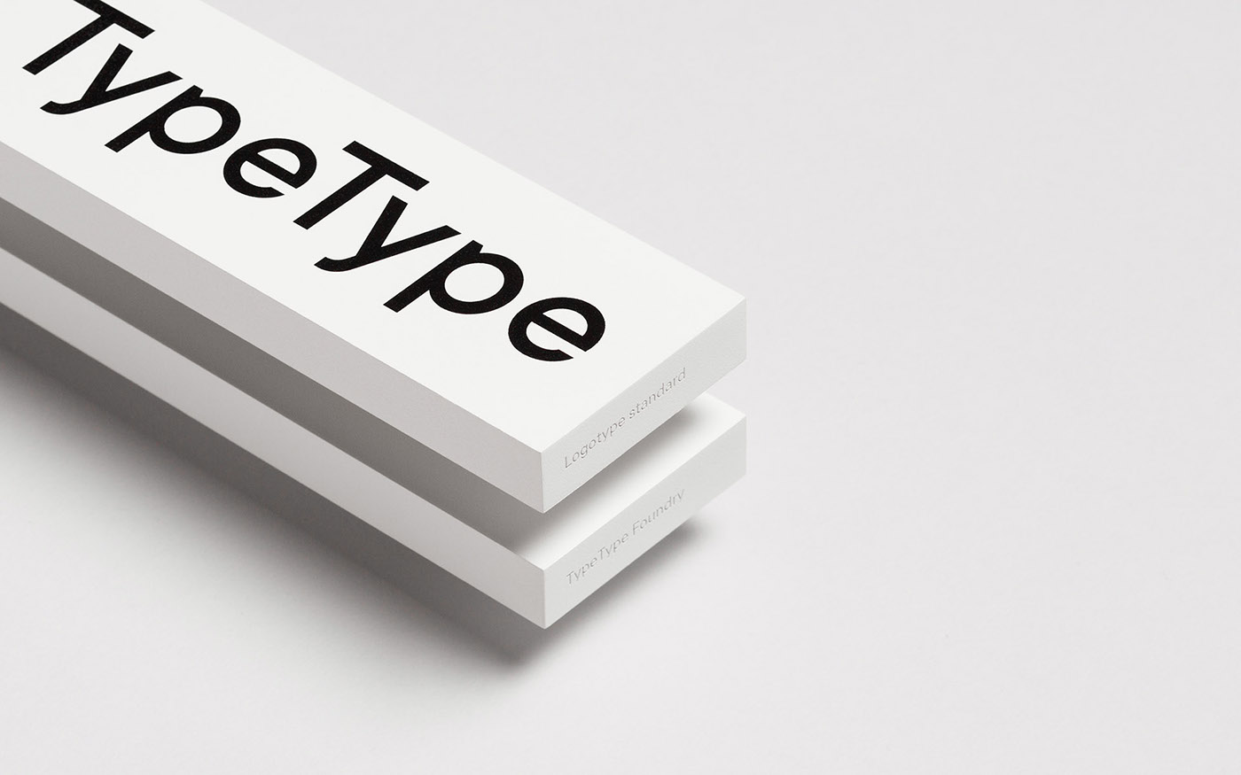
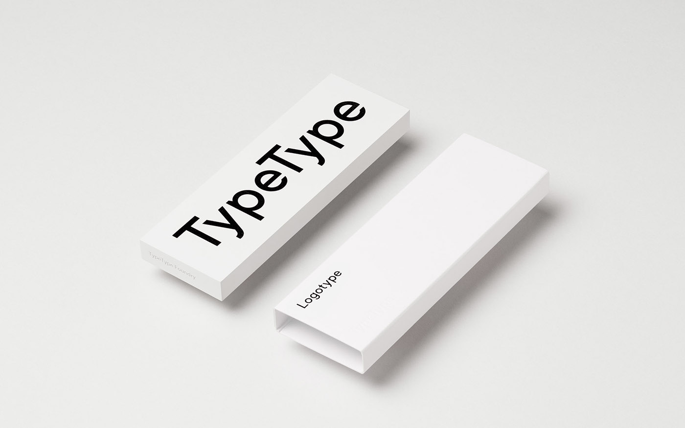
Logotype Standard
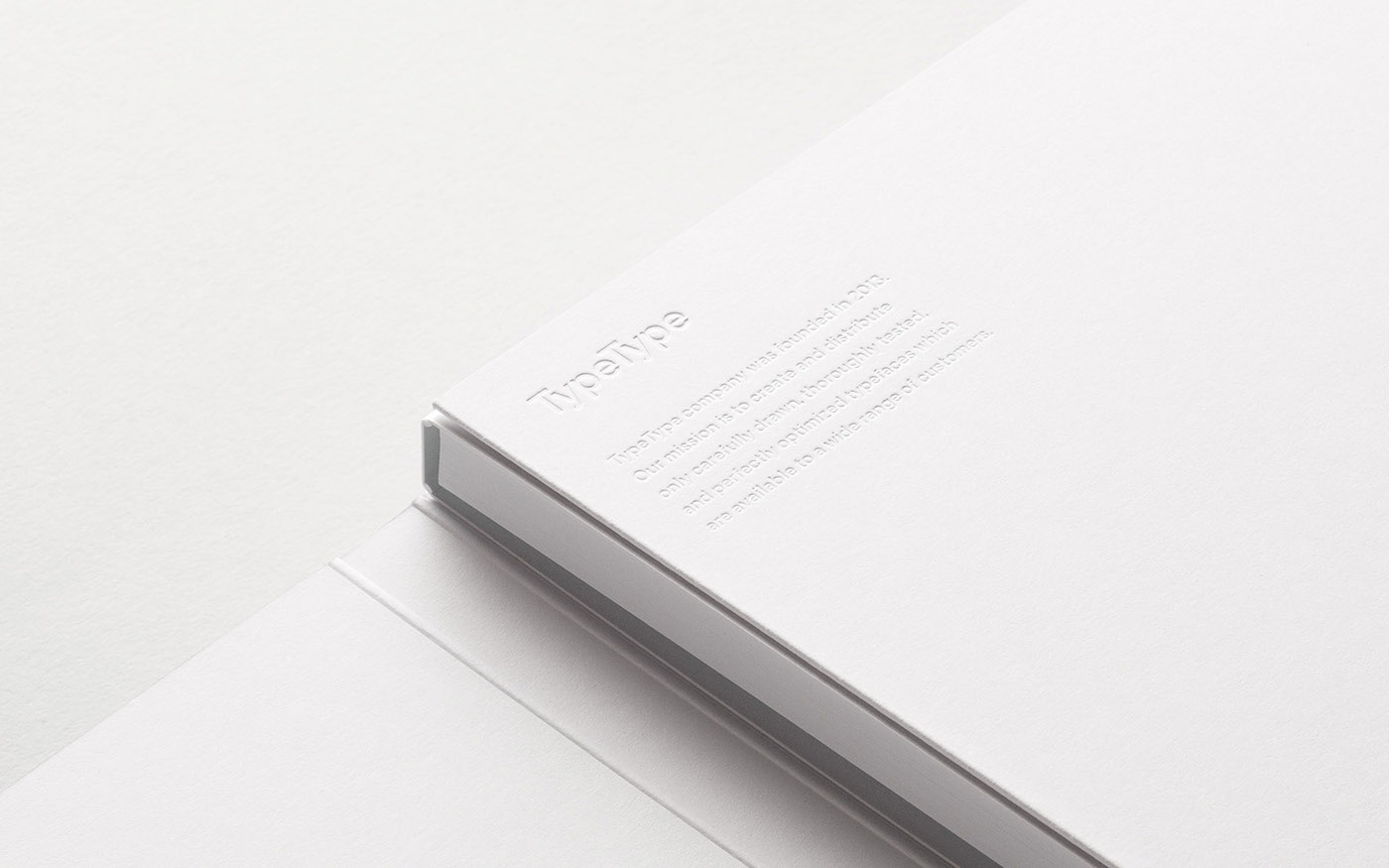
The white rectangular block with perfect edges and ideally printed logotype symbolizes the ‘golden standard’ of logotype.
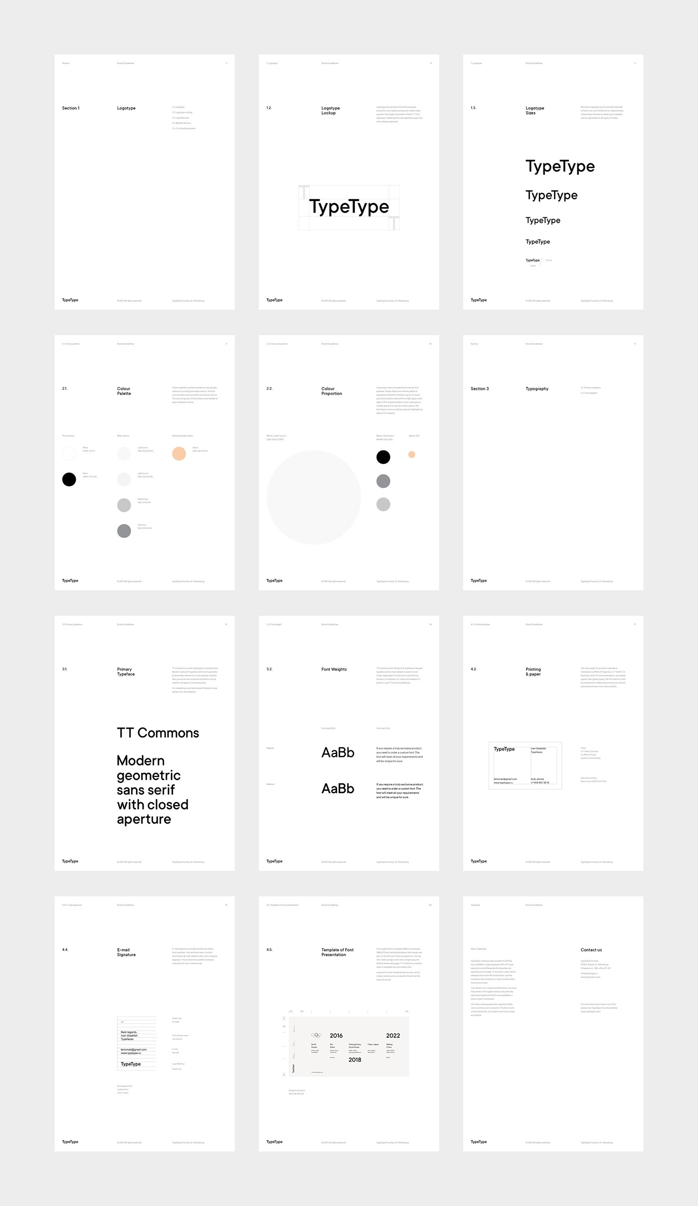
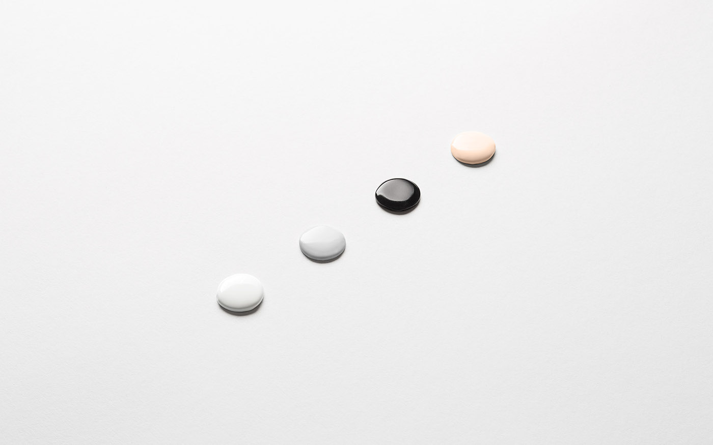
Color palette
Colors are directly inspired by and taken from the work process: white is for paper, black - for fonts, gray - for the tones of font rendering, and beige is for manual labor.
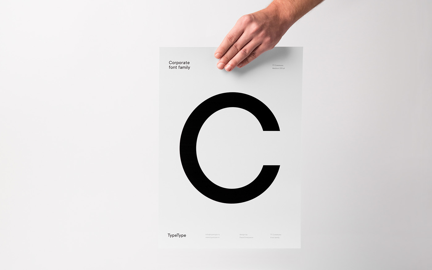
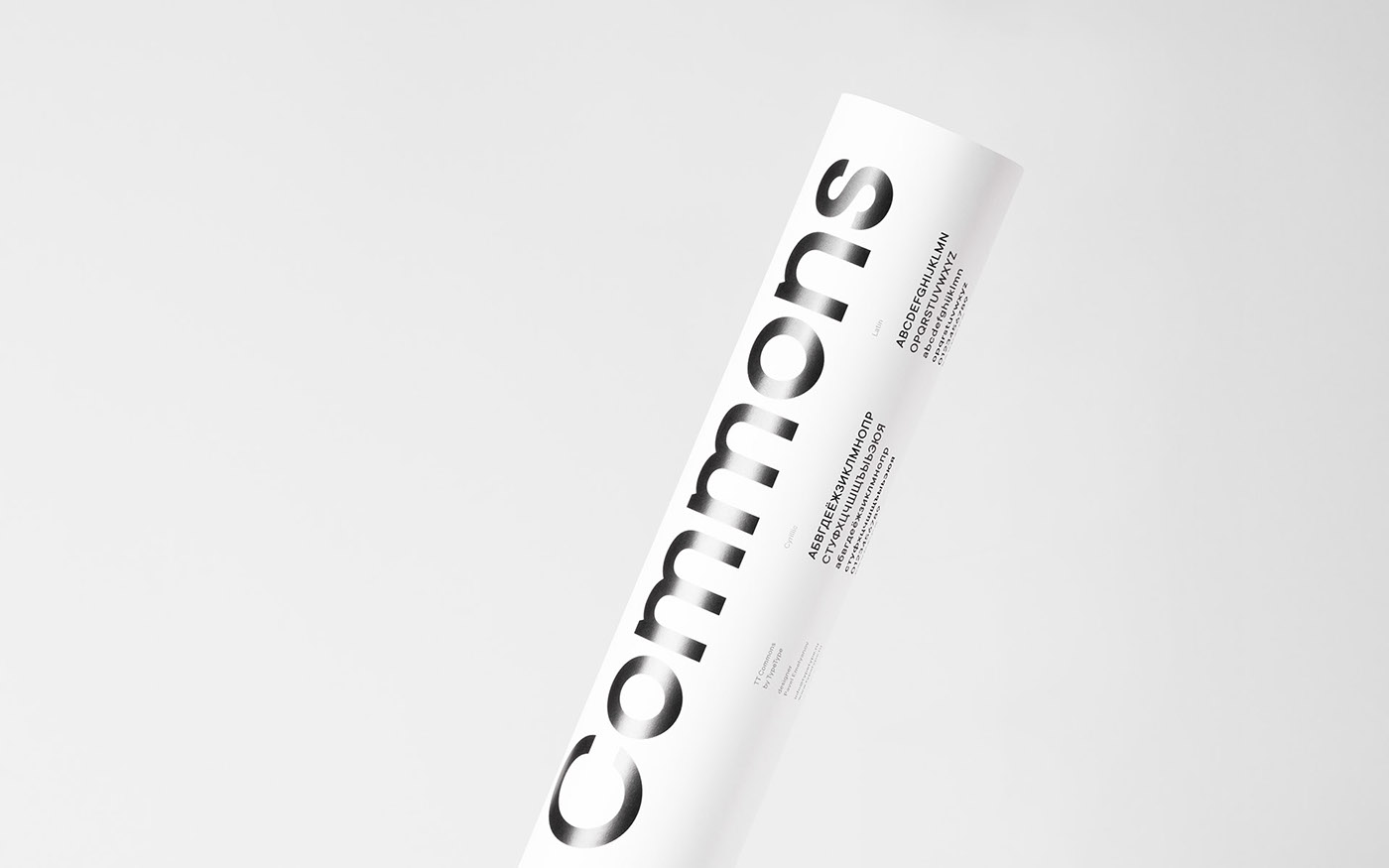
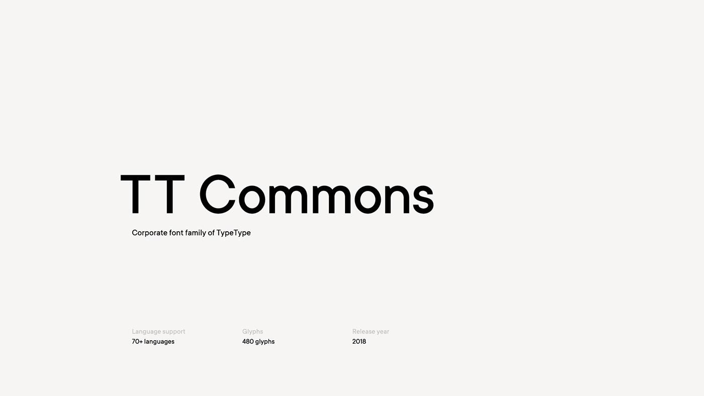
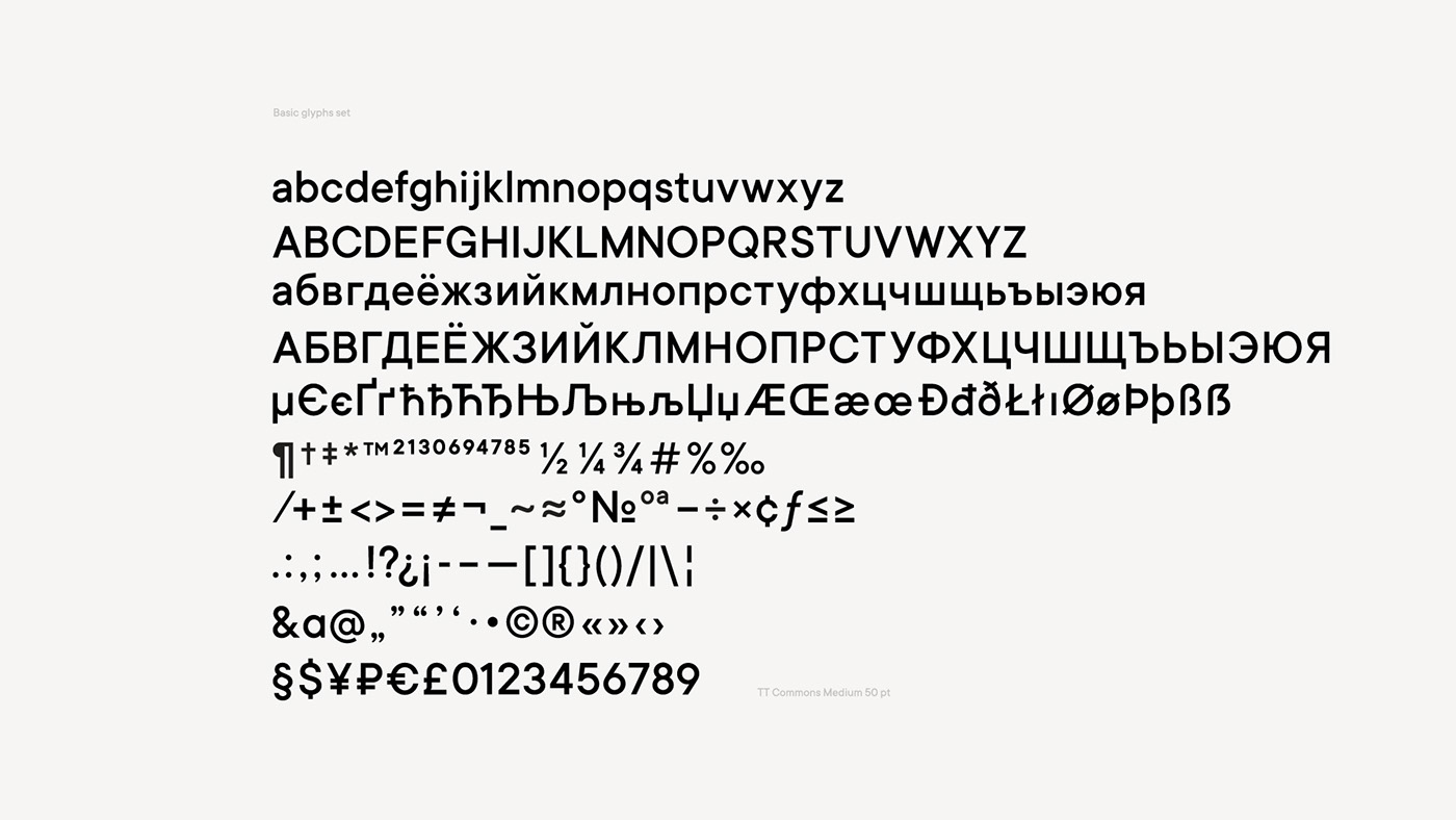
TT Commons
We created TT Commons, the corporate font, in collaboration with TypeType team. The task was to make universal modern grotesk with a multilingual support in the traditions of swiss design.
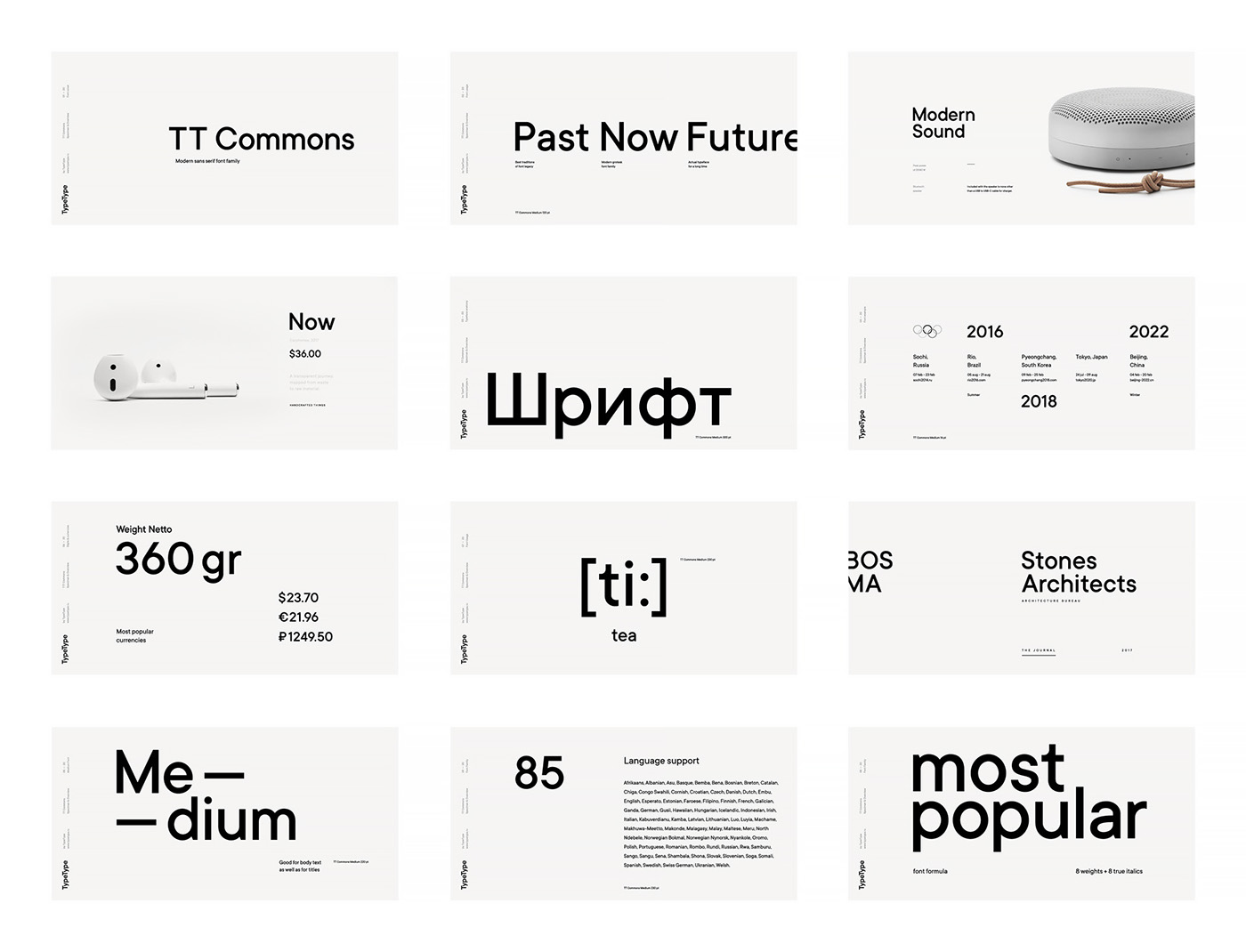
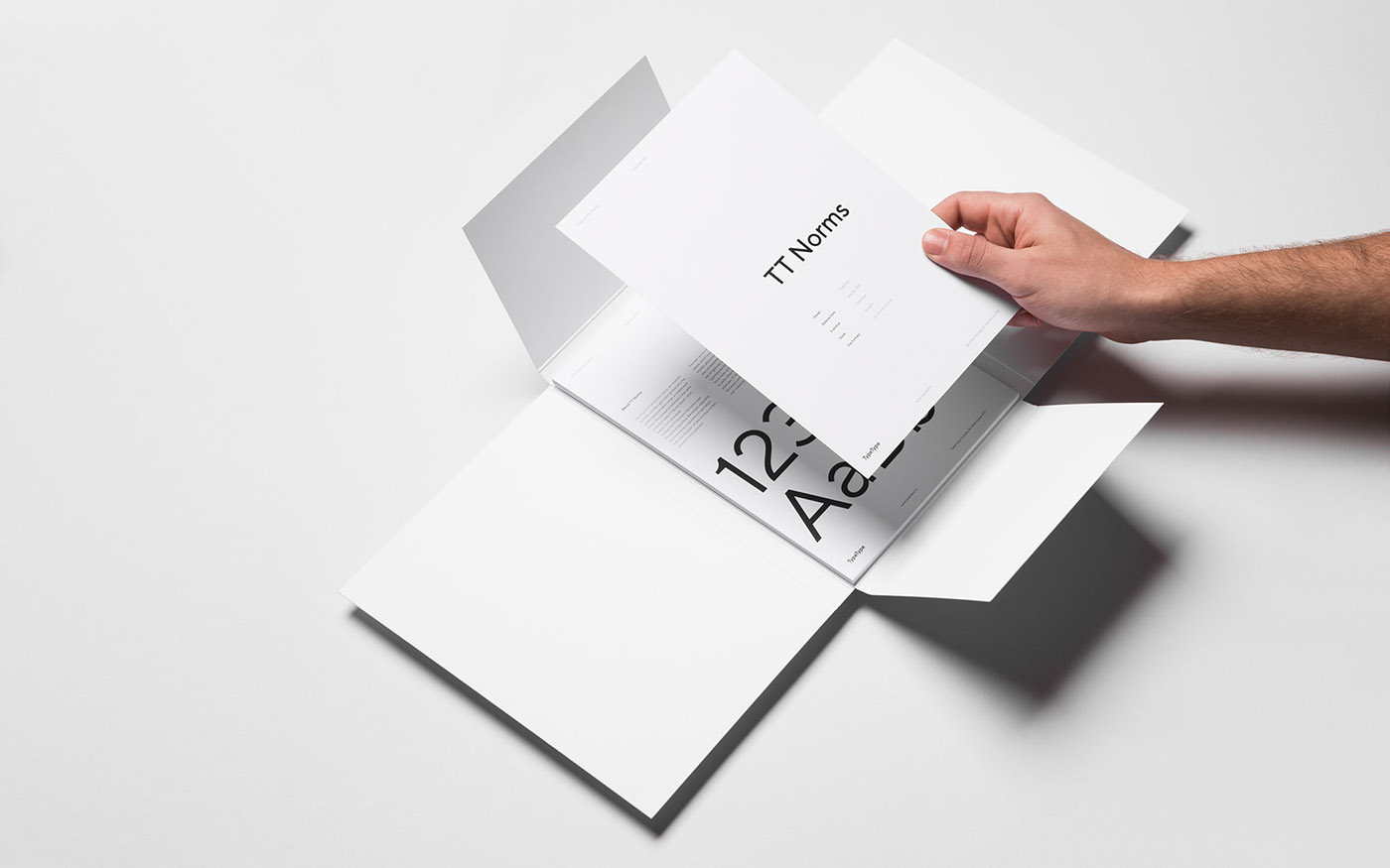
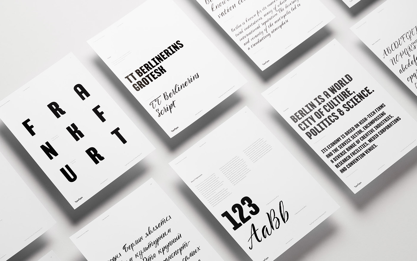
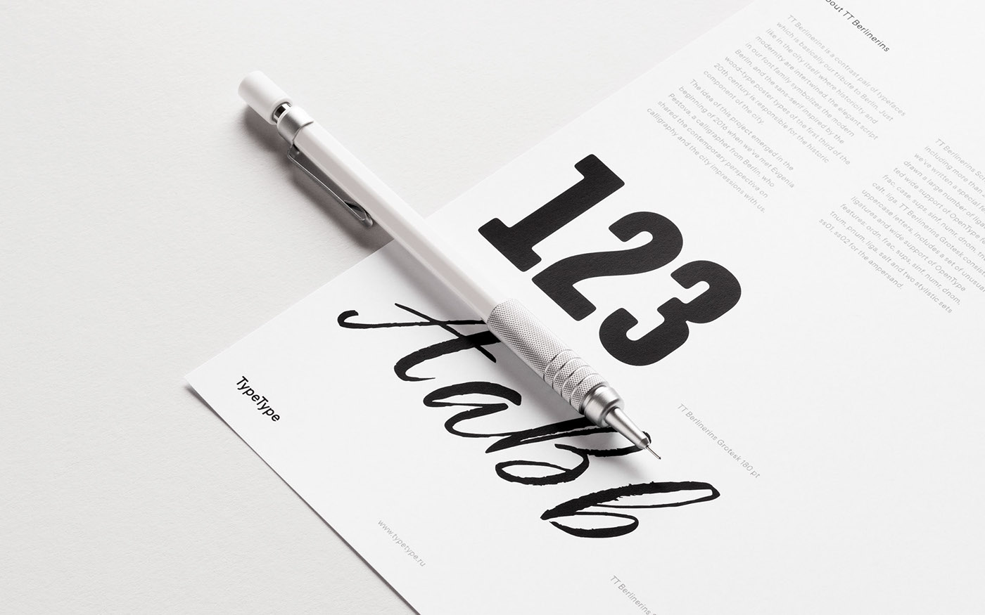
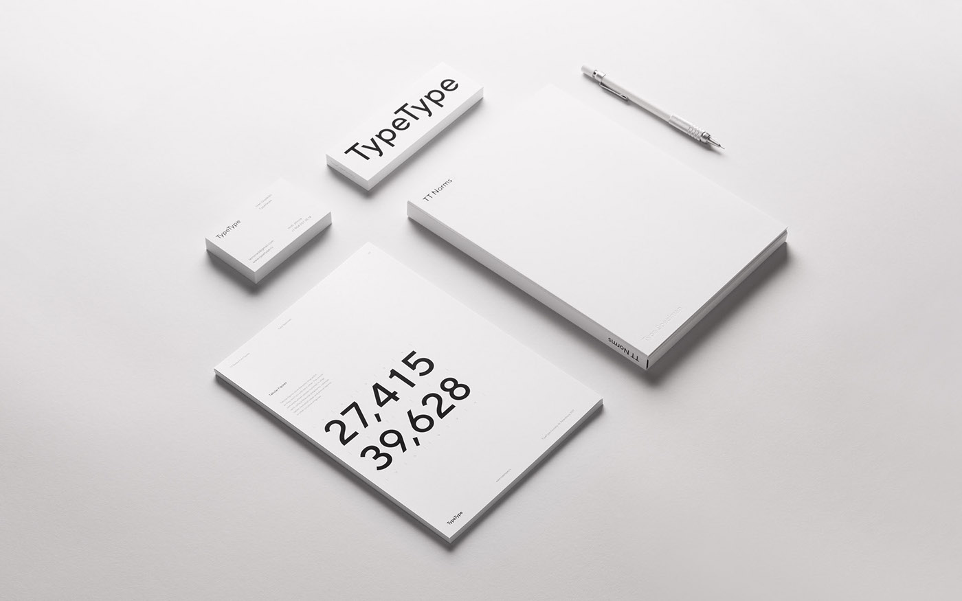
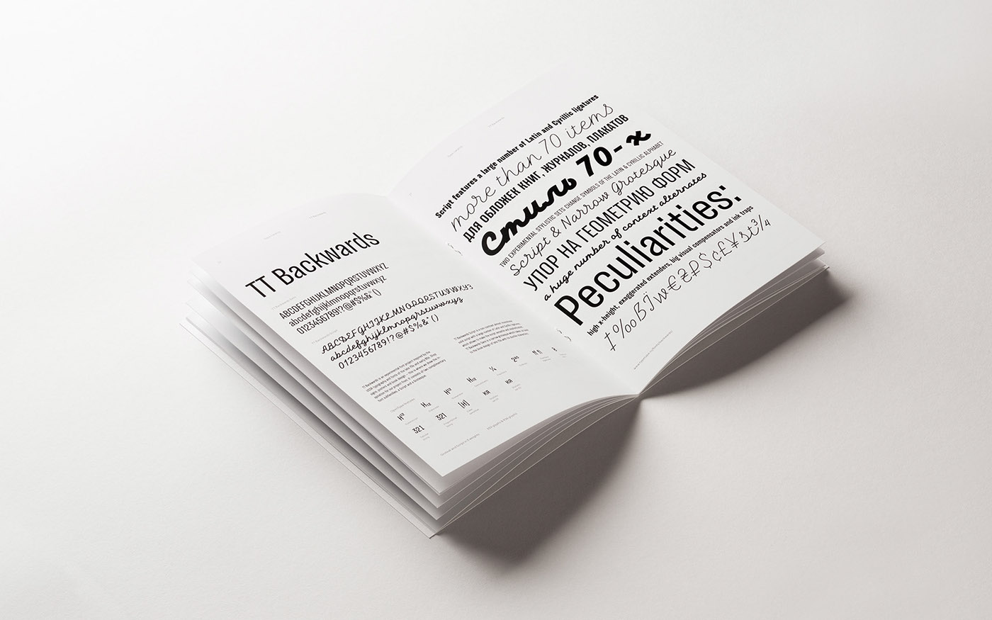
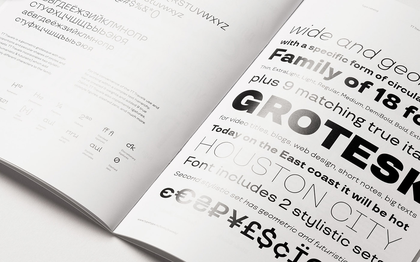
Catalog
Type catalog features fonts designed by TypeType. Each font is presented on its own page spread which lists main font characteristics, implementation examples, and OTFs.
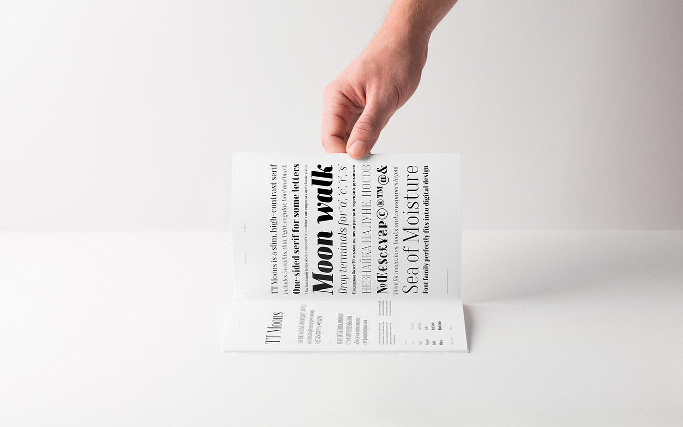


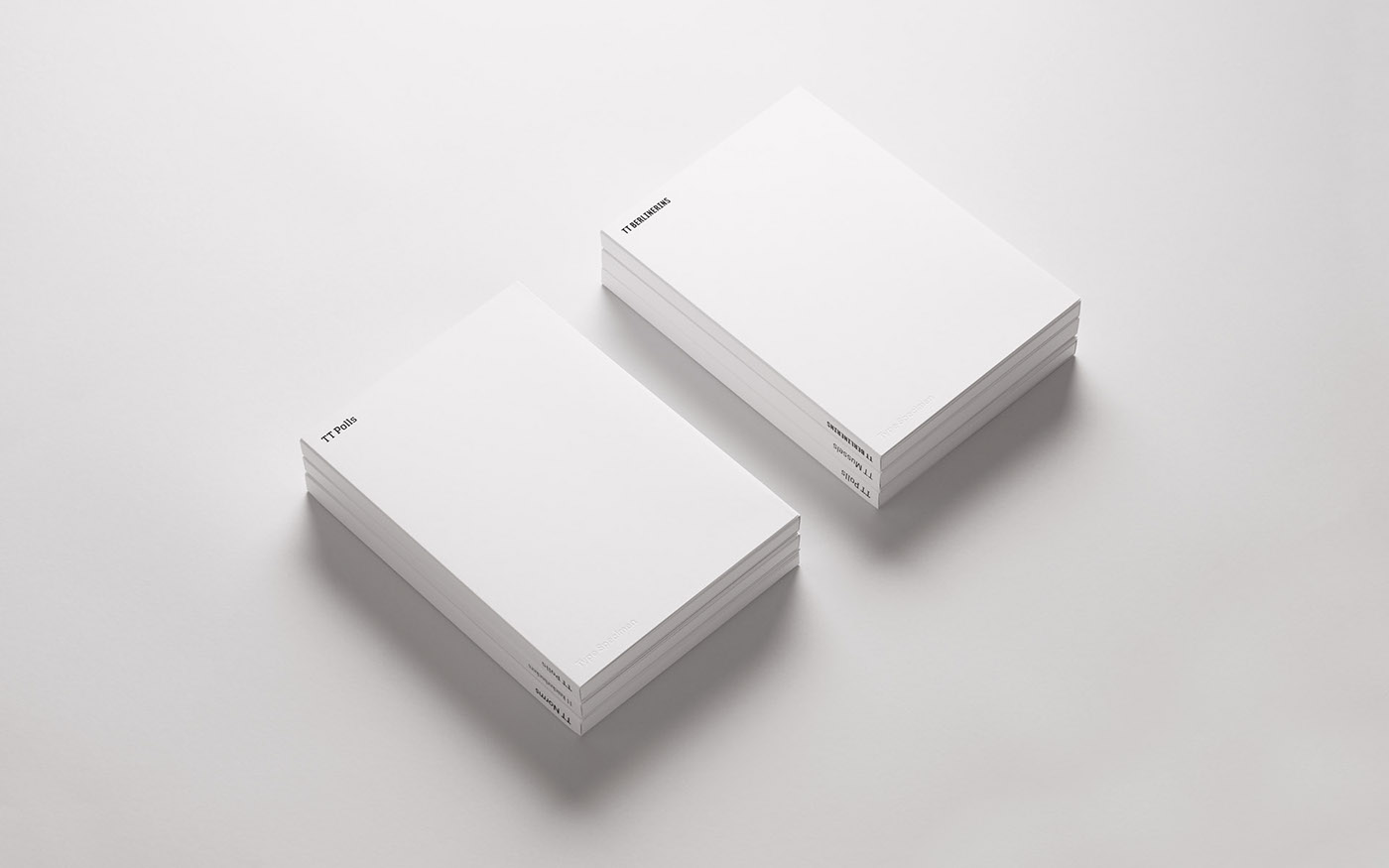
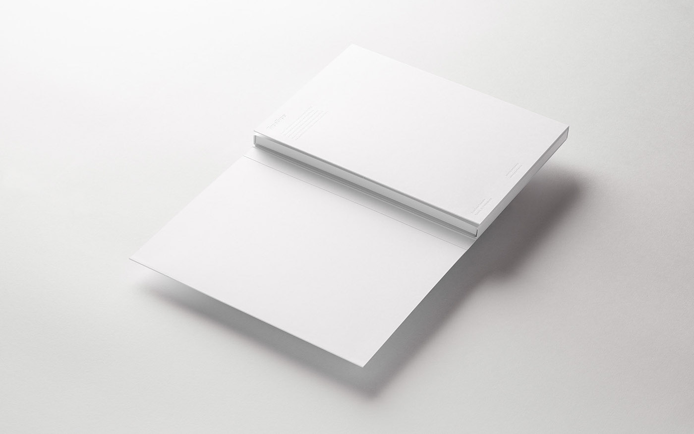
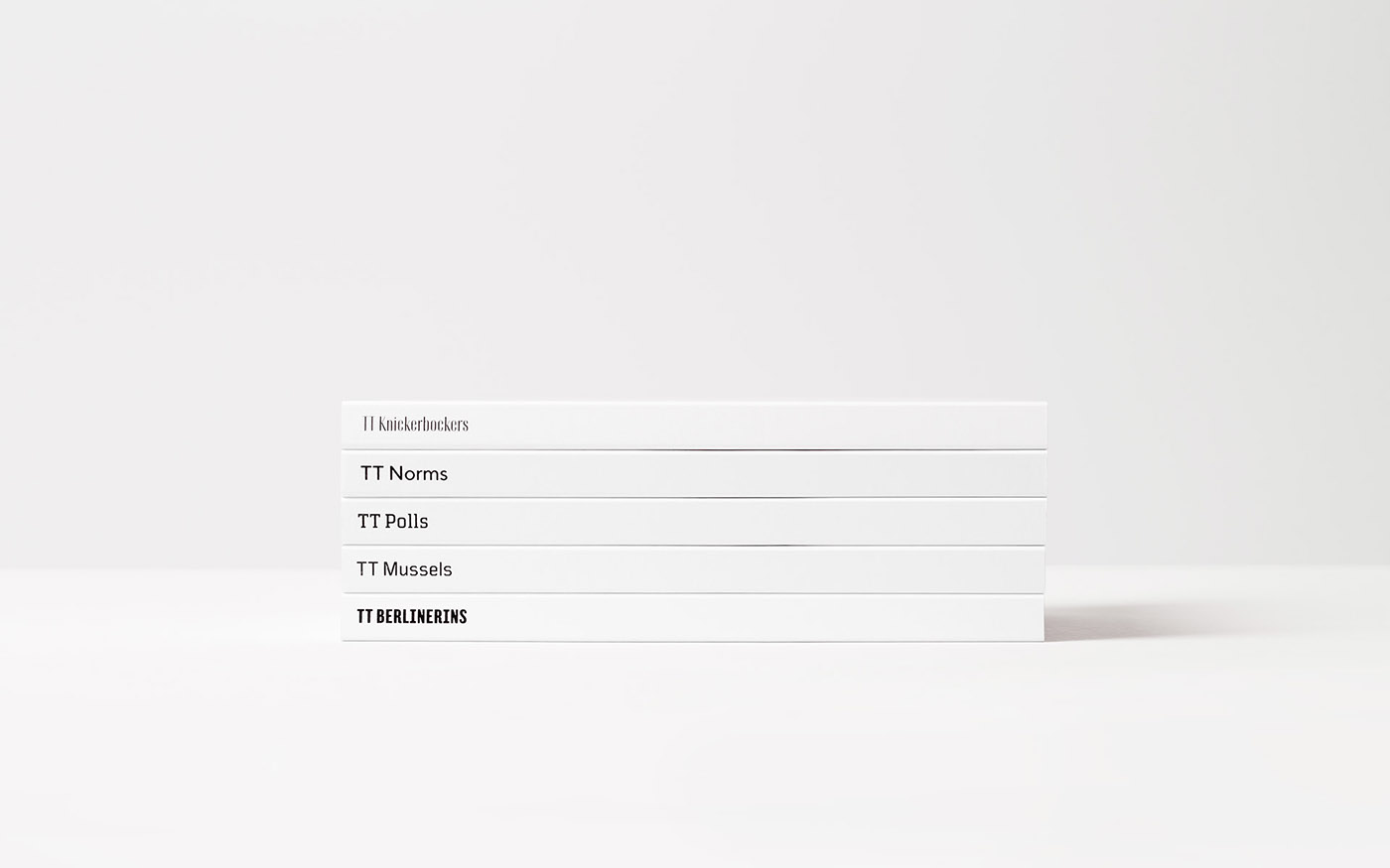
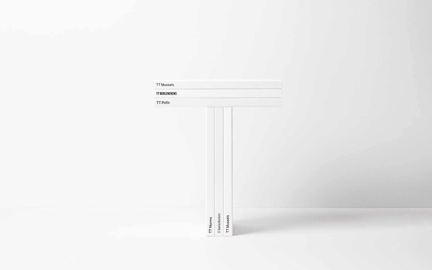
Specimen
Each font specimen has an individual folder made of stiff white cardboard. The physical font versions are visual representations of how the fonts look in print.