Futura_90.
A tribute to the typography of Paul Renner in commemoration of his ninetieth anniversary.
A tribute to the typography of Paul Renner in commemoration of his ninetieth anniversary.
At a time when Germany was still struggling between the suitability of Roman typography to read or the preservation of the traditional Gothic fraktur, Paul Renner created one of the most audacious and used alphabets of the twentieth century, the Futura typeface.

Renner, prolific writer in typography and director of the School of Master Artisans for Printers in Munich, began working on a commission during the summer of 1924. “Die Schrift unserer Zeit” (the type of our era) was the sentence that helped him to do his first sketches which did not generate the expected effect on his client. Months later, after the initial project came to a halt, he decided to show the sketches to Heinrich Jost, artistic advisor to the foundry Bauer de Fránkfort and former student, who in turn showed the design to his owner, Georg Hartmann. Fascinated with the proposal, Hartmann and Renner began a close collaboration that would end with the publication of the Futura alphabet at the end of 1927.

Far from the dogmatism of the time, Renner did not use geometry as an objective, but rather as an instrument from which to construct an alphabet based on reading criteria. He was well versed in the classical typographical heritage, starting from the Roman inscriptions for capital letters, giving them a rhythm and proportions not existing until then in dry stick typographies. In this way, the proportions of the Roman lapidary and a geometric construction based on the essential geometric shapes (square, circle and triangle) would define, in a non-negotiable way, the character of capital letters as a starting point to later build the lower-case letters with the same logic, eliminating the calligraphic legacies that were still present in some low-base characters.


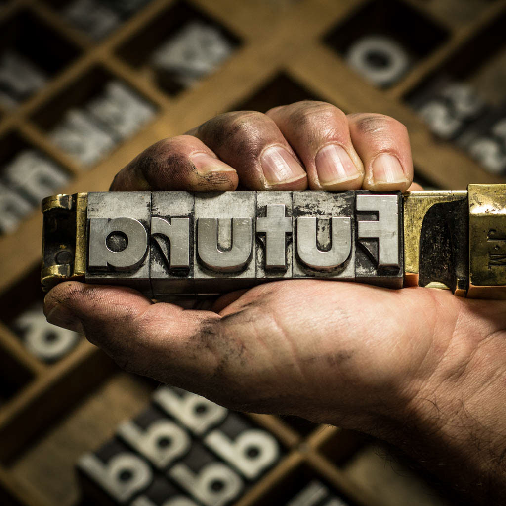
Ninety years later Futura has become a milestone in the history of typography and one of the most used and copied alphabets in history. In BunkerType, the alphabet with majority of versions and weights is Futura and is one of my favorites in lead as well. To sustain the materiality of its super black version in 72/84 points is a pleasure hardly describable for any lover of the letter. This project is my little tribute to those 90 years.

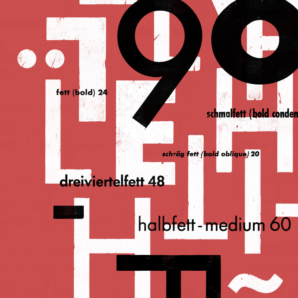
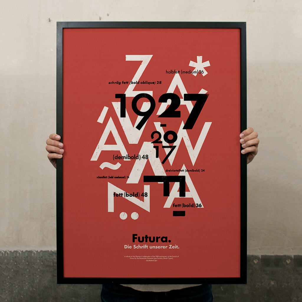
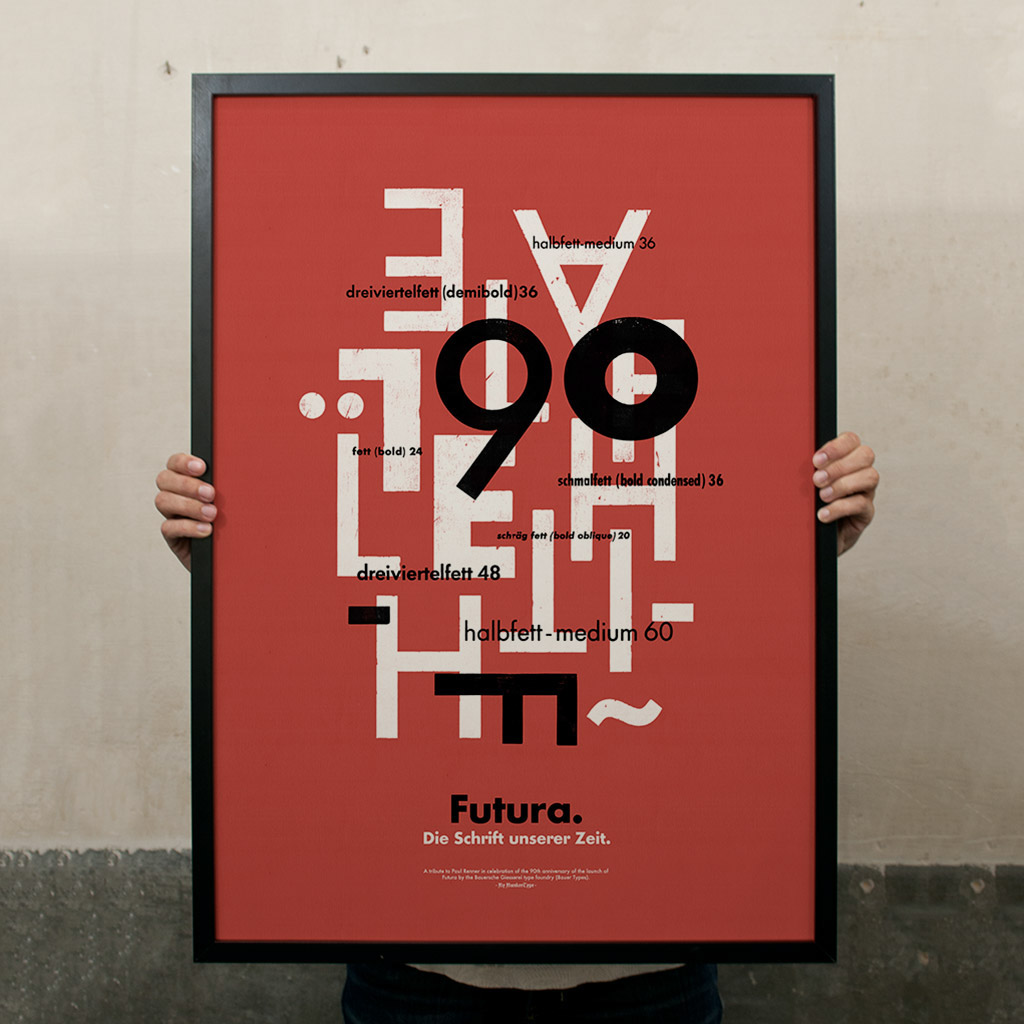
A composition in capital letters, essentially square or triangular, forms the background plane of the two proposals (on this occasion – and to guarantee the quality of the white – printed in silk-screen printing). In another reading plane, the main objective of the project appears: the celebration of the 90th anniversary of the launching of the typography by the Bauer foundry. In that plane the circular shapes are opposed to the previous plane. For this purpose, the initial versions of old style numbers which Renner drew, were used. Those designs were discarded at the time and never came to be produced in lead.

Finally, some of the versions of the lead typography that I have in BunkerType, especially in large sizes, serve as a counterpoint while at the same time they help to make visible the different versions and weights of which the whole typographic family consisted.


This is a limited edition of 90 prints that are sealed, numbered and signed.
All the prints are letterpress printed in a Korrex Hannover of 1964, on Materica Terrarossa Fedrigoni’s paper.
Size: 19 ¾ x 27 ½” (50x70cm.)

Bunker Type online store gives the possibility to buy the compositions individually for 45 euros each, or to buy both compositions for 65 euros. At BunkerType webshop site you will also find previous projects, such as the one dedicated to H.N. Werkman (“The New Call”) or “Spain … is different”, based on the graphic language of the Gerd Artz.

