


Keyholders
Keyholders is a social media and creative production agency
founded in 2017 in Cyprus. The client and CEO had
approached me with the idea of creating a forward thinking
brand that understands how the traditional market of the
island operates thus helping move small businesses and
brands forward with the power of social media.
founded in 2017 in Cyprus. The client and CEO had
approached me with the idea of creating a forward thinking
brand that understands how the traditional market of the
island operates thus helping move small businesses and
brands forward with the power of social media.

Combining classic design & modern day thinking
Early on in the design process it was identified that
the client wished to explore a classic and luxurious design
the client wished to explore a classic and luxurious design
for the brand. Fusing that classic design with clean, bold edges
the logo marque was created combining the multiple aspects
and characteristics of the brand.
the logo marque was created combining the multiple aspects
and characteristics of the brand.
The lock represents the possibilities that lie behind a successful
relationship. The eye symbolises the creative and forward
thinking nature of the agency and its goal to seek more innovative
solutions. Lastly, all this is hosted within the container which
is there to keep everything grounded taking into consideration
the traditional market of the island.
relationship. The eye symbolises the creative and forward
thinking nature of the agency and its goal to seek more innovative
solutions. Lastly, all this is hosted within the container which
is there to keep everything grounded taking into consideration
the traditional market of the island.


Typography & Colour
The colours used in this project are meant to reflect
the combination of classic and modern design.
Cyprus was famous in antiquity for its copper resources.
In fact the very word copper is derived from the
Greek name for the island, Kupros and thus to represent
the root and origin of the brand, copper was chosen as the main colour.
the combination of classic and modern design.
Cyprus was famous in antiquity for its copper resources.
In fact the very word copper is derived from the
Greek name for the island, Kupros and thus to represent
the root and origin of the brand, copper was chosen as the main colour.
The complimentary blue and grey are supporting colours meant to
emphasise the main colour and further enhance its impact.

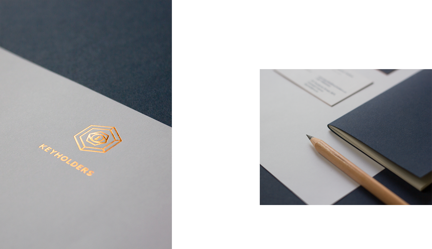

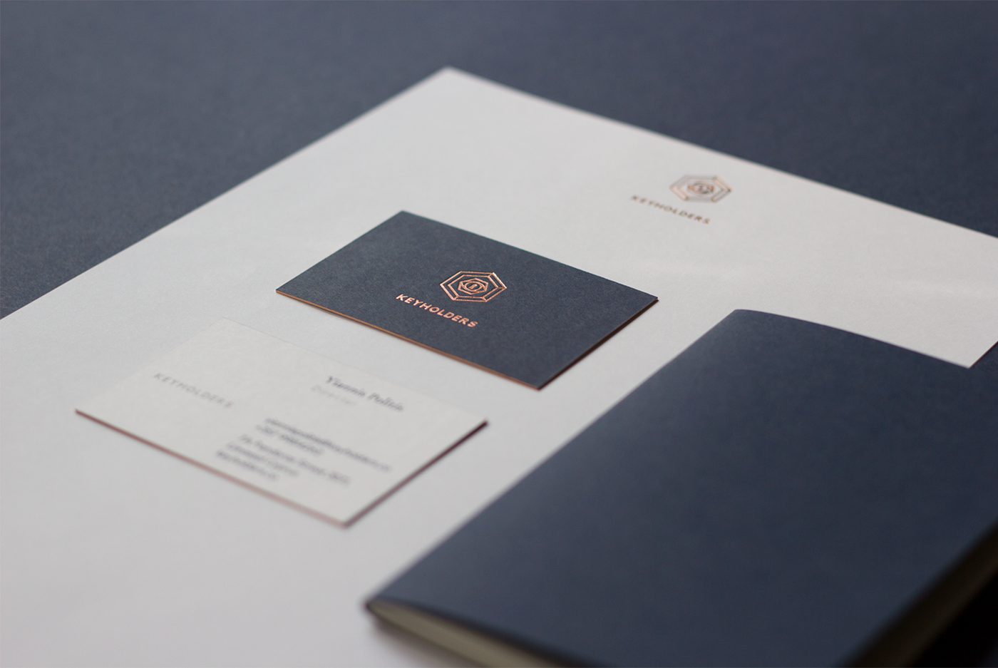
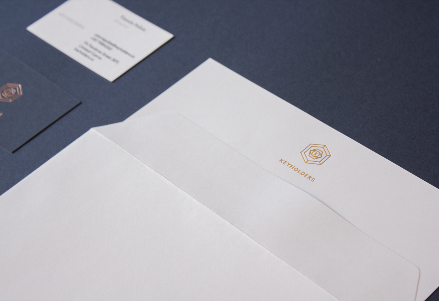
Translating the brand in print format
In addition to creating the brand i was also tasked to
research and develop the best solution for offline print
formats. In Cyprus word of mouth still plays a tremendous
role in the growth of a business and because of this is i had
to ensure that the stationery produced would leave a memorable
impression to whomever would receive them.
research and develop the best solution for offline print
formats. In Cyprus word of mouth still plays a tremendous
role in the growth of a business and because of this is i had
to ensure that the stationery produced would leave a memorable
impression to whomever would receive them.
Business cards were printed on Imperial Blue
& Ice White Colorplan G.F SMITH paper.
350GSM duplexed, copper foiled and gilt edged.
& Ice White Colorplan G.F SMITH paper.
350GSM duplexed, copper foiled and gilt edged.
The folders and letterheads were copper foiled
and printed on 150GSM textured uncoated white stock.
and printed on 150GSM textured uncoated white stock.


Credits:
Design, Art Direction & Photography:
Kyriakos Kokkinos
__
Kyriakos Kokkinos
__
Please leave a like if you enjoyed this case study
Thank you!


