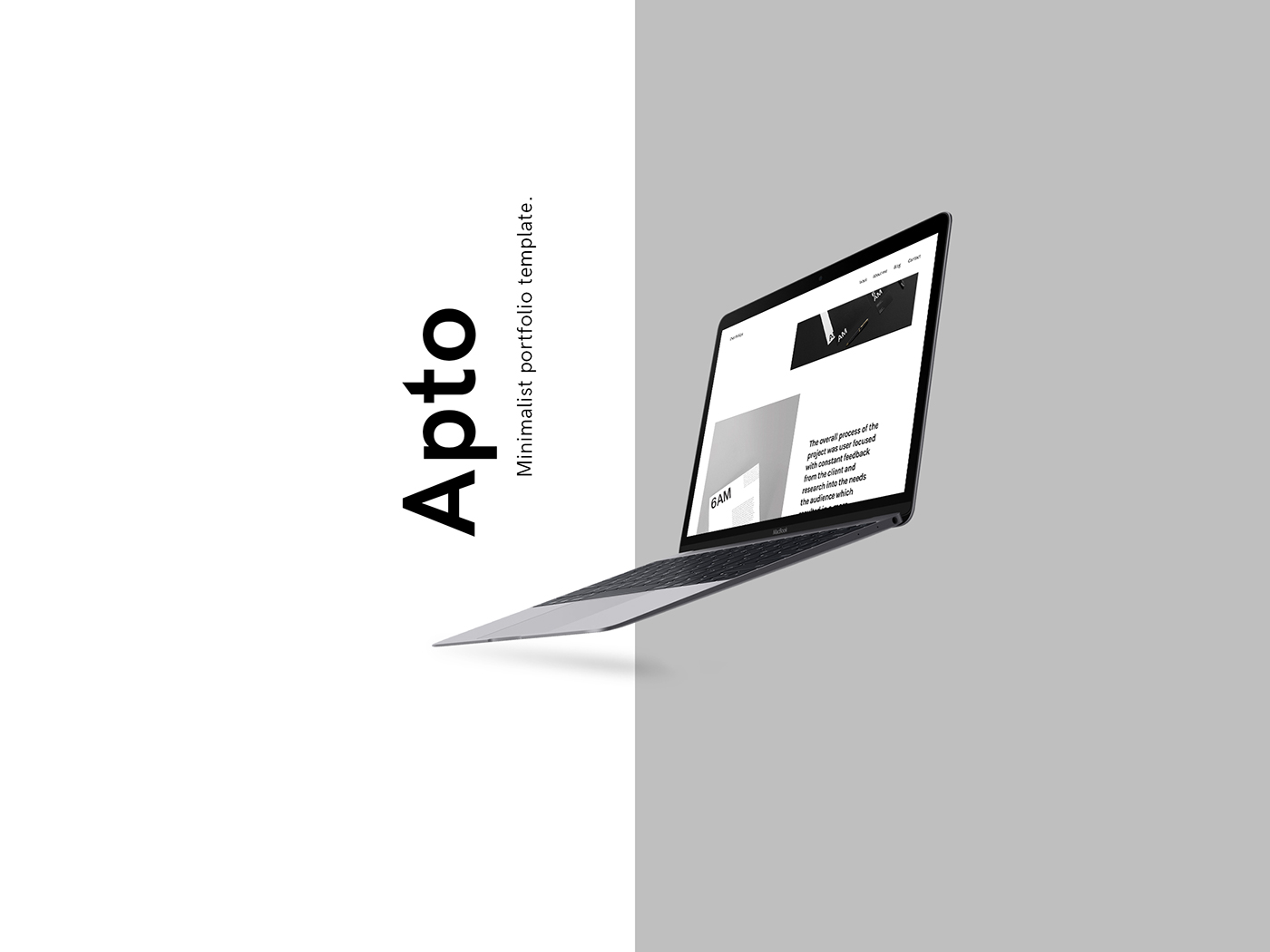
Apto is a minimal template with a purpose, to tailor around your content and help you showcase your work to its full potential. It’s full width asymmetric layout, contemporary design and contrasting typography create a subtle aesthetic which you can customize to fit your needs making it ideal for creatives.
The design decisions were developed from a questionnaire given to 25 designers both students and industry professionals.
This project was an entry for the D&AD New Blood 2017 Squarespace Brief and won a Wooden Pencil.
aptō (present infinitive aptāre, perfect active aptāvī, supine aptātum); first conjugation
- fasten, fit, apply, adjust.
- adapt, accommodate, fit.
- make ready, prepare.
- adapt, accommodate, fit.
- make ready, prepare.

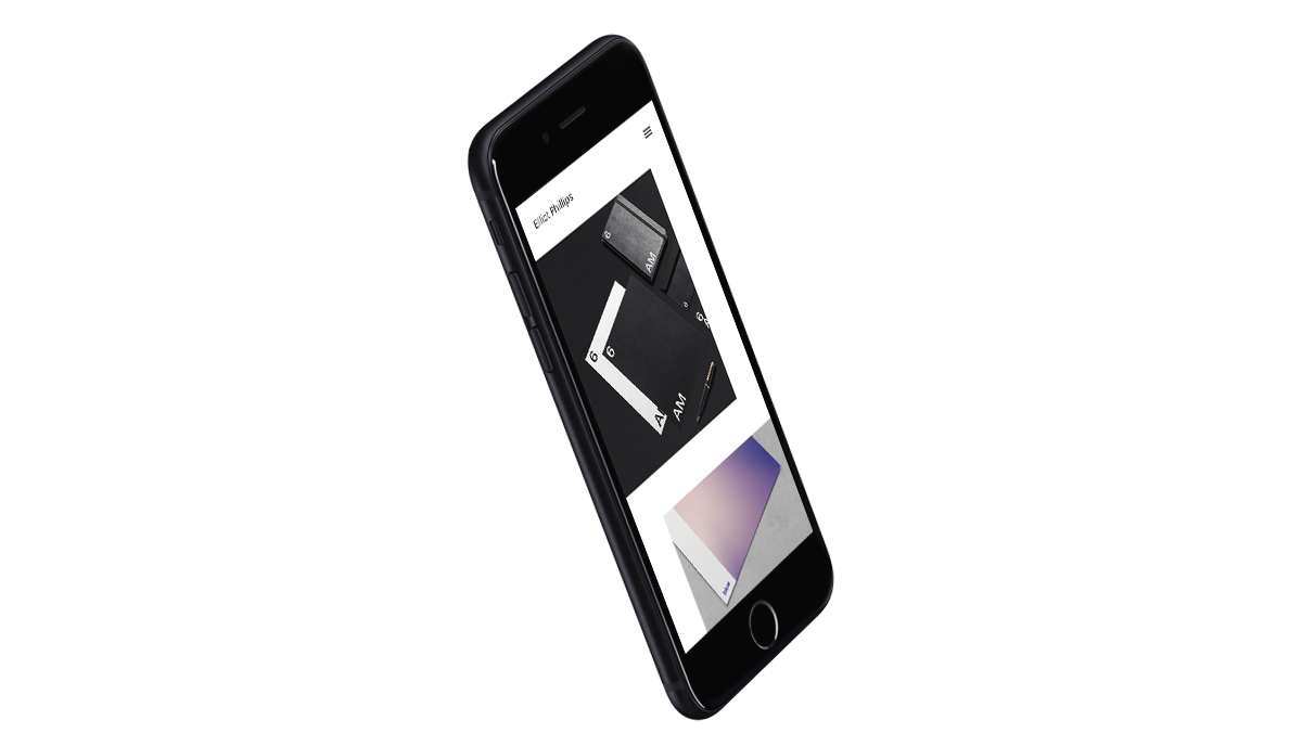
01. Index/Work Page
The asymmetric layout of the work page allows the designer to upload any width or height of image that they want. This results in a very editorial-like layout that sets a fixed margin of 200px after each element to create even spacing of content. The addition of a full width fluid layout also allows for the images to take up the maximum amount of real-estate of the users screen creating a more impactfull first impression.
The design was created around screens of 2560,1440 and 414 pixels on a 12 column grid with 20px gutter and 75px margins on each side. The system calucates the screens width and creates the column width.
Google fonts is the main and source for fonts for the template. With a maximum combination of two fonts the system can achieve great results due to the contrast and impact of varying type.


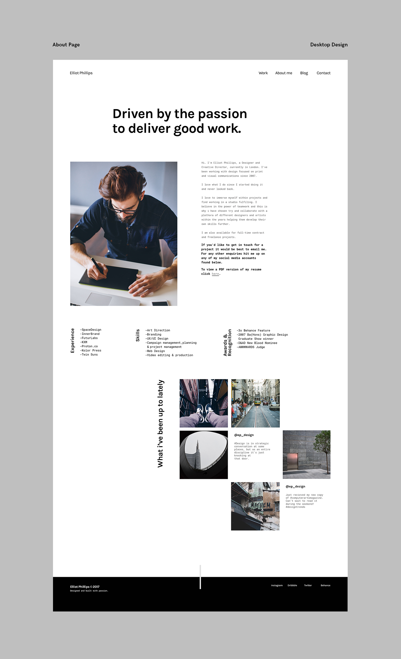
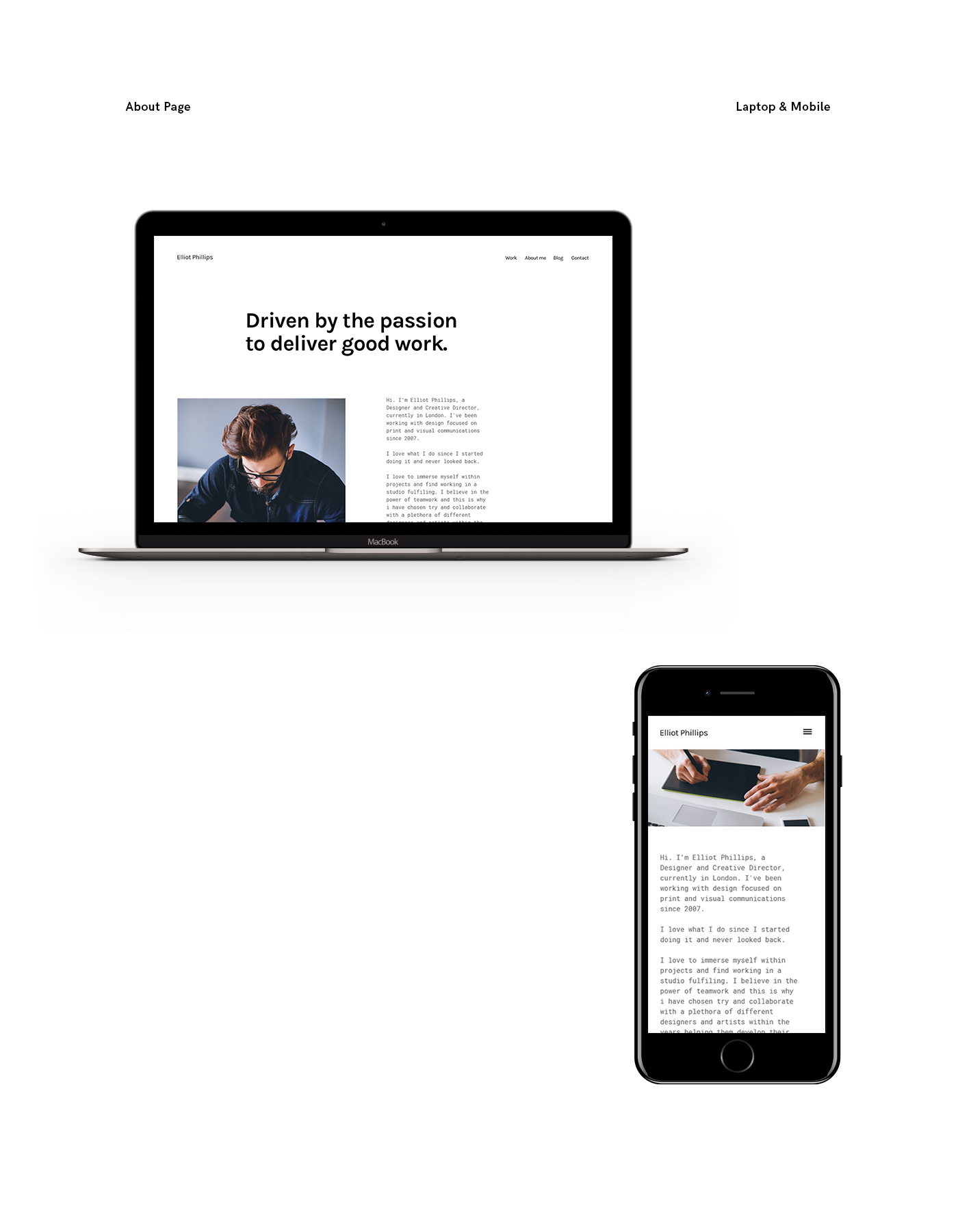
02. About Page
The about page brings a more conventional approach to the overall design system but also introduces column offsets and customisable sections that the designer can use to showcase their sets of skills and experience. It is also very important to mention the social media integration element which uses Facebook, Instagram and Twitter posts to create a feed that gives a very personal feel to the whole design.
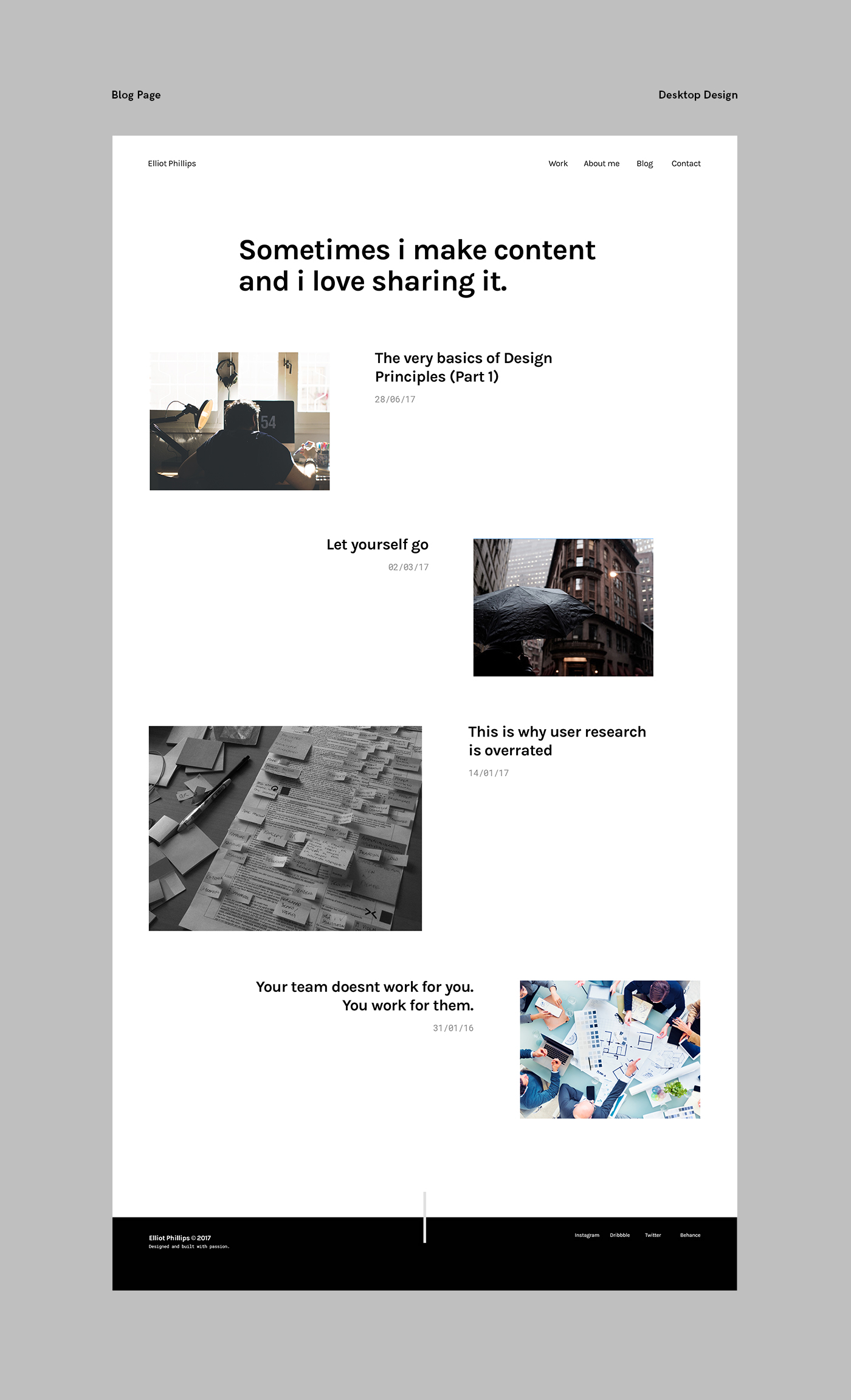
03. Blog Page
A blog is essential to any pro-active designers portfolio website. This particular page creates a more conservative approach to the asymmetric layout previously shown. It uses fixed width images and fixed margins that can be either 1x or 2x sized. This creates a more standard layout that can be either used for blog features or portfolio pieces.
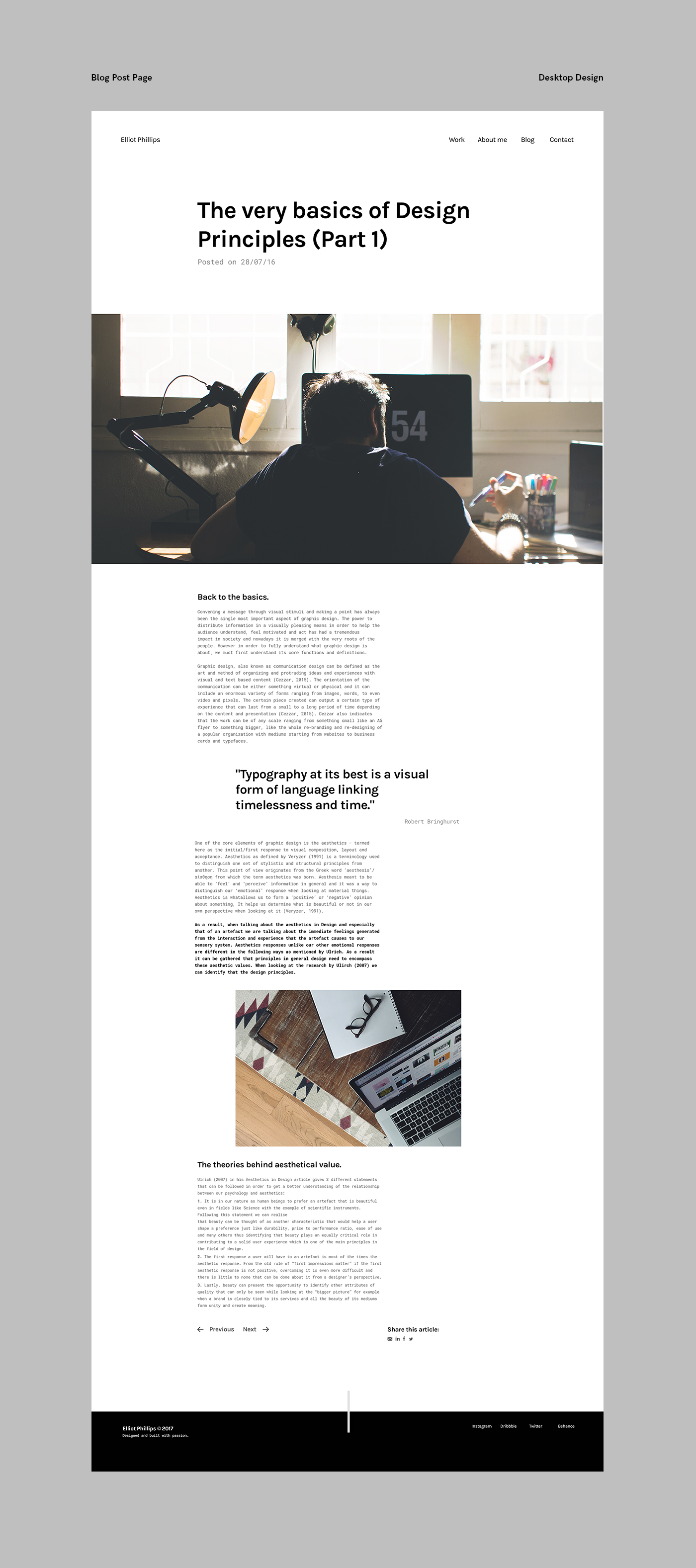
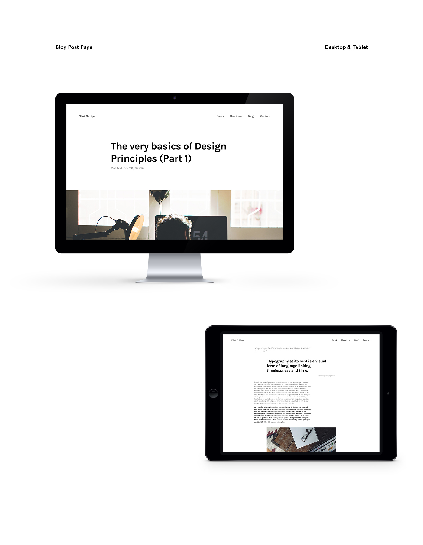
04. Blog Post Page
The blog post page introduces a lot of new elements that sit within the design system. It features the social media share interactions as well as typography elements that help pull out certain parts of the copy and helps them make a statement. In addition, it also allows navigation to previous and next blog posts to keep the potential user engaged.
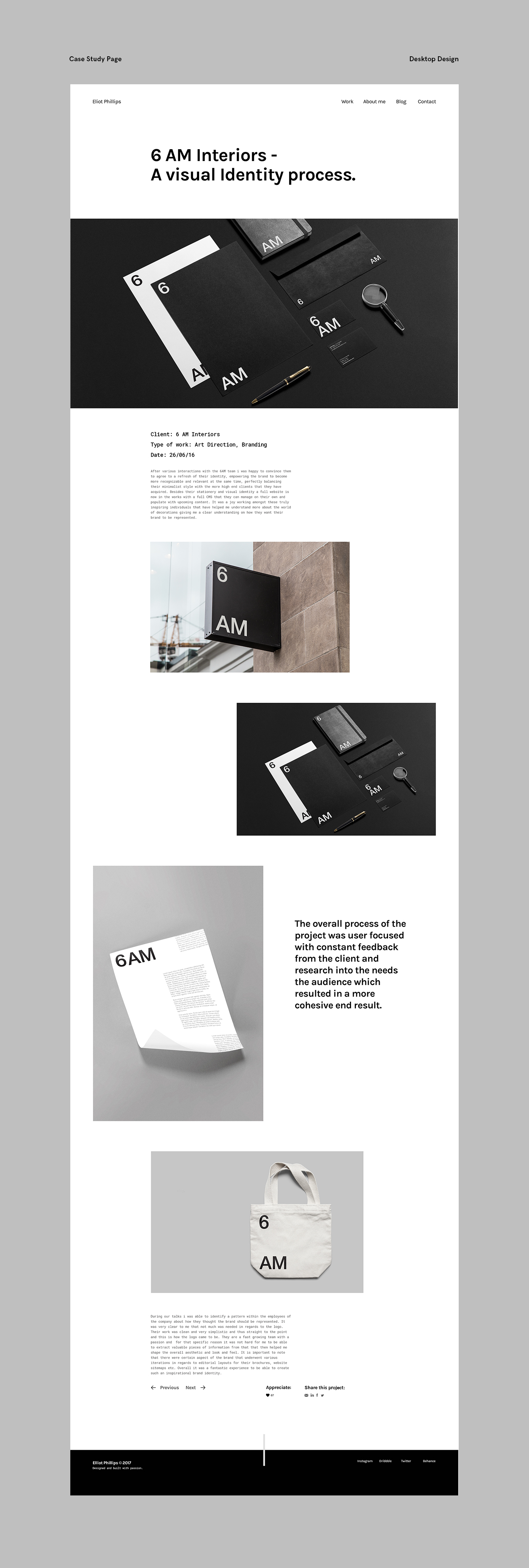
05. Case Study Page
The case study page shows the consistency in grid, layout and typography with the rest of the design system. It uses the format of the blog post regarding copy and social media interactivity but also incorporates the asymmetric layout featured on the portfolio page to create a more impactful and bold result.


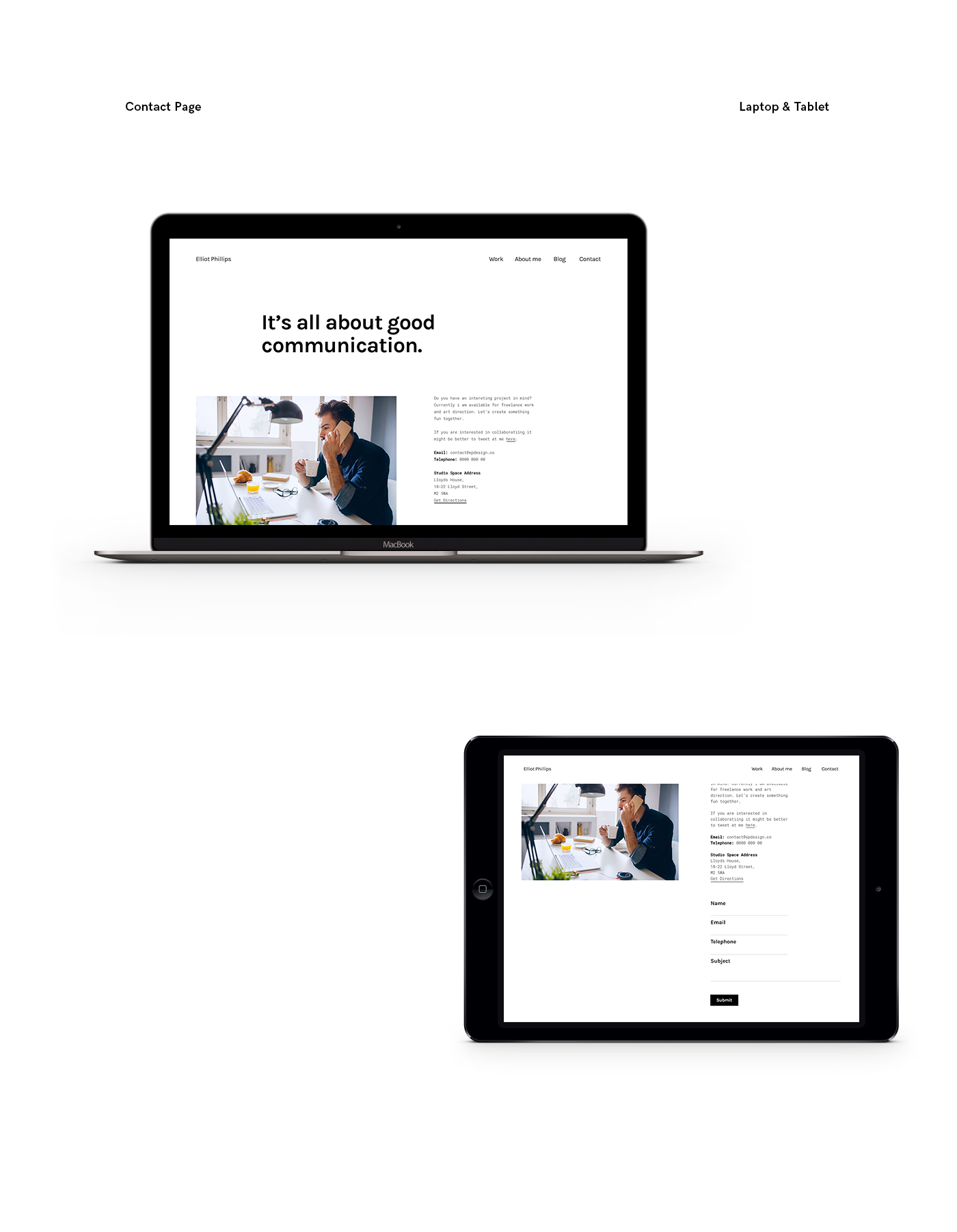
06. Contact Page
The contact page and all its elements just like the whole design has been kept simple to allow the designer of the template to create their own style for buttons and form inputs. It also features variations on the block of copy elements that the designer can utilize to provide a different information.
Thank you for scrolling this far!
This project was an entry for the D&AD New Blood 2017 Squarespace Brief.
Please don't forget to appreciate the project!