We developed several design solutions for the identity, each focusing on some aspect of our research conclusions. In the end, the Clinic overwhelmingly supported the identity shown here. The symbol represents an “O”, helping viewers associate the mark with Ogden Clinic. The identity system was built around the symbol, using overlapping, flowing green shapes to exude a feeling of life and vitality viewers could associate with the Ogden Clinic brand.
We found in our research with community members, that while 100% of those polled were familiar with Ogden Clinic, the majority could not recall the logo. Existing Clinic signage failed to brand the facilities and only identified the neighborhood in which it resided. We designed the symbol to make it clearly legible, even on signage.
We found in our research with community members, that while 100% of those polled were familiar with Ogden Clinic, the majority could not recall the logo. Existing Clinic signage failed to brand the facilities and only identified the neighborhood in which it resided. We designed the symbol to make it clearly legible, even on signage.
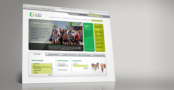
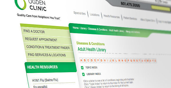
The Ogden Clinic Web site is an important piece of the Ogden Clinic brand experience. Visually, the Web site carries the identity elements throughout. The home page is not only utilitarian offering various helpful services to visitorsbut also strongly communicates the Ogden Clinic brand message by highlighting their involvement in the community, and displaying health and clinic news items. The site creates a resource for the community by incorporating large, easily searchable libraries of health-related content. The site was built dynamically to allow cross-linking, i.e. if a viewer is researching a topic like tendonitis then Ogden Clinic orthopedic providers would be referenced along side the articles. The site also creates a personalized area for patients to login, make appointments, contact providers, and check medical history.