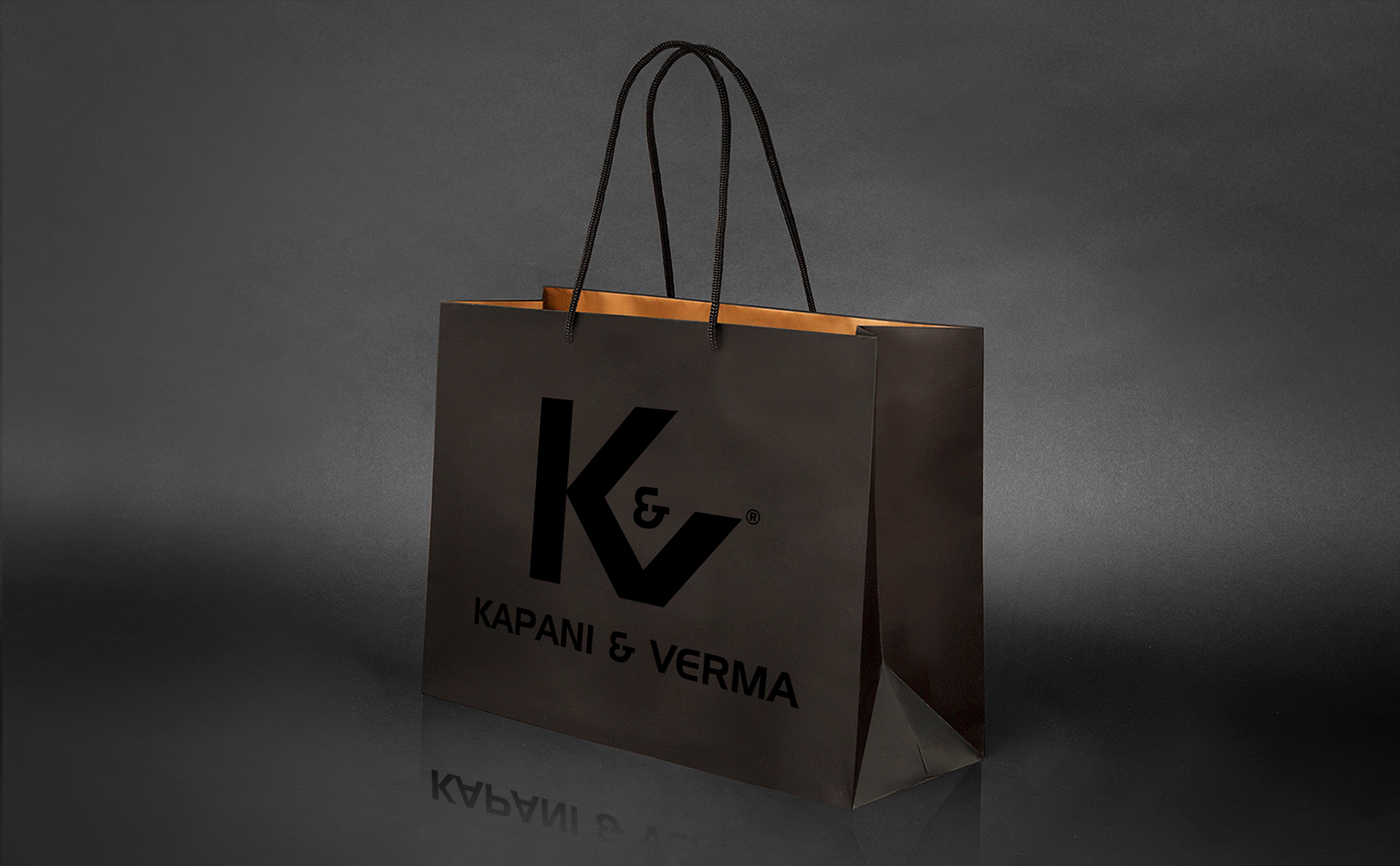
Kapani & Verma is an apparel company who needed a logo. K&V was founded in 2016 by an international designer whose goal was to grow her company. She asked me to come up with a simple, yet classy and appealing design that people could relate to easily since the company’s focus was to produce minimal, functional apparel designs for medium to high end customers.

I wanted to make an iconic logo that could be either paired with the full name of the company or simply be used by itself, as they planned to use it on shoes, t-shirts, labels, and other products. I made the symbol from their initials K&V. It has a strong but elegant feel to it. Since it takes a person all of about nine seconds to decide whether they like a certain brand, I wanted to make this logo stand out and be memorable when it’s in a shop next to so many competing brands. I wanted it to be striking.


I played around with the letters and did about 20 sketches on paper before I started to work on a computer. While doing my sketches, I conducted some research about symbols and how to make this symbol stand out. The symbol K&V doesn’t follow a current fad that will—poof—be gone next year; rather, it is styled to stay relevant and be a “trend” for many years to come. I decided to digitalize four of my drawings, but I knew this was the one.

As for the color, we decided to stay with black and white since it already was eye-catching and color would just detract from the shape itself without attracting additional attention.

This creative letter mark is a minimalistic and simple logo that can be scaled to any size, and it’s easy to implement in designs and branding. It works well with business cards, big banners, and a host of other marketing options.