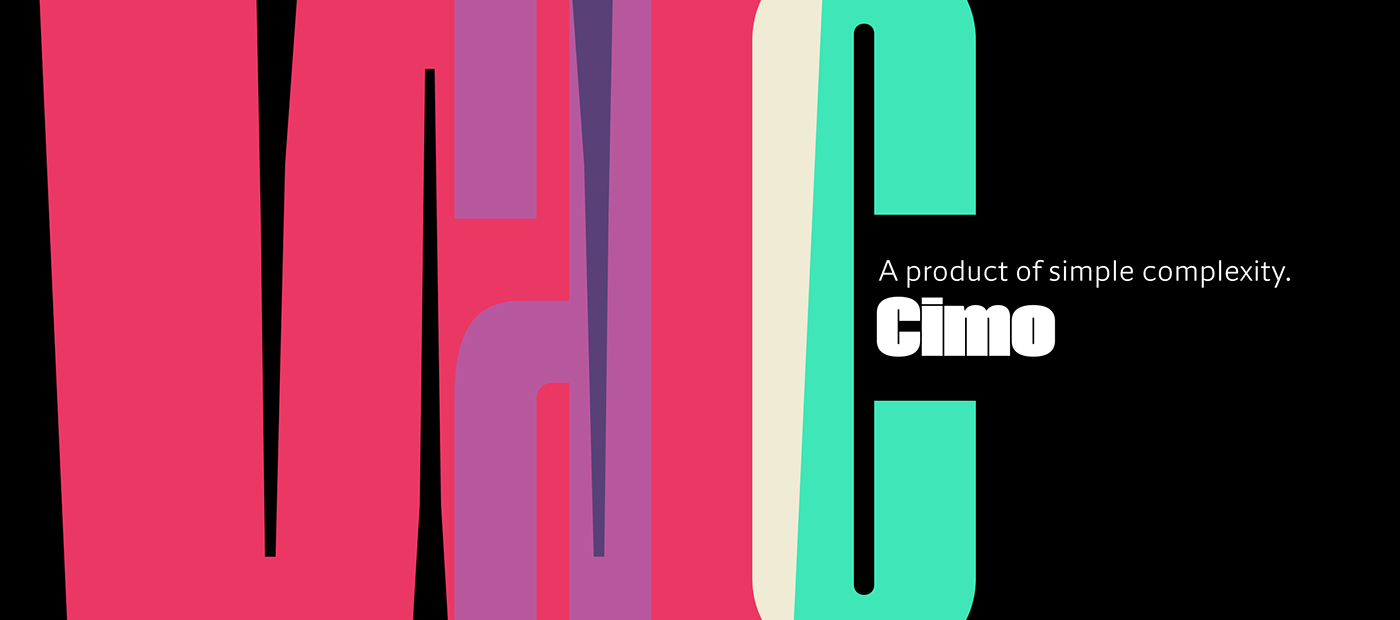


Simple complexity is the best way to describe Cimo. This type family of upright sans fonts is defined by the inner spaces that stand exactly the same across all fonts, while the stroke weight significantly increases. Cimo provides a natural gradient from the hairline compact versions to the ultra black wide typefaces, all in one uncommon type family. The huge x-height of the lowercase, the severe inktraps and grotesque aspect make this type family the ideal for use in versatile headlines where there’s room to play with the horizontal space.
