App UI Case – Keyword Сlustering
What is it? It is the web app for automating tedious, repetitive process of keyword clustering. The end result is an Excel table that is used as a part of SEO report.
The input: we have a whole bunch of search terms, usually already grouped in blocks by some common term.
The task is to segment these terms into other groups (clusters).
The problem: a person had to go through each block and pick search terms for each cluster manually.
Needless to say, it is not only tedious awful experience for a person but also a huge waste of time and energy. So, to save time, energy and sanity of the person, the first "quick and dirty" version of the app was made.
So, how we got from this horrible UI...

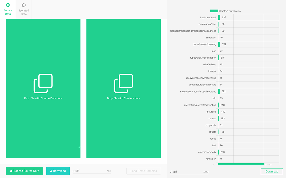
...to this new one?

What's the first version is all about
At first, it was bare-bones inputs and a button to start the process of sorting.
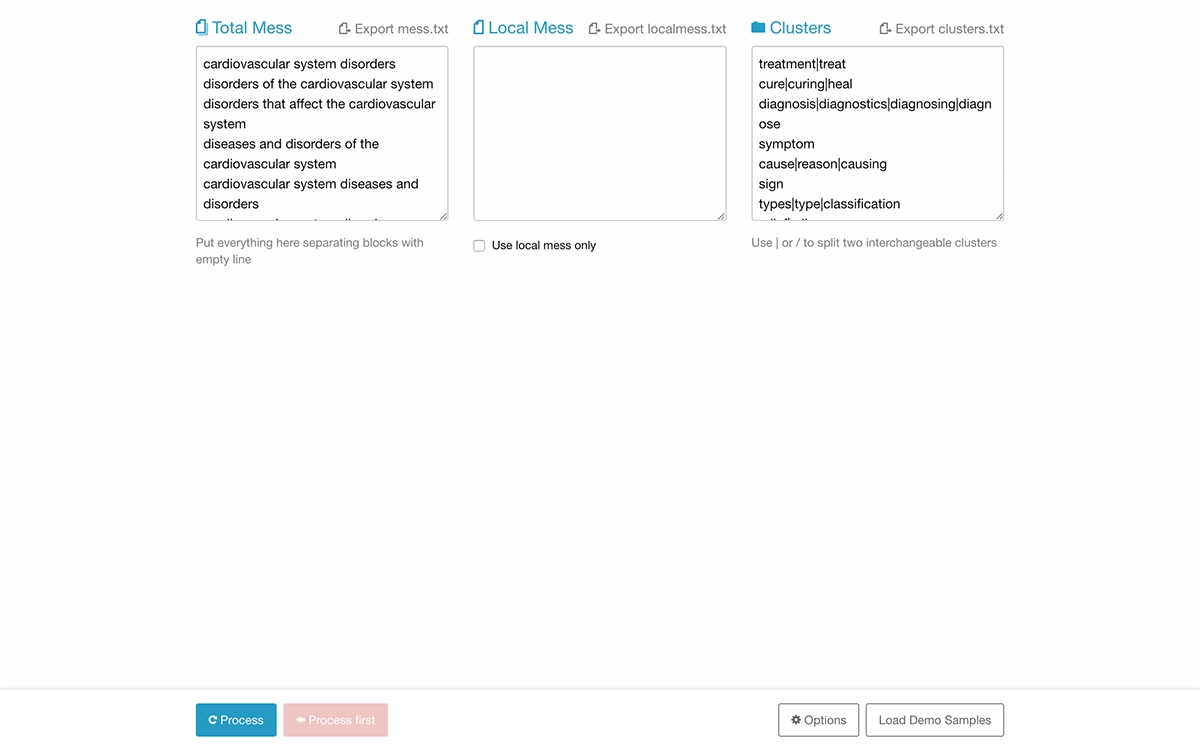
The only requirement for the source input data (Total Mess) is to separate query blocks with empty lines.
This requirement allowed to generate dynamically an interactive table of contents, and use it to copy chosen blocks into a separate input area.
This requirement allowed to generate dynamically an interactive table of contents, and use it to copy chosen blocks into a separate input area.
In the app, a user can isolate some blocks of data to work on separately by clicking checkboxes. It eliminates the need to edit source input data if a user needs to do some minor adjustments.
That said, if a user does need to edit source input data, it's also possible to save those changes by exporting the whole thing in a TXT file.
Though it wasn't entirely necessary, I've also added a bar chart to visualize the result. With the chart, the user can assess, at least roughly, the correctness of the result at a glance. It allows making further decisions whether the data should be altered before next processing.
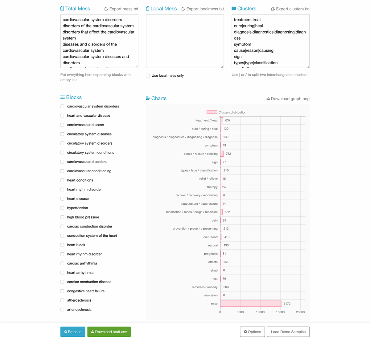
I also added options for renaming downloadable files before downloading them because browsers don't show Save As dialog by default.
Of course, files could be renamed later, after downloading, but finding them can be troublesome, especially if you download several files in a row and saved them to the cluttered Desktop. Duplication can also cause some inconveniences.
Issues with the first UI version
• The placeholder, nondescriptive headings.
• The interface definitely lacks focus.
• It violates several Gestalt principles makes UI even less obvious.
• The user is guided only by elements' contrast at best.
These are the issues that describe the problem with the UI in general. Devil is, as always, in the details.
Details and reasoning
The core UI elements that are absolutely essential for the app to work are input for Source Data, input for keywords, start button and a download button. Everything else is secondary.
Buttons are on the panel that floats above everything else to be accessible at any moment to avoid "Out of sight - out of mind" problem. So, this should prevent a user from searching for primary controls all over the place.
Primary input elements should occupy the most space on the screen to provide convenience for editing if it's needed.
As it turns out, the chart provides not only helpful information about search queries distribution but also all sorts of visual feedback. In addition to the progress bar, it provides even better visual feedback when the process finishes. It is the largest, the most noticeable indicator.
So, it is another UI element to give a good amount of attention to.
So, it is another UI element to give a good amount of attention to.
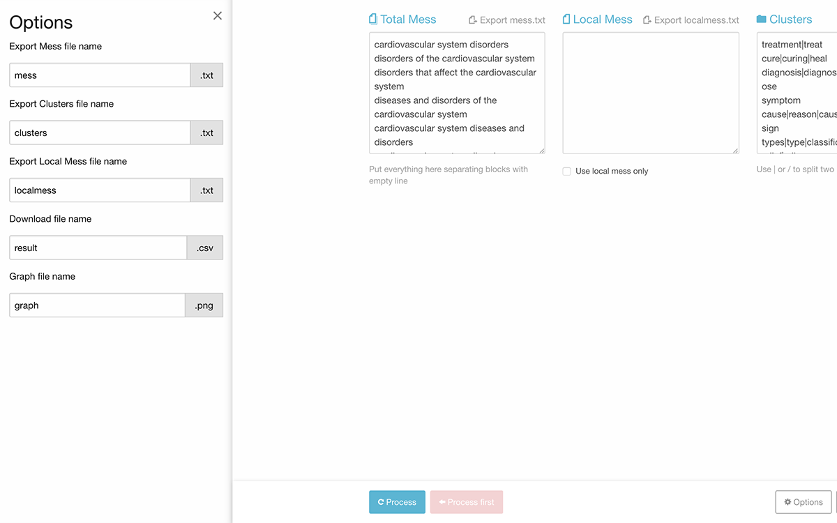
Renaming options should be always visible to be somewhat useful. Moreover, each field should be placed next to corresponding download or export button. As long as options panel contained only fields for files names, it is not necessary anymore.
In the first version, I've put progress counter into download button, for whatever reason. That unwise design decision means that download button should be visible all the time and it should be disabled until the process is finished.
Newly redesigned version
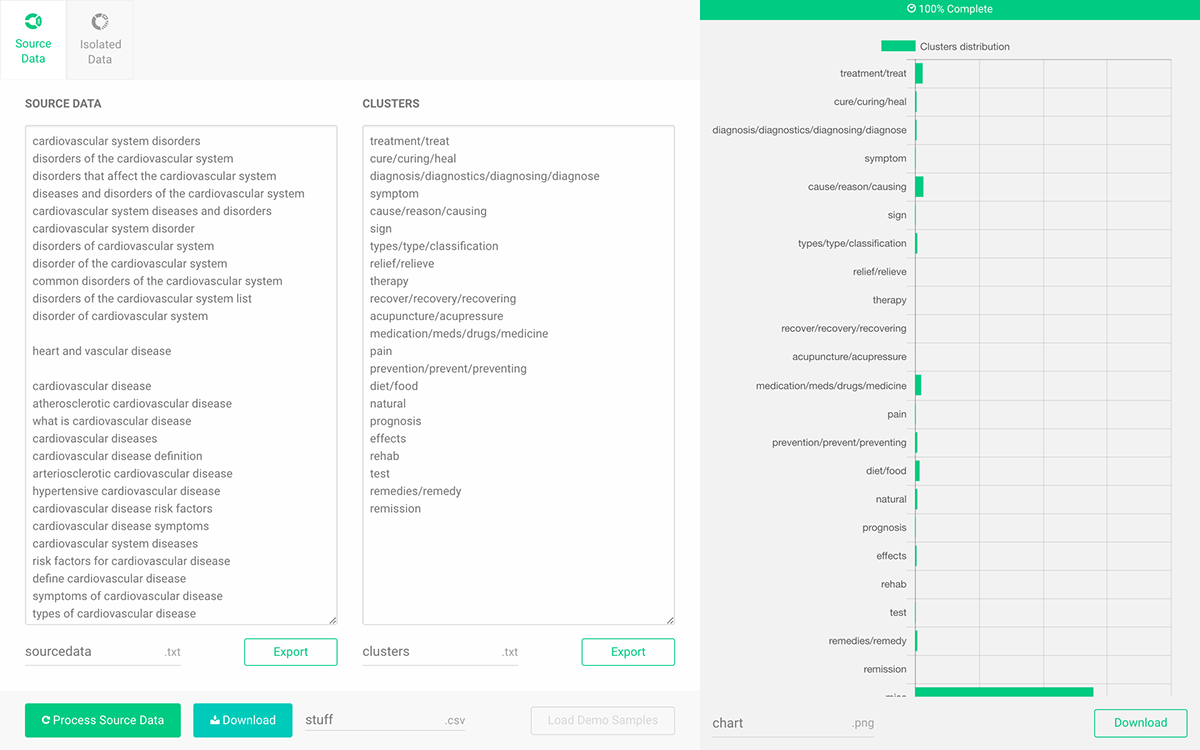
New UI version brings more focus to each of use cases by separating them into tabs.
The chart is always visible to provide context and feedback for user's actions.
Contrast and visual elements grouping bring order and sense of direction to the interface. Now it should be absolutely clear what to do first and where to click next.
The progress bar is now a separate element, as it should be. Download button does not appear on the screen until the processing is finished, this also leads to less confusion.
Tab with isolated blocks is also hidden until the processing finishes.
New Drag&Drop from the Desktop feature, that can also improve productivity a little bit.
Possibilities for further improvements
All the processing occurs on the client in a browser, the server is not involved at all, except serving the interface and scripts. By adding Service Worker API it's possible to create an offline first experience, so after the very first load user won't even need an internet connection to work.
If we go down this root even further, the web app could be turned into a Google Chrome app or a desktop app with the help of Electron Project. It opens up a whole bunch of new possibilities and features like proper access to the desktop file system.
Final thoughts
Design is not only about making things look better, it's about making things work better and, as a result, make people more productive, make them feel better about those interactions and themselves.
“Design is only subjective if you’re too lazy to make it objective.” — Dan Mall
Thanks for your time.


