


CONTENTS
CORE VALUES
BACKGROUND
A MONOLOGUE ABOUT MY WORK
CHAPTER
01/ 100 Words to revolutionize your life
02/ Materials for Design
03/ How digital photography works
04/ Transparent house
05/ MUJI Design
06/ How music works
07/ Tsunami 311
08/ A Guide to Wang Da Hong’s Architecture
09/ MY DEAR BOMB


核心價值
書本重製的概念核心在於,善用設計的能力來從事美術創作,與以往的設計印刷品區別在於,藉 由藝術的原創性昇華設計品的價值。會選擇以書本來從事藝術創作,優勢在於,書本自身就是一 個就算設計結合藝術,也完全無違合的場域,運用美術精化;再與設計規劃輔佐,達成重製初衷 的淘汰性。
Core Values
My recreation of book covers focus on the use of design ability. Differing from the original cover, the artistic design raises the value of the work. The advantage of using a book cover as a material is that it’s a modulate medium for designing and art. The recreated works combine the concept of designing and art.
背 景
作品投射作者的背景故事始於;一個決定轉唸美術系的視覺傳達設計系學生開始。在唸完快三年 的視覺傳達設計系裡,我領悟的對自己發問,對於初衷的美術系是否值得一試?掙扎於設計與藝 術的場域裡前者帶給我成就;後者帶給我快樂,在升學時我決定已實用性較高的設計系開始,後 期才開始追求想完成的快樂,雖然這個規劃看似多花了點時間,但回顧美術系也帶給我不得不經 歷的因果成就,若先不談細節收穫,舉關鍵的例子我想,果在於最終我也徹底利用畢業製作來完 成我對這兩個領域的所學。
Background
The reason my work involves designing and art i s due to my pursuit of education. I used to study Department of Visual Communication Design, but after three years of learning, I asked myself, isn't it worth a try to do my personal favorite, Art. This thought hits me because designing brings me the content of self-fulfillment, and doing art works makes me feel happy. Finally I decided to transfer to college of fine arts(Department of Art?). It took me few more years to study, but in return, I gained lots of valuable experience. After all, I put all I learned about these two areas to complete my final works.


與自己創作的獨白
我想以觀者的角度來一一解構包含在創作中的幾點核心重點。從創作為何是書開始,到理念與素 材的理由。對於創作的起點我明白該善用學生的優勢創作,在現階段的創作是自由的,更該天馬 行空,這階段的我不必擔心材質的侷限、複製作業時的可能性、與作品本身對市場接受度的檢驗 ,能夠排除這些條件以外的身份創作是我目前最大的幸福,原因在於我的創作若歸類為設計還真 的不是個好設計,不方便量產製作,視覺的主觀性強烈,還有待市場檢驗,但若以藝術品來分別 ,又太過擁有設計感。所以我的結論是利用設計把書本封面當作藝術品製作,設計的領域裡我採 用較多材質變化搭配文字編排,藝術領域裡我以手工製作近半立體的作品搭配。換言之也可說是 把平常最常見的複製品製作成獨一無二的藝術品,這樣的創作方式我認為也直接正式的昇華“書 ”的價值,原因在於市面上的書本設計考慮到的基本因素之一在於方便量產,在可以大量生產的 前提下,也使得印刷品顯得較為廉價,但對書本以在創作藝術品精雕細琢的態度呈現的話,雖然 世上僅有唯一一本,卻是價值連城,但前提在於實驗性的重要,否則這樣創作其實也直接扼殺書 本為傳播性的本質。
A Monologue about My Work
Here I want to say that I’m actually very lucky. My works are hardly good ones in terms of designing. They are not easy to put into mass production and I don’t know if they would ever hit the market. They are not completely art works either. As art works they involve too many elements of designing. However, the advantage, I think, of being a college student is that, we should let our imagination fly. I don’t have to use certain materials or worry about the difficulty of mass production and the acceptability of the market. Without these constraints, I try to turn an ordinary book cover into a handmade art work. In the designing part, I put different materials along with different cover layouts. In the artistic part, I turn a flat cover into a tree-dimensional work. By doing so, a usual replication is turned into one of a kind which directly adds up some values to it.
理念與素材的理由 我的個人創作基於市面上現有的書籍,目的為了表達自己的創作手法與向原作者致敬。
Concepts and the choice of materials My works are basically based on existing books to show my own expression and to pay tribute to the original authors.
1 / 阿德勒-接受不完美的勇氣 100 Words to revolutionize your life
2 / 設計師的材料學 Materials for Design
3 / 相機解剖How digital photography works
4 / 透光建築Transparent house
5 / 無印良品的設計MUJI Design
6 / 製造音樂How music works
7 / 東日本大震災記録写真集Tsunami 311
8 / 王大閎-永恆的建築詩人A Guide to Wang Da Hong’s Architecture
9 / 山本耀司-MY DEAR BOMB MY DEAR BOMB

阿德勒-接受不完美的勇氣
此書是本容易讀的心理學書籍,以阿德勒的角度來解釋心理學,會讓眾人質疑是否太過簡單,而 阿德勒表示:「所以簡單有什麼不好」。這句話確實令人醒悟,也是喜歡這本書的原因之一。本 書製作以單純的“白”體現對哲學的想像,主畫面以阿德勒的肖像製作紙雕作為主體。
100 Words to revolutionize your life
This is an easy-to-read psychology book. Elaborating psychology from Adler’s point of view makes people wonder if it’s too simple. However as Adler said, what’s wrong with all the simple? This is what inspires me and why I choose touse this book. I use white color to show the imagination to his philosophy along with his portrait on the book cover.


設計師的材料學
關於本書的背後故事,是一連串的巧合與緣分,在本書構成的四種天然素材中,頁岩剛好是一種 與別種類別的岩石相較容易處理與切割的岩石,現在想起來如果沒有上一趟旅行中從南投把它帶 回來,或許就不會有這本書的誕生,而這本書的重要性正是決定我畢業製作方向的第一個作品。 本書利用四種自然素材呈現材料學多樣性的可能,在以書腰做書名與文字敘述。
Materials for Design
Four different nature materials are used to make this book cover. One of the materials is shale. If I didn’t bring it back from my trip to Nantou, there wouldn’t be this book in the first place. All the works I have done are inspired by this book. These materials from Mother Nature show the possibility of materials science and I put the book title and description on its tummy band.


相機解剖
透過時間的流逝我們會慢慢發現,物品的革新與汰換正在不停地進行中,抽屜裡的深處躺著再也 不被使用的數位相機,在這番拆解的過程中,我見識了它的精密之處。本書是以介紹相機構造的 書作為設定,將相機的構造嵌入書面上,以呈現配件與書一體的完整感。
How digital photography works
I use the components of my decommissioned digital camera as the material on this book cover. When I was decomposing the camera, I realize how exquisite it was. I put the components on the book cover and show how it’s supposed to assemble. This makes the book consistent from the inside to the outside since this book is talking about the structure of a camera.


透光建築
這是九本書中唯一一件沒有使用市面書籍的創作,但結合了自己的假想與設定。在近代建築中越 來越常見到建築的設計為了利用光影變化為住宅的生活品質加分,而設計的透光建築,通常以建 築師善用玻璃透光的特性來達到效果,我的構想是如果有那麼一本書籍是專為這類建築而介紹的 ,會是本實用的另類建築書籍。本書的製作手法是採用玻璃來襯托透光建築的主題,再來封面部 分的兩張照片是採用攝影師好友拍攝的住家建築,而此建築正是他父親操刀的設計,上方的照片 為建築整體,下方的照片為建築細節,除了書名外的下面兩行內文敘述,是採用最近購買的書籍 PALETTE No.6: Transparent中所提到對透明度非常重視的兩句話;There's a great depth in transparency as it is the representation of light. Transparent objects reveal themselves as light hits them and transform as light dances.;「透明度是一種偉大的深度,因為它是光的表 現。透明物顯露自己作為光線的媒介,並轉化為光的舞蹈」。
Transparent house
This book actually doesn’t exist. I imagine, if there was a book talking about transparent houses, it would definitely be interesting and useful. I use glass to represent the image of transparent house and two pictures from my photographer friend. The construction in the pictures is designed by his father. The description below the book title is taken from the book PALETTE No.6: Transparent. According to the book, it is a very important concept when it comes to ransparency. “There's a great depth in transparency as it is the representation of light. Transparent objects reveal themselves as light hits them and transform as light dances.”


無印良品的設計
回到純設計的領域來談,這是九本裡唯一有可能性做到量產的作品,這本看似最簡單的書籍,其 實最能表達我對平面設計已被局限在某種程度上的看法,早期的我會害怕好看的排版設計終將被 飽和,好看的設計是否會被侷限於在某一類的風格當中不斷的在被模仿被複製,而現在的我相信 差別只在細節當中,而你有沒有比別人更用心。本書的製作方式以描圖紙印刷成書衣搭配六張生 活中所拍攝的相片。
MUJI Design
In terms of designing, this cover is the only one that is possible to put into mass production. This book seems to be the simplest one on the design. Actually I think graphic design has come to a choke point. I used to think all the good designs are just in a loop of repetition and replication. Now I believe it’s all about the details. Details make all the difference. I use tracing paper for the book cover and six pictures of daily life.


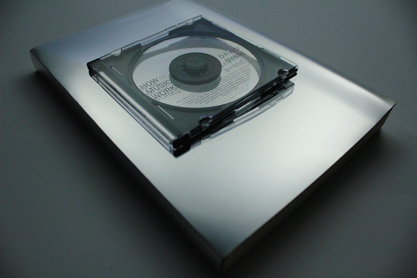
製造音樂
再決定要設定音樂類別的書籍後,我的腦中就立刻出現此刻成品的打樣,也許是經驗帶給我的便 利,不管是不是,我的感觸是在腦中累積作品的數量很重要。本書採用鋁銅紙,利用反光的特性 替代CD的質感,再以挖空的CD盒製造虛實的假象。
How music works
I had an idea about how it should look like the moment I decided to recreate this book cover. Perhaps it was my experience talking or I just happened to have an inspiration. No matter which that is, my conclusion is that, it’s very important to have enough existing works in mind. I use Aluminum and copper sheet to represent the texture of CDs, and a hollowed CD box to make it look like there’s a real CD on it.


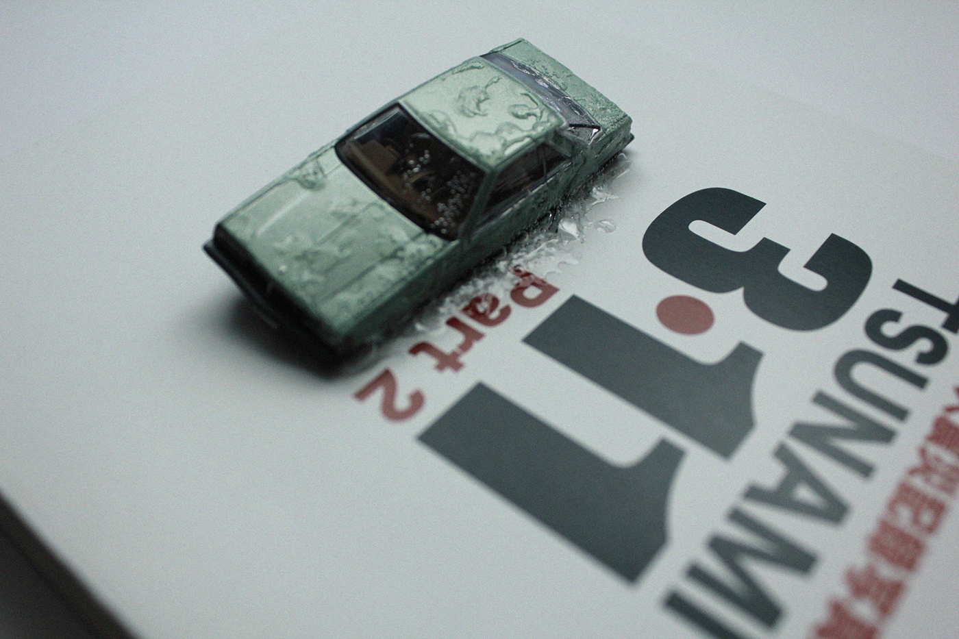
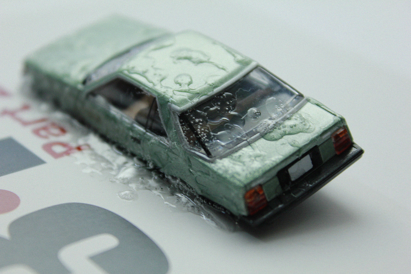
東日本大震災記録写真集
我想我與這本書籍有特別的緣分,去年的我無意間在咖啡館翻閱過此書,當下只覺得很想購買, 但經查詢因已絕版而作罷。一年後因為畢業製作,讓我有機會製作這本311東日本大地震的紀念 寫真。這本的打樣經歷過三套版本最終才選擇了白底,顧慮的因素略分為兩點;一是白底巧妙襯 托了日本國旗的底色,二是留白給予觀者的想像空間。在主畫面的排版中放置一輛正在下沈的國 產車,是一件需要觀者發揮想像力的作品。
Tsunami 311
Last year, I saw this book in a Café. I wanted to buy it but I couldn’t because it was already out of print. Now since I have a chance to recreate book covers, I choose it to be one of my works. I tried three different colors before I chose white color as the background. There are two reasons I did so. First, white color is the background color of Japan’s national flag. Second, white color gives a space where viewers can fill it out with their own imagination. And the sinking car on the cover drives the viewers to use their imagination.


王大閎-永恆的建築詩人
這本是沈睡在我書架上已久的書籍,在剛開始製作書籍的階段時,並沒有想製作它的想法,或許 是因為這本書本身就已經設計得非常好看,加上設計者又是我欣賞的前輩,但我也有我想表達的 語言,這才選定了我的第8 件作品設定。此作品的排版與原書籍沒有太大差異,多出來的是採用 木條企圖排列側視圖概念圖像的中正紀念堂,我明白王大閎本人並不喜歡此件被修改過的作品, 但對後人來說,這的確是多數人心中的代表作,若以客觀的角度,這是在不自覺的時空中漸漸形 成的事實。
A Guide to Wang Da Hong’s Architecture
This book has been lying on my book shelf for a long time. At first, I didn’t want to use it as one of my recreation works. Perhaps it’s because it’s a well designed cover already and I also admire the author. However, I still recreate it because I want to express my feelings about this book. I didn’t change much on the layout, but tried to put sticks onto the cover on the image of Chiang Kai-shek Memorial Hall. It’s still his representative work in many people’s mind despite it’s been edited by the producer.


山本耀司-MY DEAR BOMB
有次幫忙學生製片拍攝劇照的空檔時,朋友與我隨口提到;我最近發現用黑色紙印四色黑發現莫 名的質感,效果非常美,當下我的想法是有機會也許可嘗試。在設定我的最後一件作品為山本耀 司的”MY DEAR BOMB“之後,本來就不打算更動它原本的設計太多,但要做到類似的效果, 印刷廠也不可能接獨立開版只為了一頁書面的實驗作品,於是採用較土法煉鋼的方式解決這個問 題,也就是上面所提到的黑色紙印四色黑的部分。雖然質感有些差異,但在創作上原本就也沒打 算要與原書籍做到一模一樣,還是希望與本尊能做出差異的質感與特色。再來要談到的是,山本 耀司的服裝設計師身份,決定了這本書上唯一加上去的物件。過程中我與同為服裝設計師的母親 在公司挑布,黑色布當中我選了三種不同質感的皮革重覆比對,最終才選定目前車上成品書面及 書背間的皮革布料。
MY DEAR BOMB
A friend of mine told me he thought it would show a good sense of quality printing black words on black paper. I take his advice and apply it onto this book cover. I did not change much on the style but use a different way to redo it. The only material I add up to it is a piece of cloth because the author is a fashion designer. I compared three different textures of cloth in black with the cover and finally find leather to be the most suitable one.


感謝 BranD 雜誌 NO.39期 邀請收入我的作品;“與作品的獨白”系列中的其中一本書面藝術設計“Materials for Design”,而這本作品也正好是整個系列的根基,當初正因先創作了這本作品,才以類似的概念去延續自己的畢業創作。經過了五個月的等待與流程,在昨日傍晚終於收到,這次書籍設計採用了三種不同顏色的郵包作為包裝。認識我的人應該都看過這本,如今它出現在雜誌上感覺還是很不真實。


