

Buytheway
Delivery of goods through travelers around the world

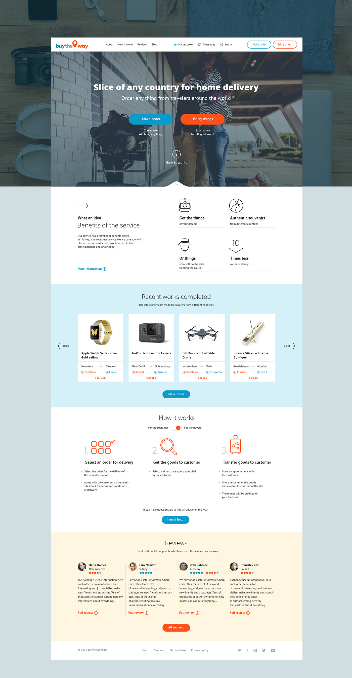
Idea of Buytheway
As you know, conventional delivery of goods from other countries is rather expensive. Especially it concerns long distances. From Australia to Europe or from America to Russia. Courier companies charge a lot for such delivery.
The main idea of Buytheway is saving money on goods delivery from different corners of the world. Travelers provide this opportunity. Any traveler can find a place in his/her luggage and earn on it. The customer of the goods saves money. And the traveler earns.
Task description
To create a convenient and clear service.
General Solutions
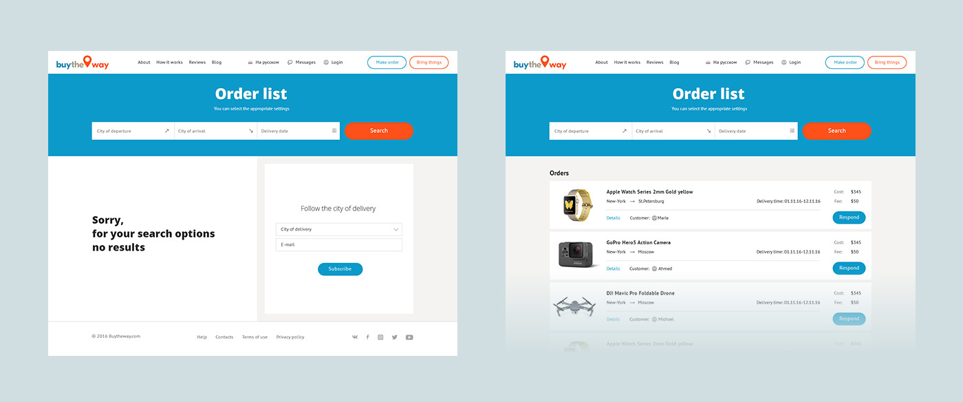
For a start, I analyzed business rivals and the market niche. After that, I created detailed wireframes. Lists of goods, personal cabinet, interaction between the buyer and the traveler courier. Various freelance exchanges, where the customer can find a freelancer for his project, partially served as wireframe. In our case, the customer could choose the flight direction and find a suitable traveler. The customer can order for goods and keep track of all activities through his personal cabinet. For travelers, this is an excellent opportunity to earn additional income through their luggage. Each traveler has a rating and history and this strengthens his loyalty.

Communication, Analysis, Wireframes
Long lasting communication with the customer, creation of a technical assignment, analysis of the audience and functional elements. All these led to certain results. At the analysis stage the following main functional elements were identified:
- Landing page standard elements are displayed on the home page: free registration, advantages, last orders, reviews, etc.
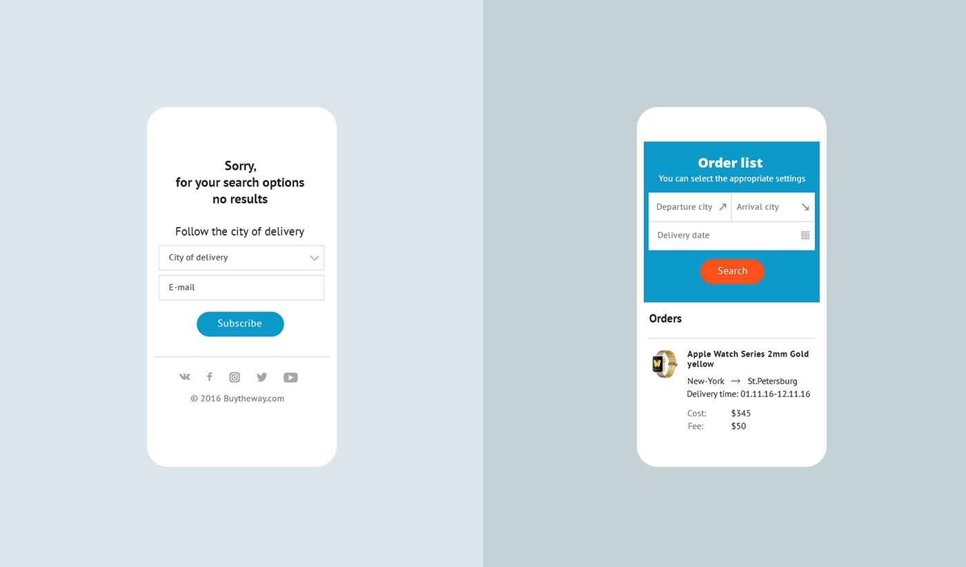
- Order lists and the order card were created. Both the traveler and the customer can view them and have their own features for control. Both of them have their own UX.
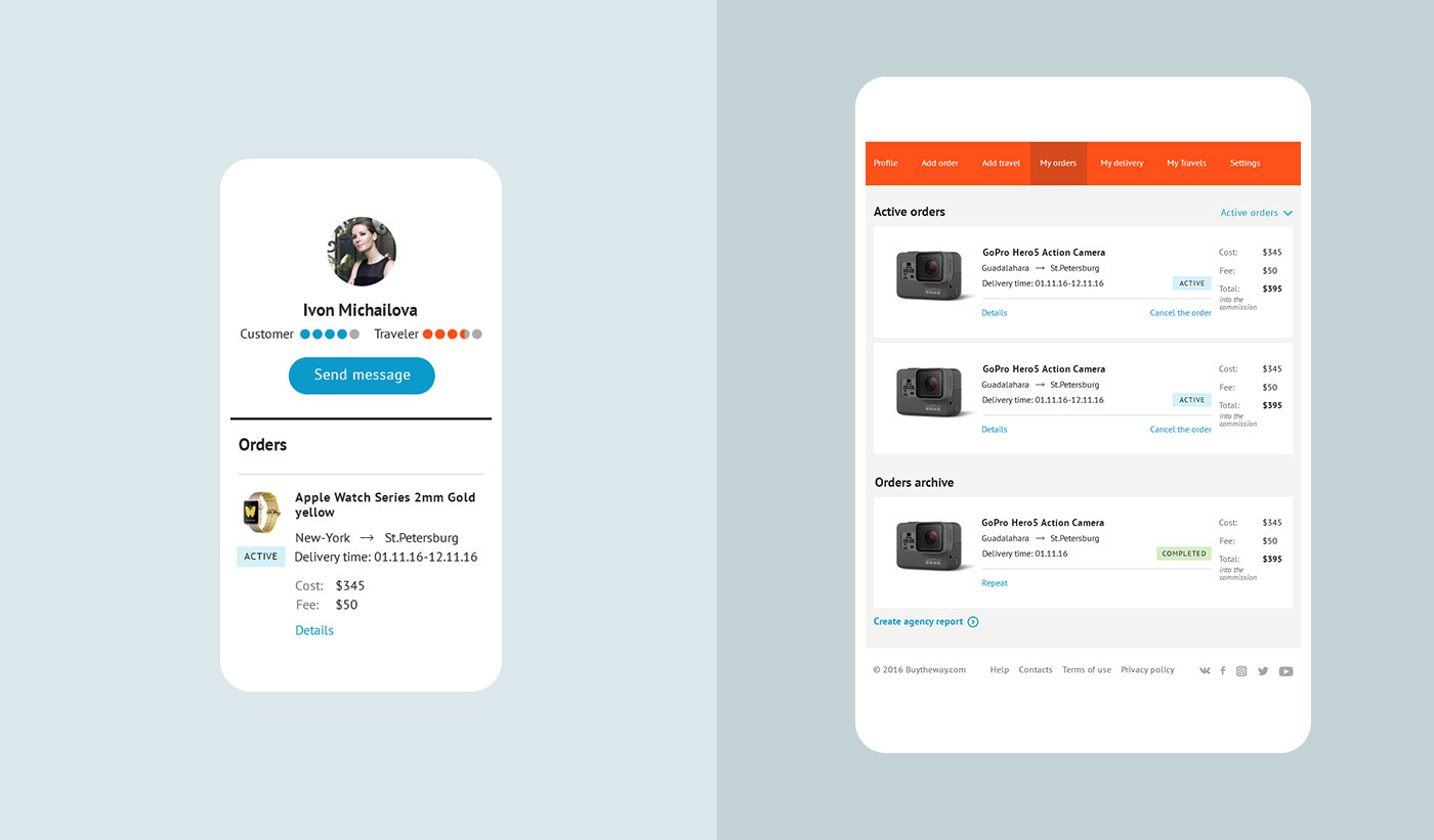
- You can see user's detailed information in his/her profile.
- Any user is rated - this is the way to improve the quality of services.
- A personal account with a large set of possibilities was created for both of them.
- Customers and travelers have a possibility to use the messenger on the website for convenience.
- A blog, fast chats, a currency converter, personal settings, unique functions, fast interaction with the interface by means of pop-ups and much more.
A lot of functions were designed. This is the list of basic features and it is very brief. At the stage of service launching two languages - Russian and English - are planned. To avoid problems with displayed length and size in texts, wireframes were created in Russian and design - in English.

A million of pop-ups and forms for fast and convenient interaction with the interface were created. Only a small part is shown here, otherwise the whole case would consist only of pop-ups.
- Registration, authorization, password recovery.
- Possibility to sign in or sign up through social networks.
- Order adding and response to the order. User rating. Ratings.
- Quick view of the order card.
- Thousands of templates for e-mail notifications
Each complex form, for example, order adding or registration, offers tips and a friendly interface. Correct fields are ticked. Multiple details were designed for convenient interaction.

Corporate Style
The service logotype was developed in parallel with features and wireframes development. We tried a few different options, and the main idea is the map point element. Workaround continued. Variety of fonts and colors.

As a result, all stars were aligned on one option; the result is presented on the company's letterhead. Three colors were used. Blue color in the service will be used for customers, and orange color - for travelers. This can additionally facilitate complex interface perception.

UI Design
All pages were created based on the analysis and prototypes. Two colors from the logo were used as the basis. Fonts, of course, are standard and rich in style to avoid problems related to displaying on the Internet and in language versions: PT Sans & Open Sans.
Absolutely all pages and elements have Full Responsive Design. It is convenient to view them on any device, despite the number of elements.


Pop-ups, Forms and E-Mail Notifications.
There is a small part of all forms and notifications below. Each field in the forms has a certain functional and graphical elements that make user's life easier. Some of the forms are displayed on a separate page, others - in the form of pop-up windows. But for the developers' convenience and for the purposes of future extension and changes in the service, all windows are universal and can be used in both versions.
All possible e-mail notifications were additionally created. Their width is standard for newsletters of this type and their font is even more standard - it is Arial. Thanks to such notifications users will always be aware of any changes related to their activities on the website. This is one of hundreds of High-quality Online Customer Service elements created for Buytheway.

Responsive Forms
Absolutely all forms are easy to fill out using any device. For example, for smartphones - it's a clean, comprehensive and modern interface.

Detail and Responsiveness
The service has thousands of interaction possibilities. Icons, buttons, windows, attached files, messages, tags, etc. - there are states for everything and everything is thought out to the smallest detail. Each element is a part of the overall design of the system. There are no problems with service expansion and new elements introduction.

Personal Account
The following general features were developed for users’ personal accounts.
- Profile
- Add order
- Add travel
- My orders
- My delivery
- My travels
- Settings
Each user can be both a traveler and a customer. All features are displayed in their Dashboard. To solve various disputes and complex situations quickly, a convenient online messenger was created.
Convenient mobile screens were created for travelers, who often use their smartphones to view something. This is another example of High-quality Online Customer Service.


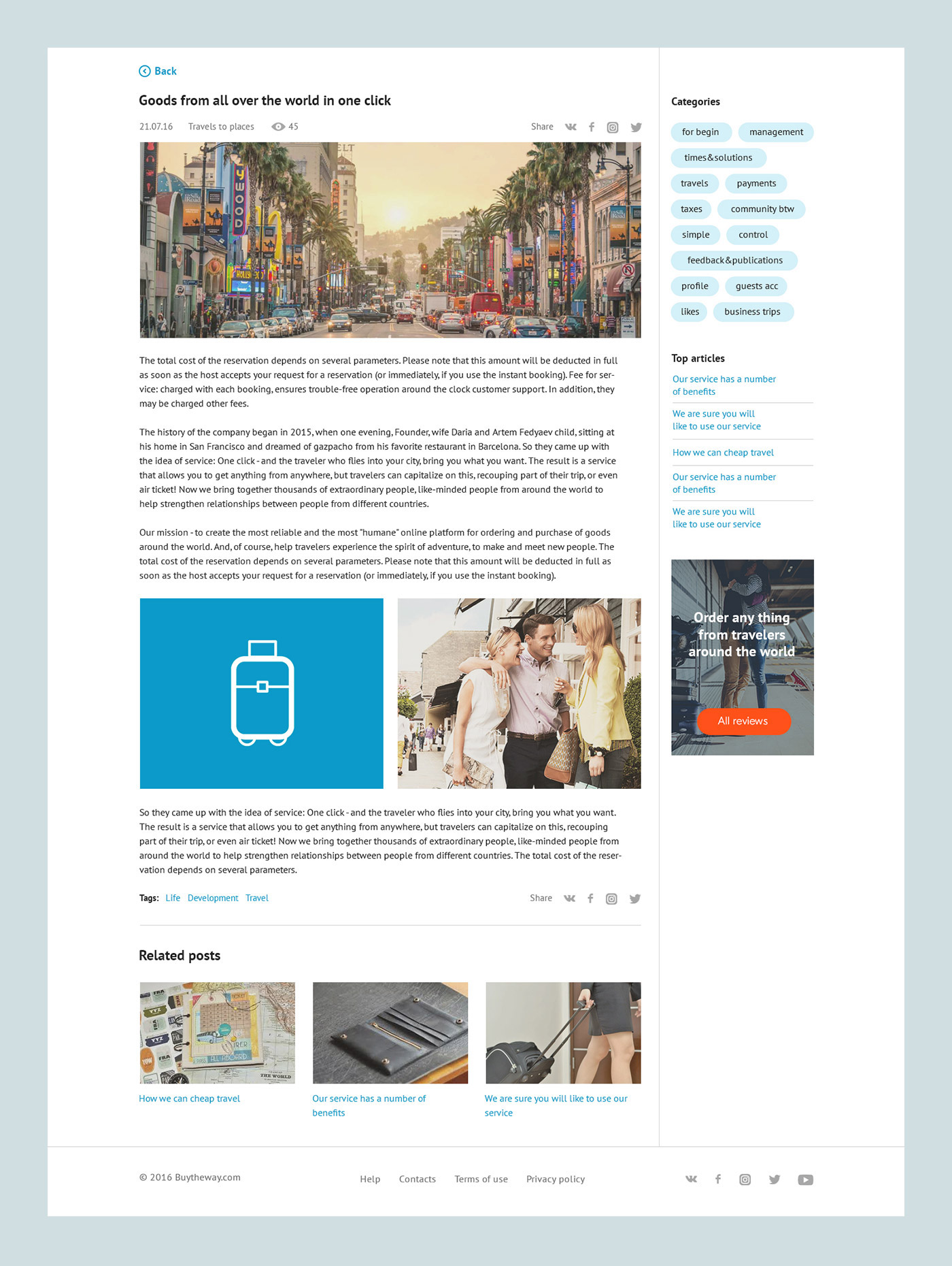
Blog of Buytheway
A blog with specific features was developed to promote and improve the quality of the service. The layout of the archive of articles is standard – the content is on the left, the sidebar is on the right. For universal blog management.
Everything in the blog is designed for the convenience of customers:
Date, time, views
Buttons to share in social networks
Categories and TOP articles
Tags and related articles
Headings, texts. Human-readable size.


Basic Layouts
If a user has questions, he/she should to use quick search or contact the support team. Before registration you can read reviews about the service or send a message by e-mail. All features of this kind are implemented in the form of basic service mock-ups.


What next?
The service is available at:
It has already been launched and tends to expand. Marketers are engaged in promotion and writing of articles. Travelers register and receive orders. UX Design service is tested and improved. The story continues...
This is how high-quality online services are created.


