Twisting Spirits
Systematic Chaos
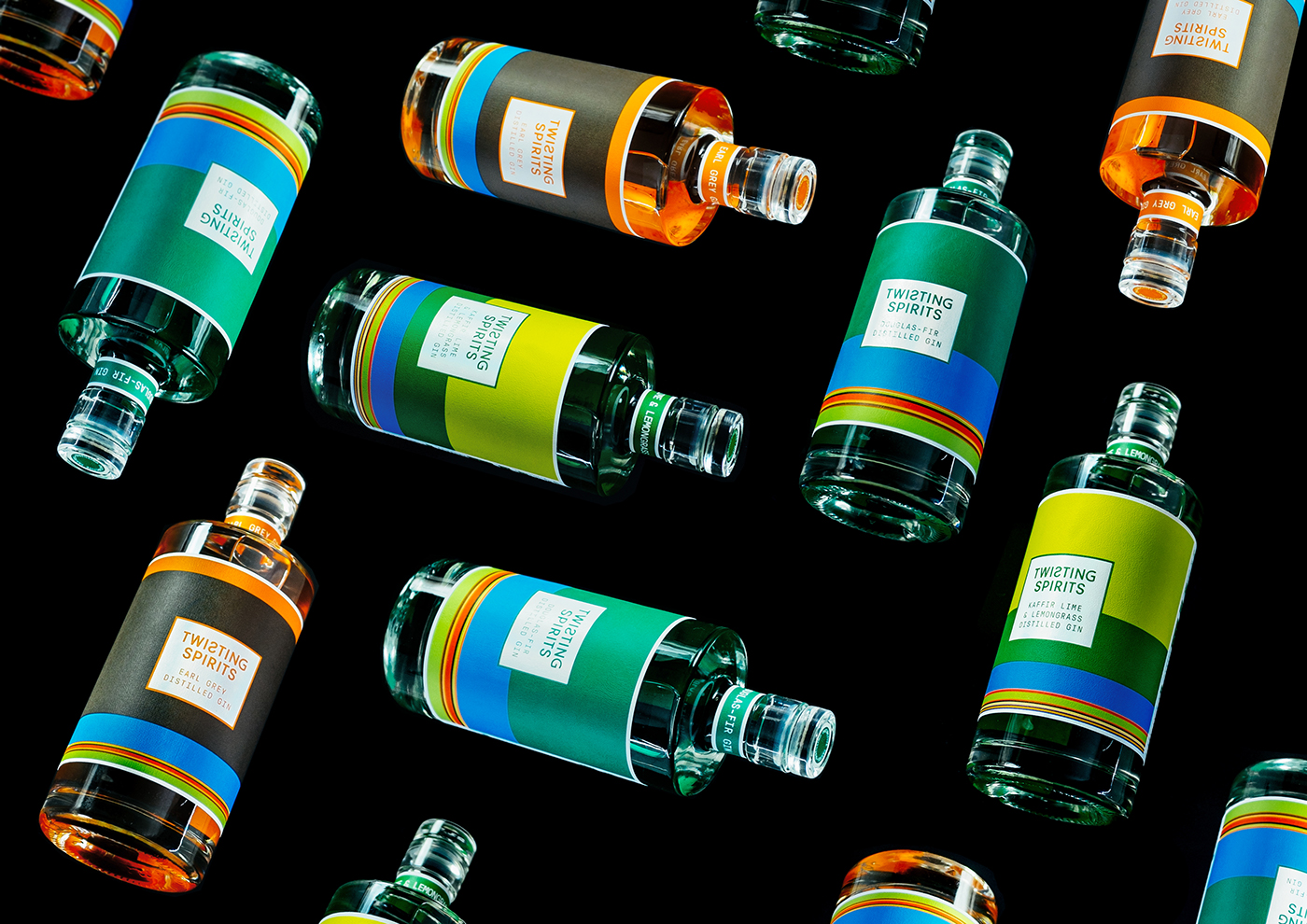
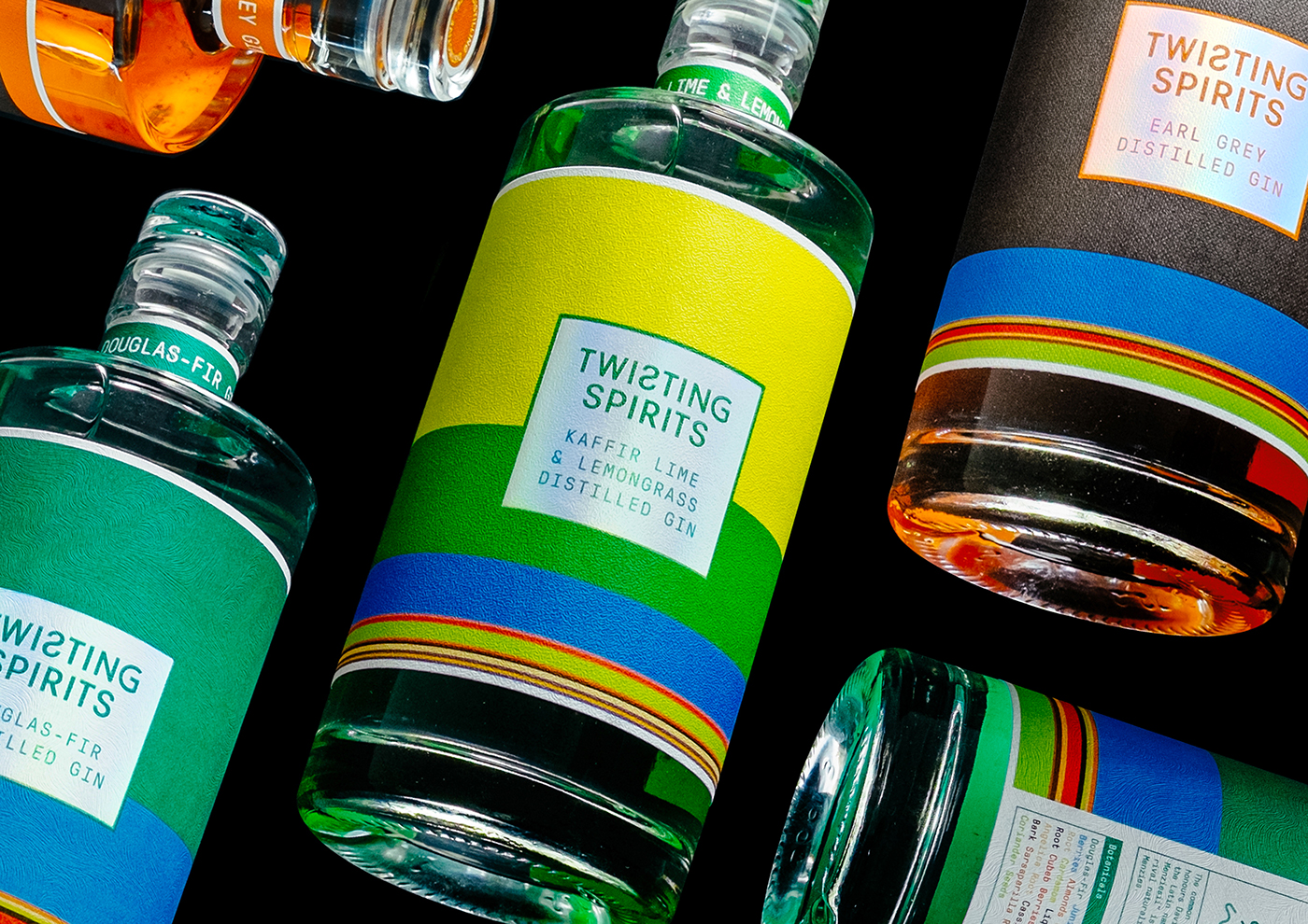
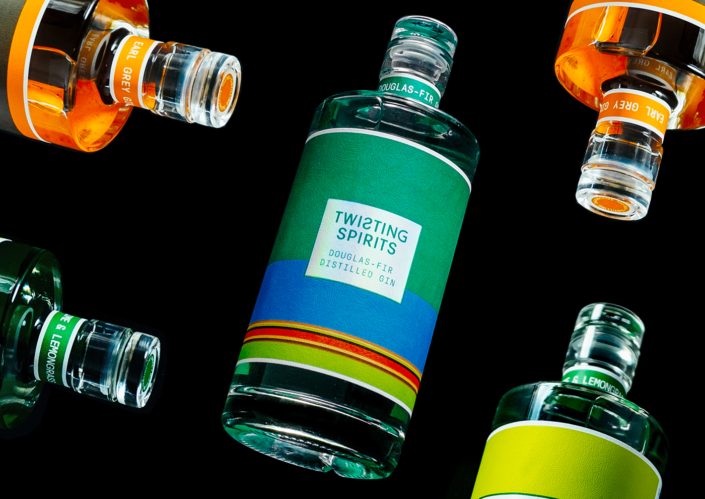
Twisting Spirits are IT geeks turned gin geeks, we wanted to take their love of data and apply it to the often traditional world of gin. TS's gins have very distinctive flavours we wanted the consumer to experience each flavour before tasting it, which is hard with a clear liquid.
We open sourced their ingredient data, representing every ingredient as a coloured bar, the more of it the bigger the bar. Each flavour is printed onto it's own tactile embossed GFSmith Colorplan, so it feels like it tastes.
As the palette is used to communicate the ratio of the ingredients, the chart is used to
determine the height of each stripe when all ingredients have their set hue.
determine the height of each stripe when all ingredients have their set hue.


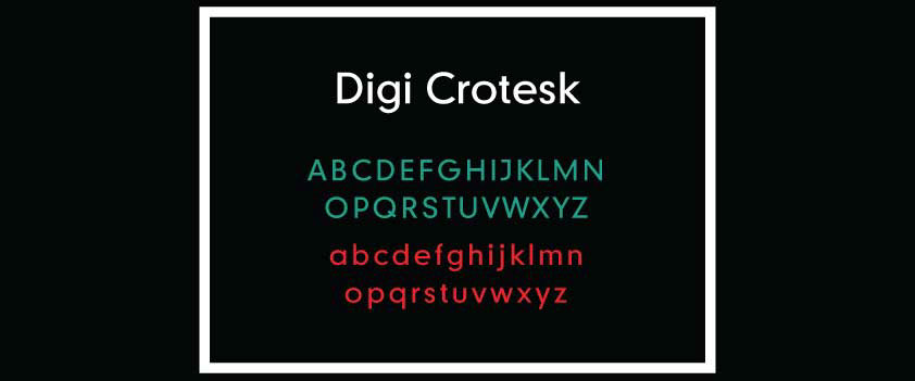
The font base we used to built the logo is Digi Grotesk.
It was the first computer font made before Arial,Comic Sans and Courier.


Printed in the method as the labels the range of business cards act like taster cards for the products, again subtly suggesting the tastes using our other senses.


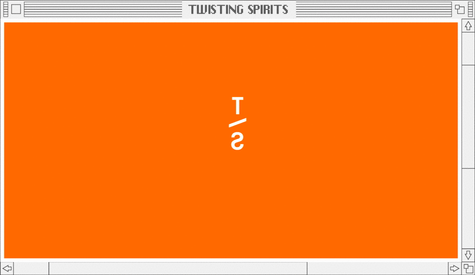
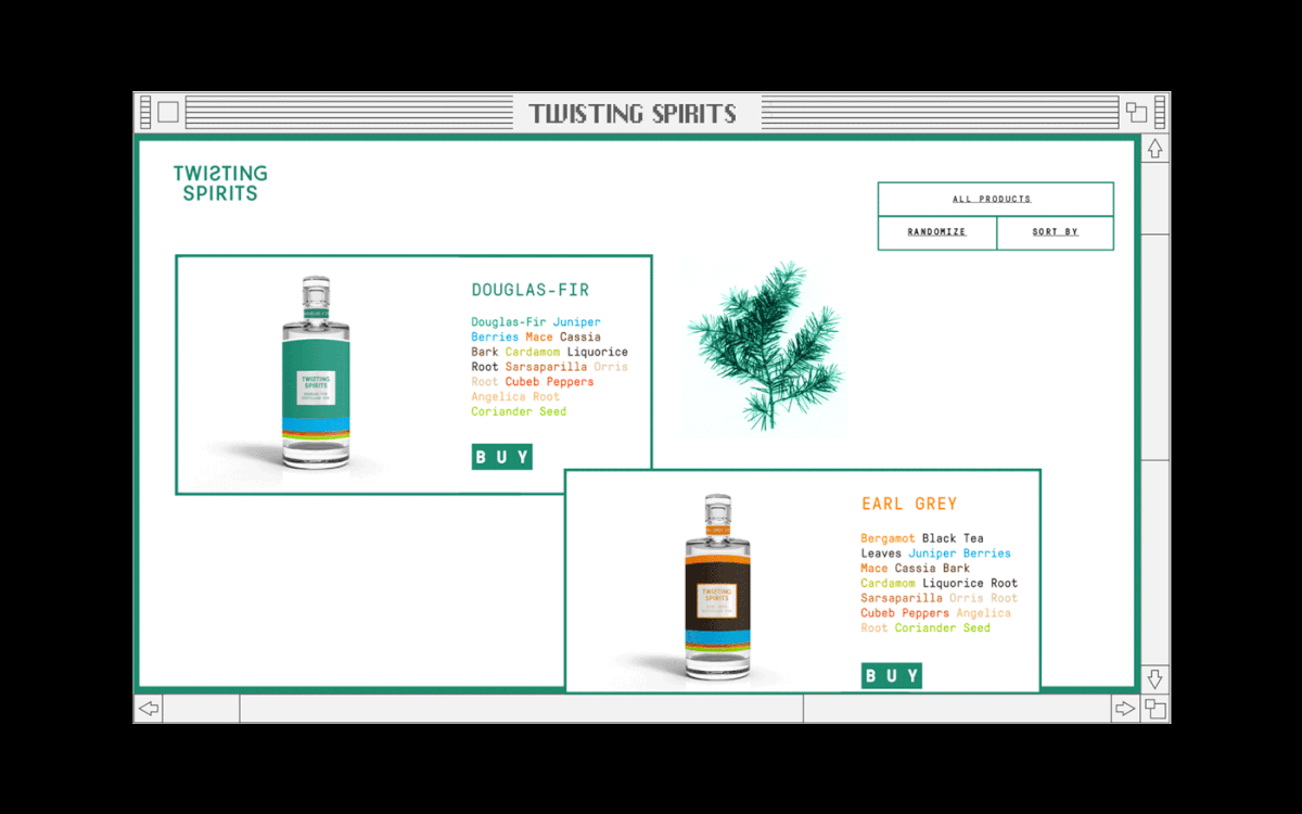
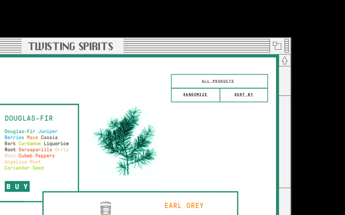
The website layout nods to the early days of the internet, a nostalgic loading page takes the user to the option of arranging the gins by their ingredient of choice, and there's a lot to choose from. It's a great way to discover what flavour the colour bars represent on the labels.