


Provoking Thought Through Film
Established in 2001, The Bureau is a Bafta-winning and Oscar, Cesar and Academy Award® nominated Film Production and Sales Company. Producing from London and Paris, The Bureau has made almost 40 feature films to date.
The Bureau looked to Alphabet to re-imagine and refresh their brand identity, infusing their core values into a new look and feel. From Brandmark and Typography to Print and Digital Collateral, our aim was to create a brand that was confident but didn't overwhelm the content, and instead, let it shine.


Three Brands, One Mark
Leaders in production and sales, The Bureau brand is split into three distinct strands; a production company in London, a production company in Paris and a Sales Agency also in Paris. The Bureau London, The Bureau Paris, and The Bureau Sales. Taking this into consideration, we devised a unique graphic system that allows the sub-brands to remain consistent, balanced and clear when working individually or together.

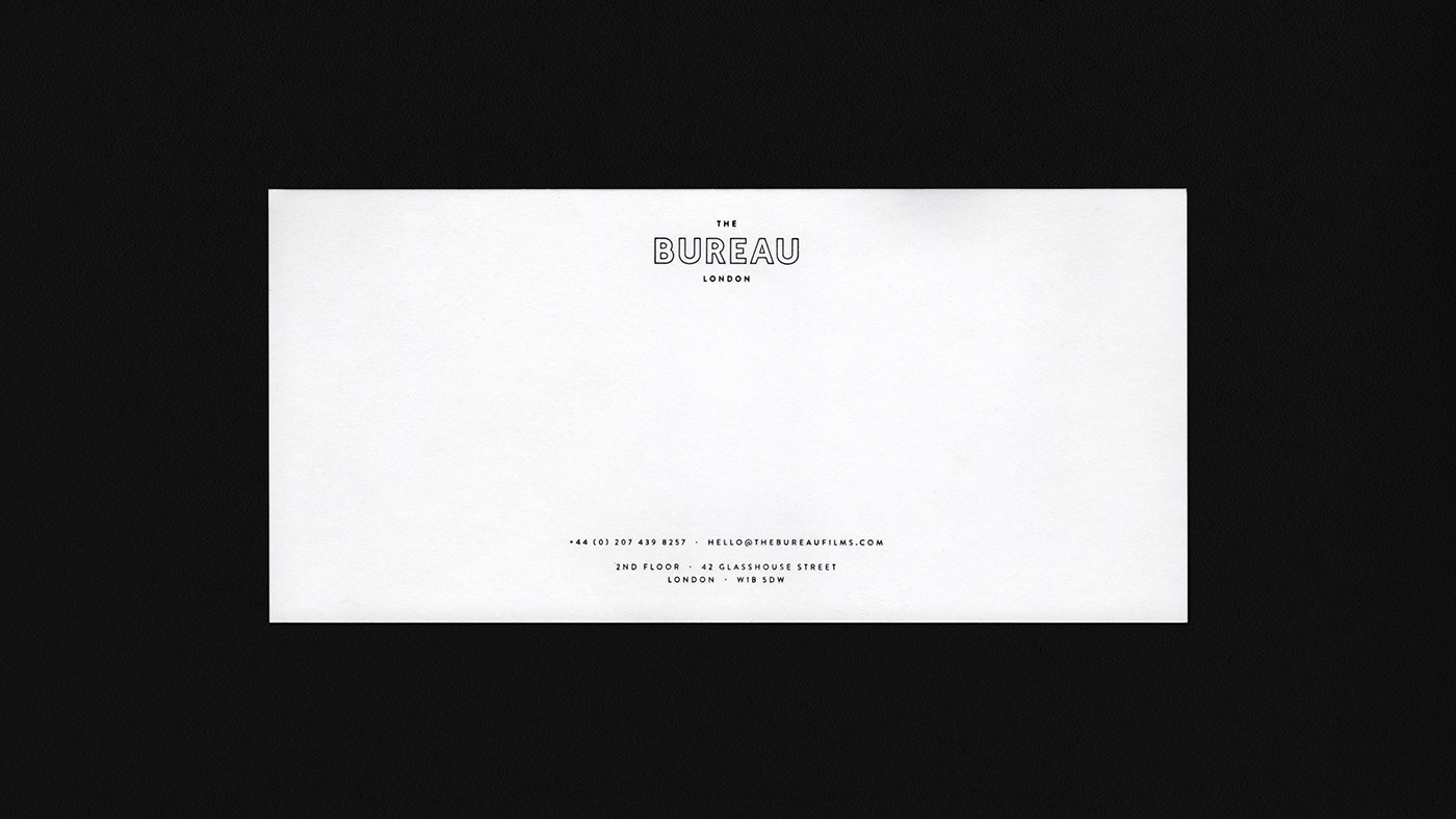

Timeless Composition
For the foundation of the brand, we created a clean and sophisticated look and feel that is highly versatile, and above all else, timeless. To reference the logo, we centrally aligned supporting copy to create a sense of balance throughout all typographic compositions. This is personified by the Stationary we created which was produced using a traditional letterpress print technique.

Telling Intelligent, Emotive Stories.
The Bureau is constantly striving to tell intelligent, emotive stories by working with the world's best writers, directors, and actors. To reflect this, our main focus was to use messaging to help build a clearer picture of each and every film within their extensive portfolio. The messaging we created was focused around well-written blurbs or reviews of films, with the core aim to keep the audience intrigued, without giving too much away. In contrast to the foundation of the brand, we used a bold headline typeface to help portray these messaging in a clear, instant and engaging way.


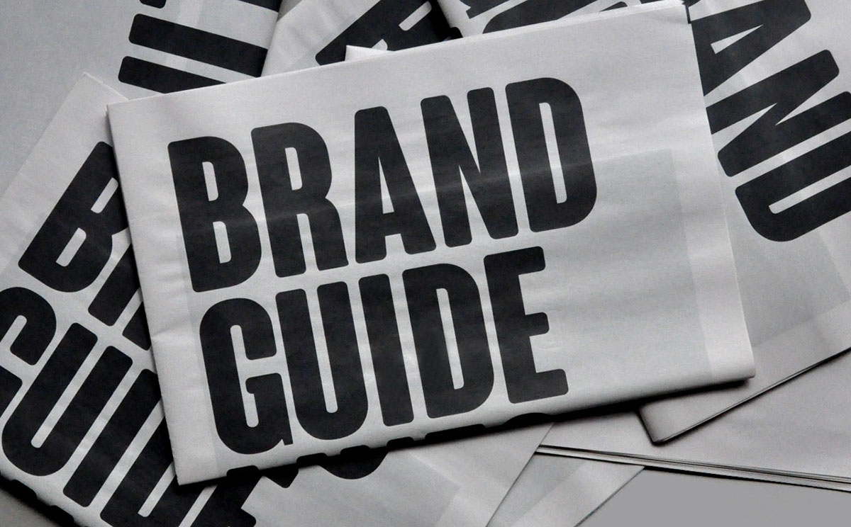
Digital Meets Tabloid
To wrap things up, we delivered a comprehensive brand guidelines document containing a complete visual overhaul of their physical and online presence. In contrast to the format of cinema, we wanted to use something that was a little more physical for the guidelines; a Newspaper to be exact. The juxtaposition of these disciplines turned out to be a really unique and stand-out way to display the brand fundamentals.
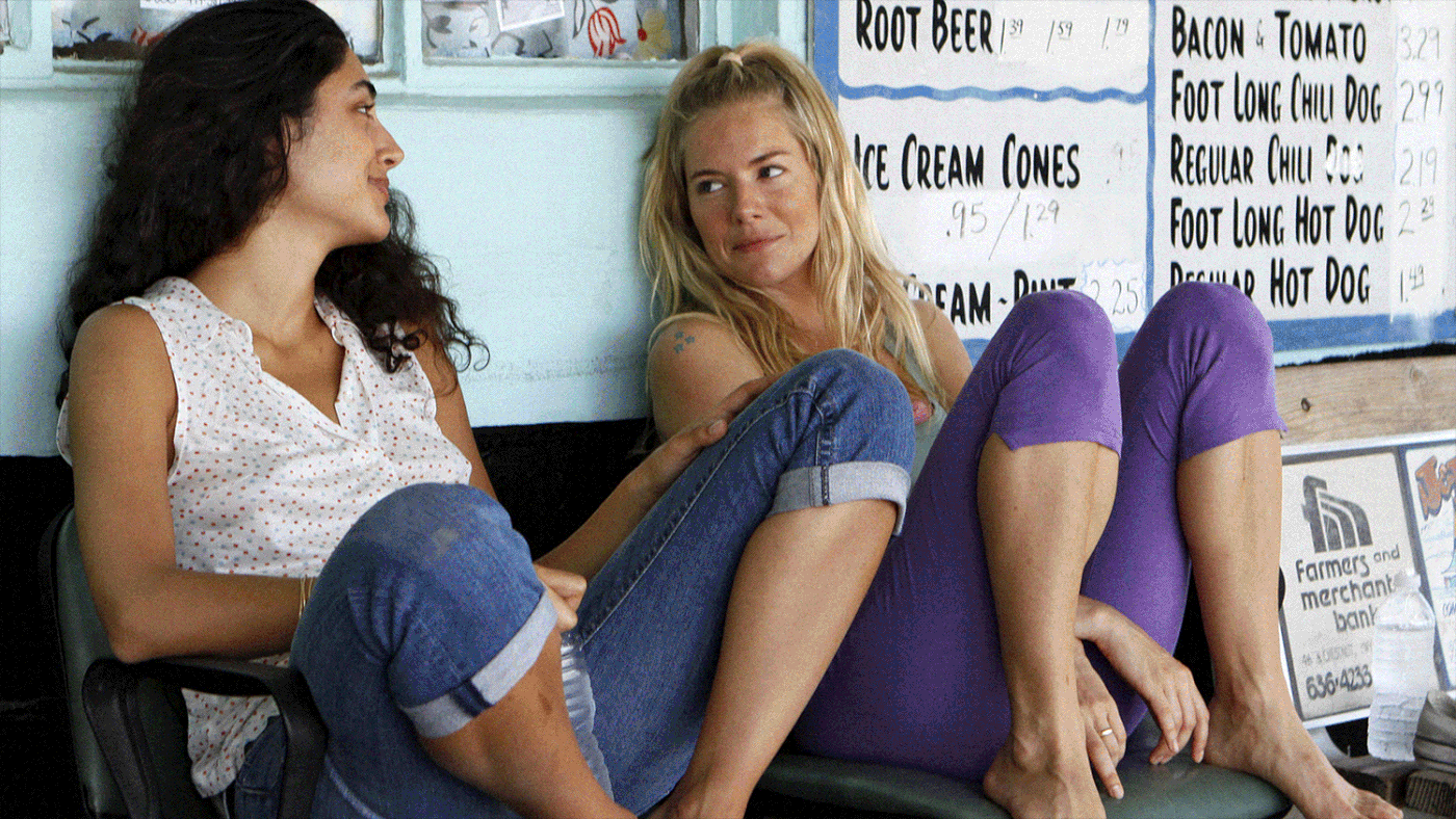
Content is King
At the very start of the project, we understood that it was important for the content to be celebrated through the entire brand. We focus heavily on using film stills from the extensive Bureau library as a focal point of not only the website but also bespoke pieces of prints such as Postcards, Press Notes and Line-up Brochures. We kept the images relatively untouched to reference the rawness of the diverse variety of content.

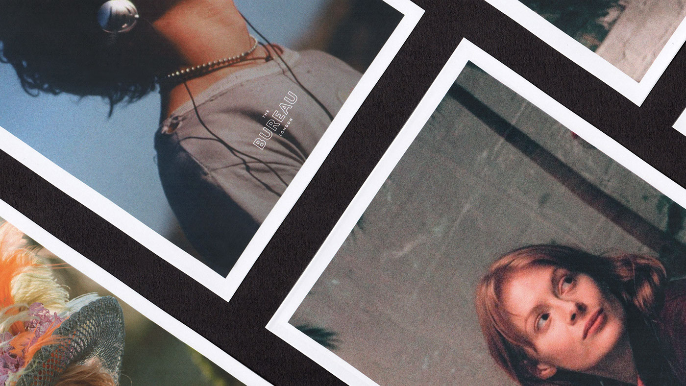

A Physical Library
To reference the vast digital library of cinema that The Bureau holds, we decided to create a physical version of this in the form of postcards. We created a series of cards that utilised the film stills on the front and the details on the reverse. These were then presented within a simple branded cloth-bound book to be delivered to writers, directors, investors and other people of interest as a physical portfolio piece.

Film in Print
We created a variety of print collateral ranging from Press Notes to Line-up Brochures for the key Film Festivals through the year. Including Cannes Film Festival, Venice Film Festival, and the European Film Market. Using the brand guidelines as a reference point, we devised a layout system that was versatile enough to tell the stores of a number of different films, each in a unique and engaging way, within one single publication. We created a bespoke iconography style which categorised the films from Pre-Production, Post Production, Completed and Archive.
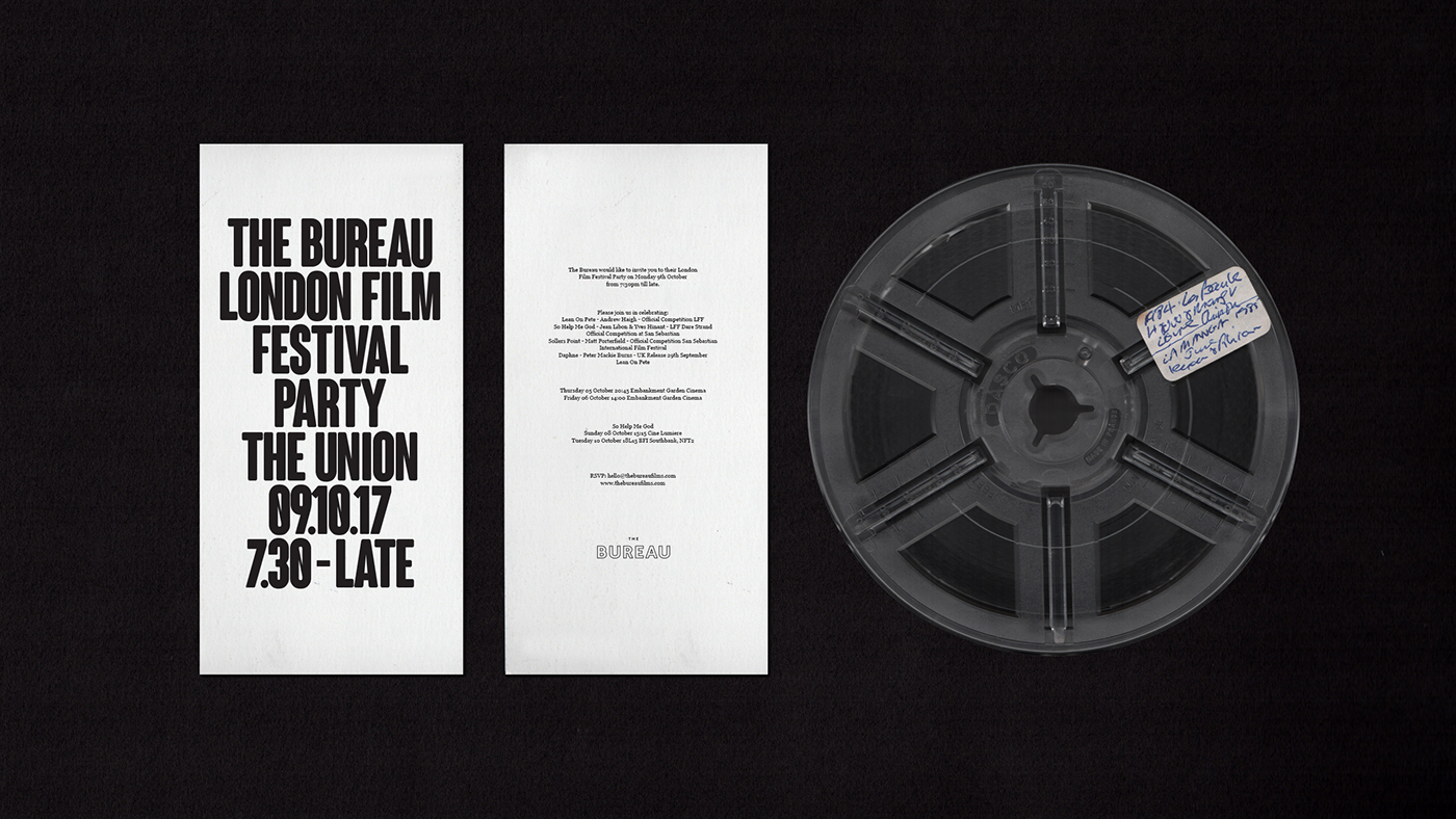
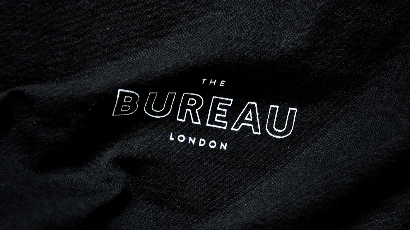

Bespoke Pieces
We created a series of bespoke one-off pieces for The Bureau including Party Invites, Tote Bags, and other Branded Apparel. The primary brand typeface allowed to create versatile pieces that held real confident stand-out value, whilst still remaining very much clean, professional and on-brand.


A Unique Web Experience
We worked with Colin Grist to design and develop a web experience that was fully bespoke for The Bureau brand. Some of the features include full-bleed responsive imagery, an extensive digital library controlled by a number of filtering options, and a bi-lingual feature that allows the user to translate all content from English to French at the click of a button.
Designing for the Big Screen
We worked closely with Rich Hinchcliffe to develop an animated version of the logo to be used as part of the Film Credits on the big screen. We wanted the brand to remain timeless, whilst still feeling contemporary and dynamic as it appeared on screen, so we played on the keyline aspect of the logo as a way of animated it in.

Thanks for scrolling
To see the full case study, visit our website;
madebyalphabet.com
Want to work with us?
madebyalphabet.com
Want to work with us?
hello@madebyalphabet.com
Copyright Alphabet 2017.All Rights Reserved
Copyright Alphabet 2017.All Rights Reserved


