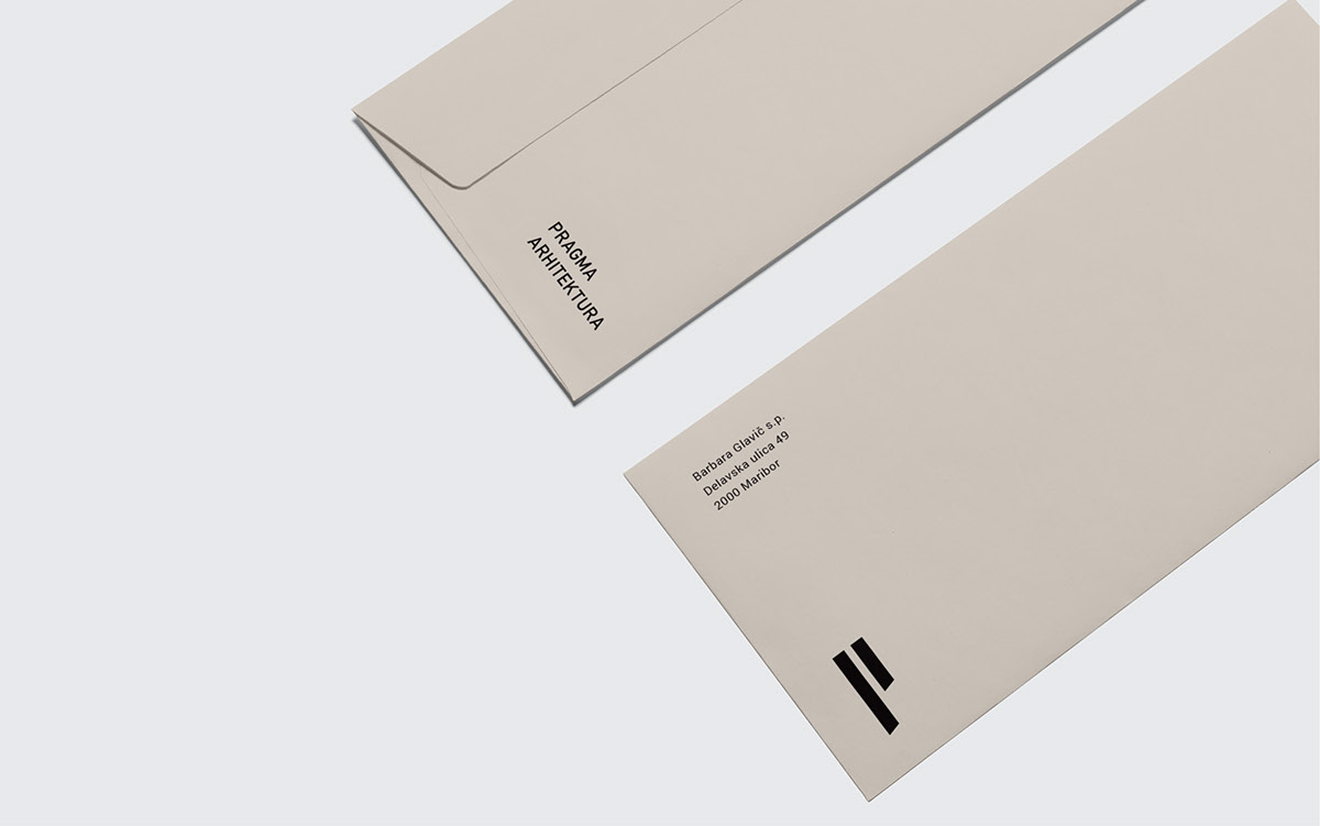
When designing a logo we considered the initial of the bureau’s name and its core business – architecture. We found our inspiration in the frequent use of horizontals in the customer’s portfolio and in the building elements as the basic elements of each construction. Straight lines and strong shapes have become the source of our thinking. We combined the first letter of the name with the idea of horizontals, where we shortened the second building element and by using simple forms designed the letter p.
Also the inscription PRAGMA ARHITEKTURA (if it is rotated) forms the same shape, so we decided to communicate both – the name of the architectural bureau in the shape of the letter p, and p, which consists of two building elements. By doing so, we cut the basic building elements at the same angle as it was cut in the letter A in both finishing words of the company name. We chose the combination of beige and grey. These two colours create a tone that is associated with commonly used materials – wood and concrete.