

This is Part 3 of a 4 part post on the logo graphics I created for a huge new candy emporium in Hollywood, California called “Sweet!”
Come back soon for Part 4—the final installment.
The design challenge in doing a logo for Yucky was to capture the gross nature of what this store was about—every form of revolting, sickening and nauseating confection imaginable—doing it with a sense of fun, but not to create a graphic that was itself repellant. This was a true challenge!. Then I remembered one of my favorite illustrators from when I was growing up: Basil Wolverton—the self-professed “Producer of Preposterous Pictures of Peculiar People who Prowl this Perplexing Planet”! If his name isn’t on the tip of your tongue, his “outrageously inventive” work (below) may be familiar:

It occurred to me that to design a logo in the spirit of his illustration might just be the ticket. After pondering this for a bit I decided that the central letter in YUCKY—a “C”—could be created as if it were a Basil Wolverton head, mouth wide open, and hurling over or through the letters to its right. The other letters surrounding the “C” could contain or support other items expanding on the revolting candy idea. And so I began my “homage” to the great Mr. Wolverton, starting with some very rough sketches:
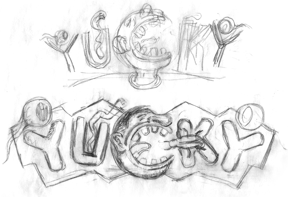
I liked where this was going, so I got a little tighter, developing the drawing a bit further:
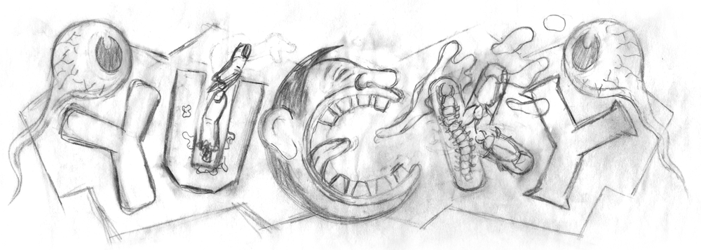
This was the point at which I presented this idea to my client, not knowing how he’d react. Fortunately, he was familiar with Basil Wolverton, and was totally in tune with my idea:
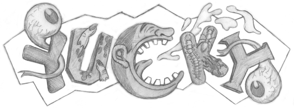
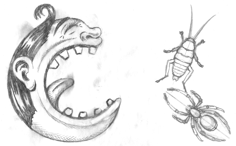
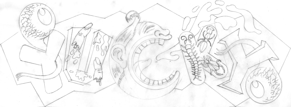
felt I needed to refine some of the detail in the drawing and develop the character a bit more, making it more “Wolverton-esque”, so I did some pencils like these:
Then finally I had the pencil drawing base on which to build the final art of “Yucky”:
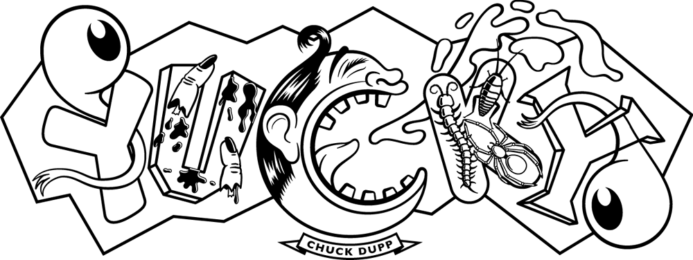
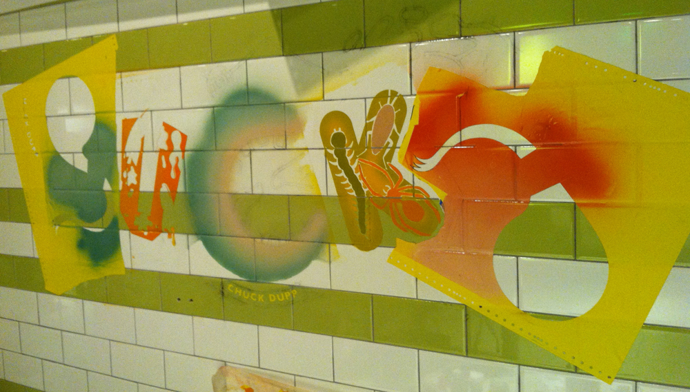
At first I believed I could create the art as would have Mr. Wolverton, with pen and ink. My first feeble attempts only proved to me that he had incredible control over the drawn line, and I had virtually none. So, with my tail between my legs, I went back to my Mac and started drawing the logo in Adobe Illustrator. The client decided that the character at the center of the logo should be appropriately named “Chuck Dupp”:
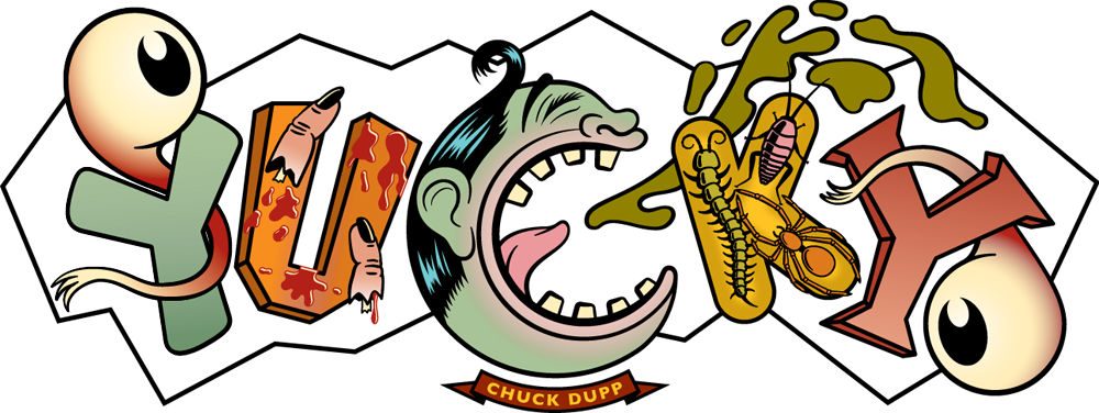
I tried to imagine what sorts of colors Wolverton would have used, that all at once could be disgusting, yet “candy-freindly”. I couldn’t come up with a good reason to NOT make Chuck a sickening shade of green:
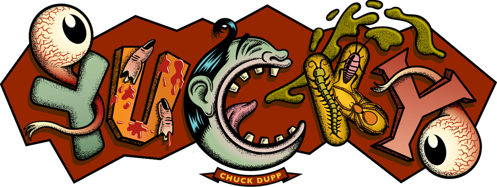
A further development of the color, adding bloodshot eyes, a background color and dropshadows:

And finally some stippling all over, and highlights in the barf—giving the whole thing a bit more dimension, grit, and “Wolverton” appeal:
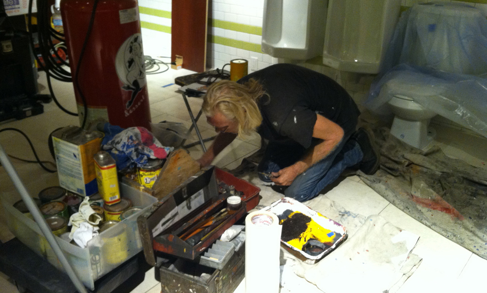
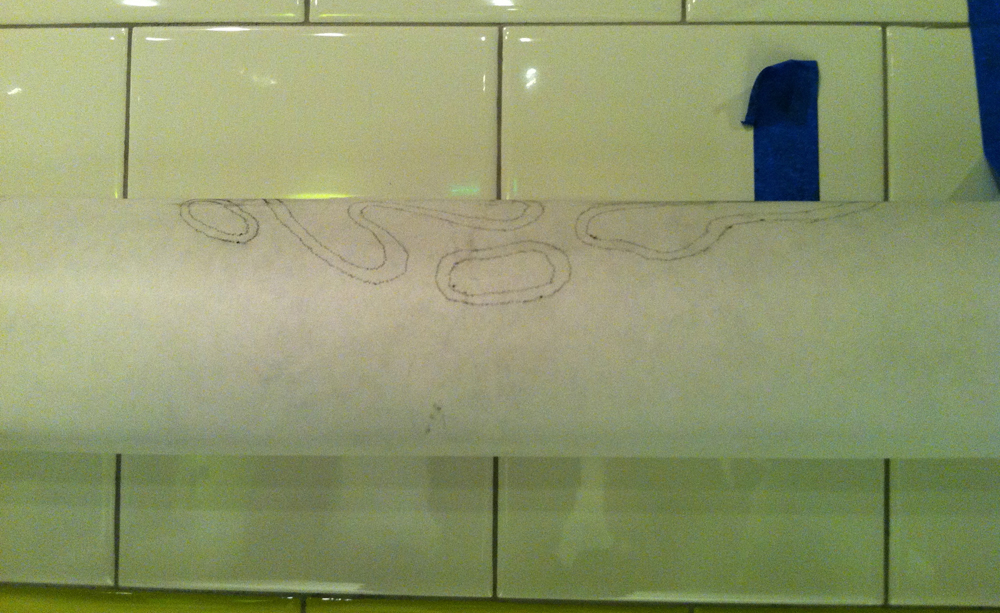
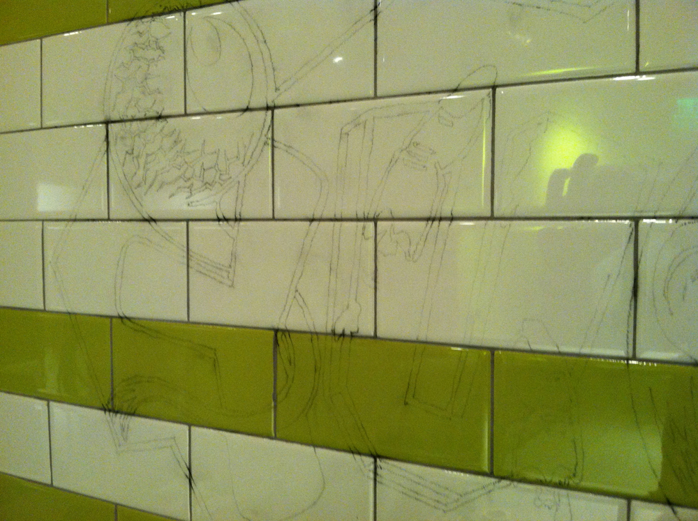
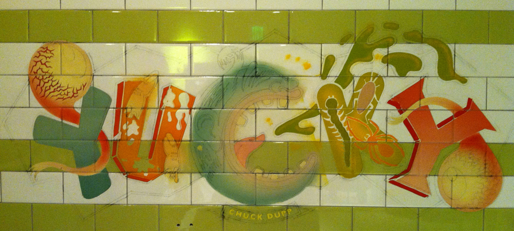
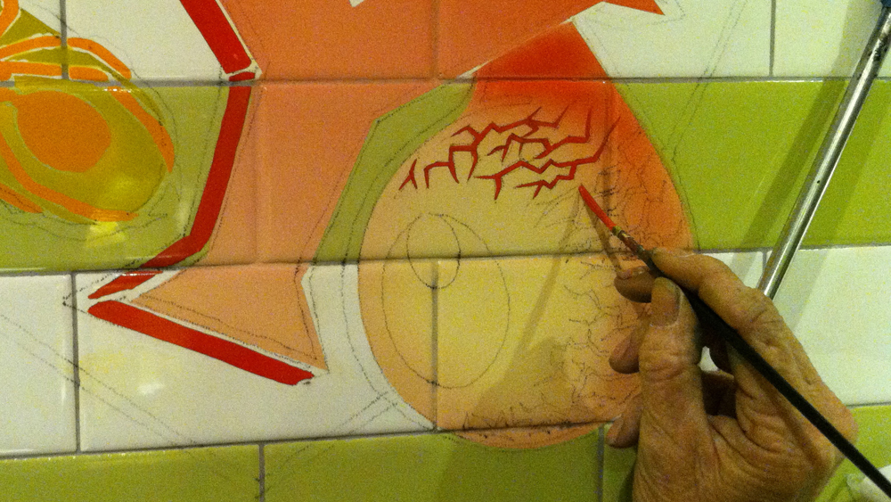
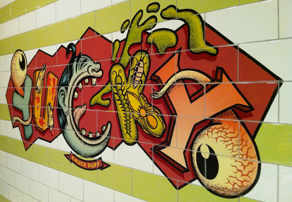
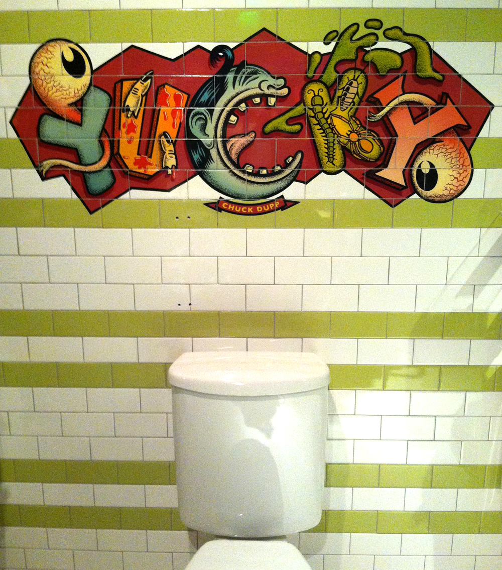
The multi-talented Richard Ankrom was hired to paint my design on the tile wall of Yucky. The space was meant to look and feel like a public restroom—in fact candy is to be dispensed from toilets. Following are shots of the process Richard went through to accurately transfer my design to the tile wall. For more information about Richard and his process, please visit my more complete BLOG post on this subject.


Award-Winning Typeface Designs for every taste from Alphabet Soup Type Founders


