
This is Part 2 of a 4 part post on the logo graphics I created for a huge new candy emporium in Hollywood, California called “Sweet!”
“Won't you get hip to this timely tip / When you make a-that California trip / Get your kicks on Route sixty-six.”
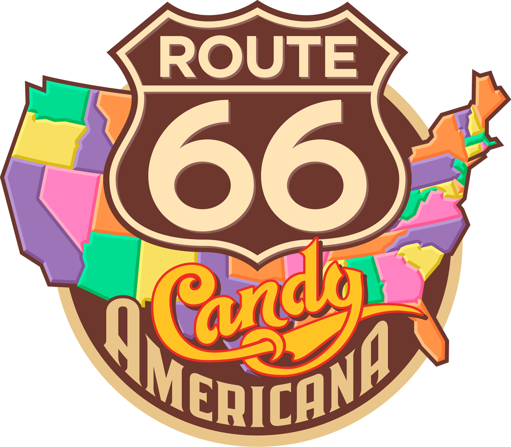
In Route 66/Candy Americana will be housed the finest selection of classic American candies, some that have not been seen in a while. Obviously the logical place to start a Route 66-ish logo would be to use the iconic road sign as a base:
“Won't you get hip to this timely tip / When you make a-that California trip / Get your kicks on Route sixty-six.”
In Route 66/Candy Americana will be housed the finest selection of classic American candies, some that have not been seen in a while. Obviously the logical place to start a Route 66-ish logo would be to use the iconic road sign as a base:

So with that as a given (which I gave to myself) I started with some very rough sketches like these:


One of the most critical parts of this direction was to figure out how to successfully integrate all the different elements. I had a sign, a map, and several different styles of lettering/typography. I also felt it had to have the authentic look of classic American Automobilia, yet be playful and colorful enough to represent a candy store. So I started to work out exactly how all the elements might fit together. After combining a map of the USA and a standard Route 66 sign I started designing my own “66” numerals and the words “Candy” and “Americana”. Not only was I trying to integrate the two words , but to do so with the right amount of playfulness in “Candy” and the right amount of gas station-y feel in “Americana”. As you can see below, there was a lot of drawing and redrawing before I felt I was close to how it should be:

Once I was happy with the balance, I tightened up the drawing in preparation for redrawing the whole thing in Adobe Ilustrator:

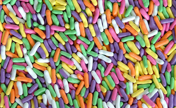
To help give this logo a bit more candy store appeal, I envisioned the individual states in five different “Good ’N’ Plenty” colors (which I’ve always loved):
So first I needed to create an accurate (but graphic) map of the USA in Adobe Illustrator where, for separation purposes, no two states touching each other were the same color. So as a working model I did the file in black and 4 grays, then made it the “Good ’N’ Plenty” USA map in 5 colors:

. . . and here are the map, sign and lettering all put together in my first draft:

But to me it was all feeling way too flat. I decided that I wanted to give the states a soft, dimensional “marshmallow-y” feel. So I first added a darker extrusion on the right and lower portions of the states (left side of the map, below), and then a lighter area on the upper and left portions (right side of the map, below)—the Marshmallow States of America:

. . . also adding a dropshadow to the word “Candy” and to the Route 66 lettering and badge, and an outline to the map:

I wasn’t too happy with the mauve-y color, so I gave it one last tweak, warming it up a bit. Everybody loved the way it now looked and felt:

Award-Winning Typeface Designs for every taste from Alphabet Soup Type Founders


