The purpose of this student project was to redesign LiFO, a weekly free press magazine.
In order to recreate visual identity of Lifo we had to use only its raw articles and photos of a random issue.
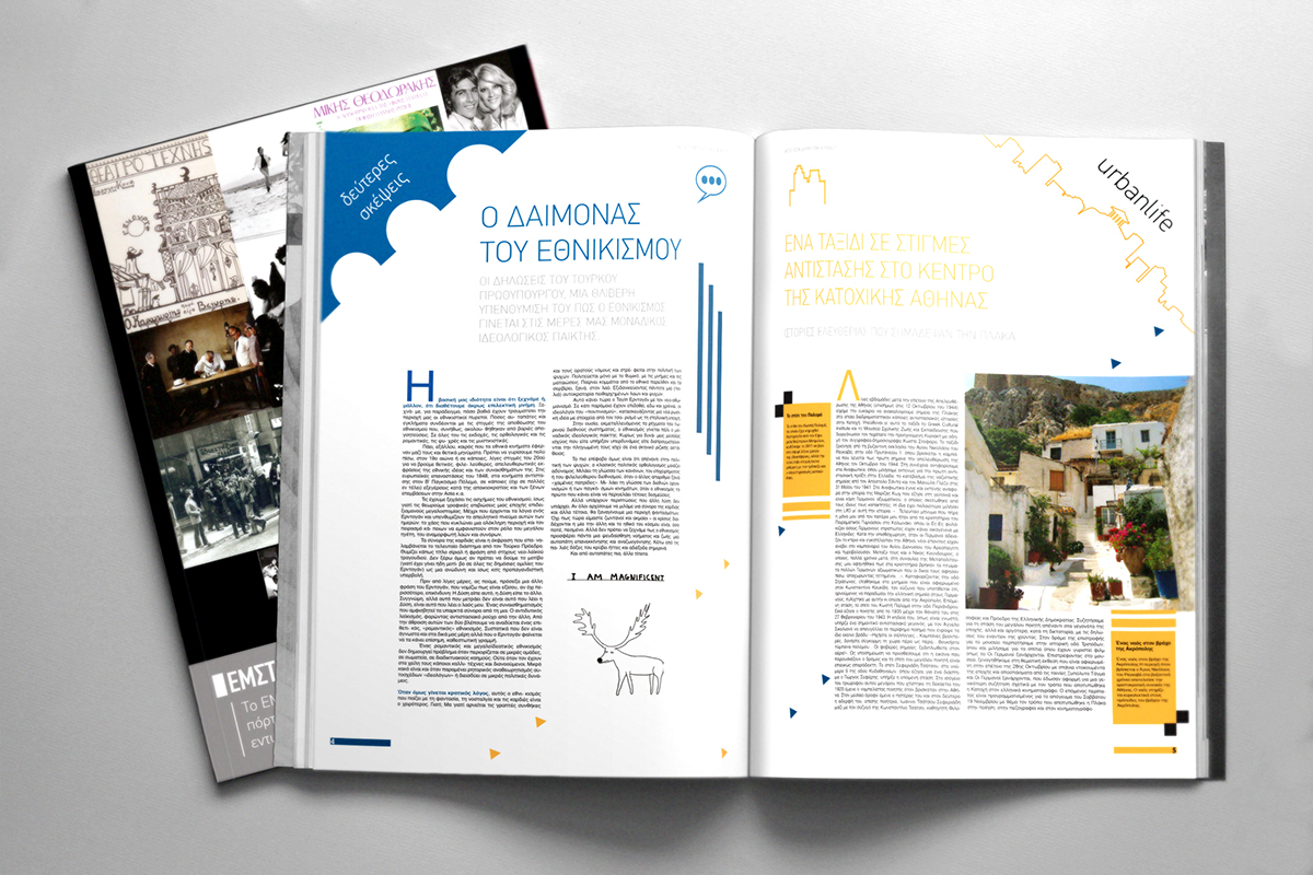
Lifo's readers are mainly young people, so I decided that it has to be simple, colorful, elegant but in a playful formation.

The design elements are basic geometric shapes in different forms and patterns. Bigger articles are accompanied by some types of typographic synthesis.
In almost every page I try to let empty columns so the page has breathing room and reflecting a nice contrast between the empty room and the rest elements.
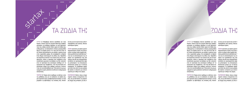
Each article's category is characterized by its own color and a big diagonal triangle inspirited by the way a reader turn the pages. In its base I use a diagonal pattern of shapes which are related to the category they belong. For example, "startax" header triangle (of a zodiac article) has in its base a pattern of simple characteristic stars.
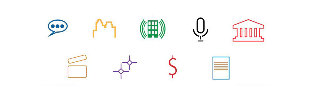
Opposite of every triangle, is used an icon that represent each category.
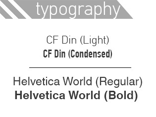
Font that used for the main body is Helvetica World and for every header and sub-header CF Din Light, a thin font that makes contrast in thickness with Helvetica World. Two font types that are clear and easy-to-read.
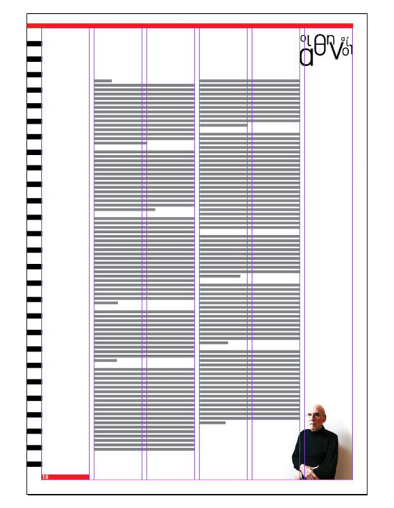
Grid is separated in 6 columns.

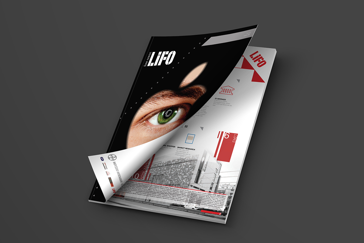
"iPhone is the most appalling spying machine that has ever been invented"
- Luke Harding
The main article of this issue is an interview with Luke Harding. The cover based on his quote represents an eye peeping inside a keyhole with Apple's logo shape. Inside his eye iris, I added a mechanic illusion representing the high technology of iPhone.

"Thanks for visiting my project!"