
東海大學創新人博覽會
INNOVATORS EXPO
INNOVATORS EXPO
∣
Category:Visual Identity
Client:東海大學 Tunghai University
Years:2017
Designer:陳品丞 Chen Ping-Chen
Client:東海大學 Tunghai University
Years:2017
Designer:陳品丞 Chen Ping-Chen
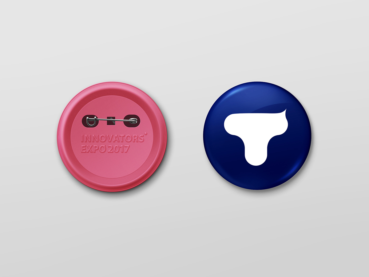
英文字母「T」不僅連結了許多和博覽會相關的想像之外,也是主辦單位東海大學英文校名的第一個字母。在看過展出作品與去年的前例後,對我而言「創新人」並非不斷地挑戰限制、向未知的前方衝刺。而是自信、沉穩,在平凡中早一步洞見未來,慢慢地崛起、突破。
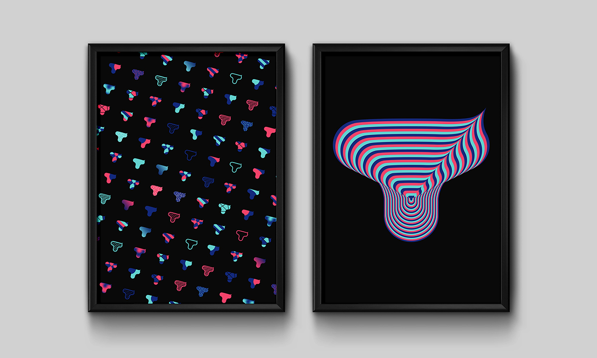
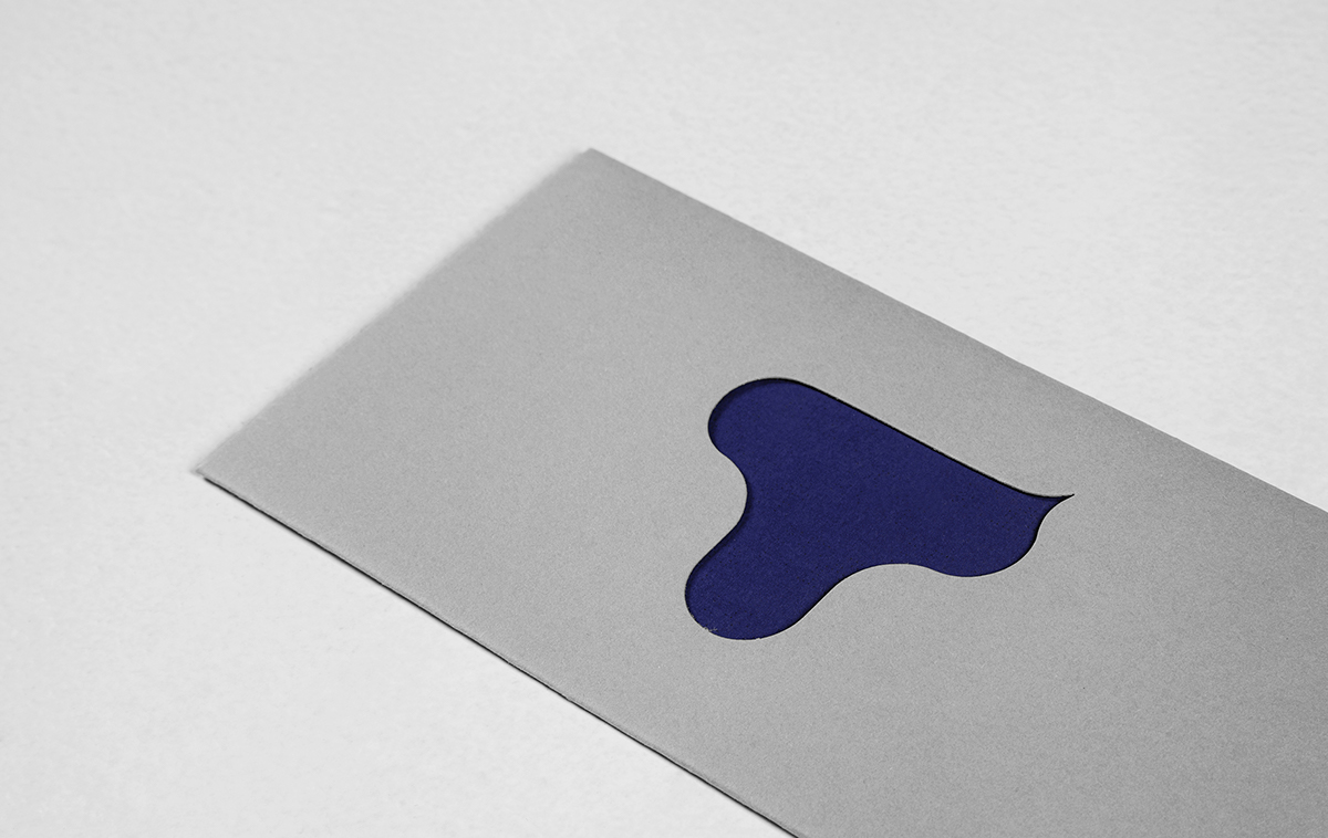
我繪製了曲線柔和的「T」字,配合東海大學校色之一的深藍色,並加上有弧度的尖角成為標誌。在延伸應用的設計上,我嘗試了許多手法來構成標誌的輪廓,除了傳達豐富性及可能性之外,更希望整體的視覺識別能夠容納各種不同的想像。
∣
The letter “T” not only does it link to various imaginations related to the Expo, but it also stands for the initial letter of its host Tunghai University. Having reviewed the works displayed as well as the examples from the previous year, the term “innovator” does not seem to me as an implication for infinite challenges against the limits, nor for the perpetual dash towards the unknown. Rather, it appears to indicate a steady rise and breakthrough achieved with confidence and composure, anticipating the future within the ordinary.
I illustrated the logo as a letter “T” with smooth flexures in dark blue, which is one of the official colors of Tunghai University, and adorned the logo with a curvy pike. For extended applications, I experimented with various ways to construct the silhouette of the logo, hoping to create an overall visual identity that is capable of accepting all types of imaginations besides communicating diversity and possibilities.
∣