


BRIEF ABOUT
Tilde Language Services is a woman owned translations company based in Lancaster, Pennsylvania. Tilde knows the importance of timely and effective communication which is why they hire only trained and qualified linguists to provide accurate translations that fit their client’s parameters. Their dedication to flexibility, reliability, and availability ensures that, when the need arises, their clients receive a worry-free language solution.
THE STORY
Jamie Hartz, Owner and Spanish Translator, reached out to me at the very beginnings of her company. She recognized the benefit of a visual identity and wanted to start establishing her brand as soon as possible.
“I wanted to set myself apart from other translators. I wanted to have a way to identify myself that would reflect what I do and how I work – professional, friendly, knowledgeable. I knew that if I invested in this type of identity early on it would become a calling card for me and a way for contacts to remember me.”
THE CHALLENGE
Hartz wanted Tilde’s visual identity to be clean, modern, and stylish while reflecting a friendly and professional tone. It was also paramount that the elements be easy to implement in Microsoft Software. She would be wearing multiple hats (marketer, accountant, project manager, translator, etc.), especially at the beginning, so it was necessary that she be able to apply the identity with ease.
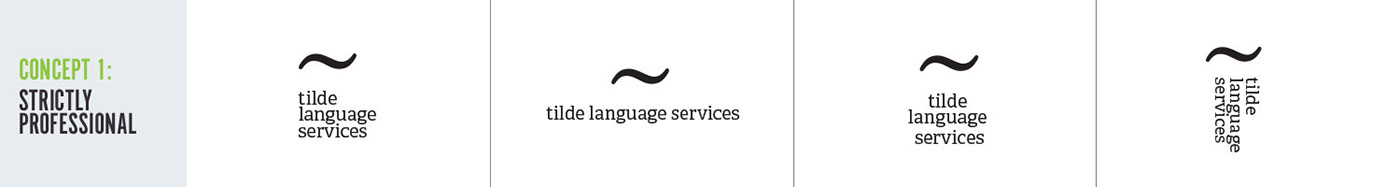
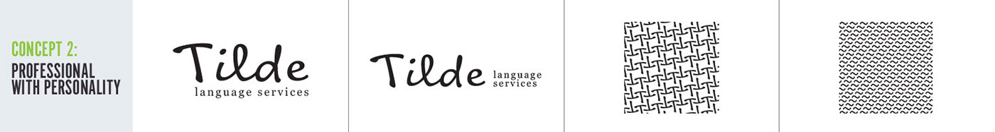
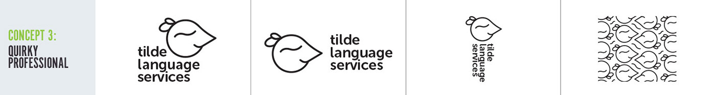
THE CREATIVE PROCESS
Mood board

Sketches

First Concepts
THE SOLUTION
When I started sketching the logo I kept in mind key characteristics: clean, simple, professional, friendly, and tilde. The final artwork is a simple wordmark crafted from a loose cursive typeface with an alteration, the top of the T is a tilde mark. To ensure versatility, I crafted 2 logo lockups: the stacked primary lockup and the horizontal secondary lockup.
I kept Tilde’s materials clean and modern by designing with plenty of whitespace, clear hierarchy, and a grid system. I crafted an interlocking tilde T pattern to use as a decorative element that would break up the white space and add a subtle complexity to the simplified look.


WORDS FROM TILDE
“Amanda is an expert at what she does! It’s important to have a visual identity no matter what your business is – I think that associating yourself with a positive, professional brand image is the first step to growing your business and Amanda is serious about helping you grow.” – Jamie Hartz, Owner and Spanish Translator
THANK YOU FOR VIEWING!


