Stratix Corp / itrac360 Web App
My Role at Stratix
UX Design : Given access to secondary research artifacts and on site users, create models and user flows to define the product experience.
UI Design : Initial low fidelity wireframes have been produced to show the key features to be implemented. Create interactive prototypes, high fidelity comps, and take charge of the front end implementation via bootstrap.
Objective
Create a visual dashboard that displays KPIs at a glance via customizable graphs. Give users powerful tools to create a view of our data that informs their products lifecycle.
Personas and Functionality
Visualizing key personas and a hierarchy of key functionality within the application.
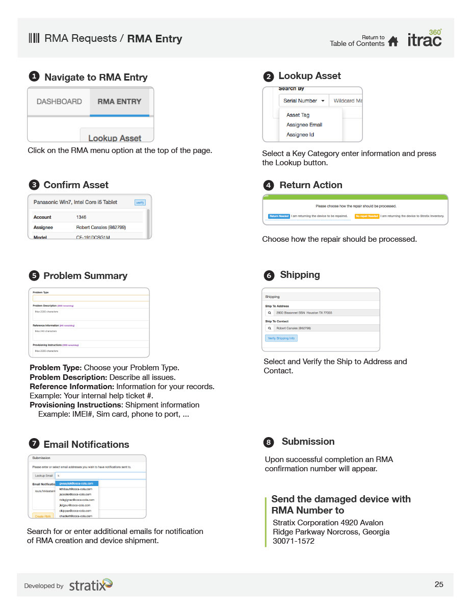
RMA Entry : Create new entries into existing data sets. RMAs are reports on the lifecycle of a product deployed by Stratix, which is in use by one their clients.
Managers : Create custom views of data sets with an individual account.
Multi-Account Managers : Manage multiple data sets across multiple client accounts.


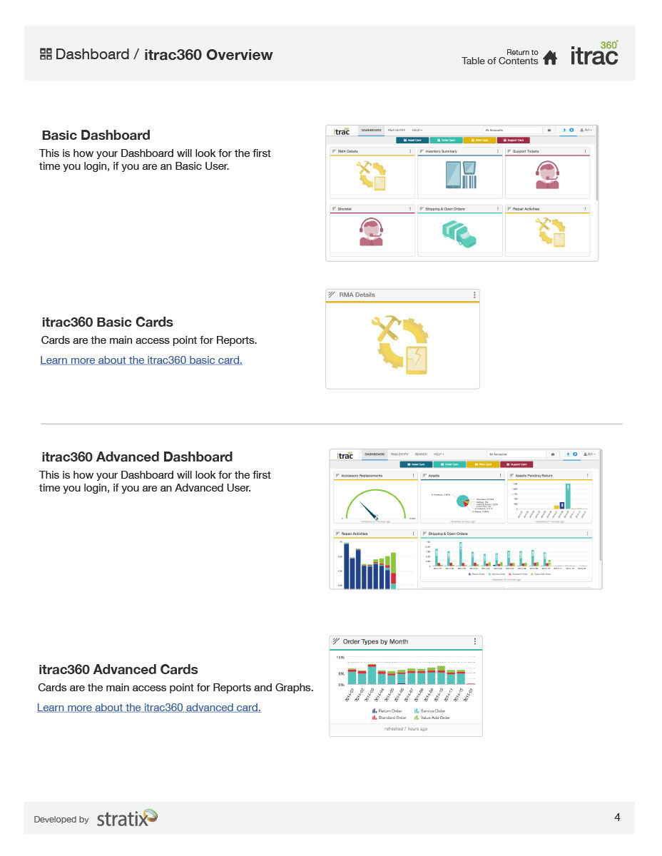
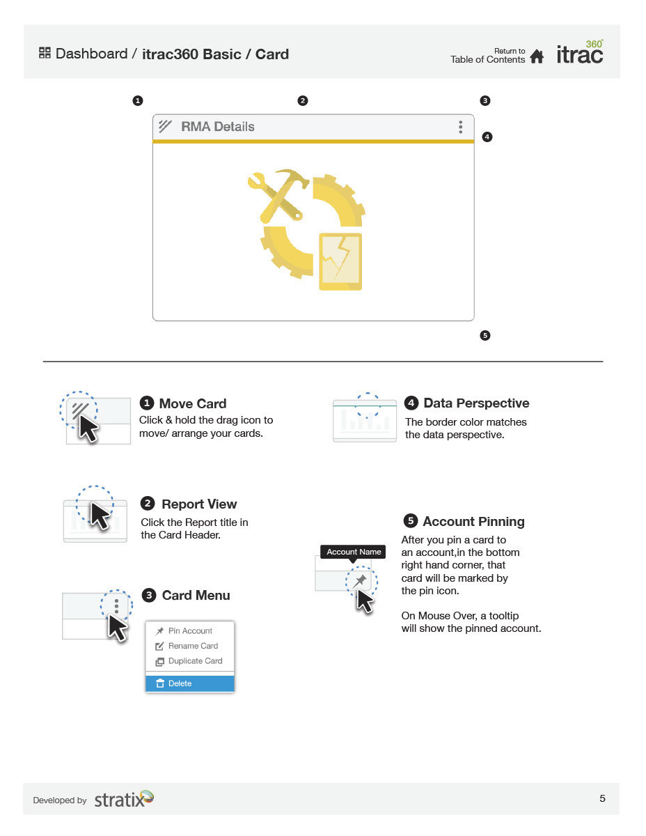
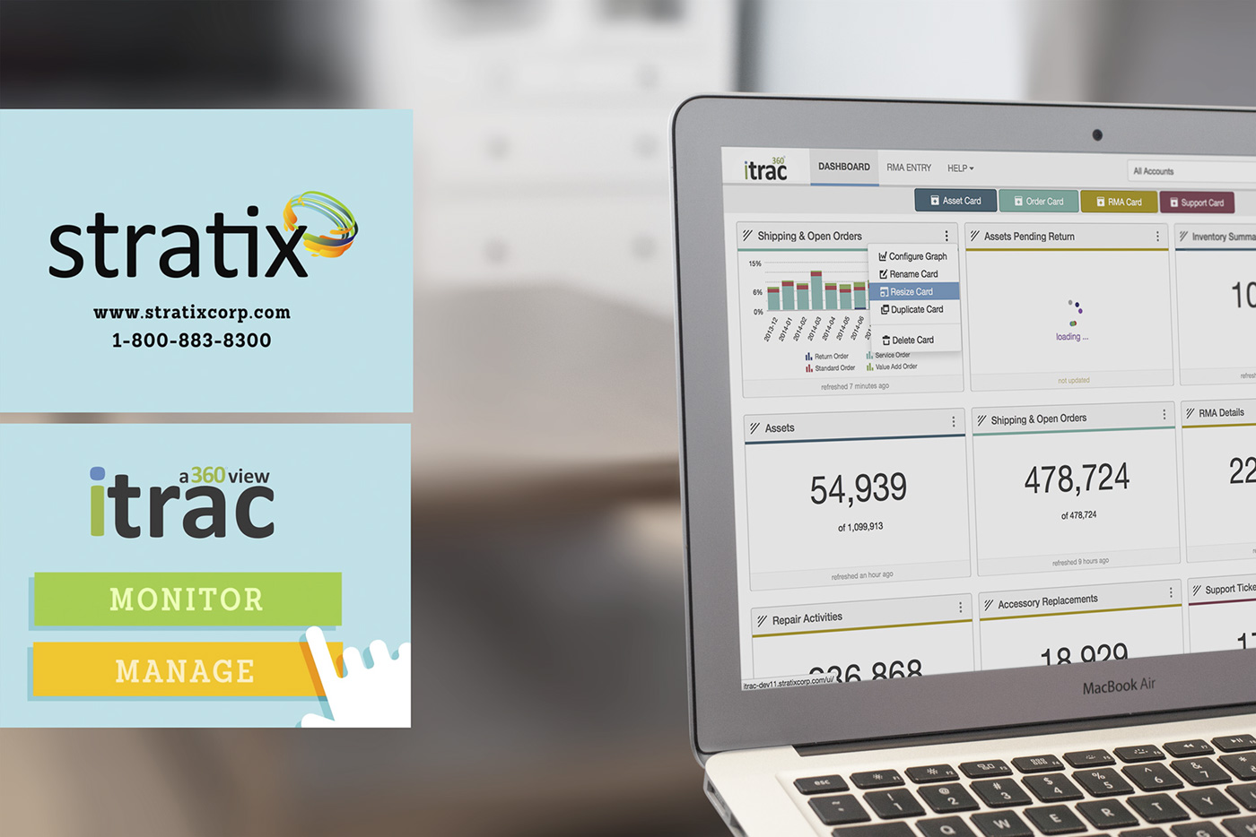
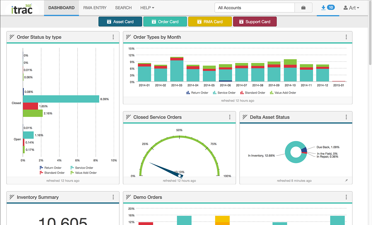
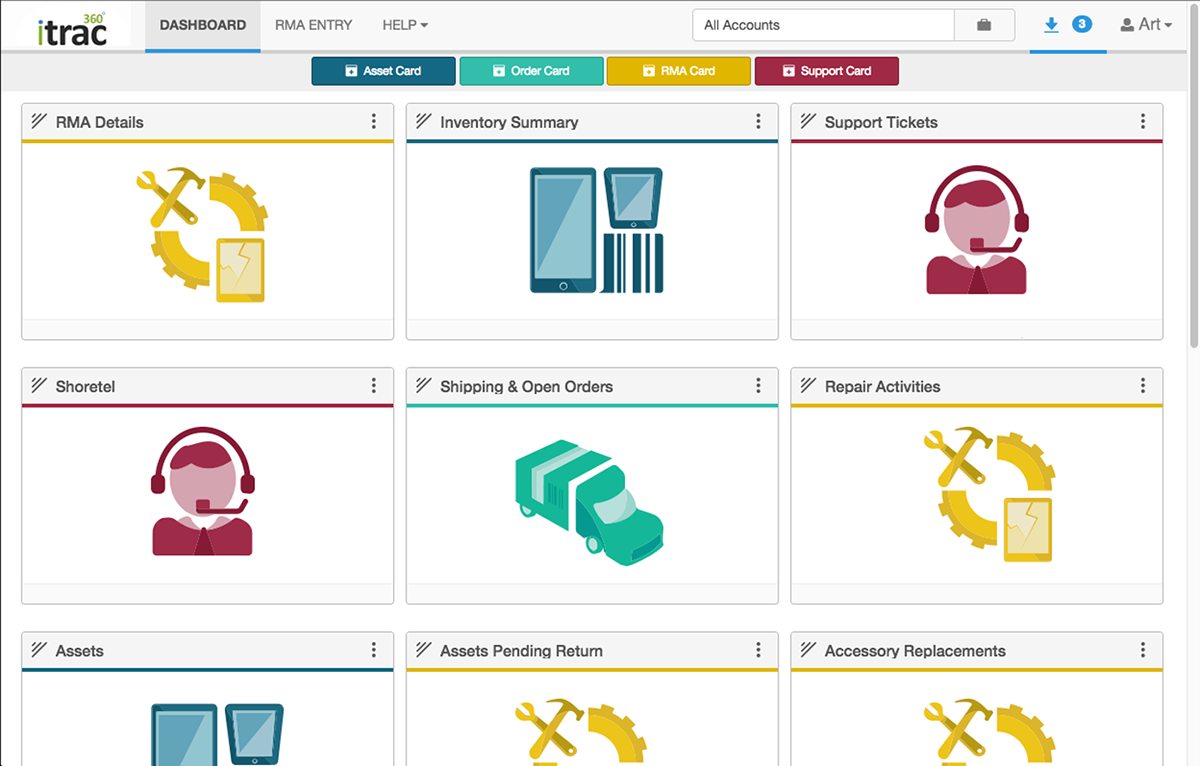
Dashboard and Dash Cards
After speaking with users and stakeholders it was clear that the dashboard should be highly modular. It needs to have the ability to adapt to live metrics, which are constantly updated. The visuals need to represent a data hierarchy which is subject to change day to day. The modular aspect of the dashboard would allow for many sizes and configurations of these dash cards.


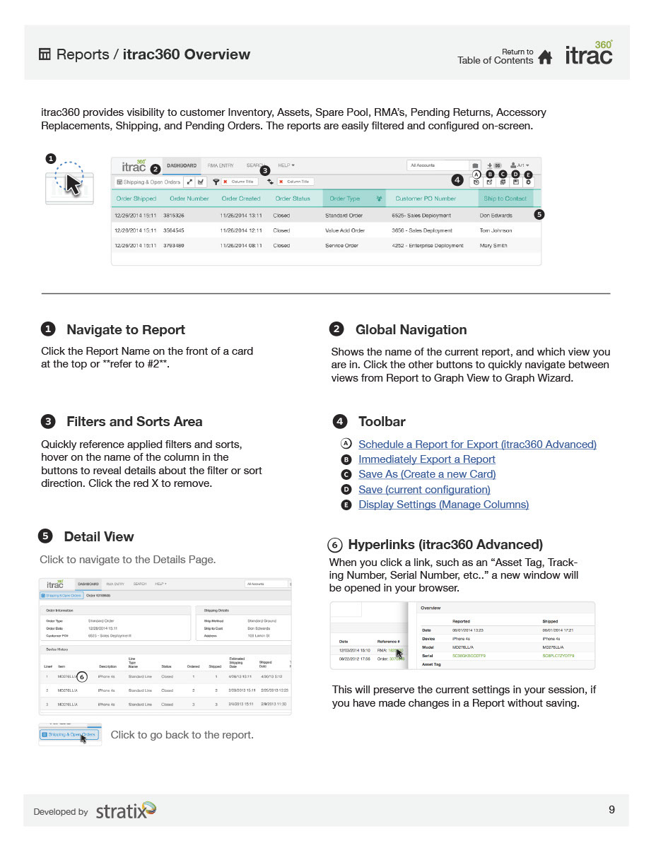
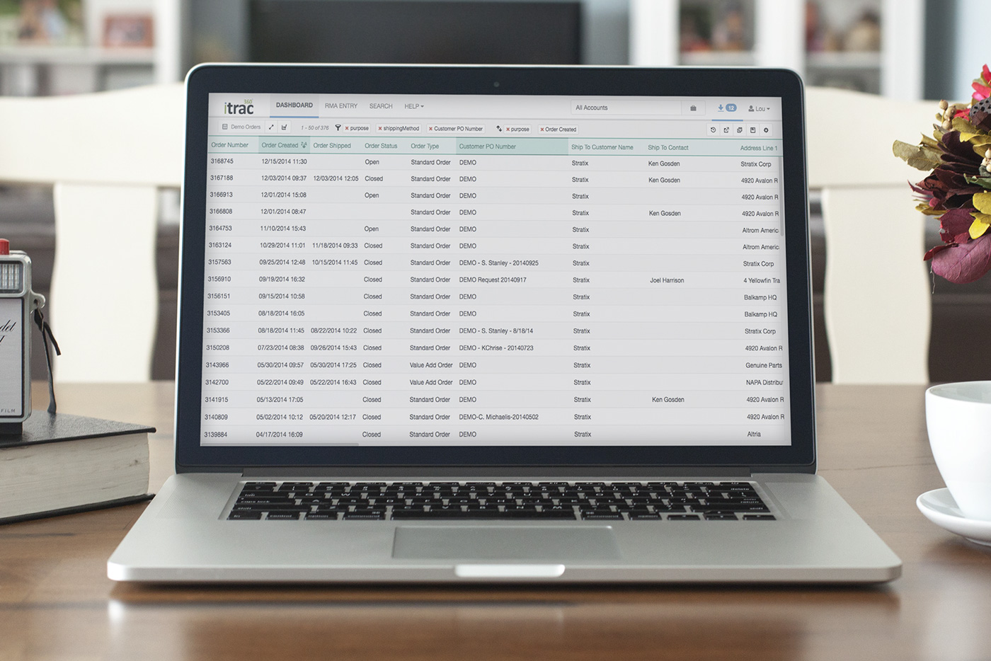
Reports
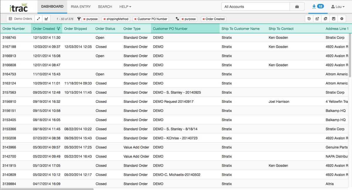
Drilling down from the dashboard into raw spreadsheets requires a heavy set of tools. Users needed the functionality to organize a multitude of columns, create numerical/alphanumerical filters, drill down into more granular details based on a single line item, and much more. Editing this raw spreadsheet view of the dataset would directly impact how the visual is represented on the dashboard. The goal was to create a toolset that was intuitive, but powerful enough so that users could stay in the context of the web application without having to use Excel.
Collaborative whiteboard ideation and low fidelity paper prototypes allowed me to collaborate with stakeholders and users. I was able to do some quick and dirty user testing despite not having much of a budget for it.


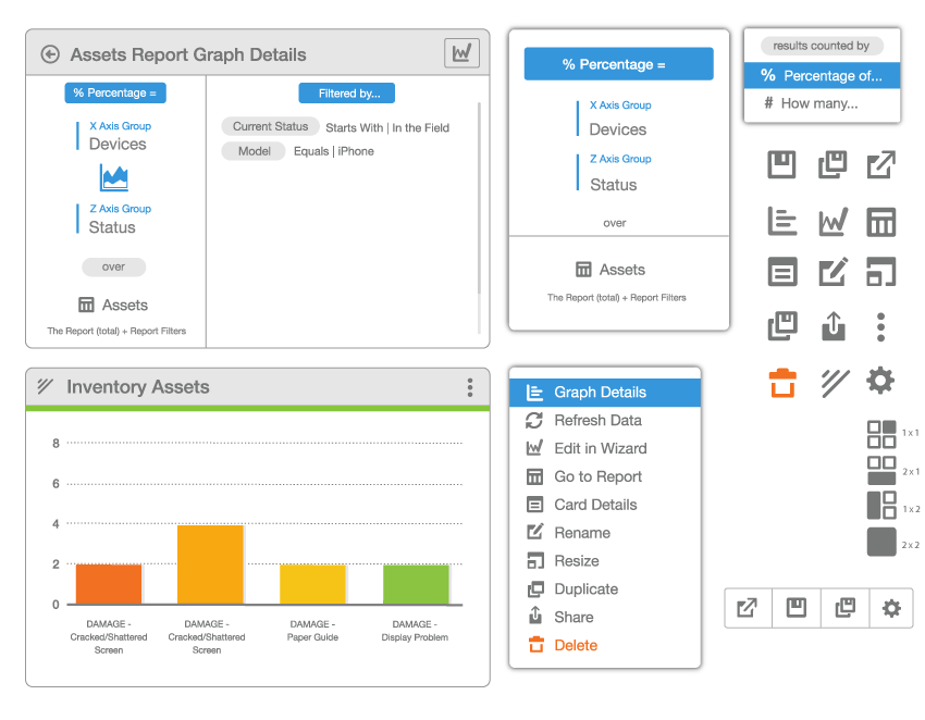
Graph Wizard
In order to create the custom visuals for the dashboard we needed to create a dedicated tool that could be configured to show a multitude of data types and visuals. In order to get the most insight from those around me i continued with the theme of co-creation via paper prototypes and whiteboard sketching sessions.
I began by mapping the process of creating a graph. I used service design methods to give each step of the process context and determine key areas of interaction.
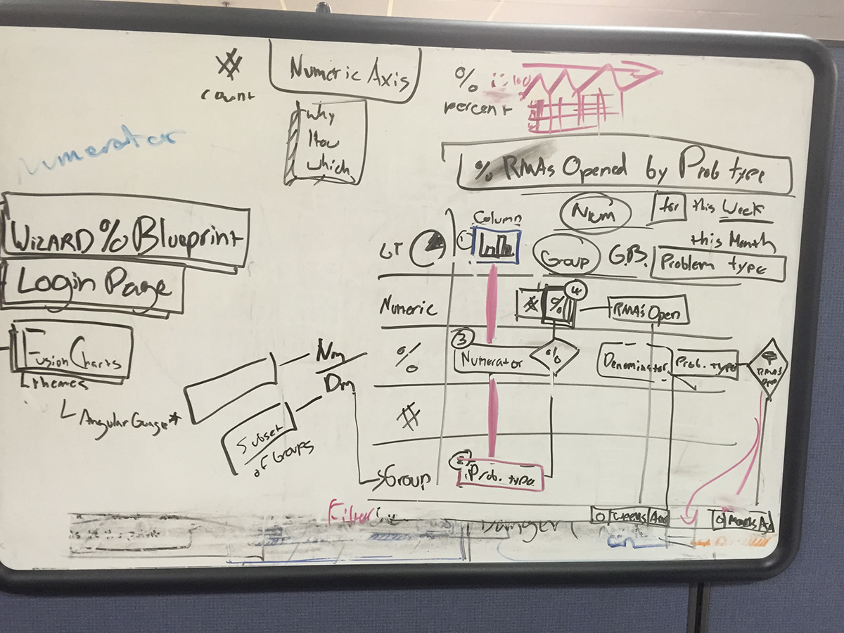


The initial concepts produced had a theme of a linear process that would take a user through a series of modals. It seemed to make sense navigating directly from the spreadsheet view of a dataset, that a user would want a quick way to configure the visual and KPI represented from the data set.


From doing some quick click throughs with users it was clear that the modal experience was cramped, and also created confusion as to what would be saved when navigating back through each step. I needed to create a concept that could be completed on a single page, keeping the user in context.


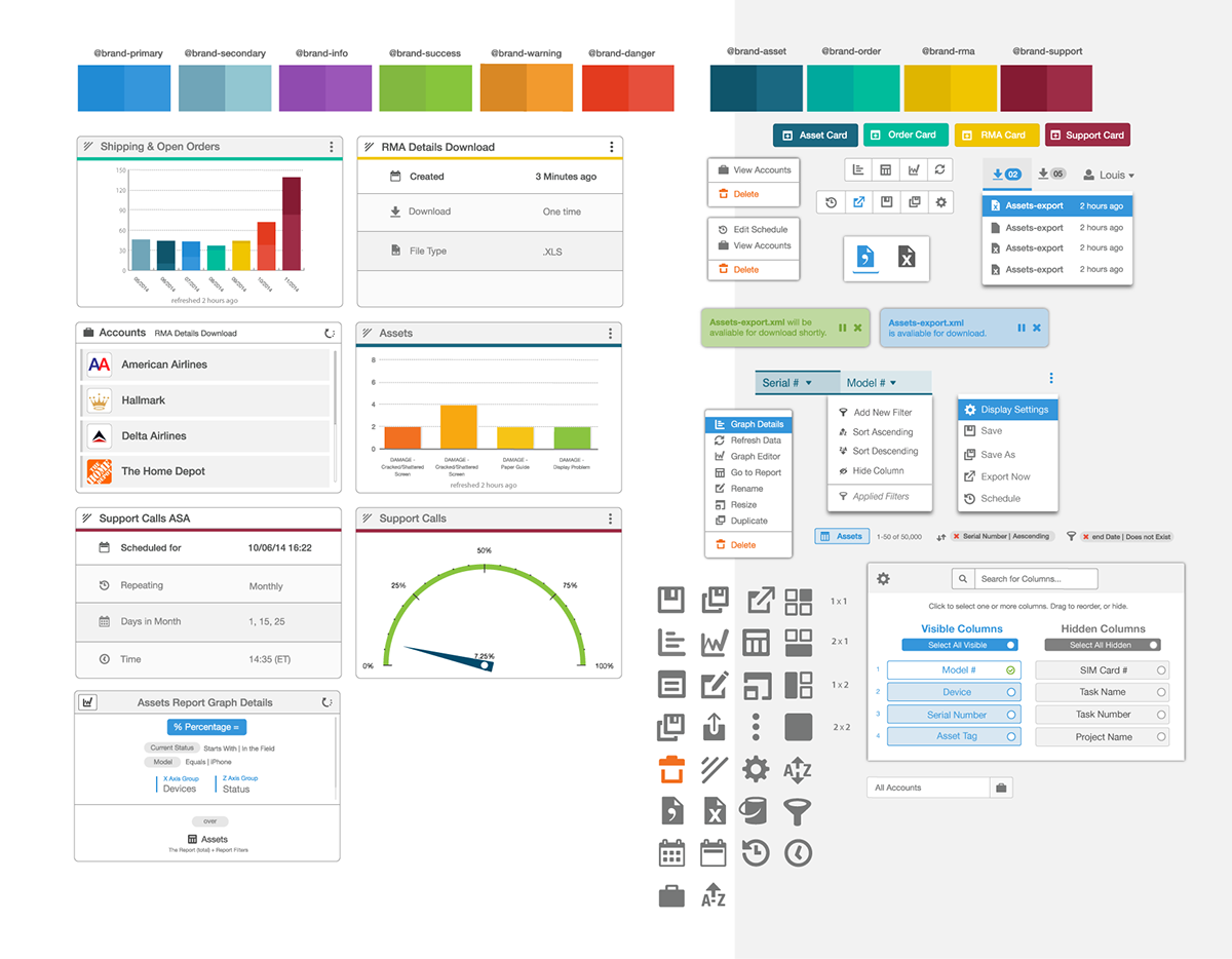
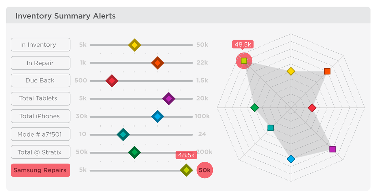
Full Paid Visual Graph version of itrac360. The "DashCards" Display visual information created by applying rules via the "Graph Wizard" to "Reports of Raw Data", we created default metrics based on the company most important visual information values when it comes to their customers.
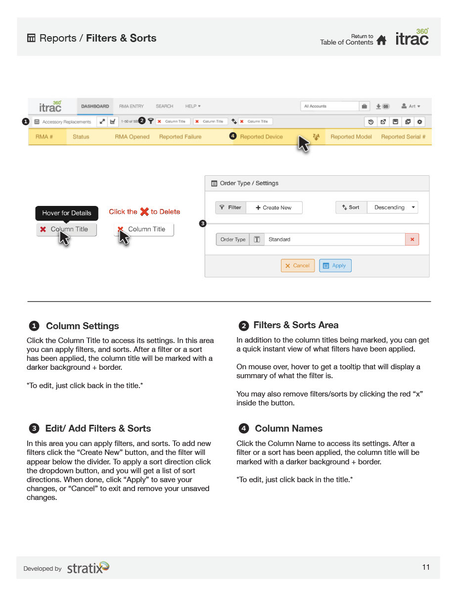
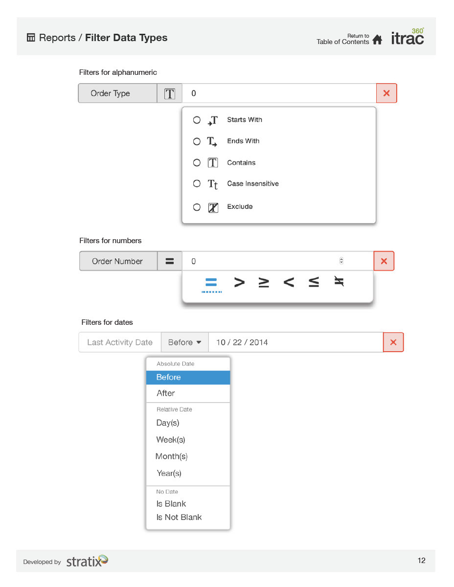
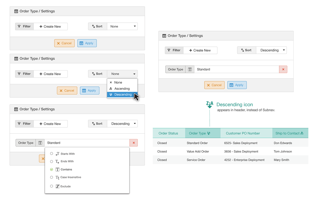
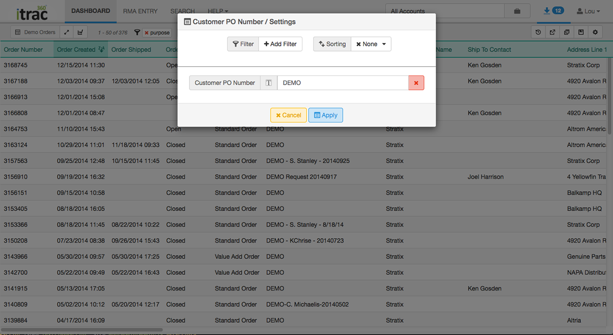
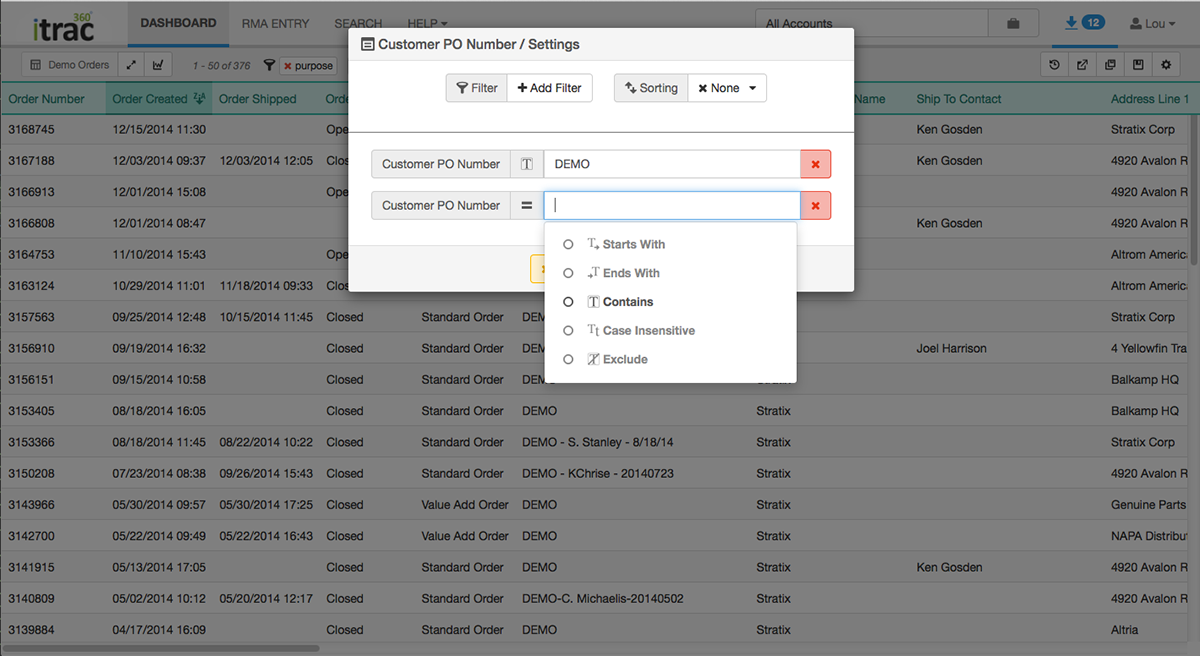
Custom filter & sort interface, pop up as modals. Also custom iconography for the custom built RegEX filters
.
Custom filters in context, being applied to a report.
Examples of custom and default settings of the filter widgets.
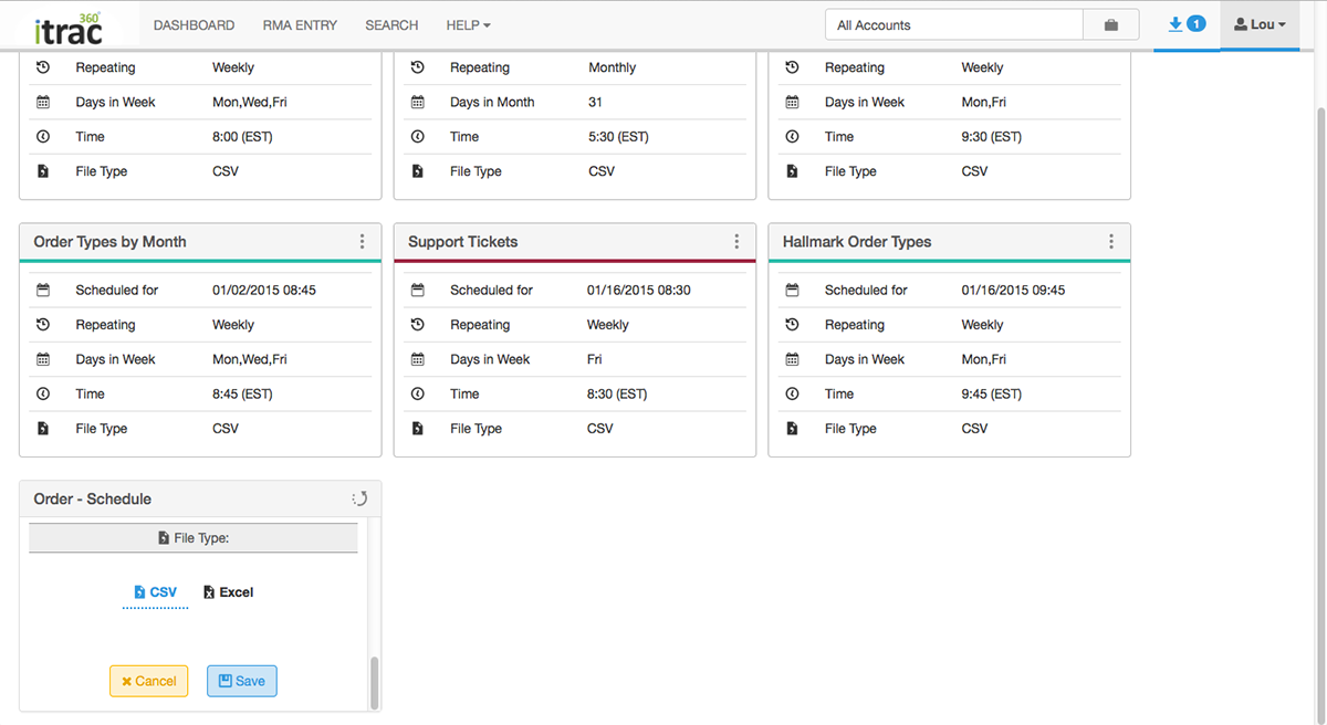
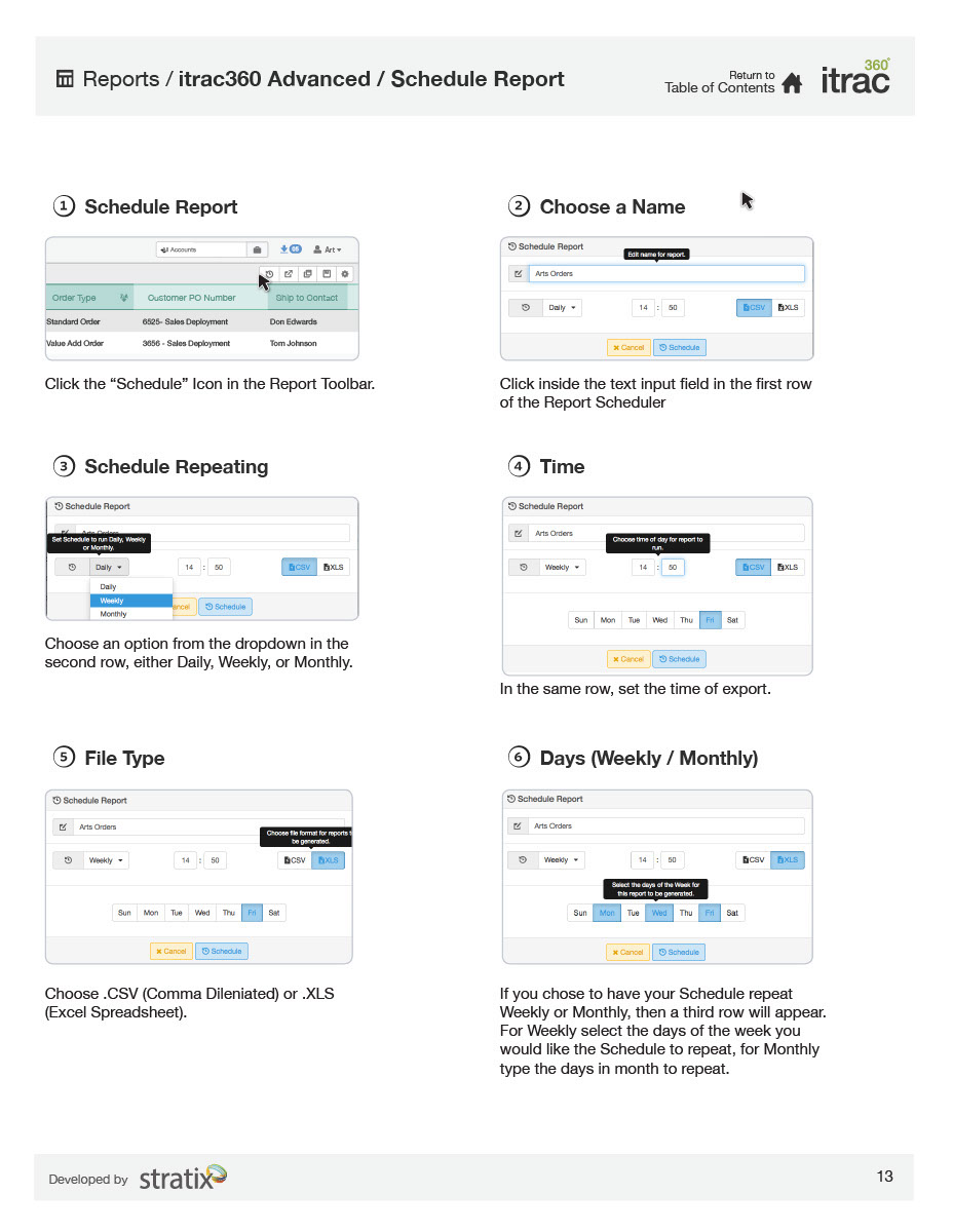
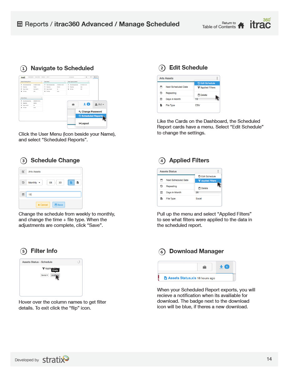
Users of itrac360 can schedule reports to export like clockwork thanks to these custom report cards on an individual dashboard i created to manage said recurring reports.
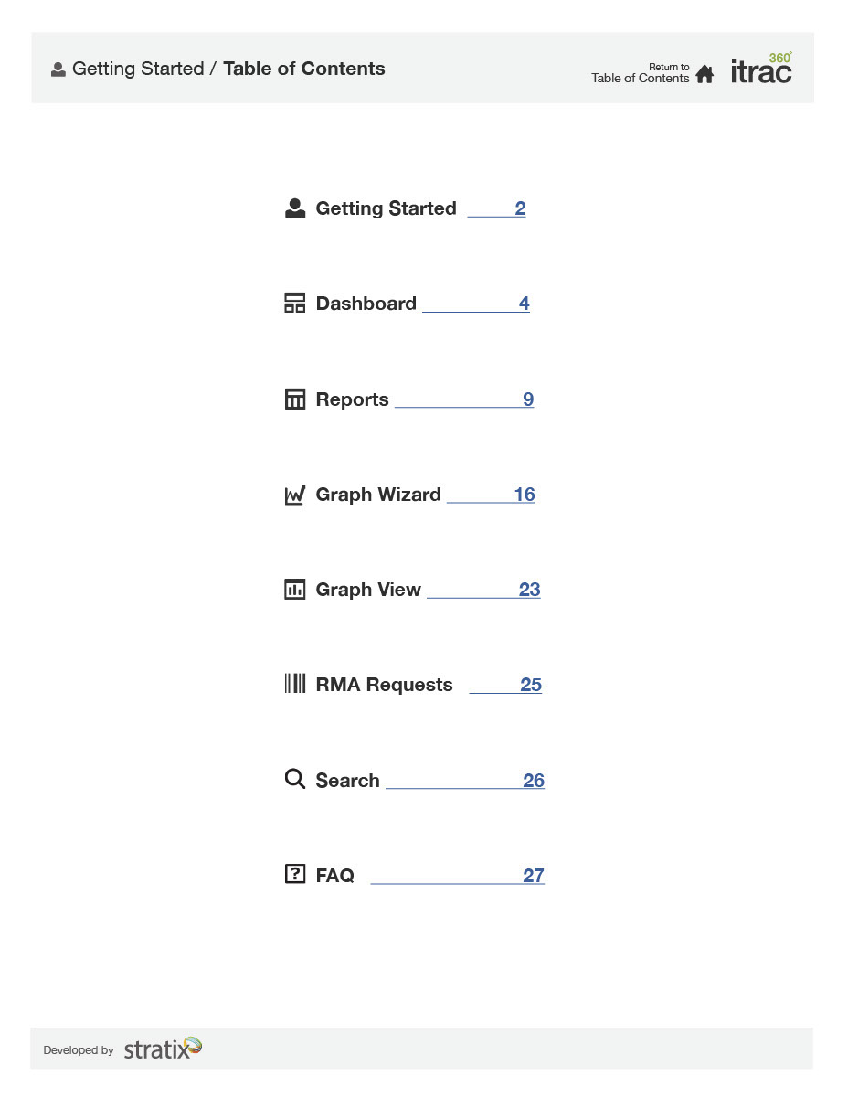
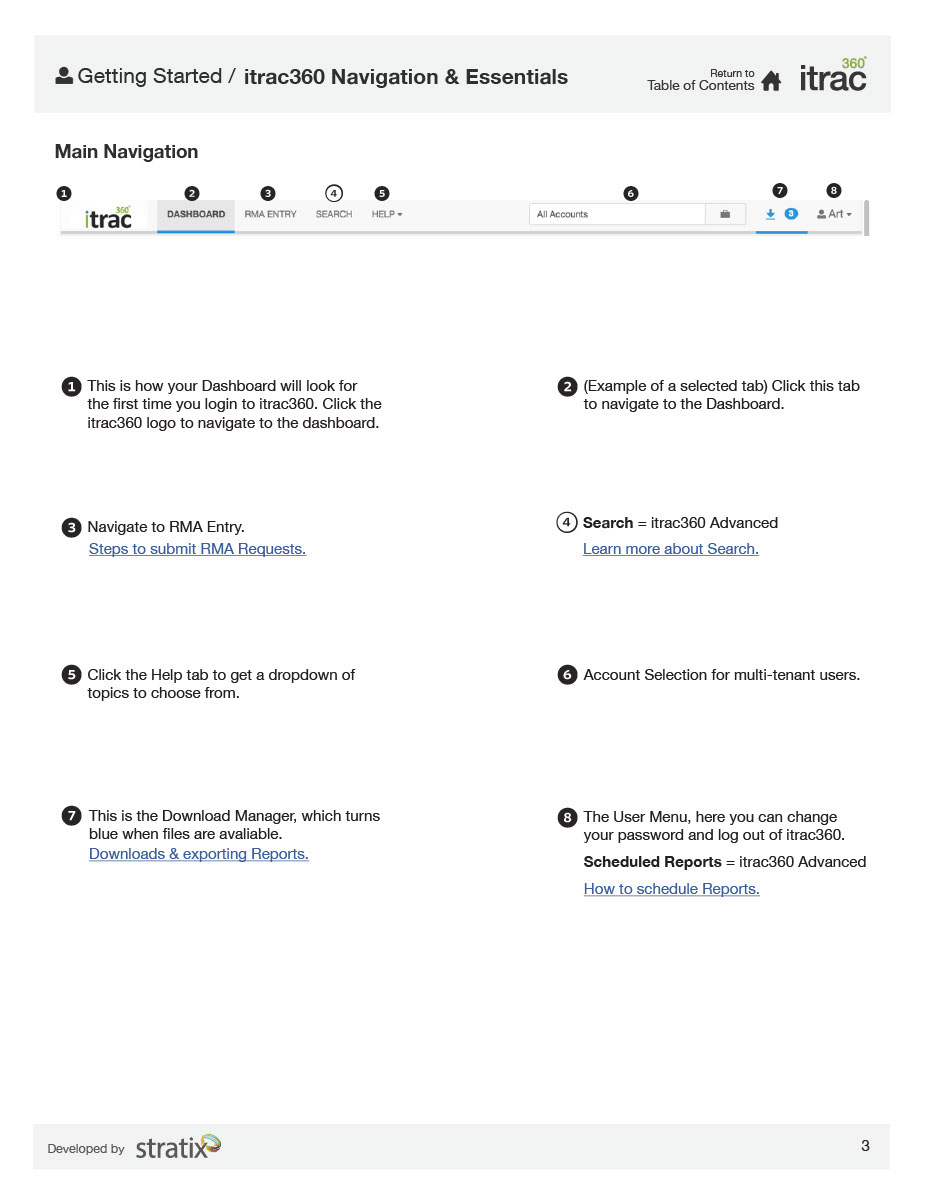
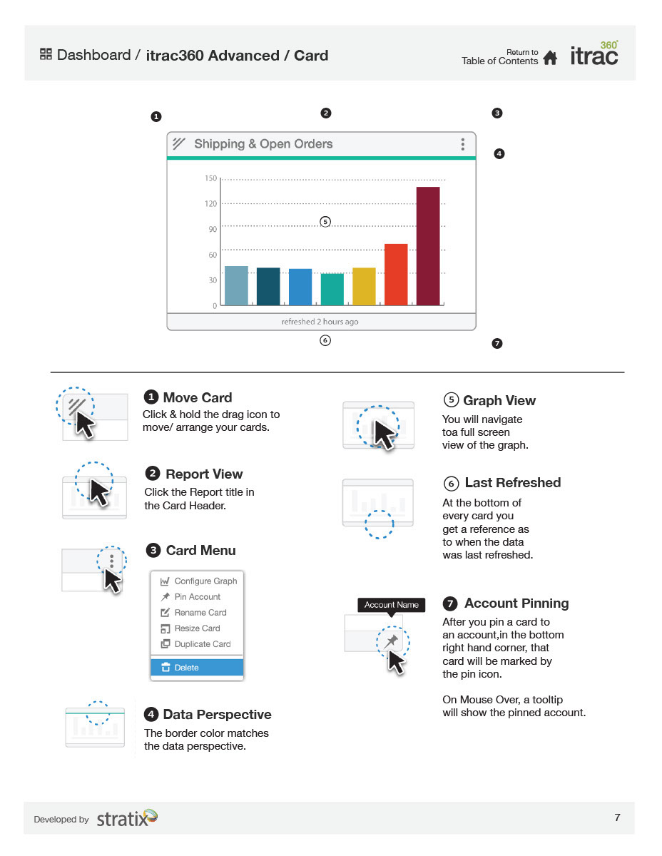
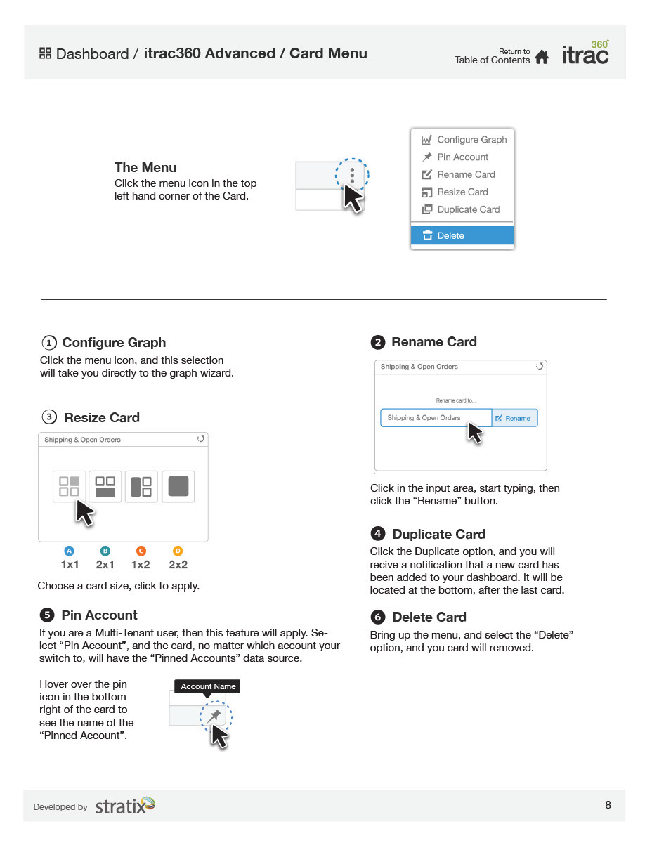
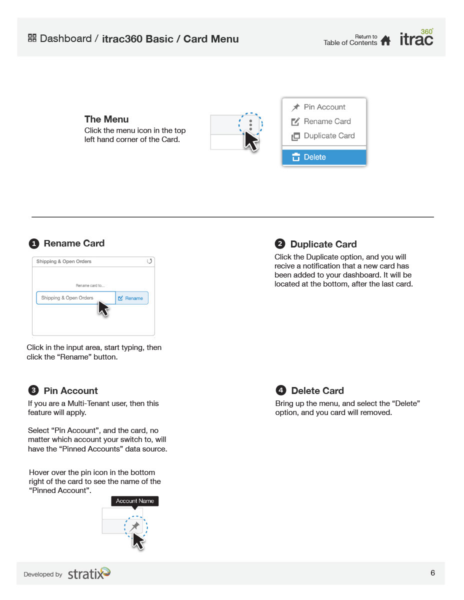
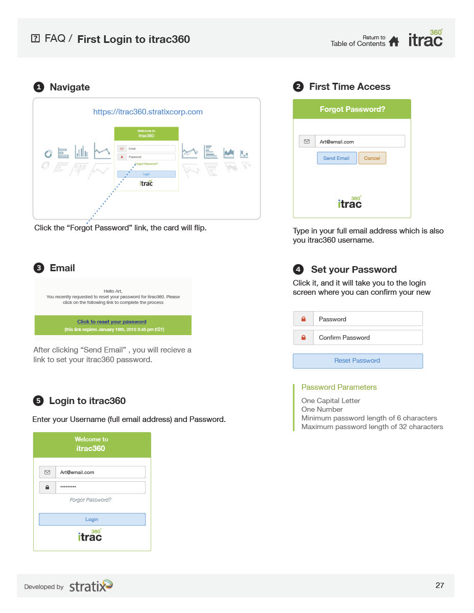
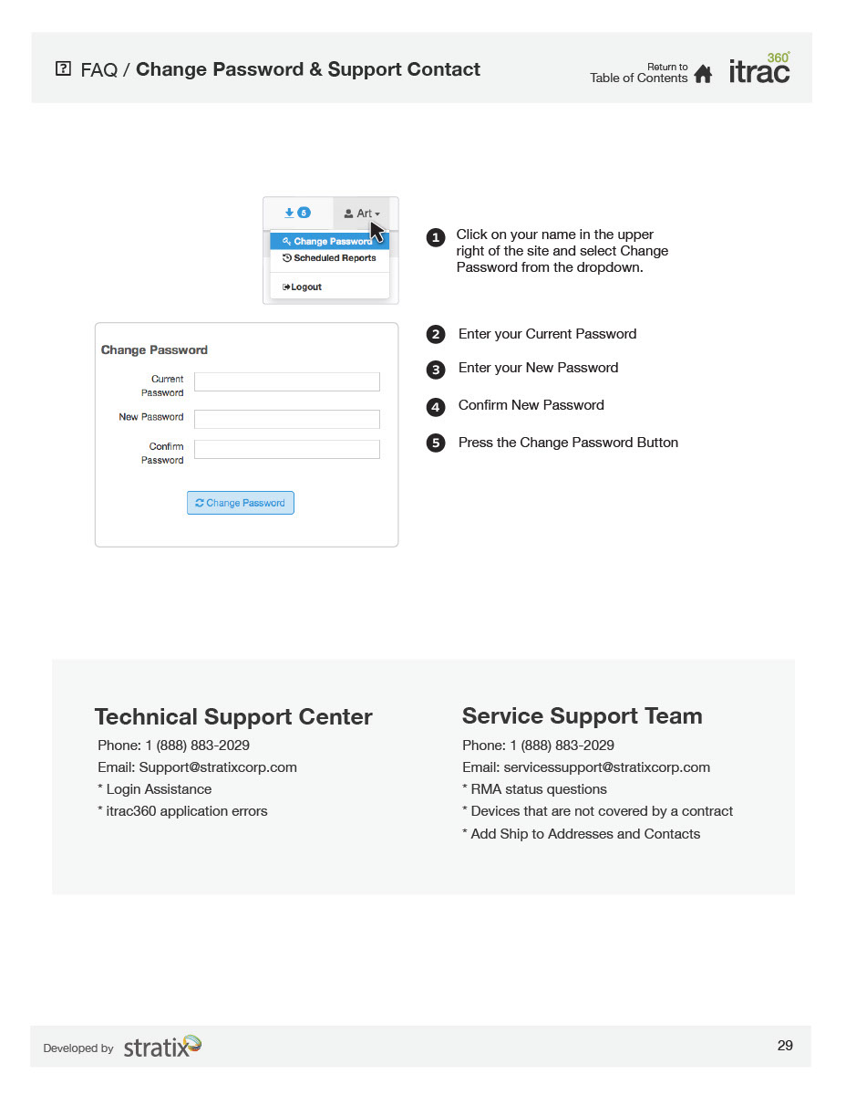
itrac360 Documentation
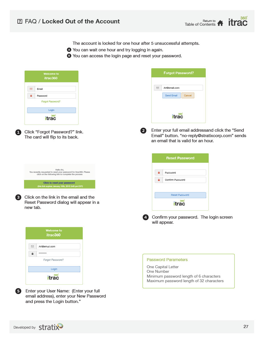
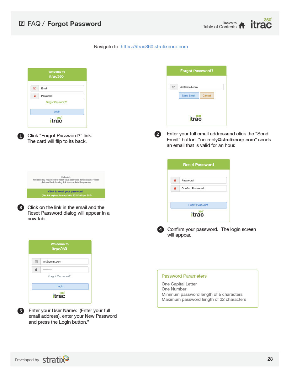
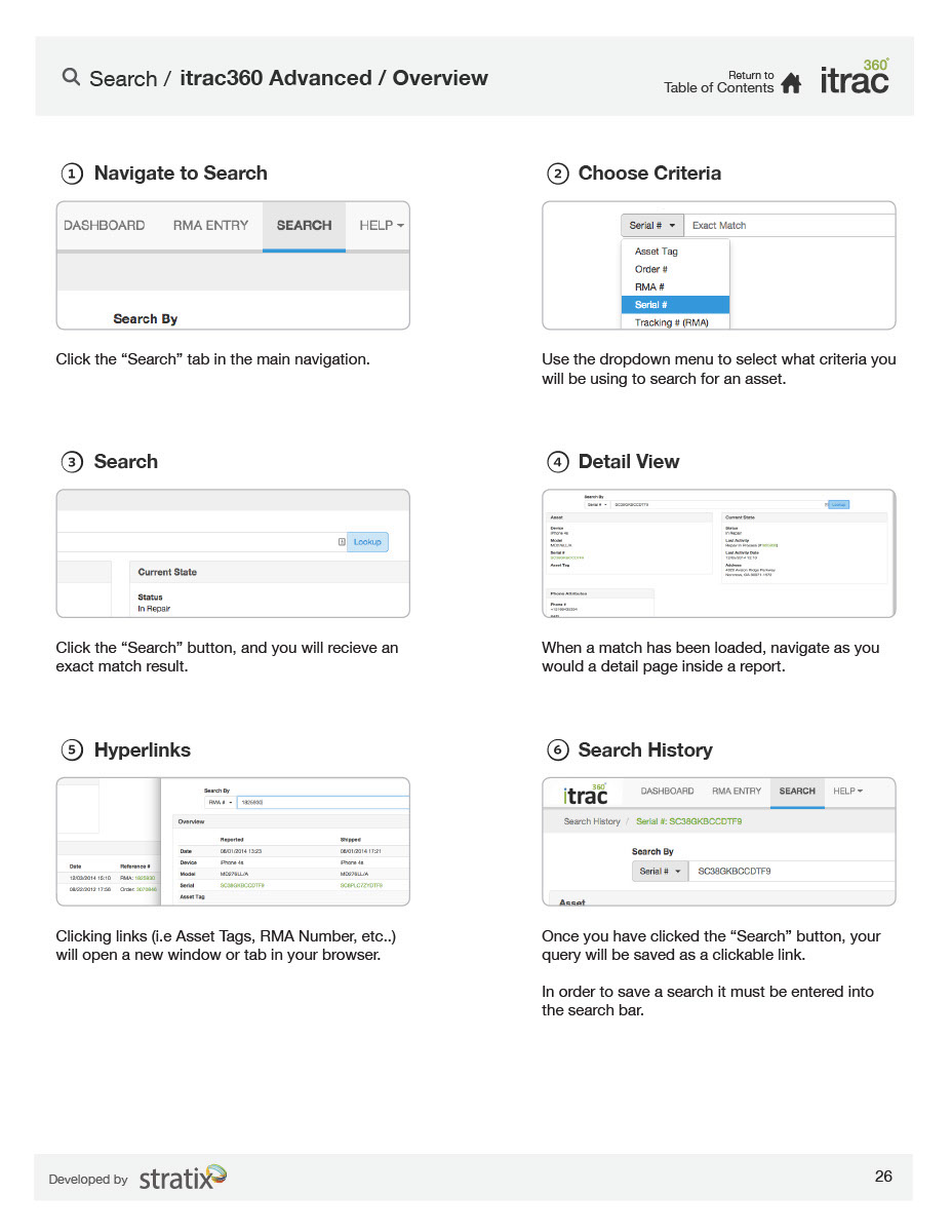
Here is the official itrac360 documentation, it is usually in interactive PDF format, but Behance Mobile made all pages into images.
Not a big deal, but if you want to know everything about itrac360 & how much work I put in, have a look see.
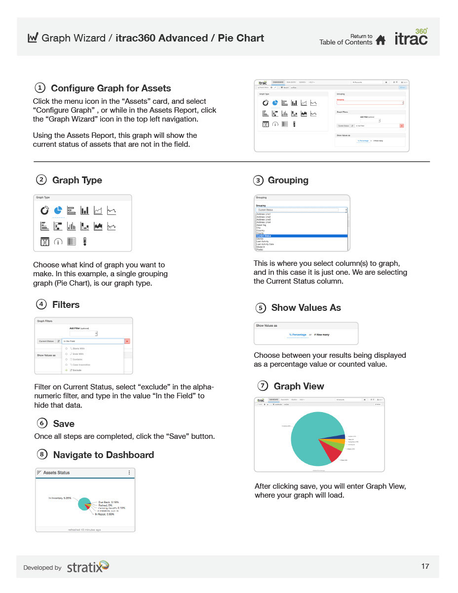
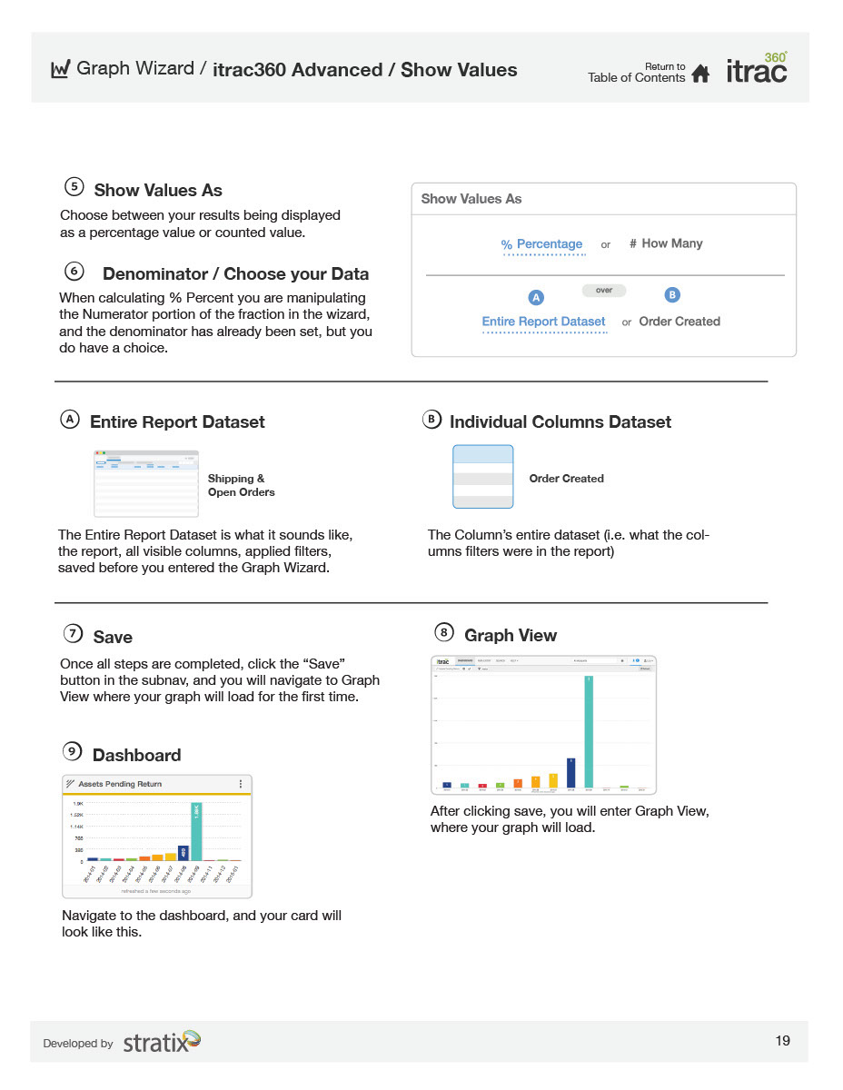
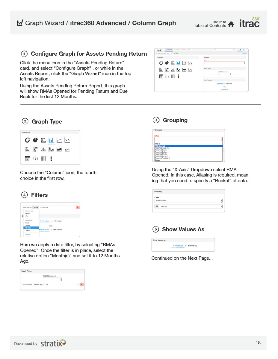
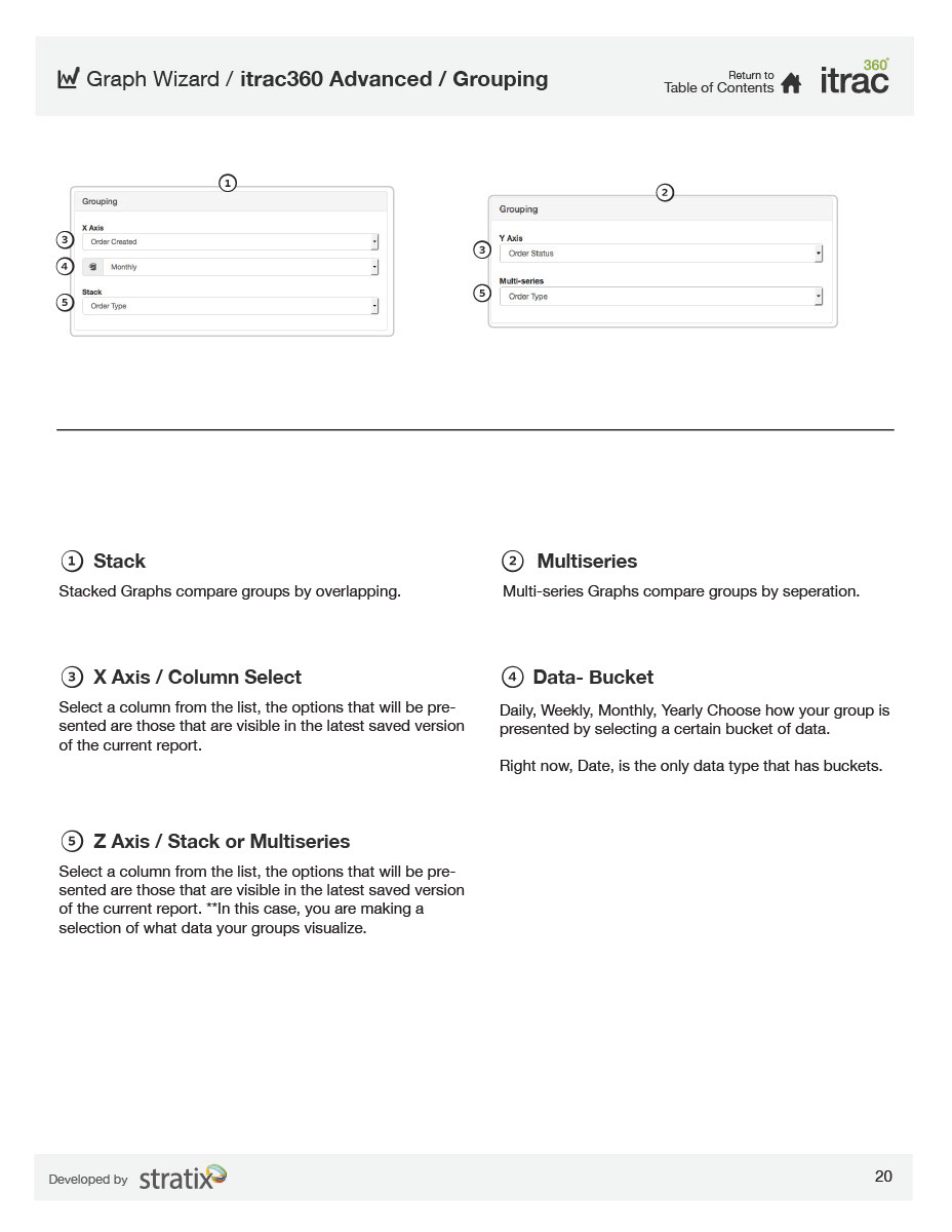
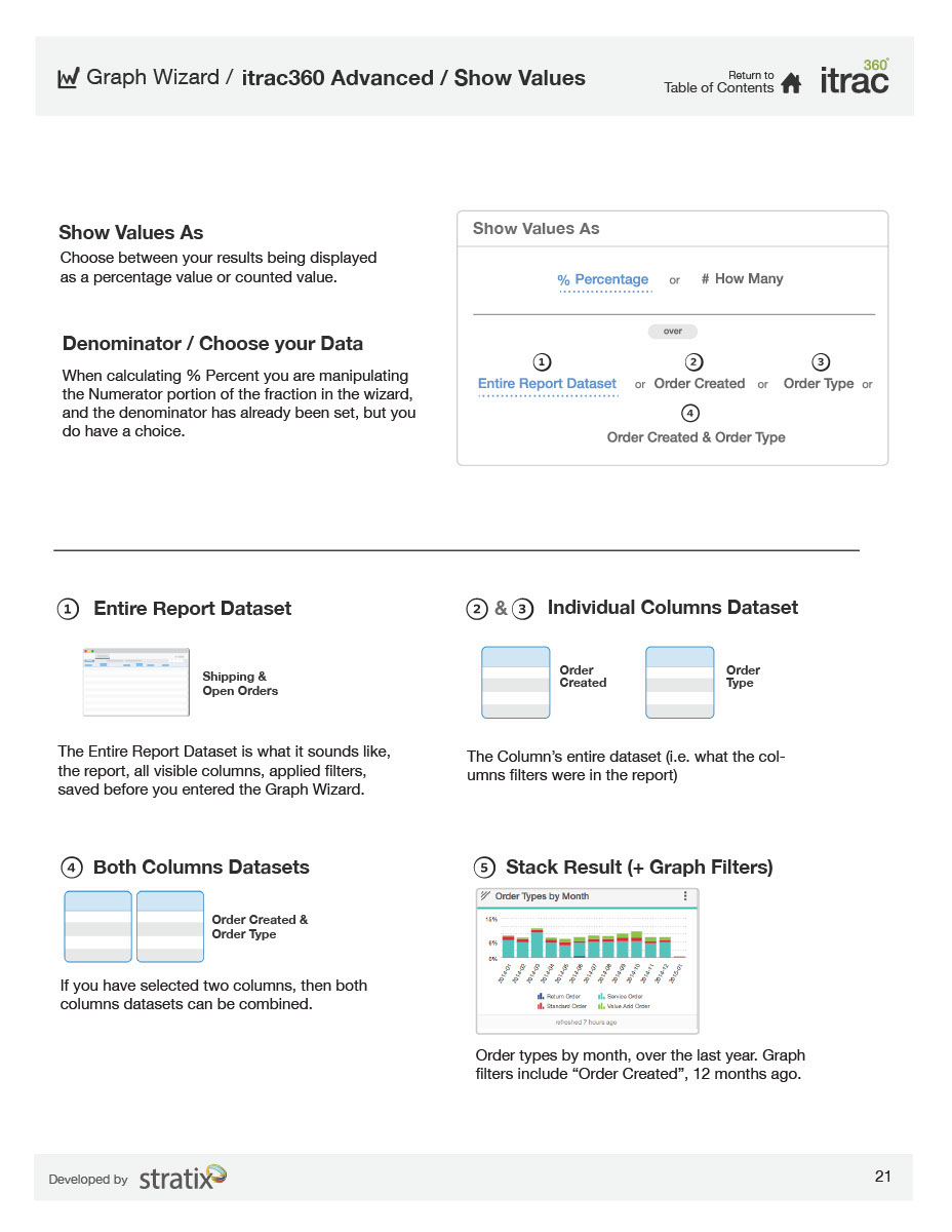
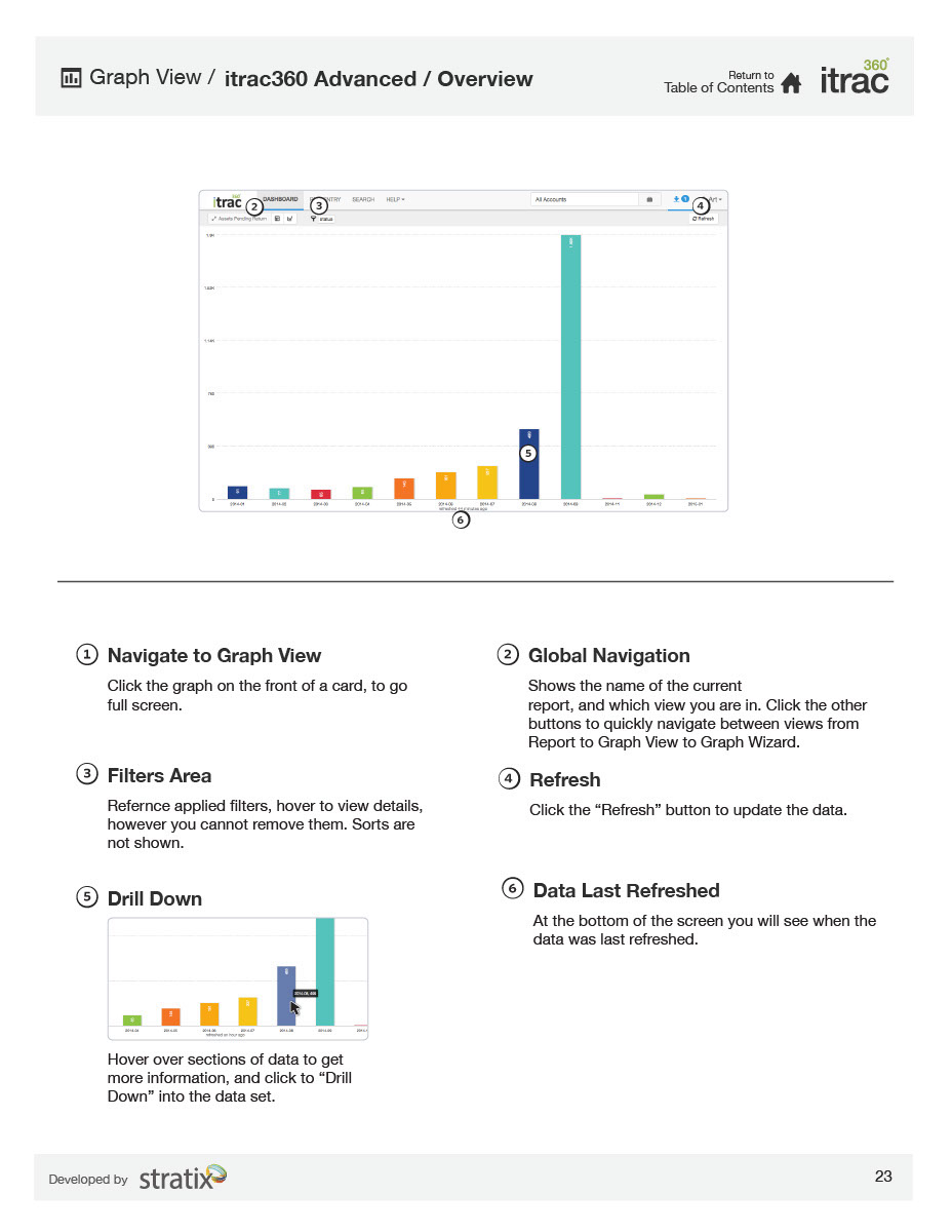
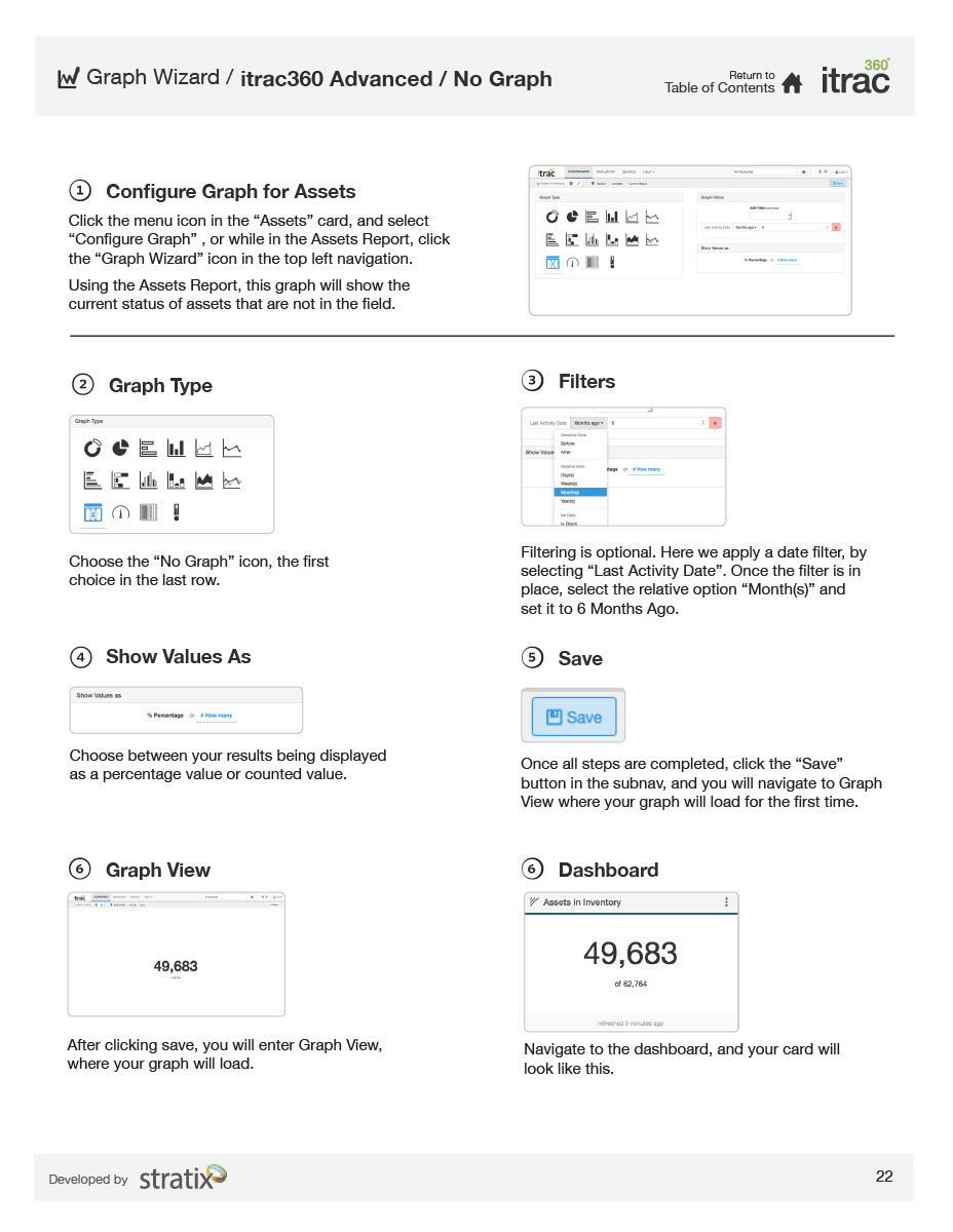
There's plenty of callouts and diagrams to explain in great detail how all custom widgets work.