

Made in 2017
Team Project - Role: UX Designer
Team Project - Role: UX Designer
Oakley Website Redesign
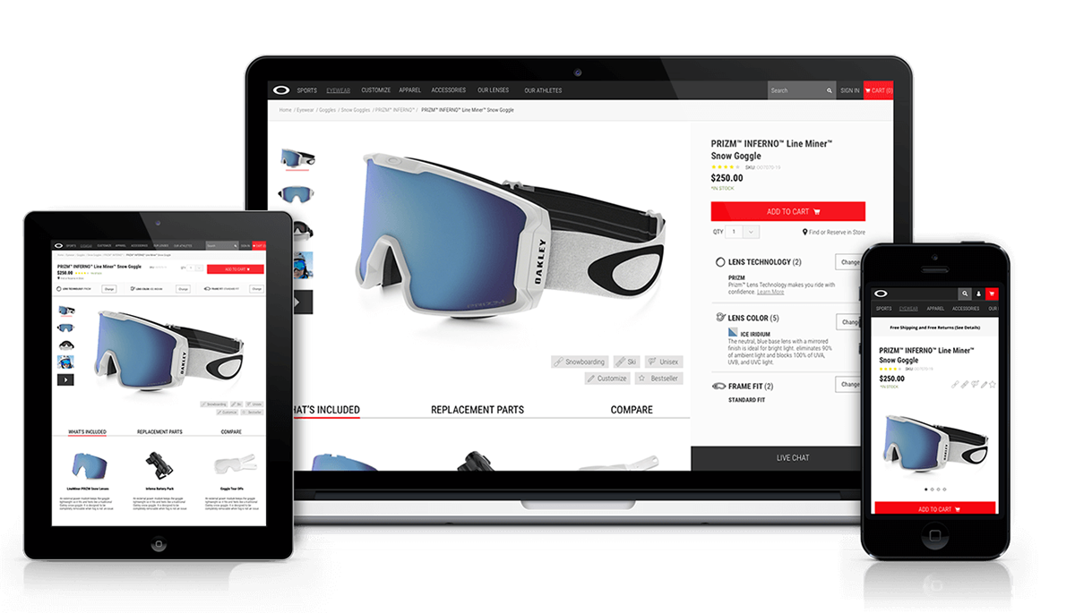
Product Detail Page (PDP), Navigation and Search redesign was the main focus of the project for the Oakley website, part of the Luxottica Group.
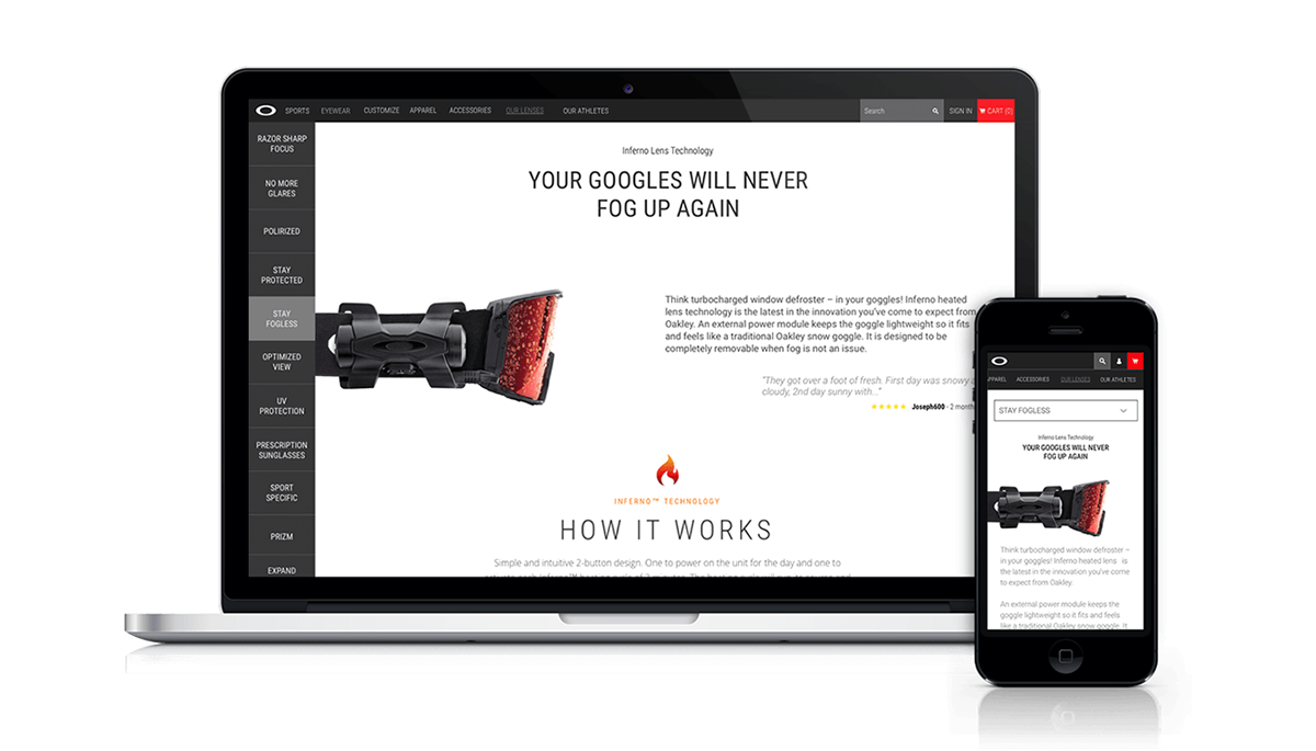
User Experience aspects were also improved on the Homepage, Product Listing Page (PLP) and Technology Page, where the brand explain its product's technology.
This project was designed at Scuola Politecnica di Design.
This project was designed at Scuola Politecnica di Design.
Some research was conducted at the first phase including competitor analysis, expert reviews, tasks and personas definition, user testing, observation and interviews. Research was important to understand how people used the website and where it was necessary to improve the experience.
In the PDP a modular layout was designed in a way every product could fit it. A fixed panel were created on the right side, in order to keep always visible main product's information and CTA for the desktop size. The same panel was moved to the top of the page on the iPad version.
Just below the product overview, other important information are displayed and managed with tabs, including a comparison one.
Scrolling the page, interactive content is provided to engage the user with description about the technology used for the product, together with similar items and reviews.

In order to give users an overview about each product at a glance, tags were introduced in the PLP. This way pogosticking was prevented while search function was improved. Tags were explained with icons related to sports, gender, customizability of the product, new arrivals/bestsellers/other.
Editorial content was added and integrated into the product list with the aim of establish context and provide information/benefits of the category.

On navigation labels where changed in a clearer way in order to be self-explanatory. In the mobile version icons were added close to labels to enable users to learn the meaning before entering other pages.

The Technology Page, became "Our Lenses" page with a new fixed vertical sub-navigation bar on the left side with labels conveying the benefit of each technology. An other improvement in this page was adding CTAs linked to Product Details Pages related to the technology.
For the Homepage two options were proposed. One is more seasonal or for special collection, designed to be used in short period with a full page video content useful for up-selling.
The other one is more classic, but reinforce trust with the use of social media content and user generated content, used in case of no special collection season.


