The Project
RR Enterprises, a Corporate Gifting and Merchandising company was founded in 2014 with an aim to provide customised solutions to its audience. They have had more than 40 clients ranging from Pernod Ricard, TATA Teleservices, Makemytrip, Exxon Mobil, Carlsberg and more.
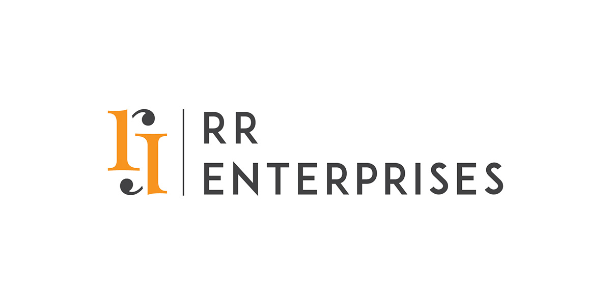
They approached us with a challenge for great appeal to the corporate industry and a professional look. We gave them a face-lift with a new identity and brand collaterals. The company is founded by two friends, Rajan and Raman and hence 'RR' in their brand name.
The Logo
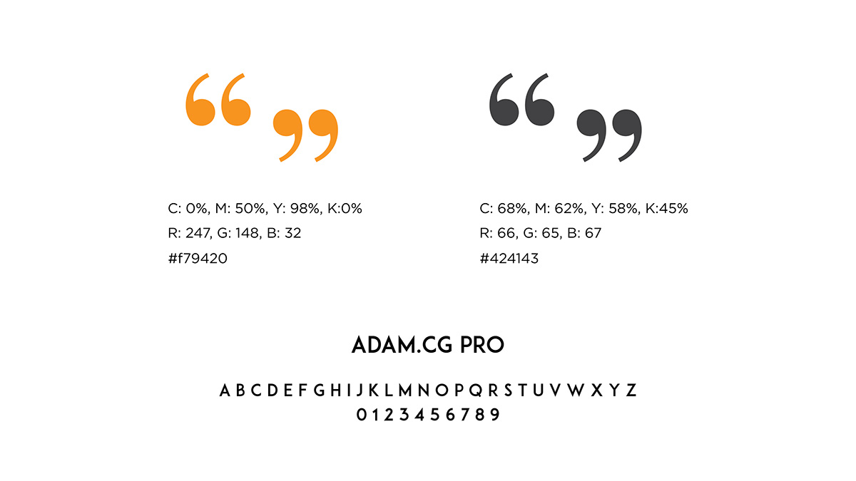
We modified the letter R that represent the names of the founders. The inverted commas in the icon suggest the exclusivity of the brand in the corporate industry and how it leads to conversations around it. It also symbolises the thought/message with which the giver gives a gift to someone.
The serif font used in the motif symbolises Luxury. The sharp san serif font represents professionalism
and pro-activeness.