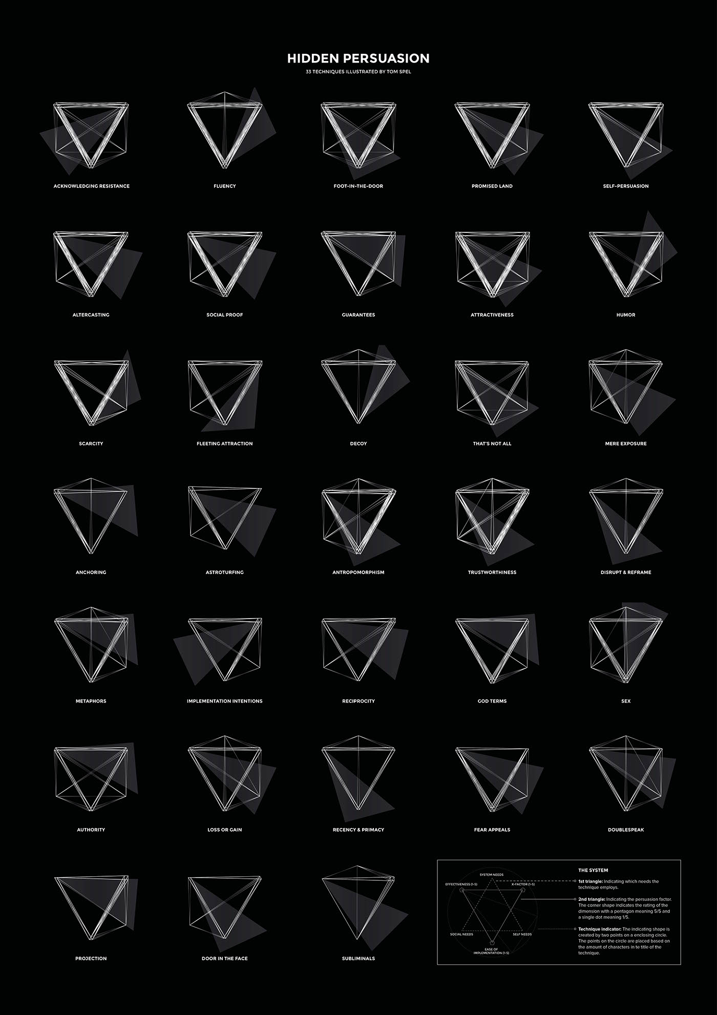
Hidden persuasion - Technique Icons
Based on the book "Hidden Persuasion" I created a series of 33 icons resembling the 33 persuasive techniques the book describes. After discovering different concepts and directions I created a system that displays the core characteristics of the technique it applies to.

About the book
The book describes explains the psychology behind 33 effective influence techniques of visual persuasion and how to apply them. Examples of these techniques are:
- Fluency A message should always be experienced fluently and with ease.
- Humour He who laughs is defenceless..
- Self Persuasion No one is better than you at persuading yourself to change.
And 30 more.
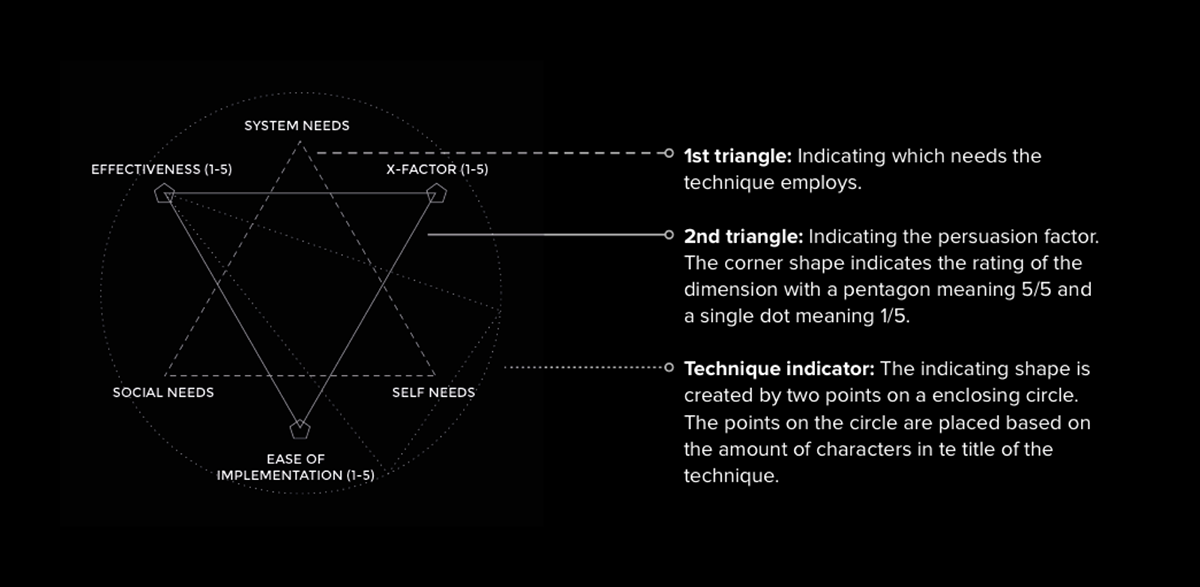
The techniques in the book are based on three classes (system needs, social needs and self needs) and are graded based on a persuasion factor (ranking the 'Effectiviness', 'X-factor' and 'Ease of implementation' on a scale from 1 to 5).
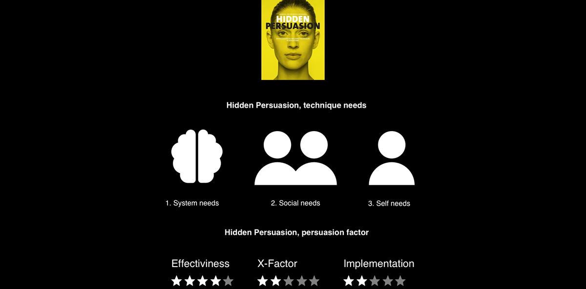
These needs and rankings are of importance for the concept later on.
I can really recommend reading the book, check it out here.
The system
For the icons I created a system. The icon consists of two triangles. The first triangle represents which needs the technique taps in to. The second triangle represents the persuasion factor. The scale that is given to each aspect of the persuasion factor determines how many points each vertex of the triangle gets.


To create an icon, you simply look at the technique and check which needs it taps into and what the persuasion factor is. After that you connect all the dots together and you've got the icon.


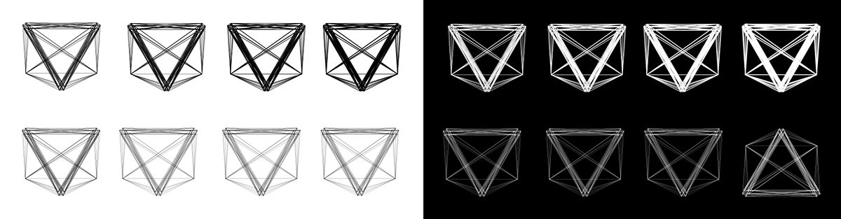
Lines and opacity
Now that I had a system for the icons I researched the right thickness and opacity for the icons by trying a bunch of options.
I found out that a white icon on a black background, combined with an opacity-gradient in the lines would work best. This way I brought hierarchy to the icons. You can distinguish the effectiveness of the technique at the first glance since the downwards triangle (representing the persuasion factor) is most present. The opacity in the lines ensures that the upward triangle (representing the needs) isn't just viewed as lines connected to the vertices but as a point (or like a dot) standing out from the shape. This makes the icon more readable.

The missing factor
There was one big problem with the icons: some icons could still turn out to be the same (because the needs and persuasion factor were exactly alike). After some research I found a way to add a final distinctive element to the icon.
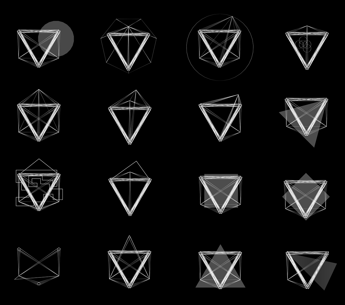
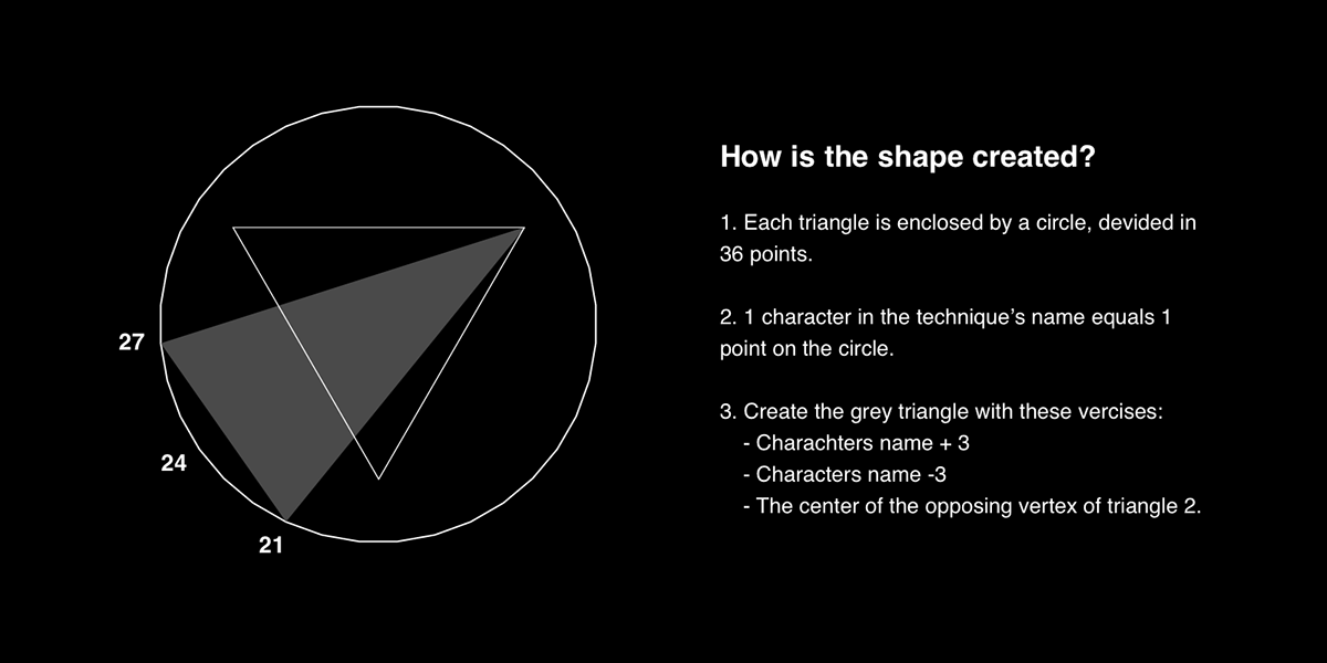
The technique indicator
After my research I decided to create the technique indicator (it's in the bottom right corner). I linked this indicator with an almost unique trait to the technique: the name. Based on the amount of characters in the technique's name the indicator gets it's shape.
The final icons
With the technique indicator introduced I finished all 33 icons and made two poster designs for the posters.


Full poster