Jogger is a finishing and production sister company to the editing house Cut+Run. A league of makers and crafters by trade, Jogger’s aesthetic vision is squarely rooted in a deep appreciation for sculptural design.

Artisans in both their professional work and out-of-office lives, we decided early on to use the hard examples of their craft as touchstones in our design. A stone and wood table fashioned by Jogger partner, David Parker, was a springboard to a brand identity that could easily transition from digital to the physical world.
The website is simple and intuitive, pulling in a concrete gray brand color that nods to the printed collateral suite. The dynamic movements of text and imagery add an edge to a minimal design that keeps the user’s eye directed to their esteemed portfolio.

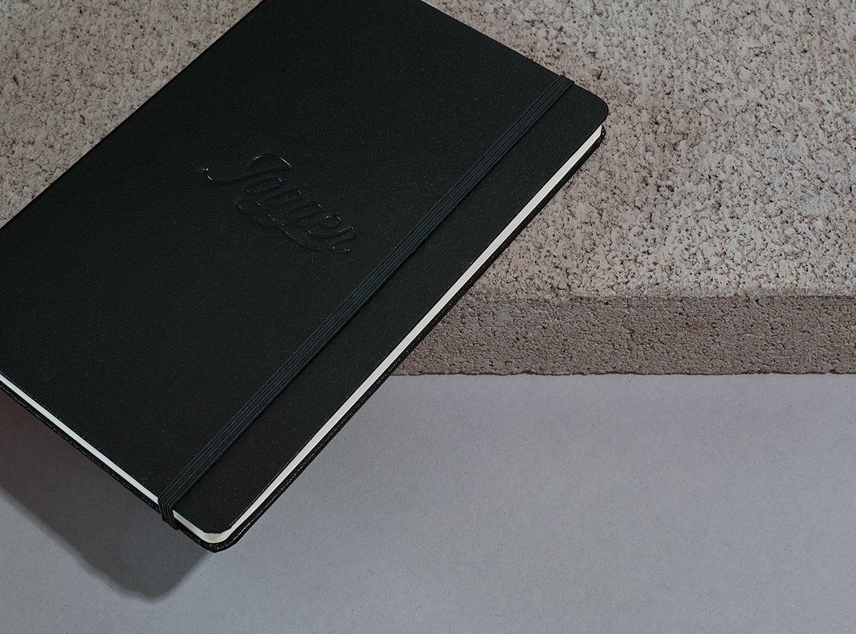
We started with an existing logo that Jogger wanted to consider alongside new concepts from our creatives. In our identity sessions, we came full circle and recommended a polish on that existing logo – refining its form and weight to ensure that it could work at any scale.
We coupled that treatment with a clean Swiss type that is given life in printed collateral through an amazing sculptural emboss and concrete-inspired color palette.


Project created while Creative Director at Funkhas


