
Project Brief
This project is a college assignment in which we were asked to choose any existing magazine and study its USP and layouts. After that, we had to collect articles that would relate to the magazine and create another edition of the magazine. I've chosen Better Homes and Gardens (website here) for the project.

Initial Research
Reasons for choosing this particular magazine are many. Firstly, I thought it would be pretty challenging to take a magazine with layouts so different on each page, yet harmonious. The colour usage is also pretty strong throughout the magazine and it is tough for a beginner like me to pull a similar layout off. Secondly, the content of the magazine is of my interest. The ideas and improvement projects for home and garden and recipes are worth reading.
To begin the process of design, I've thoroughly looked at previous editions of the magazine. After studying, I've managed to make similar yet new designs which reflect the original style of the publication.

Concept
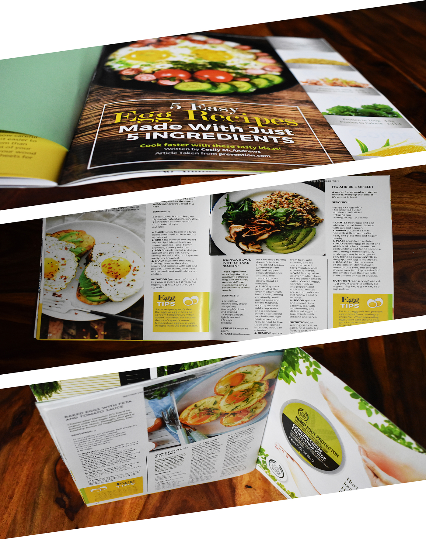
Even though the articles are not originally mine, they have been chosen from the internet with care. A concept of Do It Yourself (DIY) has been established inside the whole magazine and stories that talk about DIY techniques have been used, after looking them up on the internet, for the cover story and other articles.
Another recurring theme in the magazine is the Tips mini articles that are featured along with the main articles. Chosen from various websites online, these mini articles relate to the main article in some way or the other. They also build a sense of unique style in the magazine.
The original style articles have not been forgotten. I have ensured that I included food, gardening and home interior articles along with the other articles to maintain the original feel of the magazine.
A new concept for Better Homes and Gardens, of including a CD is done in this project. The CD talks about the cover story "DIY" by the famous blogger Martha Stewart (blog here). A subscription form printed on a light green A4 paper has also been added to the magazine for the readers to tear and mail to subscribe.

Layouts
Here are a few sketches of how I have planned the layouts initially. One thing to note about # these layouts is that in most, 2 or more article run on the same page, instead of just one, hence building up a layout that can accommodate more words and generate interest in the eyes of the readers towards another article.


Design Information
The size of the paper is A4. With a total of 24 pages including the cover and the back, the magazine contains various colours (very prominent ones being Tangerine Yellow, Conifer Green, Camarone Green and Midnight Blue) and typefaces ( Montserrat. Bodoni, ADAM.CG PRO and Century Gothic for headings and Candara and Cambria for paragraphs). Page numbers have been given on the bottom corners of each page.
Advertisements
The advertisements have been created for the magazine, as well and are shown below:


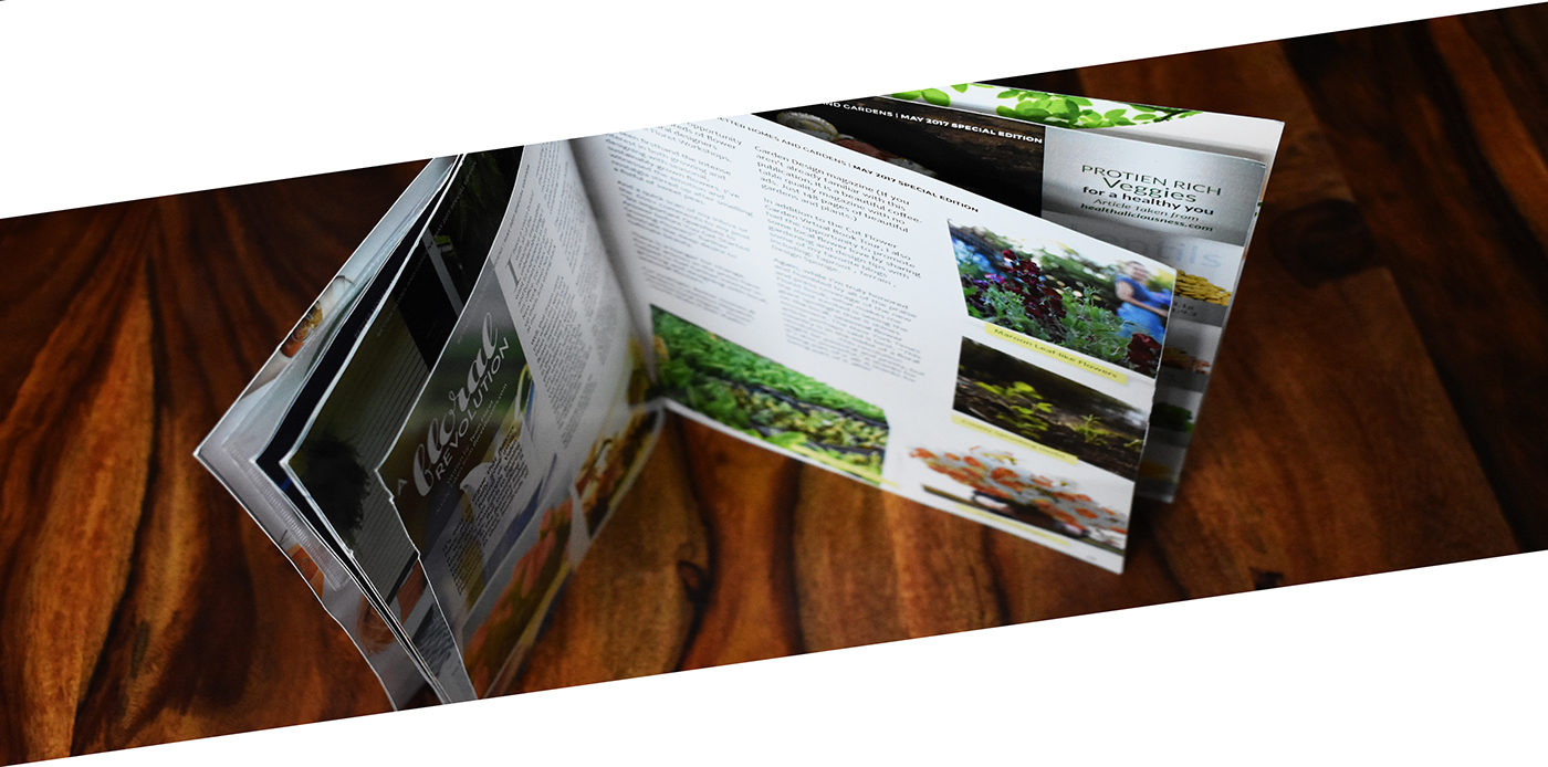
Flip through!
Disclaimer
None of the photographs used in this magazine belong to me. They all have been sourced from the internet. The images have been used for educational and non-profit purposes only.
The images of the magazine are taken using Nikon D550 camera.
The articles are taken from the following websites:
bbc.co.uk, diynetwork.com, naturallysavvy.com, preloved.co.uk, popularmechanics.com, floretflowers.com, amberinteriordesign.com, architecturaldigest.com, familyhandyman.com, prevention.com
Thank You.


