A special Excel chart (graph) that Excel chart lib is lacking, This was requested by a client, the good thing it is customizable, the bad thing it is a macro that you need to click in order to get it.
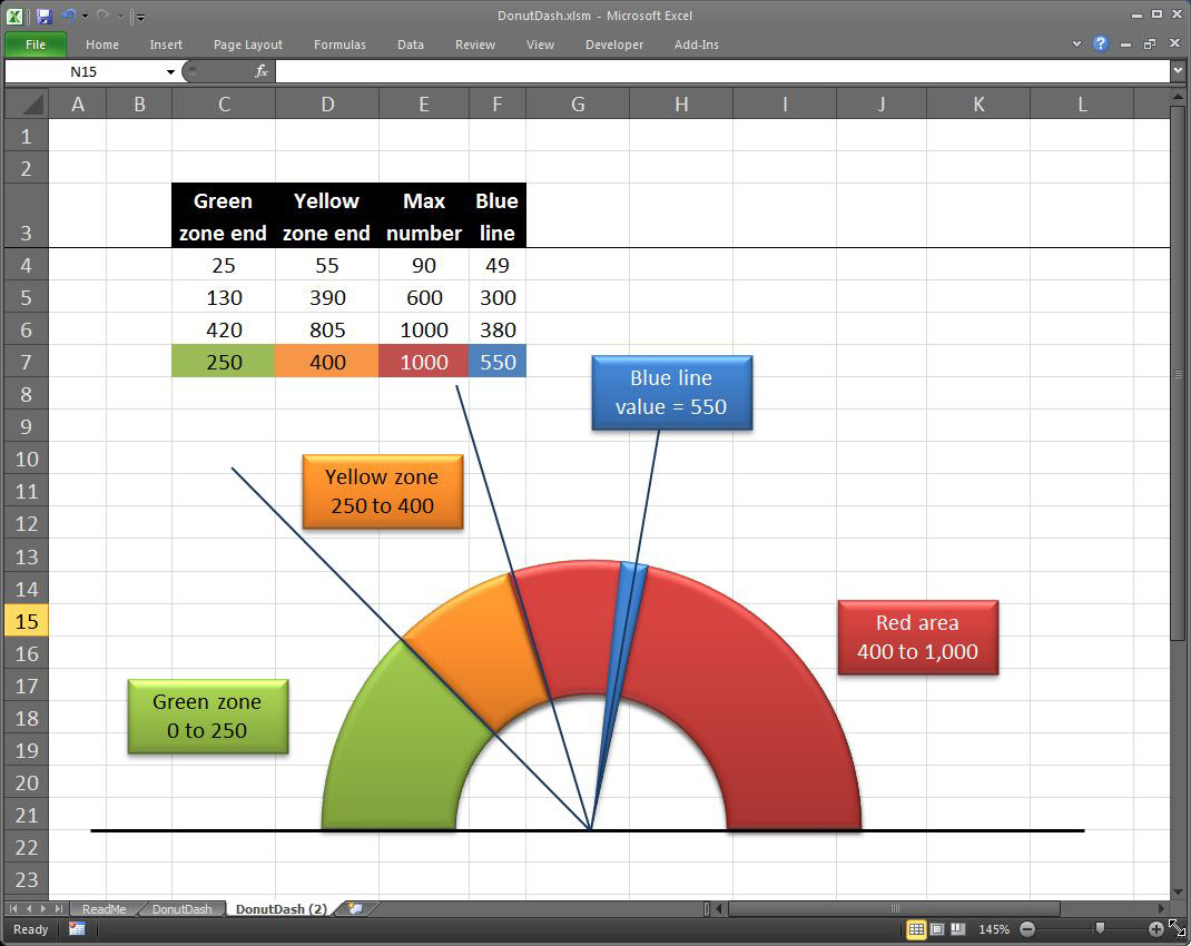
You need to set the green area max number (Min is 0), Yellow area max, Red area max (which is equal to the limit) and finally the Blue line, or where we are now. Based on these numbers, DonutDash draws you the chart that shows them, please contact me if you need more colors or change anything, most of these simple addition requests are free of charge.
http://anmars.com/Work/?P=500211120


