


FOOD CHANNEL
corporate identity rebranding
Food will never be the same again. The Food Channel takes on a whole new identity inspired by careful planning and research to ensure a successful rebrand. Creating an entire brand identity from the logo to the channel fillers that will be seen on TV. The Food Channel will change your relationship with food. Create fantastic and fresh meals. Find and discover amazing curated content. The Food Channel has it all!
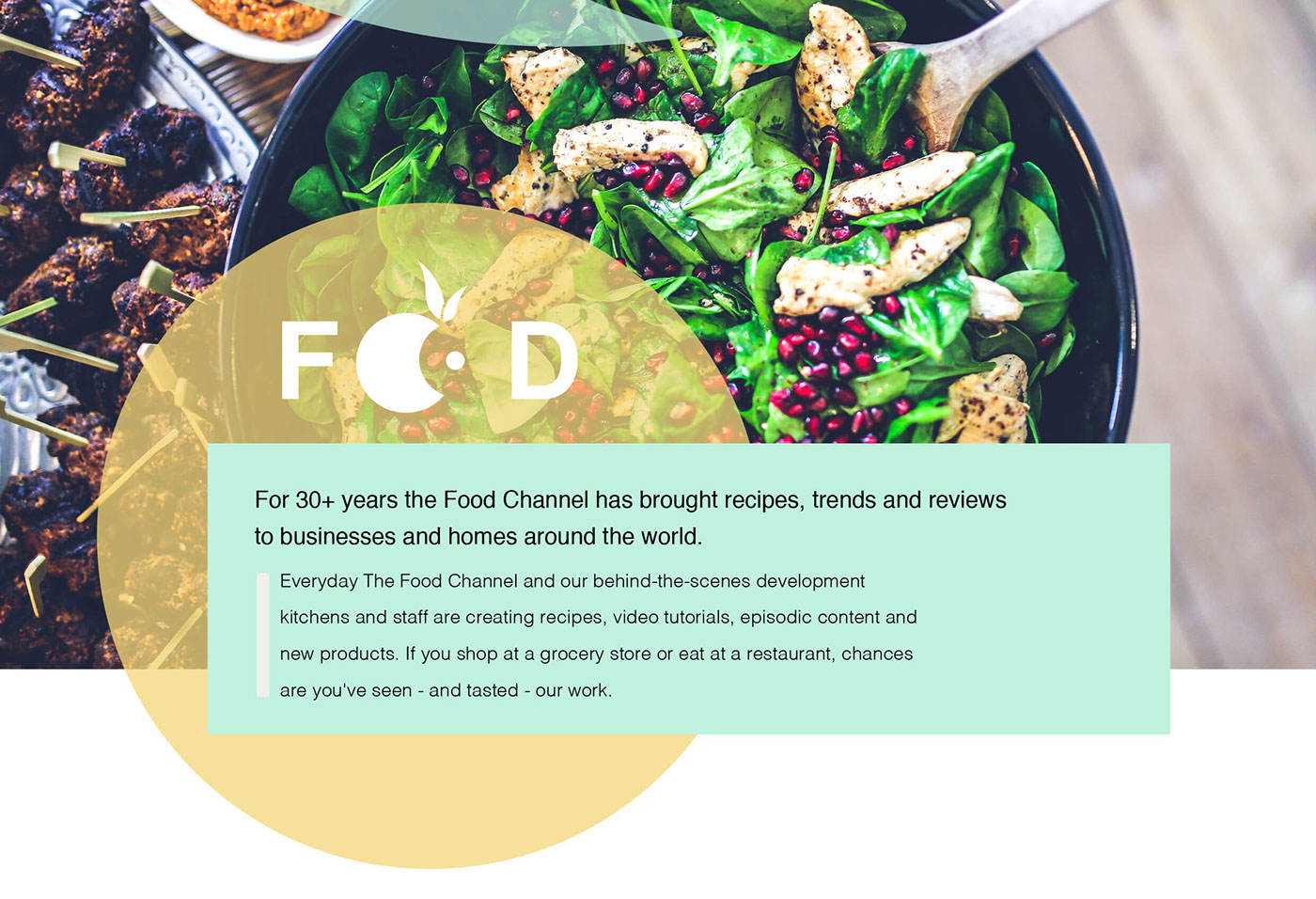


The color choices have been limited to more of a pastel color range yet the colors are still vibrant enough to make the content seem appealing to the user and effectively communicates a fresh look to the brand. The primary font choice is very bold and works well in contrast to the striking images of food that is used throughout the identity of the new food brand. The secondary font is very legible and the perfect combination to be used for the desired look and feel of the brand.


Screen grabs of channel filler. The filler can be used to transition between shows and advertisements that are featured on the FOOD channel. Screen grabs of ticker tape. The style of the ticker tape is reminiscent of the smears that chefs often applies to a plate, when plating a dish to be served. The function is to communicate information to the audience.


The use of imagery has been made very apparent in this re-branding. The images that are to be used for the band are to be of a very high quality and standard. The style of photography helps to communicate the vibrant, fun and energetic aspect of the brand and ful ll a need that was greatly lacking in the original style of branding of the brand.


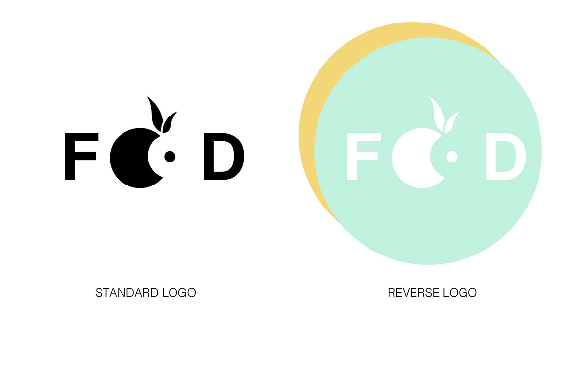
The use of imagery, color, font and general style has been kept consistent throughout the entire re-branding process of FOOD. The main shape that has been used throughout is a circle. This is a very strong shape and can be found in various instances in food. The circular shape also aids the animation style that has been used to communicate the new identity of FOOD.


The stings have been kept very simple with key focus on keeping it clean and fresh. The lighting and use of color adds to how the imagery is perceived and aids in engaging the viewer. The style, and simple action that occur in each sting speaks about the modernity that is accompanied by the new brand image. All footage used for the stings I have shot and edited myself.

*Student project - this project is hypothetical and is in no way associated with The Food Channel.


