
With so many supermarkets vying for elbow-room, newly reopened discounter, Netto, had to work hard to stand out from the Crowd. But why should a consumer choose Netto over the big names of Aldi or Lidl? It was all about personality.
We took Netto back to its Scandinavian roots and created an attention-grabbing campaign that showcased their fresh food, an important USP, with tongue-in-cheek Scandi-style copy.
The vibrant and indulgent photography gave a raw backdrop to the onomatopoeic words that popped from the page. The Scandi characters, though nonsensical, alluded to an instant understanding of Scandinavian values - quality, value, and simplicity.
Initial Scamps

Final 48 Sheets


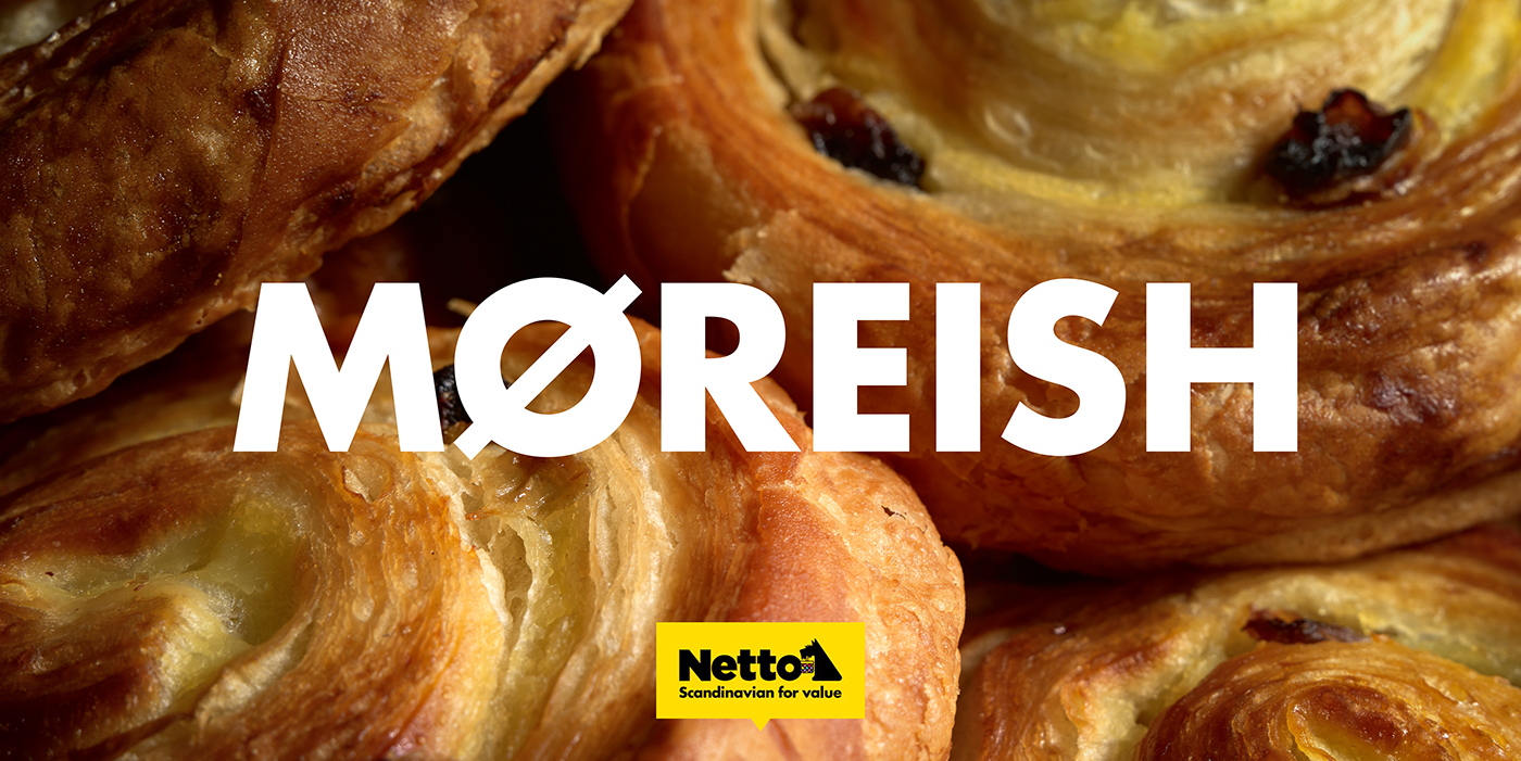
Photography by Fisheye Studio


