Developmentof the fonton the example of the logo «tumix»
From "T" tothe «X»
From "T" tothe «X»
Good day, ladies and gentlemen! I would like to share with you a technique that I used by development of the logo for the information portal tumix.ru.

Logos or, asthey used to be called, logotypes. Probably you know that as the logotype we call word part.
So a little bit simplistictheory:
Logo – word part ofthe brand (Samsung, Lenovo, Palm,Nokia, FedEx, etc.)
The sign + logo -a brand, which includes besides the word part a sign(Sony Ericsson, LG, Logitech, Beeline, MTS and a lotsof examples). This is the best variant.
Sign-logo –is the word part of the brand, including the sign which can’t be separated (Tut.by,Mexx, Zippo, Skype).
Word logos are convenient, they can be used almost everywhere. They are very easy to scale andapply them to a variety of items. They are also very suitable forinformation portal, because they occupy littlespace, they are well arranged by making-up and, besides, they don’t require a lot of free fields around.
And so I decided to make alogo that consists only of the word part. Simply select the font isn’t a goodchoice for us, because we need a catchy and long-living logo, so that’s why Iwill develop the logo from scratch.
I suggest to get acquaintedwith, in my opinion, the easiest way to develop the word part of the logo.
1. Analysis
First we need to analyze the word, take a good look atthe letters to find similar features. We need to understand which style of writing we need. I’ve chosen the most minimalistic style:no serifs and justsimple shape – so easy to read. We write down thename with the common font and try to analyze.

Even if to cast an eye on a word, we can see akey - the widget from which you can build the whole word. Here, asimple version, so the letter«m» could be well-formed from the letter «u», if you duplicateand flip them horizontally.The letter «t» is a little bit harder to build, but after thinkinga while - we can notice that it is easy to formit from the letter «u». So the key is theletter «U»
2. Using the key
Once we have found a style-forming letter, wecan begin to develop. As the keyis a style-forming element, it’ll set the pitch throughout the writing.
And nowyou can see it on the picture:

Let'sstart with the development of the letter«m», it's clearand simple.

Wetake the letter «u», flip it horizontally and vertically,and so we’ve got the letter «n», then we duplicate, mirror and mate the elements. «M» is finished. The task issimple. And now I try to get the letter «t».
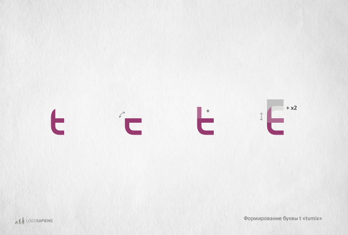
Thisis a little bit harder task, first: turn the key, in thisway we’ll get a basis for the letter«t».
Wejust add the tail to the letter, and then wecut them off. If we reflect the basis vertically, so we’ll get the proportion of theletter’s tail.
Now,we’ll develop the letter «i». It'svery simple, but the main thing is to decide in which styleit will be made: as a classic «i» (the rectangle with a dot), or it’ll be more dynamic. Look what will happen.
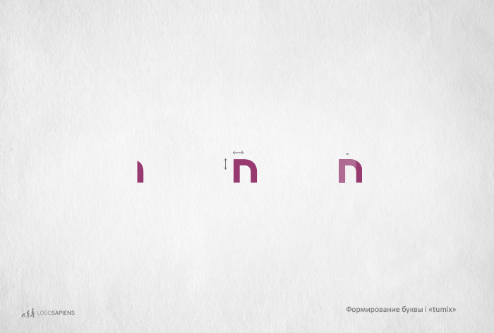
Anyway,Idecided to make the letter «i» more dynamic, so I’vejust made it from the right sideof the letter «n».
There is only oneletter to develop, the letter «X».I’ll form it on the basis of the letter«i».
There is only oneletter to develop, the letter «X».I’ll form it on the basis of the letter«i».

Asyou can see, I duplicate the letter «i»horizontally, rotate it 45 degrees, and duplicate once again.
All letters are finished! I’ve just selectthe distance between letters and the logotype is ready.
All letters are finished! I’ve just selectthe distance between letters and the logotype is ready.

Ofcourse, this approach isn’t suitable for every font development, but for the most it’s universal.
Andas always, evolve with us! © logosapiens.by
!!! Russian version - http://logosapiens.by/font1/
Andas always, evolve with us! © logosapiens.by
!!! Russian version - http://logosapiens.by/font1/


