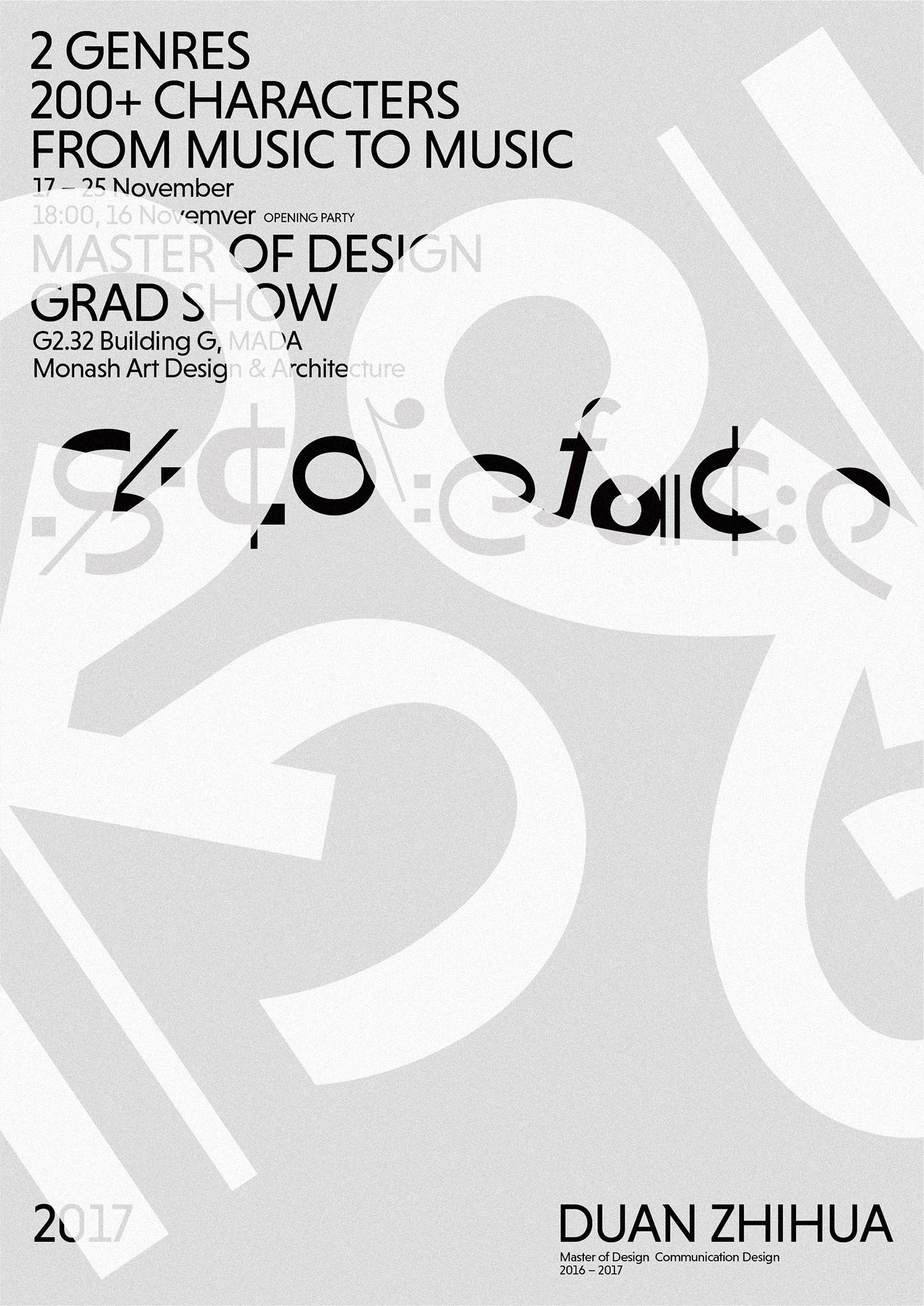
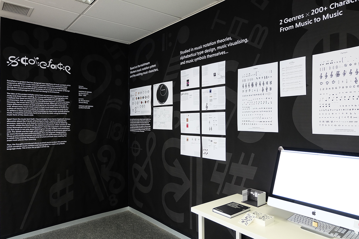
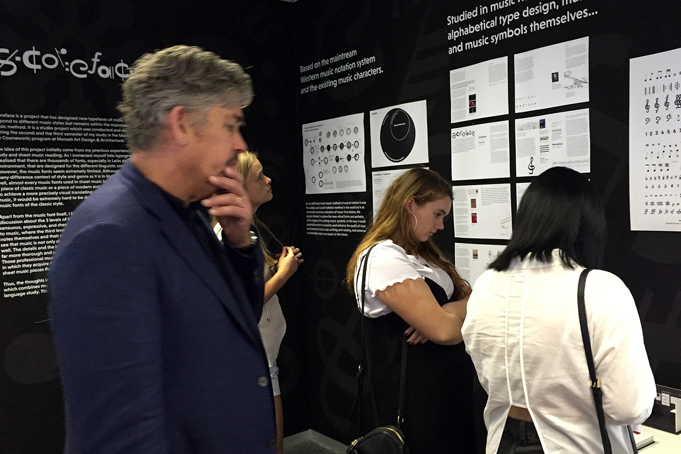
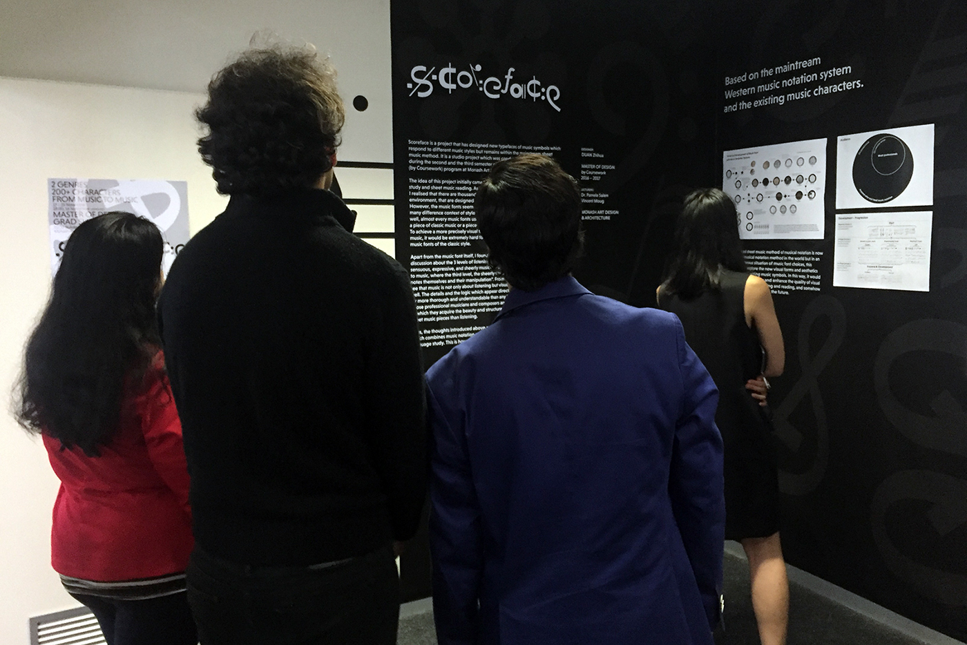
Scoreface is a project that has designed new typefaces of music symbols which responds to different music styles but remains within the mainstream sheet music method. It is a studio project which was conducted and developed during the second and the final semester of my study in the Master of Design (by Coursework) program at Monash Art Design & Architecture (MADA).
The idea of this project initially came from my previous experience of music study and sheet music reading. As I immersed myself into typography a lot, I realised that there are thousands of fonts, especially in Latin alphabet environment, that are designed for the different linguistic contexts and styles. However, the music fonts seem extremely limited. Although music itself has many difference context of style and genre as it is in linguistic language as well, almost every music fonts used in sheet music looks same no matter it is a piece of classic music or a piece of modern and contemporary pop music. To achieve a more precisely visual translating via sheet music towards diverse music, it would be extremely hard to be done by solely using the existing music fonts of the classic style.
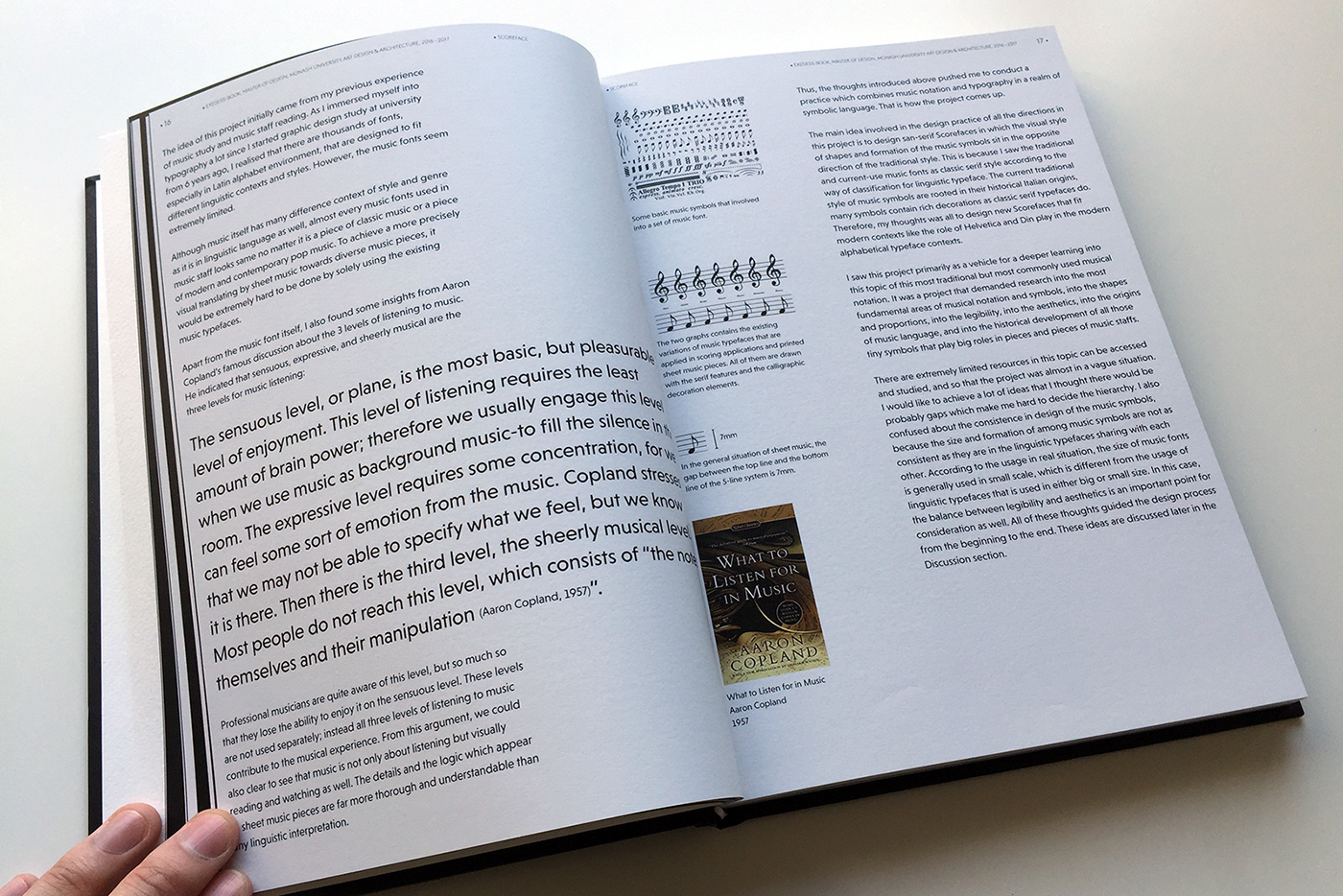
Apart from the music font itself, I found insights from Aaron Copland’s famous discussion about the 3 levels of listening to music. Copland indicated that sensuous, expressive, and sheerly musical are the three levels for listening to music, where the third level, the sheerly musical level, which consists of “the notes themselves and their manipulation”. From this argument, we could also clear to see that music is not only about listening but visually reading and watching as well. The details and the logic which appear directly on sheet music pieces are far more thorough and understandable than any linguistic interpretation. Those professional musicians and composers are quite aware of this level, in which they acquire the beauty and structure of music from reading the sheet music pieces than listening.
Thus, the thoughts introduced above pushed me to conduct this practice which combines music notation and typography in a realm of symbolic language study. This is how the project comes up.
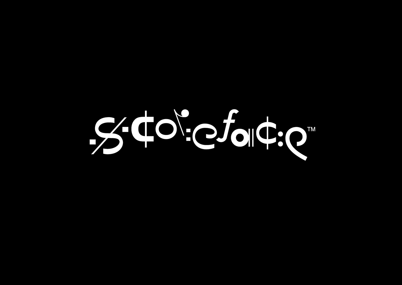
The final identity of the project is a logotype that is composed by a mix of music characters picked from all the first three style directions in which the shapes of each music characters looks similar to the alphabetical characters of the word “Scoreface” individually. It finally gives the project identity a typographical play directly from the music symbols themselves. It sits directly in the symbolic aesthetics while maintaining the legibility of the typographical and linguistic meaning as well.
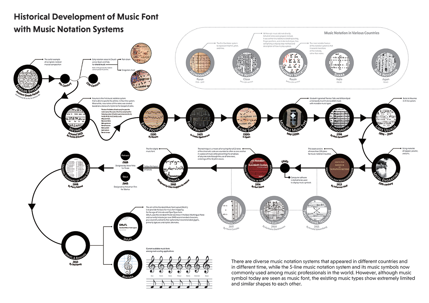

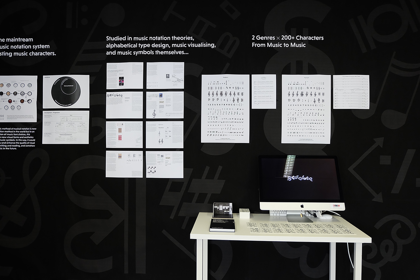
背景介紹及設計過程
Project background infographic & Design progression
終期兩套音樂字符對比視頻
Showcase video of the final 2 sets of the music type
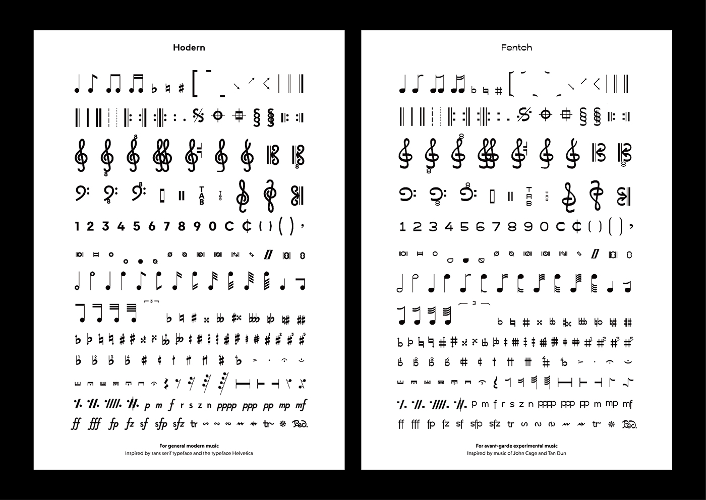
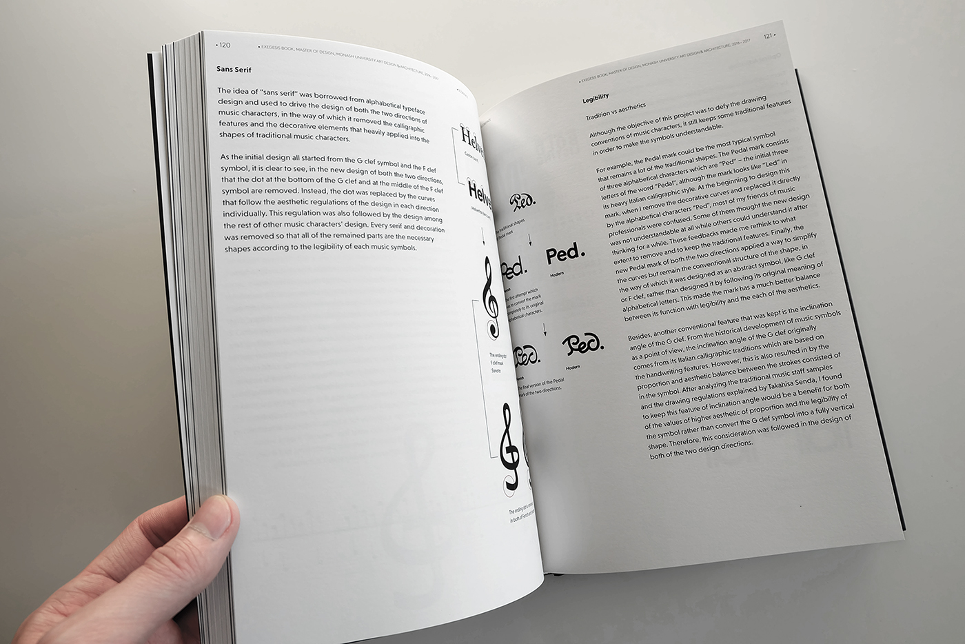
The word Scoreface is created in the same word formation of the word “typeface”. As the meaning of typeface is a set of one or more fonts each composed of glyphs that share common design features of weight, style, condensation, width, slant, ornamentation, and designer or foundry. This explanation also ts the word Scoreface that specifically focuses on the music characters, not the alphabetical characters.
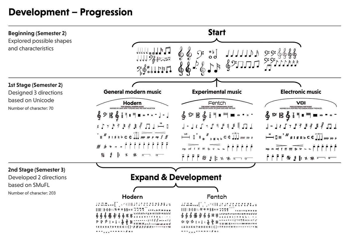
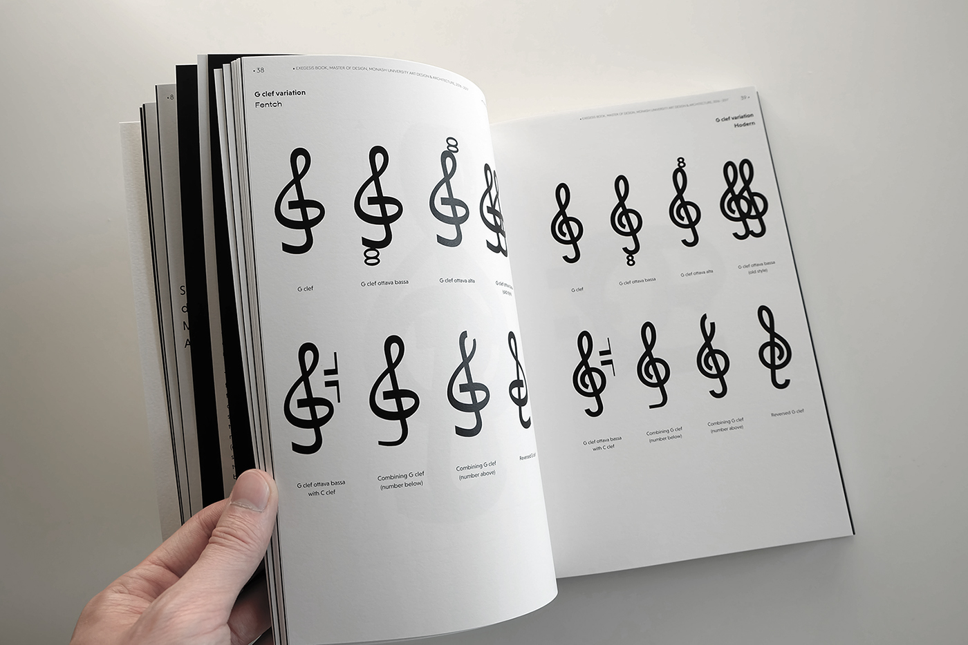
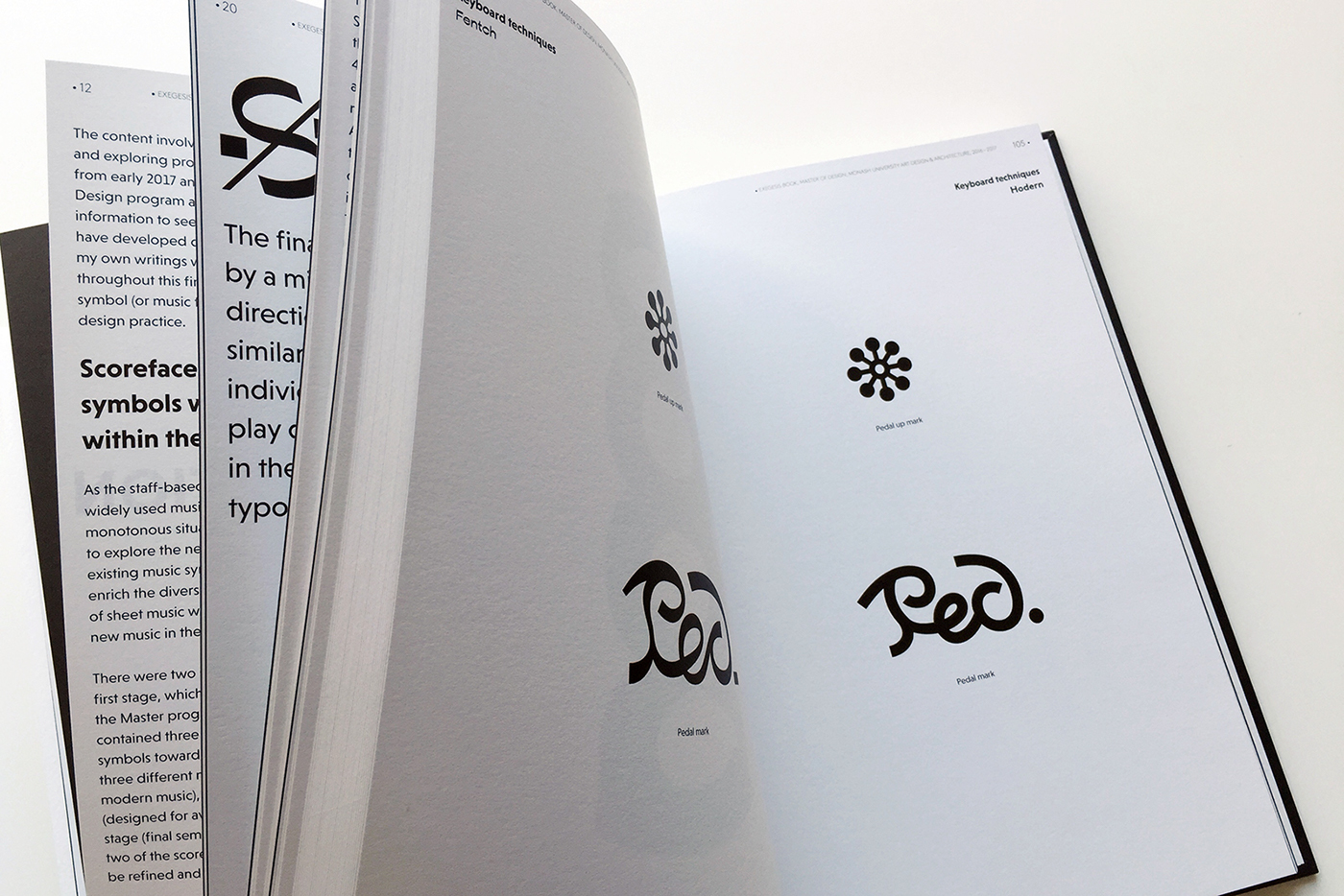
The project contains two different directions of Scoreface design, Hodern and Fentch. The two names of directions came from intuitive feeling rather than under deliberate or academic thinking.
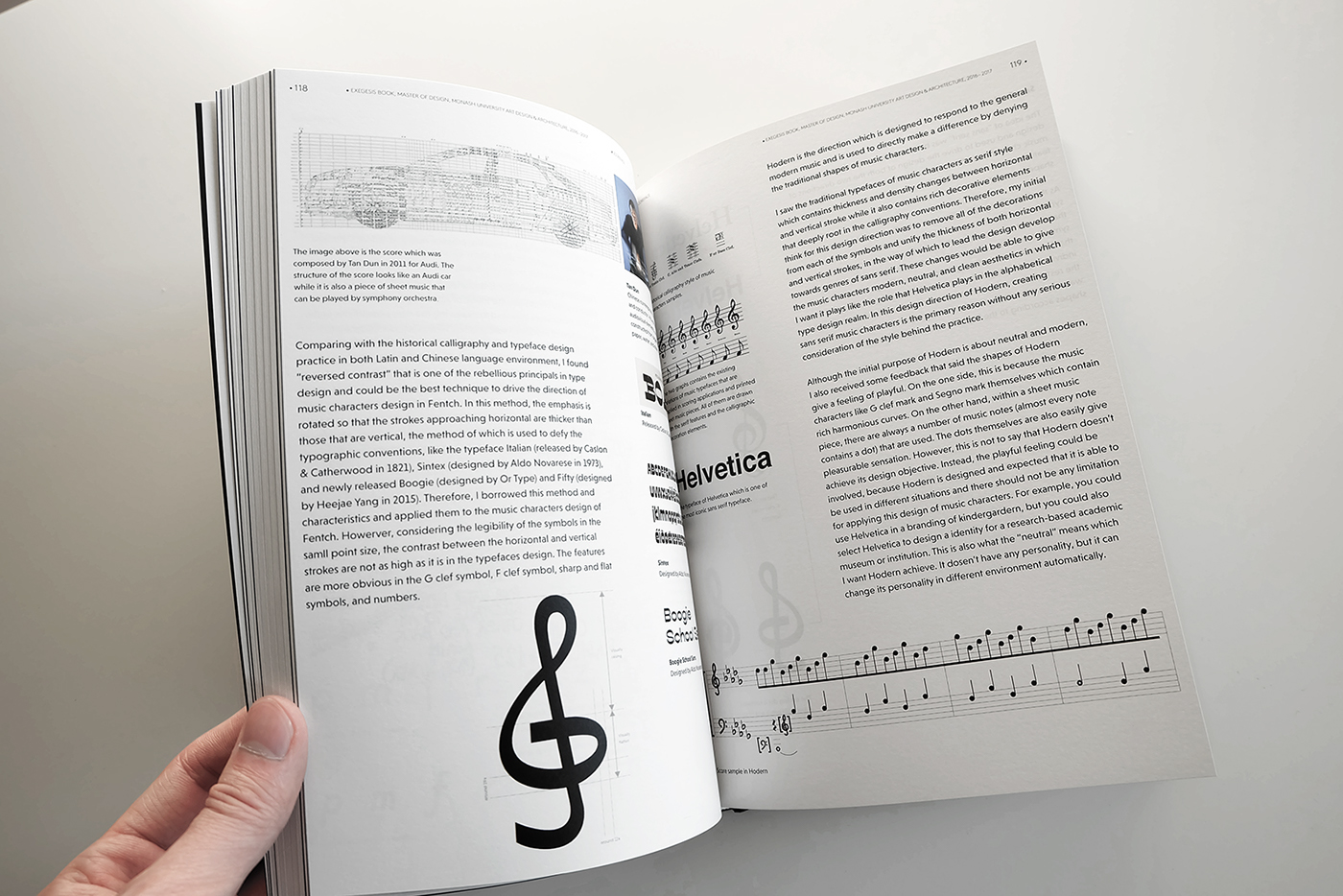
Hodern is designed towards a direction of general modern music and it inspired by the sans serif typefaces like Helvetica. As I want this direction focus on a tone of modern and playful, the word Hodern is combined by “H” + “modern”. The reason why I chose “H” to replace the initial letter “M” of “Modern” is because I found that many words start with letter “H” have lovely and friendly pronunciation and good meaning like hallo, halo, and happy, and also “H” is the initial letter of the name of Helvetica which is the most iconic modern and sans serif alphabetical typefaces. Therefore, the name Hodern should be a good choice to interpret my objective in the music characters design under this direction.
Fentch is a direction designed towards avant-garde music or experimental music that is stand in an opposite side of traditional or mainstream music. Initially, the thinking started from the music of John Cage and Tan Dun, in which their music is in a way of Atonal music method. In this way, their music sounds like mixes of note fragments rather than composed in a fluent and smooth way. At the beginning of their experimental practice, some of the audiences thought it is new and meaningful methods of music composing while others thought they are grandstand. Therefore, I combined the word “fent” and “fetch” together, where “fent” is used to describe the fragmented fabric and “fetch” is the meaning of tricks or techniques.
終期兩套音樂字符
Lists of the final 2 sets of the music type


項目研究與分析手冊
Thesis exegesis book
240 pages / Hard cover


展覽海報
Exhibition posters
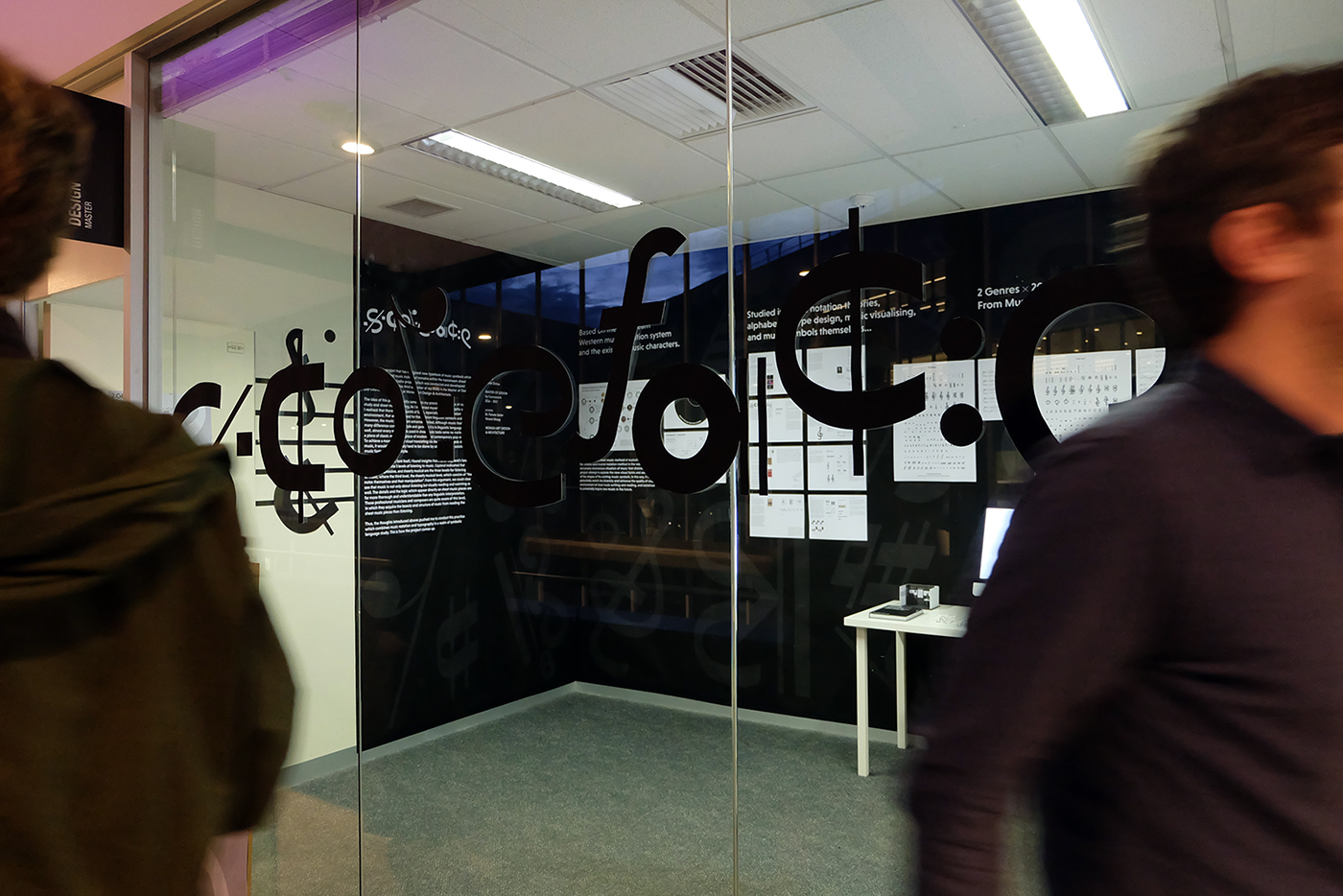


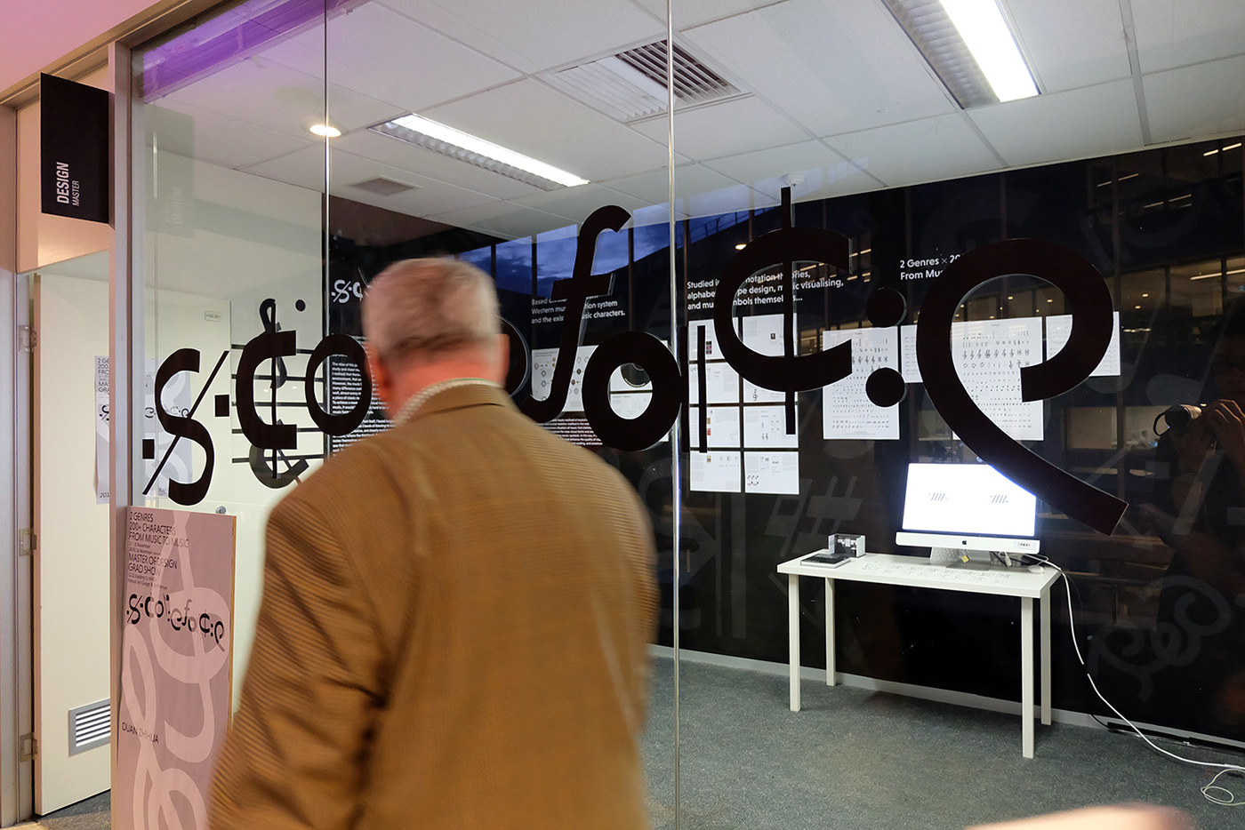
展覽
Exhibition


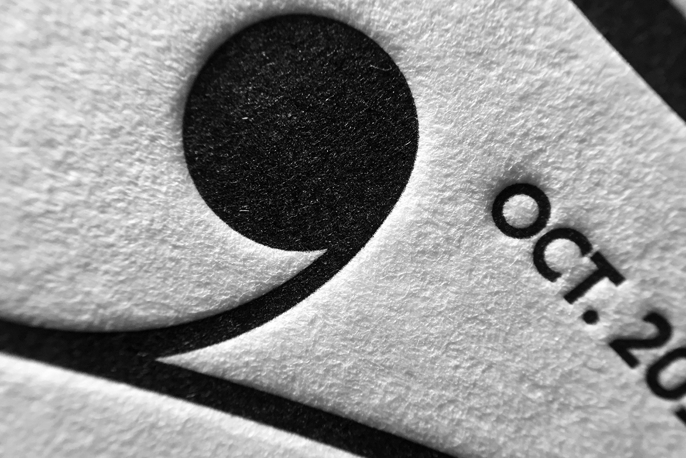
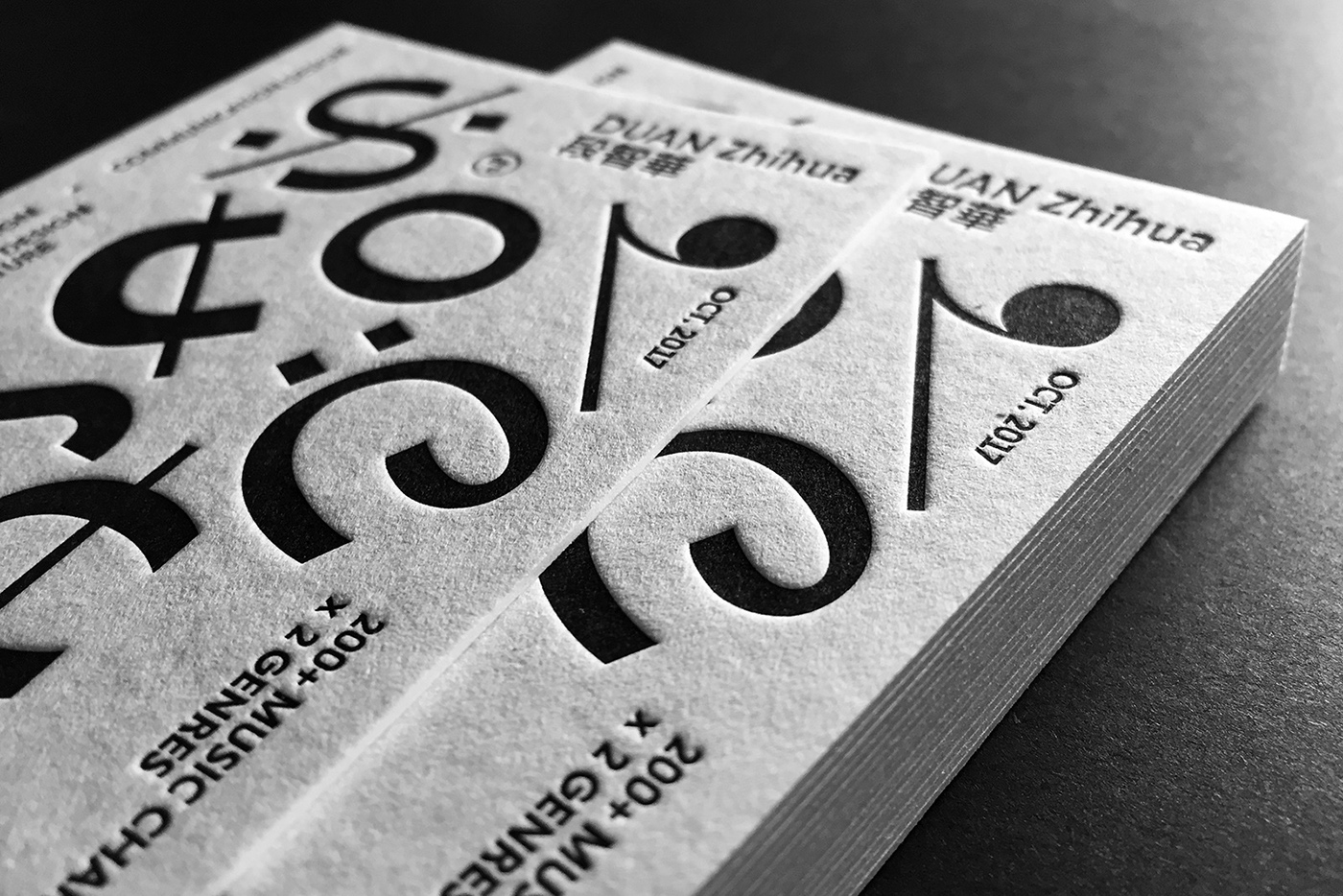
展览卡片
Letterpress exhibition cards
120mm x 80mm